A Different Kind of Data Cleaning: Making Your Data Visualizations Accessible

Introduction: Why Does Accessibility Matter?

Data visualizations are a fast and effective manner for communicating information and are increasingly becoming a more popular way for researchers to share their data with a broad audience. Because of this rising importance, it is also necessary to ensure that data visualizations are accessible to everyone. Accessible data visualizations not only help an audience who may require a screen reader or other accessible tool to read a document but are also helpful to the creators of the data visualization as it brings their data to a much wider audience than through a non-accessible data visualization. This post will offer three tips on how you can make your visualization accessible!

TIP #1: Color Selection

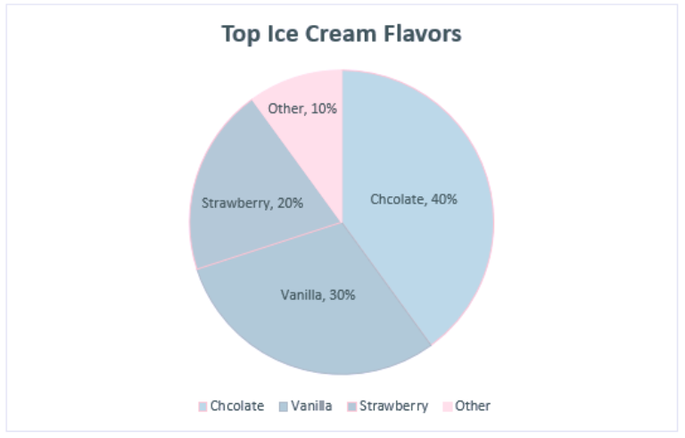
One of the most important choices when making a data visualization are the colors used in the chart. One suggestion would be to use a color blindness simulator to check the colors in the data visualization and experiment to find the right amount of contrast between colors. Look at the example regarding the top ice cream flavors:

A data visualization about the top flavors of ice cream. Chocolate was the top flavor (40%) followed by Vanilla (30%), Strawberry (20%), and Other (10%).

At first glance, these colors may seem acceptable to use for this kind of data. But when ran through the colorblindness simulator, one of the results creates an accessibility concern:

This is the same pie chart above, but placed under a tritanopia color blindness lens. The colors used for strawberry and vanilla now look the exact same and blend into one another because of this, making it harder to discern the amount of space they take in the pie chart.

Although the colors contrasted well enough in the normal view, the color palettes used for the strawberry and vanilla categories look the same for those with tritanopia color blindness. The result is that these sections blend into one another and make it more difficult to distinguish their values. Most color palettes incorporated in current data visualization software are already designed to ensure the colors do not contrast, but it is still a good practice to check to ensure the colors do not blend in with one another!

TIP #2: Adding Alt Text

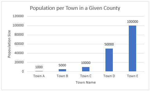
Since most data visualizations often appear as images in either published work or reports, alt text is a crucial need for accessibility purposes. Take the visualization below. If there was no alt text provided, then the visualization is meaningless to those who rely on alt text to read a given document. Alt text should be short and summarize the key takeaways from the data (there is no need to describe each individual point, but it should provide enough information to describe the trends occurring in the data).

This is a chart showing the population size of each town in a given county. Towns are labeled A-E and continue to grow in population size as they go down the alphabet (town A has 1,000 people while town E has 100,000 people).

TIP #3: Clearly Labeling Your Data

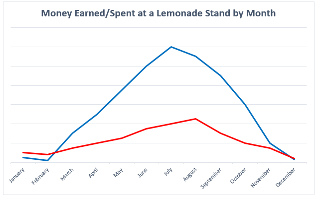
A simple but crucial component of any visualization is having clear labels on your data. Let’s look at two examples to see what makes having labels a vital aspect of any data visualization:

This is a chart for how much money was earned/spent at a lemonade stand by month. There is no y-axis labels to describe how much money is earned/spent and no key to discern the two lines that represent the money made and the money spent.

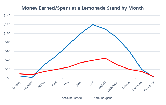
There is nothing in this graph that provides any useful information regarding the money earned or spent at the lemonade stand. How much money was earned or spent each month? What do these two lines represent? Now, look at a more clearly labeled version of the same data:

This is a cleaned version of the previous visualization regarding how much money was earned/spent at a lemonade stand. The addition of a Y-axis and key now show that more money was spent in January/February than earned, but then changes in March peaking in July, and then continuing to fall until December where more money is spent than earned again.

In adding a labeled Y-axis, we can now quantify the difference in distance between the two lines at any point and have a better idea of the money earned/spent in any given month. Furthermore, the addition of a key at the bottom of the visualization distinguishes the lines telling the audience what each represents. By clearly labeling the data, it is now in a position where audience members can interpret and analyze it properly.

Conclusion: Can My Data Still be Visually Appealing?

While it may appear that some of these recommendations detract from the creative designs of data visualizations, this is not the case at all. Designing a visually appealing data visualization is another crucial aspect of data visualization and should be heavily considered when creating one. Accessibility concerns, however, should have priority over the visual appeal of the data visualization. That said, accessibility in many respects encourages creativity in the design, as it makes the creator carefully consider how they want to present their data in a way that is both accessible and visually appealing. Thus, accessibility makes for a more creative and transmissive data visualization and will benefit everyone!

Meet Our Graduate Assistants: Ryan Yoakum

In this interview series, we ask our graduate assistants questions for our readers to get to know them better. Our first interview this year is with Ryan Yoakum!

This is a headshot of Ryan Yoakum.

What is your background education and work experience?

I came to graduate school directly after receiving my bachelor’s degree in May 2021 in History and Religion here at the University of Illinois. During my undergraduate, I had taken a role working for the University of Illinois Residence Hall Libraries (which was super convenient as I lived in the same building I worked in!) and absolutely loved helping patrons find resources they were interested in. I eventually took a second position with them as a processing assistant, which gave me a taste for working on the back end as I primarily prepared materials bought to be shelved at each of the libraries within the system. I really loved my work with the Residence Hall Libraries and wanted to shift my career to working in a library of some form, which has led me here today!

What are your favorite projects you’ve worked on?

I have really enjoyed projects where I have gotten to work with data (both for patrons as well as internal data). Such projects have allowed me to explore my growing interest in data science (which is the last thing I would have initially expected when I began the master’s program in August 2021). I have also really enjoyed teaching some of the Savvy Researcher workshops, which have included ones on optical character recognition (OCR) and creative commons licensing!

What are some of your favorite underutilized Scholarly Commons resources that you would
recommend?

The two that come to mind are the software on our lab computers as well as our consultation services. If I were still in history, using ABBYY FineReader for OCR would have been a tremendous help as well as supplementing that with qualitative data analysis tools such as ATLAS.ti. I also appreciate the expertise of the many talented people who work here in the library. Carissa Phillips and Sandi Caldrone, for example, have been very influential in helping me explore my interests in data. Likewise, Wenjie Wang, JP Goguen, and Jess Hagman (all of whom now have drop-in consultation hours) have all guided me in working with software related to their specific interests, and I have benefitted greatly by bringing my questions to each of them.

When you graduate, what would your ideal job position look like?

I currently have two competing job interests in mind. The first is that I would love to work in a theological library. The theological library could be either in a seminary or an academic library focusing on religious studies. Pursuing the MSLIS has also shifted my interests in working with data, so I would also love to work a job where I can manage, analyze, and visualize data!

What is the one thing you would want people to know about your field?

Library and Information science is not a field limited to working in the stereotypical way society pictures what a librarian’s work looks like (there was a good satirical article recently on this). It is also far from being a dead field (and one that will likely gain more relevance over time). As part of the program, I am slowly gaining skills that have prepared me for working in data which can apply in any field. There are so many job opportunities for MSLIS students that I strongly encourage people to join the field if they are interested in library and information science but have doubts about its career prospects!

Introducing Drop-In Consultation Hours at the Scholarly Commons!

Do you have a burning question about data management, copyright, or even how to work Adobe Photoshop but do not have the time to set up an appointment? This semester, the Scholarly Commons is happy to introduce our new drop-in consultation hours! Each weekday, we will have an expert from a different scholarly subject have an open hour or two where you can bring any question you have about that’s expert’s specialty. These will all take place in room 220 in the Main Library in Group Room A (right next to the Scholarly Commons help desk). Here is more about each session:


Mondays 11 AM – 1 PM: Data Management with Sandi Caldrone

This is a photo of Sandi Caldrone, who works for Research Data Services and will be hosting the Monday consultation hours from 11 AM - 1 PMStarting us off, we have Sandi Caldrone from Research Data Services offering consultation hours on data management. Sandi can help with topics such as creating a data management plan, organizing/storing your data, data curation, and more. She can also help with questions around the Illinois Data Bank and the Dryad Repository.


Tuesdays 11 AM – 1 PM: GIS with Wenjie Wang

Next up, we have Wenjie Wang from the Scholarly Commons to offer consultation about Geographic Information Systems (GIS). Have a question about geocoding, geospatial analysis, or even where to locate GIS data? Wenjie can help! He can also answer any questions related to using ArcGIS or QGIS.


Wednesdays 11 AM – 12 PM: Copyright with Sara Benson

This is a photo of Copyright Librarian Sara Benson who will be hosting the Wednesday consultation hours from 11 AM - 12 PMDo you have questions relating to copyright and your dissertation, negotiating an author’s agreement, or seeking permission to include an image in your own work? Feel free to drop in during Copyright Librarian Sara Benson’s open copyright hours to discuss any copyright questions you may have.


Thursdays 1-3 PM: Qualitative Data Analysis with Jess Hagman

This is a photo of Jess Hagman, who works for the Social Science, Education, and Health Library and will be hosting the Thursday consultation hours from 1 PM - 3 PMJess Hagman from the Social Science, Health, and Education Library is here to help with questions related to performing qualitative data analysis (QDA). She can walk you through any stage of the qualitative data analysis process regardless of data or methodology. She can also assist in operating QDA software including NVivo, Atlas.ti, MAXQDA, Taguette, and many more! For more information, you can also visit the qualitative data analysis LibGuide.


Fridays 10 AM – 12 PM: Graphic Design and Multimedia with JP Goguen

To end the week, we have JP Goguen from the Scholarly/Media Commons with consultation hours related to graphic design and multimedia. Come to JP with any questions you may have about design or photo/video editing. You can also bring JP any questions related to software found on the Adobe Creative Cloud (such as Photoshop, InDesign, Premiere Pro, etc.).


Have another Scholarly Inquiry?

If there is another service you need help with, you are always welcome to stop by the Scholarly Commons help desk in room 220 of the Main Library between 10 AM – 6 PM Monday-Friday. From here, we can get you in contact with another specialist to guide you through your research inquiry. Whatever your question may be, we are happy to help you!

Halloween Data Visualizations!

It’s that time of year where everyone starts to enjoy all things spooky and scary – haunted houses, pumpkin picking, scary movies and…data visualizations! To celebrate Halloween, we have created a couple of data visualizations from a bunch of data sets. We hope you enjoy them!

Halloween Costumes

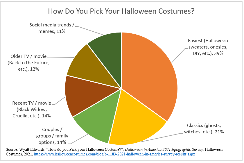
How do you decide what Halloween costume you wear? Halloween Costumes conducted a survey on this very topic. According to their data, the top way people choose their costume is based on what is easiest to make. Other inspirations include classic costumes, coordination with others, social media trends, and characters from either recent or classic movie or tv franchises.

Data on how people choose their Halloween Costumes. 39% of people base it on the easiest costume they can find, 21% on classic costumes (such as ghosts, witches, etc.), 14% on recent TV or movie characters, another 14% on couples/group/family coordination, 12% on older TV or movie characters, and 11% on social media trends.

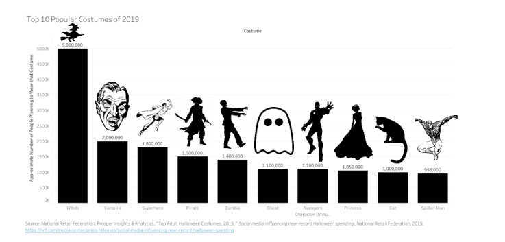
The National Retail Federation also conducted a survey of the top costumes that adults were expected to wear in 2019 (there were no good data sets for 2020…). According to the survey, the most popular Halloween costume that year was a witch. Other classic costumes, such as vampires, zombies, and ghosts, ranked high too. Superheroes were also a popular costume choice, with many people dressing up as Spider-man or another Avengers character.


Data on the top 10 costumes of 2019. The top choice was dressing up as a witch, followed by a vampire, superhero, pirate, zombie, ghost, avengers character, princess, cat, and Spider-man.


Halloween Spending and Production

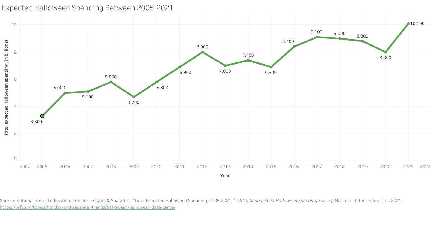
According to the National Retail Federation, Halloween spending has significantly increased between 2005 to this year, with the expected spending this year surpassing 10 billion dollars! That is up from fifteen years ago when the estimated Halloween spending averaged around 5 billion dollars.


This is data on expected Halloween spending between 2005 and 2021. In 2005, the expected spending was 3.3 Billion dollars. In 2006, it was 5 billion dollars. In 2007, it was 5.1 billion dollars. In 2008, it was 5.8 billion dollars. In 2009, it was 4.7 billion dollars. In 2010, it was 5.8 billion dollars again. In 2011, it was 6.9 billion dollars. In 2012, it was 8 billion dollars. In 2013, it was 7 billion dollars. In 2014, it was 7.4 billion dollars. In 2015, it was 6.9 billion dollars. In 2016, it was 8.4 billion dollars. In 2017, it was 9.1 billion dollars. In 2018, it was 9 billion dollars. In 2020, it was 8 billion dollars. Finally, in 2021, it is expected to be 10.1 billion dollars.

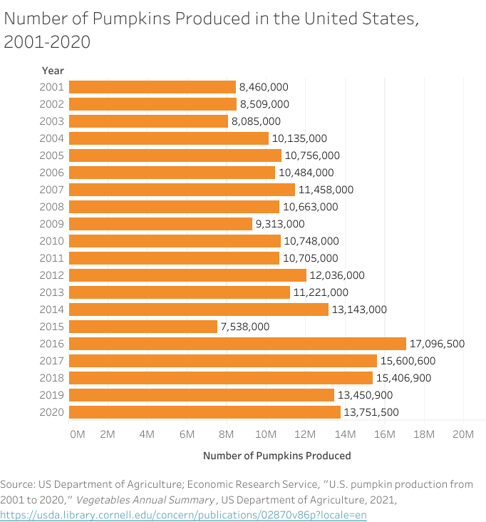
With much spending invested in Halloween, it would make sense that the production of Halloween-related items would likely grow too to meet this demand. The U.S. Department of Agriculture records each year the number of pumpkins produced in the United States. Besides one dip taken in 2015, it appears that pumpkin production has almost doubled in the past twenty years on average.


This is data on the number of pumpkins produced in the United States every year. In 2001, it was 8,460,000 pumpkins produced. In 2002, 8,509,000 Pumpkins were produced. In 2003, 8,085,000 pumpkins were produced. In 2004, 10,135,000 pumpkins were produced. In 2005, 10,756,000 pumpkins were produced. In 2006, 10,484,000 pumpkins were produced, in 2007, 11,458,000 pumpkins were produced. In 2008, 10,663,000 pumpkins were prodcued. In 2009, 9,311,000 pumpkins were produced. In 2010, 10,748,000 pumpkins were produced. In 2011, 10,705,000 pumpkins were produced. In 2012, 12,036,000 pumpkins were produced. In 2013, 11,221,000 pumpkins were prodcued. In 2014m 13,143,000 pumpkins were produced. In 2015, 7,538,000 pumpkins were prodcued. In 2016, 17,096,500 pumpkins were produced. In 2017, 15,600,600 pumpkins were produced. In 2018, 15,406,900 pumpkins were produced. In 2019, 13,450,900 pumpkins were produced. Finally, in 2020,, 13,751,500 pumpkins were produced.

Halloween Activities by Demographics

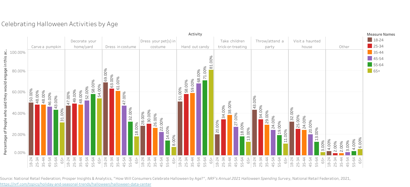
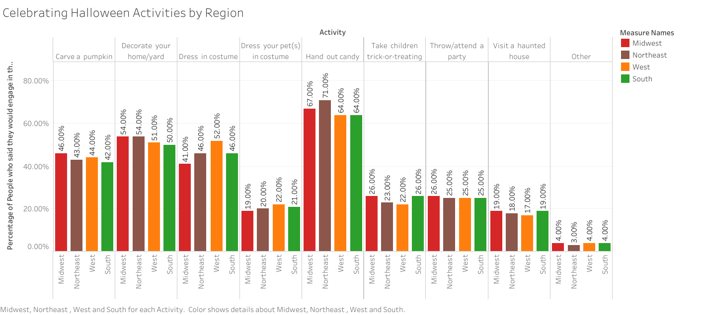
Finally, here are two statistics taken from the National Retail Federation again regarding how people celebrate activities based on age and region. As the data shows, younger people seem more likely to dress in costumes, visit haunted houses, or throw parties on Halloween. Meanwhile, older individuals are more likely to decorate their homes or hand out candy.

This is data about how people celebrate different Halloween activities by age. Those 65 and older are only 31% likely to carve a pumpkin (31%) as opposed to the 43-50% likelihood of other age groups. Those 55-64 are the most likely to decorate their homes/yard (58%) while 18-24 are the least likely (47%). Those 18-24 years old, however, are the most likely to dress in costume (69%) while only 18% of those 65 and older will dress in costumes. Those 25-34 are the most likely to dress their pets up at 30% with only 8% of those 65 and older doing the same. Those 65 and older are 81% likely to hand out candy, however, while only 51% of people 18-24 years of age will pass out candy. Those at ages 35-44 are 38% likely to take their children trick-or-treating, while only 13% of those 65 and older do so. The 18-24 year old demographic are the most likely to throw or attend a party (43%), while 11% of those 65 and older do the same. Similarly, 18-24 demographic are the most likely to attend a haunted house at 32% while only 3% of those in the 65 and older range do the same.

At the same time, there seems to be not too huge of a difference in celebrating by region, apart from those living on the west coast being more likely to dress up or those living in the northeast more likely to hand out candy. Other than those two differences, it seems that most regions celebrate the same Halloween activities in the same proportions.

This is data about how people celebrate different Halloween activities by region. 42-46% of people carve a pumpkin (with those in the Midwest on the higher end and the South on the lower end). 50-54% of people decorate their home or yard with the Midwest and Northeast on the higher end and the South on the lower end. 41-52% of people dress in costume with those living in the West on the higher end and the Midwest on the lower end. 19-22% of people dress their pets with those living in the West on the higher end and the Midwest on the lower end. 64-70% of people hand out candy with the Northeast on the higher end and the West and South tied on the lower end. 22-26% of people take their children trick-or treating with those living in the Midwest and South on the higher end and the West on the lower end. 25% of people throw or attend a party equally across regions. 17-19% of people visit a haunted house with the Midwest and South on the higher end and the West on the lower end.


We hope these data visualizations got you in the mood for spooky, Halloween fun! From all of us at the Scholarly Commons, Happy Halloween!

What Are the Digital Humanities?

Introduction

As new technology has revolutionized the ways all fields gather information, scholars have integrated the use of digital software to enhance traditional models of research. While digital software may seem only relevant in scientific research, digital projects play a crucial role in disciplines not traditionally associated with computer science. One of the biggest digital initiatives actually takes place in fields such as English, History, Philosophy, and more in what is known as the digital humanities. The digital humanities are an innovative way to incorporate digital data and computer science within the confines of humanities-based research. Although some aspects of the digital humanities are exclusive to specific fields, most digital humanities projects are interdisciplinary in nature. Below are three general impacts that projects within the digital humanities have enhanced the approaches to humanities research for scholars in these fields.

Digital Access to Resources

Digital access is a way of taking items necessary for humanities research and creating a system where users can easily access these resources. This work involves digitizing physical items and formatting them to store them on a database that permits access to its contents. Since some of these databases may hold thousands or millions of items, digital humanists also work to find ways so that users may locate these specific items quickly and easily. Thus, digital access requires both the digitization of physical items and their storage on a database as well as creating a path for scholars to find them for research purposes.

Providing Tools to Enhance Interpretation of Data and Sources

The digital humanities can also change how we can interpret sources and other items used in the digital humanities. Data Visualization software, for example, helps simplify large, complex datasets and presents this data in ways more visually appealing. Likewise, text mining software uncovers trends through analyzing text that potentially saves hours or even days for digital humanists had they analyzed the text through analog methods. Finally, Geographic Information Systems (GIS) software allows for users working on humanities projects to create special types of maps that can both assist in visualizing and analyzing data. These software programs and more have dramatically transformed the ways digital humanists interpret and visualize their research.

Digital Publishing

The digital humanities have opened new opportunities for scholars to publish their work. In some cases, digital publishing is simply digitizing an article or item in print to expand the reach of a given publication to readers who may not have direct access to the physical version. Other times, some digital publishing initiatives publish research that is only accessible in a digital format. One benefit to digital publishing is that it opens more opportunities for scholars to publish their research and expands the audience for their research than just publishing in print. As a result, the digital humanities provide scholars more opportunities to publish their research while also expanding the reach of their publications.

How Can I Learn More About the Digital Humanities?

There are many ways to get involved both at the University of Illinois as well as around the globe. Here is just a list of a few examples that can help you get started on your own digital humanities project:

  • HathiTrust is a partnership through the Big Ten Academic Alliance that holds over 17 million items in its collection.
  • Internet Archive is a public, multimedia database that allows for open access to a wide range of materials.
  • The Scholarly Commons page on the digital humanities offers many of the tools used for data visualization, text mining, GIS software, and other resources that enhance analysis within a humanities project. There are also a couple of upcoming Savvy Researcher workshops that will go over how to use software used in the digital humanities
  • Sourcelab is an initiative through the History Department that works to publish and preserve digital history projects. Many other humanities fields have equivalents to Sourcelab that serves the specific needs of a given discipline.