Strategies for Accessible E-Learning

Why Teach Accessible Classes?

No matter if you’re teaching a full semester class or a one-off workshop, you will be teaching disabled learners, whether they disclose their disabilities or not. All of your students deserve an equitable learning experience and accessible practices eliminate barriers for all users.

man using a braille keyboard writer
Image by Sigmund on Unsplash

Web Content Accessibility Guidelines (WCAG)

One of the most important standards when it comes to accessibility on the web is the Web Content Accessibility Guidelines. These guidelines are split into four components: Perceivable, Operable, Understandable, and Robust, or POUR.

Perceivable

  • Everyone can identify your content not matter how they perceive information.
    • Use text, audio, and video alternatives for content.
    • Make your lessons adaptable for different student needs.

Operable

  • Learners should be able to navigate your course with ease.
    • Have large and obvious navigation buttons.
    • Give enough time or eliminate timed progression counters.
    • Make your content keyboard navigable.

Understandable

  • Content should be clear and concise.
    • Avoid using jargon and keep text content simple.
    • Use specific language: Instead of “click here” use “click next.”

Robust

  • Content can be accessed by assistive technologies (such as screen readers).
    • Make sure your content is compatible with assistive technology.
    • Update any dead links or finicky buttons.
    • Learners should be able to access course materials with reasonably outdated software.
a teacher with a student, pointing to something on a laptop
Image by Desola Lanre-Ologun on Unsplash

Best Practices

Now that I’ve gone over the basic web accessibility standards, here are some practical tips that use can use to make your class materials more accessible.

Course Structure

  • You want your course structure to be easily digestible, so break up lessons into manageable chunks.
  • Asynchronous courses are courses that allow learners to complete work and attend lectures at their own pace. You may want to consider some form of this to allow your students flexibility.

Text and Links

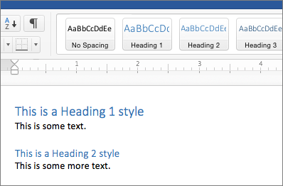
  • Headings and titles should be formatted properly. Instead of just bolding your text, use headings in numerical order. In Word, you can accomplish this by selecting Home > Styles and selecting the heading you want.
heading one and heading two in the Word styles interface

Images

  • Always include alt-text with your images. There will be different ways of doing this in different programs. Alt-text describes the image for users who cannot see it. For instance, in the alt-text I describe the image below as “a beagle with its tongue out.”
  • If the image is purely decorative, you can set it as such.
a beagle with its tongue out
Image by Milli on Unsplash

Videos

  • Videos should have error-free captioning. It can be useful to include a written transcription.
  • Video interfaces should be navigable using a keyboard (spacebar to start and stop).

Tables

  • Avoid using tables if you can, they can be challenging for screen readers to decipher.
  • Tables can be made accessible with proper web design. For a instructions on how to create accessible tables visit WebAIM’s Accessible Tables Guide.

Color Contrast

examples of good and bad color contrast
Image made with dopelycolors
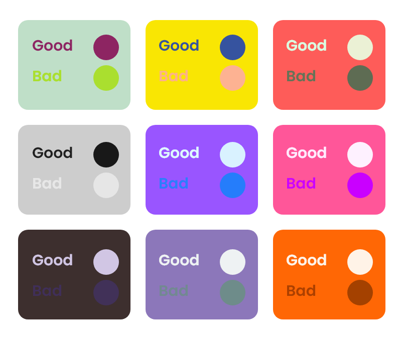
  • Make sure that your content is readable, whatever colors you use. Avoid going wild: dark text on light backgrounds and light text on dark backgrounds are standard.
  • If you want to check your color contrast, try the WCAG Color Contrast Checker.
  • Avoid providing information that solely relies on the student being able to distinguish color i.e. red meaning “stop” and green meaning “go.”

Resources to Learn More

When it comes to accessible practices, there’s a lot of information to cover. If you want to learn more, here are some resources to get you started.

By working to make your classes accessible, you can create a better learning experience for all your students.

Unreadable: Challenges and Critical Pedagogy to Optical Character Recognition Software 

In the 21st century, Optical Character Recognition (OCR) software has fundamentally changed how we search for information. OCR is the process of taking images with text and making them searchable. The implications of OCR vary from allowing searchability on massive databases to promoting accessibility by making screen readers a possibility. While this is all incredibly helpful, it is not without fault, as there are still many challenges to the OCR process that create barriers for certain projects. There are also some natural limitations to using this software that especially have consequences for time-sensitive projects, but other factors within human control have negatively influenced the development of OCR technology in general. This blog post will explore two issues: the amount of human labor required on an OCR project and the Western biases of this kind of software. 

Some text in ABBYY FineReader. Not all of the appropriate text is contained within a box, indicating the human labor that needs to go in to correct this.
Public Domain Image

Human Labor Requirements 

While OCR can save an incredible amount of time, it is not a completely automated system. For printed documents from the 20th-21st century, most programs can guarantee a 95-99% accuracy rate. The same is not true, however, for older documents. OCR software works by recognizing pre-built characters the software was initially programmed to recognize. When a document does not follow that same pattern, the software cannot recognize it. Handwritten documents are a good example of this, in which the same letter may appear differently to the software, depending on how it was written. Some programs, such as ABBYY FineReader, have attempted to resolve this problem by incorporating a training program, which allows users to train the system to read specific types of handwriting. Even still, that training process requires human input, and there is still much work for individuals to put into ensuring that the processed document is accurate. As a result, OCR can be a time-consuming process that still requires plenty of human labor for a project.  

Western Biases  

Another key issue with the OCR process is the Western biases that went into the creation of the software. Many common OCR programs were designed to handle projects with Latinized scripts. While helpful for some projects, this left barriers to documents with non-Latinized scripts, particularly from languages commonly used outside the West. While advances have been made on this front, the advancements are still far behind that of Latinized scripts. For example, ABBYY FineReader is one of the few software programs that will scan in non-western languages, but it cannot incorporate its training program when those scripts aren’t Latinized. Adobe Acrobat can also scan documents with languages that use non-Latinized scripts, but its precision is less consistent than with those languages that do.  

An old version of ABBYY FineReader. The text scanned on the left is a language with a non-Latinized script. The right side shows a variety of errors due to the system's lack of knowledge of that language.
Photo Credit: Paul Tafford 

Addressing the Issues with OCR 

Although OCR has performed many amazing tasks, there is still much development needed when it comes to projects related to this aspect of scholarly research. One crucial component when considering taking on an OCR project is to recognize the limitations of the software and to account for that when determining the scope of your project. At this stage, OCR technology is certainly a time-saver and fundamentally changing the possibilities of scholarship, but without human input, these projects fail to make an impact. Likewise, recognizing the inequality of processing for non-western languages in some of the more prevalent OCR software (which several developers have looked to offset by creating OCR programs specifically catered to specific non-Latinized languages). Acknowledging these issues can help us consider the scope of various projects and also allow us to address these issues to make OCR a more accessible field.

A Different Kind of Data Cleaning: Making Your Data Visualizations Accessible

Introduction: Why Does Accessibility Matter?

Data visualizations are a fast and effective manner for communicating information and are increasingly becoming a more popular way for researchers to share their data with a broad audience. Because of this rising importance, it is also necessary to ensure that data visualizations are accessible to everyone. Accessible data visualizations not only help an audience who may require a screen reader or other accessible tool to read a document but are also helpful to the creators of the data visualization as it brings their data to a much wider audience than through a non-accessible data visualization. This post will offer three tips on how you can make your visualization accessible!

TIP #1: Color Selection

One of the most important choices when making a data visualization are the colors used in the chart. One suggestion would be to use a color blindness simulator to check the colors in the data visualization and experiment to find the right amount of contrast between colors. Look at the example regarding the top ice cream flavors:

A data visualization about the top flavors of ice cream. Chocolate was the top flavor (40%) followed by Vanilla (30%), Strawberry (20%), and Other (10%).

At first glance, these colors may seem acceptable to use for this kind of data. But when ran through the colorblindness simulator, one of the results creates an accessibility concern:

This is the same pie chart above, but placed under a tritanopia color blindness lens. The colors used for strawberry and vanilla now look the exact same and blend into one another because of this, making it harder to discern the amount of space they take in the pie chart.

Although the colors contrasted well enough in the normal view, the color palettes used for the strawberry and vanilla categories look the same for those with tritanopia color blindness. The result is that these sections blend into one another and make it more difficult to distinguish their values. Most color palettes incorporated in current data visualization software are already designed to ensure the colors do not contrast, but it is still a good practice to check to ensure the colors do not blend in with one another!

TIP #2: Adding Alt Text

Since most data visualizations often appear as images in either published work or reports, alt text is a crucial need for accessibility purposes. Take the visualization below. If there was no alt text provided, then the visualization is meaningless to those who rely on alt text to read a given document. Alt text should be short and summarize the key takeaways from the data (there is no need to describe each individual point, but it should provide enough information to describe the trends occurring in the data).

This is a chart showing the population size of each town in a given county. Towns are labeled A-E and continue to grow in population size as they go down the alphabet (town A has 1,000 people while town E has 100,000 people).

TIP #3: Clearly Labeling Your Data

A simple but crucial component of any visualization is having clear labels on your data. Let’s look at two examples to see what makes having labels a vital aspect of any data visualization:

This is a chart for how much money was earned/spent at a lemonade stand by month. There is no y-axis labels to describe how much money is earned/spent and no key to discern the two lines that represent the money made and the money spent.

There is nothing in this graph that provides any useful information regarding the money earned or spent at the lemonade stand. How much money was earned or spent each month? What do these two lines represent? Now, look at a more clearly labeled version of the same data:

This is a cleaned version of the previous visualization regarding how much money was earned/spent at a lemonade stand. The addition of a Y-axis and key now show that more money was spent in January/February than earned, but then changes in March peaking in July, and then continuing to fall until December where more money is spent than earned again.

In adding a labeled Y-axis, we can now quantify the difference in distance between the two lines at any point and have a better idea of the money earned/spent in any given month. Furthermore, the addition of a key at the bottom of the visualization distinguishes the lines telling the audience what each represents. By clearly labeling the data, it is now in a position where audience members can interpret and analyze it properly.

Conclusion: Can My Data Still be Visually Appealing?

While it may appear that some of these recommendations detract from the creative designs of data visualizations, this is not the case at all. Designing a visually appealing data visualization is another crucial aspect of data visualization and should be heavily considered when creating one. Accessibility concerns, however, should have priority over the visual appeal of the data visualization. That said, accessibility in many respects encourages creativity in the design, as it makes the creator carefully consider how they want to present their data in a way that is both accessible and visually appealing. Thus, accessibility makes for a more creative and transmissive data visualization and will benefit everyone!

Making Your Work Accessible Online

A person uses a braille reader

Unsplash @Sigmund

What is Web Accessibility?

Web Accessibility is the ability for individuals with vision, hearing, cognitive, and mobility disabilities to access web content online via their preferred methods.

WCAG defines web content as:

  • Natural information such as text, images, and sounds
  • Code or markup that defines structure, presentation, etc.

The essential components of web accessibility include:

  • Content
  • Web browsers
  • Assistive Technology
  • Users’ Experience
  • Developers
  • Authoring Tools
  • Evaluation Tools

Why It Matters

Individuals with disabilities not only use the web but also contribute to its functions. Website accessibility focuses on the needs of people with disabilities. However, by considering how to make information more available, interactive, and easy to use, we also make content more accessible for everyone.

A website that uses best practices for accessibility provides equitable access and opportunities to all its users, creates a great user experience, increases website interaction (multi-modal interaction), and enhances the overall usability of the site.

Introducing Web Content Accessibility Guidelines (WCAG)

The WCAG developed out of the World Wide Web Consortium’s (WC3) mission of developing international standards for the continued development of the web and the W3C Web Accessibility Initiative’s (WAI) mission to gather people from varying organizations to create guidelines and resources for people with disabilities.

The WCAG create “a single shared standard for web content accessibility that meets the needs of individuals, organizations, and governments” worldwide.

The WCAG has four accessibility principles, which forms the acronym, POUR:

  • Principle 1: Perceivable
    • The information and methods of interacting with hardware and software must be presented in ways that users can perceive. Examples include having text alternatives and using captioning in videos.
  • Principle 2: Operable
    • The hardware and software elements and navigation must be practical for users. Examples include ensuring keyboard accessibility and allowing users enough time to read and understand content.
  • Principle 3: Understandable
    • The information and the operation of hardware and software must be readable and understandable for users. Examples include ensuring that the text is easy to read and retaining the same style of program selections on different pages.
  • Principle 4: Robust
    • The content must have high compatibility so it can be interpreted by a variety of software used to access the web, including assistive technologies. Examples include parsing, that is, ensuring that html elements have start and end tags and screen readers.

Tips: Validate the accessibility of your website using these tools: Web Accessibility Evaluation Tools List

What has the University of Illinois Done to Meet these Standards?

University of Illinois web developers adhere to these web accessibility standards:

  • The Illinois Information Technology Accessibility Act (IITAA)
  • Section 508 of the Reauthorized Rehabilitation Act of 1998
  • The Web Content Accessibility Guidelines (WCAG)

The Main Library provides technological assistance via:

  • Hardware
    • Large Screen Monitors and Adjustable Tables
    • Clearview+ Magnification System
    • Braille Display
    • Tranquility Kits
  • Software
    • JAWS (Job Access With Speech)
    • Kurzweil 3000
    • ZoomText Magnifier/Reader
    • OpenBook
    • Dolphin EasyReader
    • OpenDyslexie

Please see Accessibility and Assistive Technology LibGuide for more information.

If you are interested in learning more about web accessibility and the WCAG, visit the WCAG website: https://www.w3.org/WAI/standards-guidelines/wcag/

Big Ten Academic Alliance Open Access Developments

Last month, the Big Ten Academic Alliance (BTAA) made a series of announcements regarding its support of Open Access (OA) initiatives across its member libraries. Open Access is the free, immediate, online availability of research articles coupled with the rights to use those articles fully in the digital environment. Put plainly, Open Access ensures that anyone, anywhere, can access and use information. By supporting these developments in OA, the BTAA aims to make information more accessible to the university community, to benefit scholars by eliminating paywalls to research, and to help researchers to publish their own work.

Big ten academic alliance logo

On July 19, the BTAA announced the finalization of a three-year collective agreement with the Open Library of Humanities (OLH), a charitable organization dedicated to publishing open access scholarship with no author-facing article processing charges. OLH publishes academic journals from across the humanities disciplines, as well as hosting its own multidisciplinary journal. This move was made possible thanks to the OLH Open Consortial Offer, an initiative that offers consortia, societies, networks and scholarly projects the opportunity to join the Open Library of Humanities Library Partnership Subsidy system as a bloc, enabling each institution to benefit from a discount. Through this agreement, the BTAA hopes to expand scholarly publishing opportunities available to its member libraries, including the University of Illinois.

Following the finalization of the OLH agreement, the BTAA announced on July 21 the finalization of a three-year collective action agreement with MIT Press that provides Direct to Open (D2O) access for all fifteen BTAA member libraries. Developed over two years with the support of the Arcadia Fund, D2O gives institutions the opportunity to harness collective action to support access to knowledge. As participating libraries, the Big Ten members will help open access to all new MIT Press scholarly monographs and edited collections from 2022. As a BTAA member, the University of Illinois will support the shifting publication of new MIT Press titles to open access. The agreement also gives the University of Illinois community access to MIT Press eBook backfiles that were not previously published open access.

By entering into these agreements, the BTAA aims to promote open access publishing across its member libraries. On how these initiatives will impact the University of Illinois scholarly community, Head of Scholarly Communication & Publishing Librarian Dan Tracy said:

“The Library’s support of OLH and MIT Press is a crucial investment in open access publishing infrastructure. The expansion of open access publishing is a great opportunity to increase the reach and impact of faculty research, but common models of funding open access through article processing charges makes it challenging for authors in the humanities and social sciences particularly to publish open access. The work of OLH to publish open access journals, and MIT Press to publish open access books, without any author fees while also providing high quality, peer reviewed scholarly publishing opportunities provides greater equity across disciplines.”

Since these announcements, the BTAA has continued to support open access initiatives among its member libraries. Most recently, the BTAA and the University of Michigan Press signed a three-year agreement on August 5 that provides multi-year support for the University of Michigan Press’ new open access model Fund to Mission. Based on principles of equity, justice, inclusion, and accessibility, Fund to Mission aims to transition upwards of 75% of the press’ monograph publications into open access resources by the end of 2023. This initiative demonstrates a move toward a more open, sustainable infrastructure for the humanities and social sciences, and is one of several programs that university presses are developing to expand the reach of their specialist publications. As part of this agreement, select BTAA members, University of Illinois included, will have greater access to significant portions of the University of Michigan’s backlist content.

The full release and more information about recent BTAA announcements can be found on the BTAA website. To learn more about Open Access efforts at the University of Illinois, visit our OA Guide.

Comparison: Human vs. Computer Transcription of an “It Takes a Campus” Episode

Providing transcripts of audio or video content is critical for making these experiences accessible to a wide variety of audiences, especially those who are deaf or hard of hearing. Even those with perfect hearing might prefer to skim over a transcript of text rather than listen to audio sometimes. However, often times the slowest part of the audio and video publishing process is the transcribing portion of the workflow. This was certainly true with the recent interview I did with Ted Underwood, which I conducted on March 2 but did not release until March 31. The majority of that time was spent transcribing the interview; editing and quality control were significantly less time consuming.

Theoretically, one way we could speed up this process is to have computers do it for us. Over the years I’ve had many people ask me whether automatic speech-to-text transcription is a viable alternative to human transcription in dealing with oral history or podcast transcription. The short answer to that question is: “sort of, but not really.”

Speech to text or speech recognition technology has come a long way particularly in recent years. Its performance has improved to the point where human users can give auditory commands to a virtual assistant such as Alexa, Siri, or Google Home, and the device usually gives an appropriate response to the person’s request. However, recognizing a simple command like “Remind me at 5 pm to transcribe the podcast” is not quite the same as correctly recognizing and transcribing a 30-minute interview. It has to handle differences between two speakers and lengthy blocks of text.

To see how good of a job the best speech recognition tools do today, I decided to have one of these tools attempt to transcribe the Ted Underwood podcast interview and compare it to the actual transcript I did by hand. The specific tool I selected was Amazon Transcribe, which is part of the Amazon Web Services (AWS) suite of tools. This service is considered one of the best options available and uses cloud computing to convert audio data to textual data, presumably like how Amazon’s Alexa works.

It’s important to note that Amazon Transcribe is not free, however, it only costs $0.0004 per second of text, so Ted Underwood’s interview only cost me 85 cents to transcribe. For more on Amazon Transcribe’s costs, see this page.

In any case, here is a comparison between my manual transcript vs. Amazon Transcribe. To begin, here is the intro to the podcast as spoken and later transcribed by me:

Ben Ostermeier: Hello and welcome back to another episode of “It Takes
a Campus.” My name is Ben, and I am currently a graduate assistant at
the Scholarly Commons, and today I am joined with Dr. Ted Underwood,
who is a professor at the iSchool here at the University of Illinois.
Dr. Underwood, welcome to the podcast and thank you for taking time
to talk to me today.

And here is Amazon Transcribe’s interpretation of that same section of audio, with changes highlighted:

Hello and welcome back to another episode of it takes a campus. My
name is Ben, and I am currently a graduate assistant at Scali Commons.
And today I'm joined with Dr Ted Underwood, who is a professor 
at the high school here at the University of Illinois. 
Dr. Underwood, welcome to the podcast. Thank you for taking 
time to talk to me today.

As you can see, Amazon Transcribe did a pretty good job, but there are some mistakes and changes from the transcript I hand wrote. It particularly had trouble with proper nouns like “Scholarly Commons” and “iSchool,” along with some minor issues like not putting a dot after “Dr” and missing an “and” conjunction in the last sentence.

Screenshot of text comparison between Amazon-generated and human-generated transcripts.

Screenshot of text comparison between Amazon-generated (left) and human-generated (right) transcripts of the podcast episode.

You can see the complete changes between the two transcripts at this link.

Please note that the raw text I received from Amazon Transcribe was not separated into paragraphs initially. I had to do that myself in order to make the comparison easier to see.

In general, Amazon Transcribe does a pretty good job in recognizing speech but makes a decent number of mistakes that require cleaning up afterwards. For me, I actually find it faster and less frustrating to transcribe by hand instead of correcting a ‘dirty’ transcript, but others may prefer the alternative. Additionally, in some cases an institution may have a very large number of untranscribed oral histories, for example, and if the choice is between having a dirty transcript vs. no transcript at all, a dirty transcript is naturally preferable.

Also, while I did not have time to do this, there are ways to train Amazon Transcribe to do a better job with your audio, particularly with proper nouns like “Scholarly Commons.” You can read more about it on the AWS blog.

That said, there is very much an art to transcription, and I’m not sure if computers will ever be able to totally replicate it. When transcribing, I often have to make judgement calls about whether to include aspects of speech like “um”s and “uh”s. People also tend to start a thought and then stop and say something else, so I have to decide whether to include “false starts” like these or not. All of these judgement calls can have a significant impact on how researchers interpret a text, and to me it is crucial that a human sensitive to their implications makes these decisions. This is especially critical when transcribing an oral history that involves a power imbalance between the interviewer and interviewee.

In any case, speech to text technology is becoming increasingly powerful, and there may come a day, perhaps very soon, when computers can do just as good of a job as humans. In the meantime, though, we will still need to rely in at least some human input to make sure transcripts are accurate.

Automated Live Captions for Virtual and In-Person Meetings

At the University of Illinois at Urbana-Champaign, we are starting to think about what life will look like with a return of in-person services, meetings, and events. Many of us are considering what lessons we want to keep from our time conducting these activities online to make the return to in-person as inclusive as possible.

Main library reading room

“Mainlibraryreadingroom.jpg.” C. E. Crane, licensed under a CC-BY 2.0 Attribution license.

One way to make your meetings and presentations accessible is the use of live, automated captions. Captions benefit those who are hard-of-hearing, those who prefer to read the captions while listening to help focus, people whose first language is not English, and others. Over the course of the last year, several online platforms have introduced or enhanced features that create live captions for both virtual and in-person meetings.

Live Captions for Virtual Meetings and Presentations

Most of the major virtual meeting platforms have implemented automated live captioning services.

Zoom

Zoom gives you the option using either live, automated captions or assigning someone to create manual captions. Zoom’s live transcriptions only support US English and can be affected by background noise, so they recommend using manual captioner to ensure you are meeting accessibility guidelines. You can also integrate a third-party captioning software if you prefer.

Microsoft Teams

MS Teams offers live captions in US English and includes some features that allow captions to be attributed to individual speakers. Their live captioning service automatically filters out profane language and is available on the mobile app.

Google Meet

Unlike Zoom and Teams, Google Meet offers live captions in French, German, Portuguese, and Spanish (both Latin America and Spain). This feature is also available on the Google Meet app for Android, iPhone, and iPad.

Slack

Slack currently does not offer live automated captions during meetings.

Icon of laptop open with four people in different qudrants representing an online meeting

“Meeting” by Nawicon from the Noun Project.

Live Captions for In-Person Presentations

After our meetings and presentations return to in-person, we can still incorporate live captions whenever possible to make our meetings more accessible. This works best when a single speaker is presenting to a group.

PowerPoint

PowerPoint’s live captioning feature allows your live presentation to be automatically transcribed and displayed on your presentation slides. The captions can be displayed in either the speaker’s native language or translated into other languages. Presenters can also adjust how the captions display on the screen.

Google Slides

The captioning feature in Google slides is limited to US English and works best with a single speaker. Captions can be turned on during the presentation but do now allow for the presenter to customize their appearance.

Icon of four figures around a table in front of a blamk presentation screen

“Meeting”. by IconforYou from the Noun Project.

As we return to some degree of normalcy, we can push ourselves to imagine creative ways to take the benefits of online gathering with us into the future. The inclusive practice we have adopted don’t need to just disappear, especially as technology and our ways of working continue to adapt.

Free, Open Source Optical Character Recognition with gImageReader

Optical Character Recognition (OCR) is a powerful tool to transform scanned, static images of text into machine-readable data, making it possible to search, edit, and analyze text. If you’re using OCR, chances are you’re working with either ABBYY FineReader or Adobe Acrobat Pro. However, both ABBYY and Acrobat are propriety software with a steep price tag, and while they are both available in the Scholarly Commons, you may want to perform OCR beyond your time at the University of Illinois.

Thankfully, there’s a free, open source alternative for OCR: Tesseract. By itself, Tesseract only works through the command line, which creates a steep learning curve for those unaccustomed to working with a command-line interface (CLI). Additionally, it is fairly difficult to transform a jpg into a searchable PDF with Tesseract.

Thankfully, there are many free, open source programs that provide Tesseract with a graphical user interface (GUI), which not only makes Tesseract much easier to use, some of them come with layout editors that make it possible to create searchable PDFs. You can see the full list of programs on this page.

The program logo for gImageReader

The program logo for gImageReader

In this post, I will focus on one of these programs, gImageReader, but as you can see on that page, there are many options available on multiple operating systems. I tried all of the Windows-compatible programs and decided that gImageReader was the closest to what I was looking for, a free alternative to ABBYY FineReader that does a pretty good job of letting you correct OCR mistakes and exporting to a searchable PDF.

Installation

gImageReader is available for Windows and Linux. Though they do not include a Mac compatible version in the list of releases, it may be possible to get it to work if you use a package manager for Mac such as Homebrew. I have not tested this though, so I do not make any guarantees about how possible it is to get a working version of gImageReader on Mac.

To install gImageReader on Windows, go to the releases page on Windows. From there, go to the most recent release of the program at the top and click Assets to expand the list of files included with the release. Then select the file that has the .exe extension to download it. You can then run that file to install the program.

Manual

The installation of gImageReader comes with a manual as an HTML file that can be opened by any browser. As of the date of this post, the Fossies software archive is hosting the manual on its website.

Setting OCR Mode

gImageReader has two OCR modes: “Plain Text” and “hOCR, PDF”. Plain Text is the default mode and only recognizes the text itself without any formatting or layout detection. You can export this to a text file or copy and paste it into another program. This may be useful in some cases, but if you want to export a searchable PDF, you will need to use hOCR, PDF mode. hOCR is a standard for formatting OCR text using either XML or HTML and includes layout information, font, OCR result confidence, and other formatting information.

To set the recognition to hOCR, PDF mode, go to the toolbar at the top. It includes a section for “OCR mode” with a dropdown menu. From there, click the dropdown and select hOCR, PDF:

gImageReader Toolbar

This is the toolbar for gImageReader. You can set OCR mode by using the dropdown that is the third option from the right.

Adding Images, Performing Recognition, and Setting Language

If you have images already scanned, you can add them to be recognized by clicking the Add Images button on the left panel, which looks like a folder. You can then select multiple images if you want to create a multipage PDF. You can always add more images later by clicking that folder button again.

On that left panel, you can also click the Acquire tab button, which allows you to get images directly from a scanner, if the computer you’re using has a scanner connected.

Once you have the images you want, click the Recognize button to recognize the text on the page. Please note that if you have multiple images added, you’ll need to click this button for every page.

If you want to perform recognition on a language other than English, click the arrow next to Recognize. You’ll need to have that language installed, but you can install additional languages by clicking “Manage Languages” in the dropdown appears. If the language is already installed, you can go to the first option listed in the dropdown to select a different language.

Viewing the OCR Result

In this example, I will be performing OCR on this letter by Franklin D. Roosevelt:

Raw scanned image of a typewritten letter signed by Franklin Roosevelt

This 1928 letter from Franklin D. Roosevelt to D. H. Mudge Sr. is courtesy of Madison Historical: The Online Encyclopedia and Digital Archive for Madison County Illinois. https://madison-historical.siue.edu/archive/items/show/819

Once you’ve performed OCR, there will be an output panel on the right. There are a series of buttons above the result. Click the button on the far right to view the text result overlaid on top of the image:

The text result of performing OCR on the FDR letter overlaid on the original scan.

Here is the the text overlaid on an image of the original scan. Note how the scan is slightly transparent now to make the text easier to read.

Correcting OCR

The OCR process did a pretty good job with this example, but it there are a handful of errors. You can click on any of the words of text to show them on the right panel. I will click on the “eclnowledgment” at the end of the letter to correct it. It will then jump to that part of the hOCR “tree” on the right:

hOCR tree in gImageReader, which shows the recognition result of each word in a tree-like structure.

The hOCR tree in gImageReader, which also shows OCR result.

Note in this screenshot I have clicked the second button from the right to show the confidence values, where the higher the number, the higher the confidence Tesseract has with the result. In this case, it is 67% sure that eclnowledgement is correct. Since it obviously isn’t correct, we can type new text by double-clicking on the word in this panel and type “acknowledgement.” You can do this for any errors on the page.

Other correction tips:

  1. If there are any regions that are not text that it is still recognizing, you can right click them on the right and delete them.
  2. You can change the recognized font and its size by going to the bottom area labeled “Properties.” Font size is controlled by the x_fsize field, and x_font has a dropdown where you can select a font.
  3. It is also possible to change the area of the blue word box once it is selected, simply by clicking and dragging the edges and corners.
  4. If there is an area of text that was not captured by the recognition, you can also right click in the hOCR “tree” to add text blocks, paragraphs, textlines, and words to the document. This allows you to draw a box on image and then type what the text says.

Exporting to PDF

Once you are done making OCR corrections, you can export to a searchable PDF. To do so, click the Export button above the hOCR “tree,” which is the third button from the left. Then, select export to PDF. It then gives you several options to set the compression and quality of the PDF image, and once you click OK, it should export the PDF.

Conclusion

Unfortunately, there are some limitations to gImageViewer, as can often be the case with free, open source software. Here are some potential problems you may have with this program:

  1. While you can add new areas to recognize with OCR, there is not a way to change the order of these elements inside the hOCR “tree,” which could be an issue if you are trying to make the reading order clear for accessibility reasons. One potential workaround could be to use the Reading Order options on Adobe Acrobat, which you can read about in this libguide.
  2. You cannot show the areas of the document that are in a recognition box unless you click on a word, unlike ABBYY FineReader which shows all recognition areas at once on the original image.
  3. You cannot perform recognition on all pages at once. You have to click the recognition button individually for each page.
  4. Though there are some image correction options to improve OCR, such as brightness, contrast, and rotation, it does not have as many options as ABBYY FineReader.

gImageViewer is not nearly as user friendly or have all of the features that ABBYY FineReader has, so you will probably want to use ABBYY if it is available to you. However, I find gImageViewer a pretty good program that can meet most general OCR needs.

Library e-Book Usability

Since the onset of the pandemic in March, e-Books have occupied a position of higher importance in library collections. They allow for the easy circulation of library resources without patrons ever needing to enter the library building thus possibly infecting our staff or vice versa. This shift to e-Books was swift and now the library will even purchase an e-Book before circulating a physical copy. You can read more about the library’s Electronic-First Access Strategy on the Covid-19 Response page. This strategy is potentially saving lives but it is important to acknowledge some of the challenges for users that e-Books present. I have personally struggled with using library e-Books for class work and research and I identify as a pretty advanced library user. For years many users have avoided e-Books in favor of print copies in order to bypass usability problems.

Lets explore some of the most common usability problems for library e-Books. I conducted a brief literature review of recent publications on the usability of e-Books for library users. Below are the top 4 themes that I noticed in the literature:

1.) Every e-Book platform is different

Every single library electronic resource vendor has a different user interface. Some of them are better than others and I am not here to name names. The problem emerges when users are asked to learn new platforms. They will become frustrated quickly by poorly designed interfaces with steep learning curves. It would be easier for our users if vendors standardized their interfaces so users don’t have to continue figuring out how to use a different website every time they check out an e-Book.

2.) Interfaces can be “cluttered”

Often times when you open an e-Book using a vendor’s site the text will be surrounded by different features and tool-bars. Examples of these features include: table of contents, citation tools, note-taking capabilities, arrow navigation buttons, and more. Sometimes these features can provide increased functionality.  However, a lot of the time these tools and pop-ups distract from the text. Additionally, users complain that the cluttered e-Book displays can make it harder to enhance the size of the text for improved readability thus creating an accessibility problem. This problem could be solved if vendors conduct thorough user testing or work alongside librarians to ascertain which features are commonly used by our end-users and remove those features that are simply taking up space.

3.) Difficulties with citations 

Have you ever noticed how some e-Books don’t have page numbers? Or they do but they change when you increase the text size? This was a common complaint among e-Book users who expressed frustration generating accurate citations using e-Books because page numbers were inconsistent. Users did not have this problem when e-Books could be viewed as a PDF because formatting remained consistent. The solution to this is to have standardized page numbers and formatting for e-Books. Additionally, it is important to educate our users that when citing an e-Book they need to specify that in their bibliography because the page numbering will most likely be different from the print version of the same book.

4.) Navigational challenges

In order to gain access to the full text of an e-Book users often have to navigate through many webpages first. They may start at the library catalog, then go to bibliographic record, then choose between several links to access the book through the vendor site, then they are asked to log-in to the vendor site, then they need to navigate to the correct chapter using the navigational toolbar, etc, etc, etc. All of this takes a lot of time, patience, and knowledge. Something could go wrong at any point of the process between finding the book in the catalog and accessing the text. I for one, can never figure out how to log-in to the different vendor sites. For our users who may not be as comfortable navigating in the digital world, this creates a huge barrier to access. I think it’s important for us as librarians and library staff to know the ins and outs accessing our resources. Additionally, we need to keep an open line of communication with vendors and publishers to help them provide our users with the best product possible.

Resources consulted

Alkawaz, M. H., Segar, S. D., & Ali, I. R. (2020). A Research on the Perception and use of Electronic Books Among it Students in Management & Science University. 2020 16th IEEE International Colloquium on Signal Processing & Its Applications (CSPA), Signal Processing & Its Applications (CSPA), 2020 16th IEEE International Colloquium On, 52–56. https://doi-org.proxy2.library.illinois.edu/10.1109/CSPA48992.2020.9068716

Jaffy, M. (2020). Bento-Box User Experience Study at Franklin University. Information Technology & Libraries39(1), 1–20. https://doi-org.proxy2.library.illinois.edu/10.6017/ital.v39i1.11581

Landry Mueller, K., Valdes, Z., Owens, E., & Williamson, C. (2019). Where’s the EASY Button? Uncovering E-Book Usability. Reference & User Services Quarterly59(1), 44–65.

Tracy, D. G. (2018). Format Shift: Information Behavior and User Experience in the Academic E-book Environment. Reference & User Services Quarterly58(1), 40–51. https://doi-org.proxy2.library.illinois.edu/10.5860/rusq.58.1.6839


Creating Accessible Slides for Presentations and Online Posting

Making presentations accessible is important, whether in a classroom, in a meeting, or any situation you find yourself delivering information to an audience. Now, more learning than ever is taking place online where inaccessible content can create unequal learning opportunities.

Do you want to learn what it takes to make an accessible presentation? Read on for information about creating accessible slides for both live and recorded presentations!

Thinking about Universal Design

Universal Design is the idea that things should be created so that the most people possible can make use of them. What might be considered an accommodation for one person may benefit many others. The following tips can be considered ways to improve the learning experience for all participants.

Live and Recorded Presentations

Whether your presentation is happening in-person, live virtually, or asynchronously, there are several steps you can take to make your slides accessible.

1. Use a large font size.

During in-person presentations, participants may have trouble seeing if they are sitting far away or have impaired sight. In the virtual environment, participants may be tuning in on a phone or tablet and a larger font will help them see better on a small screen.

Image reads "this text is way too small" in 12 point font.

Example of text that is too small to read from a distance, phone, or tablet in 12 point font.

Image reads "This text is big enough to read" in size 28 font

Example of text that is big enough to read from a distance in 28 point font.

2. Use sans serif fonts.

Fonts like Calibri, Franklin Gothic Book, Lucida Sans, and Segoe are the most accessible to people with reading comprehension disabilities. Leaving plenty of white space makes your slides both more readable and more visually appealing.

3. Minimize text on slides.

People who can’t see the slides may be missing out on important content, and too much text can distract from what you’re saying. When you do include text, read everything out loud.

Image of a slide with too much text. Slide is completely filled with text.

Example of a slide with too much text.

Image of a slide with the right amout of text, including three main bullet points and a few sub bullets not in complete sentences.

Example of a slide with the right amount of text.

4. Use high contrast colors.

High contrast colors can more easily be seen by someone with a visual impairment (black and white is a reliable option). Always explain your color-codes for people who can’t see them and so all participants are on the same page.

Top half contains dark blue background with white text reading "this is high contrast". Bottom half contains light blue background with white text reading "this is low contrast"

Examples of slide font and background using high and low contrast colors.

5. Summarize all charts and images.

Images and charts should also be explained fully so that all participants understand what you are communicating.

6. Use closed captions.

For recorded presentations, both PowerPoint and Google slides allow you to add closed captions to your video or audio file. For live sessions, consider using subtitles or creating a live transcription. Technology Services offers instructions on how activate subtitles for Zoom meetings.

Posting Slides Online

Virtual presentations should be recorded when possible as our usual participants may be in other time zones, experiencing technology issues, or dealing with a countless list of challenges brought on by the pandemic or life.

Posting your slides online in an accessible format is another way to make that information available.

1. Use built in slide designs.

Slide designs built into PowerPoint and Google Slides are formatted to be read in the correct order by a screen reader. If you need to make adjustments, PowerPoint allows you to check over and adjust the reading order of your slides.

Screenshot of office theme slide designs in MS PowerPoint.

Built-in slide designs in MS PowerPoint.

2. Give all slides a title.

Titles assist people who are reading the document with a screen reader or are taking notes and allow all readers to navigate the document more easily.

3. Add alt-text to all images.

Alternative text allows screen readers to describe images. Use concise, descriptive language that captures the motivation for including the image on the slide.

4. Use meaningful hyperlinks.

Both screen readers and the human eye struggle to read long hyperlinks. Instead, use descriptive hyperlinks that make clear where the link is going to take the reader.

Examples of inaccessible hyperlinks

Examples of inaccessible or non-descriptive hyperlinks.

Example of a descriptive hyperlink

Example of an accessible and descriptive hyperlink.

5. Create a handout and save it as a PDF.

Finally, always include your speaker’s notes when posting slides online as the slides themselves only contain a fraction of what you will be communicating in your presentation.

Example of a slide with speaker's notes saved as a handout

Example of a slide with speaker’s notes saved as a handout.

It is always easier to make your presentation accessible from the start. By keeping these tips in mind, you can make sure your content can be used by the widest audience possible and help create a more inclusive learning environment!

For more information about how to use and apply these features, check out the following resources: