*hacker voice* “I’m in” – Coding and Software for Data Analysis

While data analysis has existed in one form or another for centuries, its modern concept is highly tied to a digital environment, which means that people who are looking to move into the data science field will undoubtedly need some technology skills. In the data field, the primary coding languages include Python, R, and SQL. Software is a bit more complicated, with numerous different programs and services used depending on the situation, including Power BI, Spark, SAS, Excel, to name a few. While this is overwhelming, remember that it is not important to become an expert in all of the languages and software. Becoming skilled in one language and a few of the software options, depending on your interest or on the in-demand skills on job listings, will give you the transferable skills to quickly pick up the other languages and software as needed. If this still seems to be  an overwhelming prospect, remember that the best way to eat an elephant is one bite at a time. Take your time, break up the task, and focus on one step at a time! 

LinkedIn Learning

  1. Python for Data Science Essential Training Part 1 
    1.  This 6 hour course guides users through an entire data science project that includes web scrapers, data cleaning and reformatting, generate visualizations, preform simple data analysis and create interactive graphs. The project will have users coding in Python with confidence and give learners a foundation in the Plotly library. Once completed, learners will be able to design and run their own data science projects.  
  1. R for Excel Users 
    1. With Excel being a familiar platform for many interested in data, it is an ideal bridge to more technical skills, like coding in the R language. This course is specifically designed for data analytics with its focus on statistical tasks and operations. It will take user’s Excel skills to another level while also laying a solid foundation for their new R skills. Users will be able to switch between Excel and the R Desctools package to complete tasks seamlessly, using the best of each software to calculate descriptive statistics, run bivariate analyses, and more. This course is for people who are truly proficient in Excel but new to R, so if you need to brush up your Excel skills, go back to the first post in this series and go over the Excel resources!   
  1. SQL Essential Training 
    1. SQL is the language of relational databases, so it is of interest to anyone looking to expand their data handling skills. This training is designed to give data wranglers the tools they need to use SQL effectively using the SQLiteStudio Software. Learners will soon be able to create tables, define relationships, manipulate strings, use triggers to automate actions, and use sub selects and views. Real world examples are used throughout the course and learners will finish the course by building their own SQL application. If you want a gentler introduction to SQL, check out our earlier post on SQL Murder Mystery  

O’Reilly Books and Videos (Make sure to follow these instructions for logging in!) 

  1. Data Analysts Toolbox – Excel, Python, Power BI, Alteryx, Qlik Sense, R, Tableau 
    1. This 46 hour course is not for the faint of heart, but by the end, users will be a Swiss army knife data analyst. This isn’t for true beginners, but rather people who are already familiar with the basic data analysis concepts and have a good grasp of Excel. It is included in this list because it is a great source for learning the basics of the myriad of software and programming languages that data analysts are expected to know, all in one place. The course starts with teaching users about advanced pivot tables, so if users have already mastered the basic pivot table, they should be ready for this course.  
  1. Programming for Data Science: Beginner to Intermediate 
    1. This is an expert curated playlist of courses and book chapters that is designed to help people who are familiar with the math side of data analysis, but not the computer science side. This playlist gives users an introduction to NumPy, Pandas, Python, Spark and other technical data skills. Some previous experience with coding may be helpful in this course, but patience will make up for lack of experience.  

In the Catalog

  1. Python crash course : a hands-on, project-based introduction to programming 
    1. Python is often lauded as one of the most approachable coding languages to learn and its functionality makes it popular in the data science field. So it is no surprise that there are a lot of resources on and off campus for learning Python. This approachable guide is just one of the many resources available to UIUC students, but it stands out with its contents and overall outcomes. “Python Crash Course” covers general programming concepts, Python fundamentals, and problem solving. Unlike some other resources, this guide focuses on many of Python’s uses, not just its data analytics capabilities, which can be appealing to people who want to be more versatile with their skills. However, it is the three projects that make this resource stand out from the rest. Readers will be guided in how to create a simple video game, use data visualization techniques to make graphs and charts, and build an interactive web application.  
  1. The Book of R : a first course in programming and statistics 
    1. R is the most popular coding language for statistical analysis, so it’s clearly important for data analysts to learn. The Book of R is a comprehensive and beginner friendly guide designed for readers who have no previous programming experience or a shaky mathematical foundation as readers will learn both concurrently through the book’s lessons. Starting with writing simple programs and data handling skills, learners will then move forward to producing statistical summaries of data, preforming statistical tests and modeling, create visualizations with contributed packages like ggplot2 and ggvis, write data frames, create functions, and use variables, statements, and loops; statistical concepts like exploratory data analysis, probabilities, hypothesis tests, and regression modeling, and how to execute them in R; how to access R’s thousands of functions, libraries, and data sets; how to draw valid and useful conclusions from your data; and how to create publication-quality graphics of your results.  

Join us next week for our final installment of the Winter Break Data Analysis series: “You can’t analyze data if you ain’t cute: Data Visualization for Data Analysis”    

A Different Kind of Data Cleaning: Making Your Data Visualizations Accessible

Introduction: Why Does Accessibility Matter?

Data visualizations are a fast and effective manner for communicating information and are increasingly becoming a more popular way for researchers to share their data with a broad audience. Because of this rising importance, it is also necessary to ensure that data visualizations are accessible to everyone. Accessible data visualizations not only help an audience who may require a screen reader or other accessible tool to read a document but are also helpful to the creators of the data visualization as it brings their data to a much wider audience than through a non-accessible data visualization. This post will offer three tips on how you can make your visualization accessible!

TIP #1: Color Selection

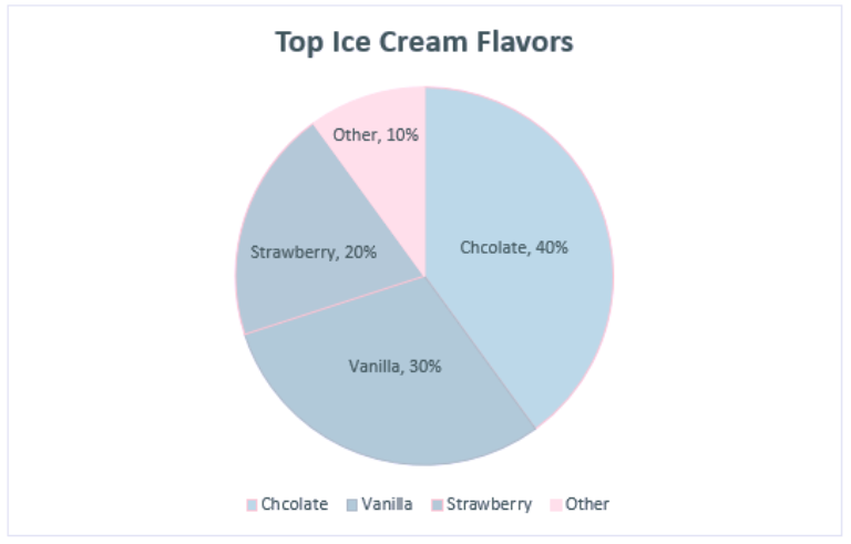
One of the most important choices when making a data visualization are the colors used in the chart. One suggestion would be to use a color blindness simulator to check the colors in the data visualization and experiment to find the right amount of contrast between colors. Look at the example regarding the top ice cream flavors:

A data visualization about the top flavors of ice cream. Chocolate was the top flavor (40%) followed by Vanilla (30%), Strawberry (20%), and Other (10%).

At first glance, these colors may seem acceptable to use for this kind of data. But when ran through the colorblindness simulator, one of the results creates an accessibility concern:

This is the same pie chart above, but placed under a tritanopia color blindness lens. The colors used for strawberry and vanilla now look the exact same and blend into one another because of this, making it harder to discern the amount of space they take in the pie chart.

Although the colors contrasted well enough in the normal view, the color palettes used for the strawberry and vanilla categories look the same for those with tritanopia color blindness. The result is that these sections blend into one another and make it more difficult to distinguish their values. Most color palettes incorporated in current data visualization software are already designed to ensure the colors do not contrast, but it is still a good practice to check to ensure the colors do not blend in with one another!

TIP #2: Adding Alt Text

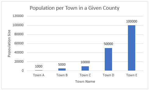
Since most data visualizations often appear as images in either published work or reports, alt text is a crucial need for accessibility purposes. Take the visualization below. If there was no alt text provided, then the visualization is meaningless to those who rely on alt text to read a given document. Alt text should be short and summarize the key takeaways from the data (there is no need to describe each individual point, but it should provide enough information to describe the trends occurring in the data).

This is a chart showing the population size of each town in a given county. Towns are labeled A-E and continue to grow in population size as they go down the alphabet (town A has 1,000 people while town E has 100,000 people).

TIP #3: Clearly Labeling Your Data

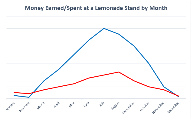
A simple but crucial component of any visualization is having clear labels on your data. Let’s look at two examples to see what makes having labels a vital aspect of any data visualization:

This is a chart for how much money was earned/spent at a lemonade stand by month. There is no y-axis labels to describe how much money is earned/spent and no key to discern the two lines that represent the money made and the money spent.

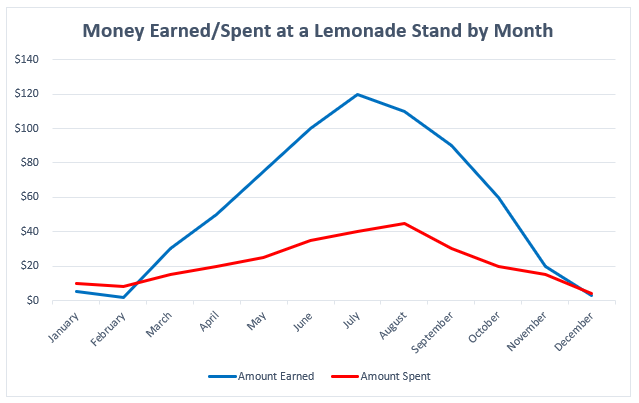
There is nothing in this graph that provides any useful information regarding the money earned or spent at the lemonade stand. How much money was earned or spent each month? What do these two lines represent? Now, look at a more clearly labeled version of the same data:

This is a cleaned version of the previous visualization regarding how much money was earned/spent at a lemonade stand. The addition of a Y-axis and key now show that more money was spent in January/February than earned, but then changes in March peaking in July, and then continuing to fall until December where more money is spent than earned again.

In adding a labeled Y-axis, we can now quantify the difference in distance between the two lines at any point and have a better idea of the money earned/spent in any given month. Furthermore, the addition of a key at the bottom of the visualization distinguishes the lines telling the audience what each represents. By clearly labeling the data, it is now in a position where audience members can interpret and analyze it properly.

Conclusion: Can My Data Still be Visually Appealing?

While it may appear that some of these recommendations detract from the creative designs of data visualizations, this is not the case at all. Designing a visually appealing data visualization is another crucial aspect of data visualization and should be heavily considered when creating one. Accessibility concerns, however, should have priority over the visual appeal of the data visualization. That said, accessibility in many respects encourages creativity in the design, as it makes the creator carefully consider how they want to present their data in a way that is both accessible and visually appealing. Thus, accessibility makes for a more creative and transmissive data visualization and will benefit everyone!

Meet Our Graduate Assistants: Ryan Yoakum

In this interview series, we ask our graduate assistants questions for our readers to get to know them better. Our first interview this year is with Ryan Yoakum!

This is a headshot of Ryan Yoakum.

What is your background education and work experience?

I came to graduate school directly after receiving my bachelor’s degree in May 2021 in History and Religion here at the University of Illinois. During my undergraduate, I had taken a role working for the University of Illinois Residence Hall Libraries (which was super convenient as I lived in the same building I worked in!) and absolutely loved helping patrons find resources they were interested in. I eventually took a second position with them as a processing assistant, which gave me a taste for working on the back end as I primarily prepared materials bought to be shelved at each of the libraries within the system. I really loved my work with the Residence Hall Libraries and wanted to shift my career to working in a library of some form, which has led me here today!

What are your favorite projects you’ve worked on?

I have really enjoyed projects where I have gotten to work with data (both for patrons as well as internal data). Such projects have allowed me to explore my growing interest in data science (which is the last thing I would have initially expected when I began the master’s program in August 2021). I have also really enjoyed teaching some of the Savvy Researcher workshops, which have included ones on optical character recognition (OCR) and creative commons licensing!

What are some of your favorite underutilized Scholarly Commons resources that you would
recommend?

The two that come to mind are the software on our lab computers as well as our consultation services. If I were still in history, using ABBYY FineReader for OCR would have been a tremendous help as well as supplementing that with qualitative data analysis tools such as ATLAS.ti. I also appreciate the expertise of the many talented people who work here in the library. Carissa Phillips and Sandi Caldrone, for example, have been very influential in helping me explore my interests in data. Likewise, Wenjie Wang, JP Goguen, and Jess Hagman (all of whom now have drop-in consultation hours) have all guided me in working with software related to their specific interests, and I have benefitted greatly by bringing my questions to each of them.

When you graduate, what would your ideal job position look like?

I currently have two competing job interests in mind. The first is that I would love to work in a theological library. The theological library could be either in a seminary or an academic library focusing on religious studies. Pursuing the MSLIS has also shifted my interests in working with data, so I would also love to work a job where I can manage, analyze, and visualize data!

What is the one thing you would want people to know about your field?

Library and Information science is not a field limited to working in the stereotypical way society pictures what a librarian’s work looks like (there was a good satirical article recently on this). It is also far from being a dead field (and one that will likely gain more relevance over time). As part of the program, I am slowly gaining skills that have prepared me for working in data which can apply in any field. There are so many job opportunities for MSLIS students that I strongly encourage people to join the field if they are interested in library and information science but have doubts about its career prospects!

When did you first fall in love with data?

This post is part of a series for Love Data Week, which takes place February 14-18 2022.

Written by Lauren Phegley

Picture it – North Central College, Illinois, 2018. Twenty-one-year-old sociology major Laurent Phegley takes her seat in Professor Corsino’s class with no idea that she’s about to fall in love…with data. At the time, Dr. Corsino studied occupational attainment of Italian immigrants in Chicago Heights during the 1900’s. Lauren and her classmates sifted through census data to piece together the career tracks of (mostly male) Italian Americans. These data weren’t just checkmarks on a form. They were glimpses into entire families, glimpses that when pieced together told a story about how the American dream operates on the basis of social class. “For me, tracking the individuals through the census was a large puzzle,” Lauren says. Since then, Lauren has focused on helping other researchers solve their data puzzles. “Social science students are often not taught about data management because they don’t see their research as relating to ‘data’. I make a concerted effort now in my work and teaching to target fields that are often forgot about in terms of data management. Research is a labor of love. It is well worth a few hours of time to make sure that your data stays useable and understandable!”

Headshot of LaurenLauren Phegley is a graduate assistant for the Library Research Data Service pursuing her Masters of Science in Library and Information Science at the University of Illinois iSchool. Once she graduates in May 2022, she hopes to work as an academic librarian helping researchers manage their data and research.
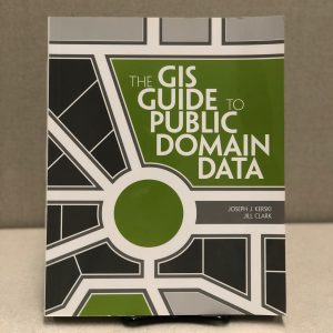
Lightning Review: The GIS Guide to Public Domain Data

One of the first challenges encountered by anyone seeking to start a new GIS project is where to find good, high quality geospatial data. The field of geographic information science has a bit of a problem in which there are simultaneously too many possible data sources for any one researcher to be familiar with all of them, as well as too few resources available to help you navigate them all. Luckily, The GIS Guide to Public Domain Data is here to help!

The front cover of the book "The GIS Guide to Public Domain Data" by Joseph J. Kerski and Jill Clark. Continue reading