The end of the semester is a stressful time with finals and preparing for the summer. During this time it is especially important to take care of your mental health and take some time for yourself. Here are some ways to relax using equipment from Scholarly Commons:
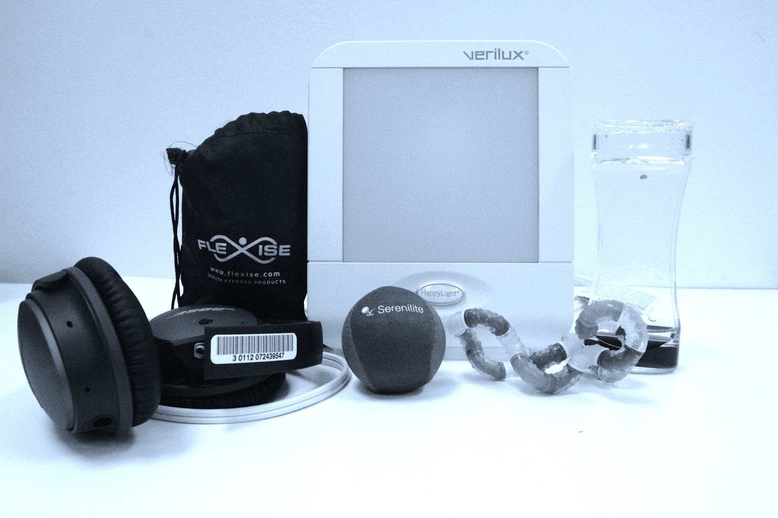
Check out a Tranquility Kit to help with mental health during the stress of finals. This kit includes a Happy Light, headphones, exercise bands and an exercise guide, stress ball, and fidget toys. One of these kits is also available in the Orange Room on the first floor of the library.
Photo Credit: Media Commons
Read a book on an Amazon Kindle. The Kindles have 4GB memory storage which is enough storage for thousands of books.
Now that the weather is getting nice you can check out a camera and take a walk outside. Take pictures or videos of the campus or all the geese outside.
Photo Credit: Media Commons
Check out a projector and projector screen and watch a movie with friends.
Try out our new Digital Drawing Kits with downloaded programs including Procreate, Sketchbook, Adobe Illustrator, Adult Coloring Book and Assembly.
Check out one of the sensory toys from the Orange Room while you study. Sensory toys available include a water wiggler, wacky tracks, and twisty tangles. Loanable technology from the Orange Room is available for two-hour check outs.
Technology from Scholarly Commons is available for loans of up to 10 days. You can book in advance on the Scholarly Commons website or make a booking at the Tech Desk in room 306. To pick up equipment, make sure to bring a valid i-card.
Good luck with finals! We’ll see you again next year!
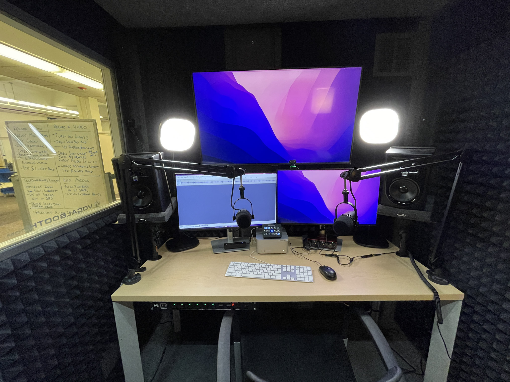
Getting an interview is both exciting and nerve-wracking. While I was excited for the opportunity, I knew I would have to deal with the stressors involved with interviewing on Zoom: what to say, what to wear, and where to do the interview. I wanted a place where I could be sure I would not be interrupted, would not have to deal with loud noises, and that would look professional to the interviewers. I decided to take advantage of my workplace’s resources and try out the self-use media studios in Scholarly Commons. I made my appointment on the Scholarly Commons website.
The self-use media studios are sound isolation booths with features including two Shure MV7 microphones, Insta360 4k Webcam, LED light banks, three large screens, mac studio, headphones, powered speakers, and Stream Deck. The studios are designed for video recording, podcasting, oral histories, streaming, interviews, video editing, and more.
I checked into the booth thirty minutes before the start of my interview. The signs posted around the booth told me how to log in, control the audio, and adjust the camera to follow my movements. I experienced a small challenge, when I could not figure out how to get the camera to turn on. But, with the help of Scholarly Commons staff I was able to begin my interview on time and confident in both myself and the technology I was using.
One of the first things the interviewers asked me was where I was zooming in from. They were extremely impressed with the set up and the professional setting helped me to stand out as a candidate. I felt comfortable speaking at a regular volume, trusting that those outside could not hear what I was saying as I could not hear anything from outside of the booth. The audio was clear on both my side and the interviewers’.
If you are using the media studios for the first time, you might find these tips helpful:
Book in advance- the booths are first-come, first-serve and can fill up quickly
Make your booking earlier than your meeting so that you have time to set up and be prepared in case of any challenges
Make sure to read all the signage as they have instructions, helpful tips, and images which help make the booths easier to navigate
If you are having difficulty, ask a staff member as they are happy to help
I found the self-use media studios in Scholarly Commons to be an excellent place to do my interview. If you have an interview coming up or a project that would benefit from the use of an audio booth, I would highly recommend booking one of the media studios.
If you’ve ever had to design a poster for class, you’re probably familiar with Canva. This online and app-based graphic design tool, with free and subscription-based versions, features a large selection of templates and stock graphics that make it pretty easy to create decent-looking infographics. While it is far from perfect, the ease of use makes Canva worth trying out if you want to add a bit of color and fun to your data presentation.
Getting Started
Starting with a blank document can be intimidating, especially for someone without any graphic design experience. Luckily, Canva has a bunch of templates to help you get started.
Canva infographic templates
I recommend picking a template based on the color scheme and general aesthetic. It’s unlikely you’ll find a template that looks exactly how you want, so you can think of a template as a selection of colors, fonts, and graphics to use in your design, rather than something to just copy and paste things into. For example, see the image below – I recently used the template on the left to create the infographic on the right.
General Design Principles
Before you get started on your infographic, it’s important to remember some general design guidelines:
Contrast. High levels of contrast between your background and foreground help keep everything legible.
Simplicity. Too many different colors and fonts can be an eyesore. Stick to no more than two fonts at a time.
Space. Leave whitespace to keep things from looking cluttered.
Alignment and balance. People generally enjoy looking at things that are lined up neatly and don’t have too much visual weight on one side or another.
An exaggerated example of a design that ignores the above advice.
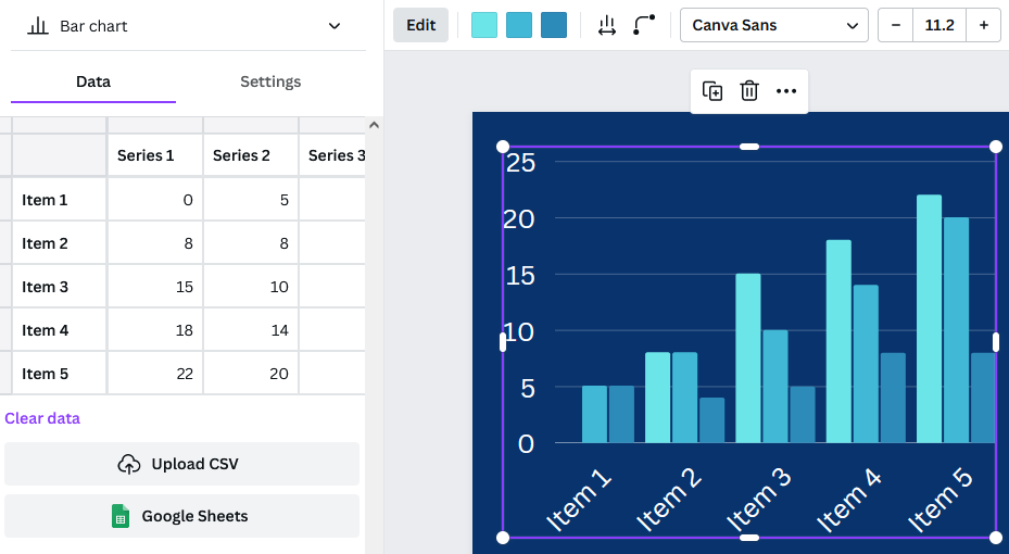
Adding Graphs and Graphics
Now that you have a template in hand and graphic design principles in mind, you can start actually creating your infographic. Under “Elements,” Canva includes several types of basic charts. Once you’ve added a chart to your graphic, you can edit the data associated with the chart directly in the provided spreadsheet, by uploading a csv file, or by linking to a google spreadsheet.
The settings tab allows you to decide whether you want the chart to include a legend or labels. The options bar at the top allows for further customization of colors and bar or dot appearance. Finally, adding a few simple graphics from Canva’s library such as shapes and icons can make your infographic more interesting.
Examples of charts available in Canva, with a variety of customizations.
Limitations and Frustrations
The main downsides to Canva are the number of features locked behind a paywall and the inability to see only the free options. Elements cannot be filtered by price and it seems that more and more graphics are being claimed by Canva Pro, so searching for graphics can be frustrating. Templates can be filtered, but it will still bring up results where the template itself is free, but there are paid elements within the template. So, you might choose a template based on a graphic that you really like, only to find out that you need a Canva Pro subscription to include that graphic.
The charts in Canva also have limitations. Pie charts do not allow for the selection of colors for each individual slice; you have to pick one color, and Canva will generate the rest. However, if you want to have more control over your charts, or wish to include more complicated data representations, you can upload charts to Canva, which even supports transparency.
Conclusion
As mentioned above, Canva has its downsides. However, Canva’s templates, graphics, and charts still make it a super useful tool for creating infographics that are visually appealing. Try it out the next time you need to present some data!
If you are interested in data or relational databases, then you have heard of SQL. SQL, or Structured Query Language, is designed to handle structured data in order to assist in data query, data manipulation, data definition and data access control. It is a very user-friendly language to learn with a simple code structure and minimal use of special characters. Because of this, SQL is the industry standard for database management, and this is reflected in the job market as there is a strong demand for employees with SQL skills.
Enter SQL Murder Mystery
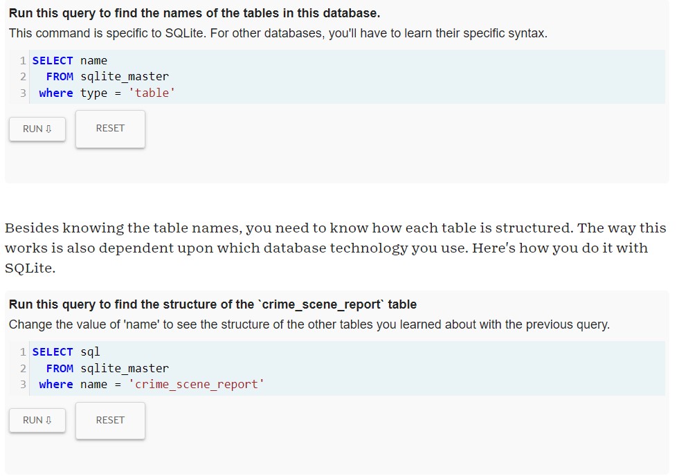
In an effort to promote the learning of this valuable language, Knight Labs, a specialized subsidiary of Northwestern University, created SQL Murder Mystery. Combining the known benefits of gamification and the popularity of whodunit detective work, SQL Murder Mystery aims to help SQL beginners become familiar with the language and have some fun with a normally dry subject. Players take on the role of a gumshoe detective tasked with solving a murder. The problem is you have misplaced the crime scene report and you now must dive into the police department’s database to find the clues. For true beginners with no experience, the website provides a walkthrough to help get players started. More experienced learners can jump right in and practice their skills.
I’m on the case!
I have no experience with SQL but I am interested in database design and information retrieval, so I knew it was high time that I learn the basics. As a fan of both games and detective stories, SQL Murder Mystery seemed like a great place to start. Since I am a true beginner, I started with the walkthrough. As promised on the website, this walkthrough did not give me a complete, exhaustive introduction to SQL as a language, but instead gave me the tools needed to get started on the case. SQL as a language, relational databases and Entity Relationship Diagrams (ERD) were briefly explained in an approachable manner. In the walk through, I was introduced to vital SQL functions like “Select:, “Where”, wildcards, and “Between”. My one issue with the game was in the joining tables section. I learned later that the reason I was having issues was due to the tables each having columns with the same title, which is apparently a foundational SQL feature. The guide did not explain that this could be an issue and I had to do some digging on my own to find out how to fix it. It seems like the walkthrough should have anticipated this issue and mentioned it. That aside, By the end of the walkthrough, I could join tables, search for partial information matches, and search within ranges. With some common sense, the database’s ERD, and the new SQL coding skills, I was able to solve the crime! If users weren’t challenged enough with that task, there is an additional challenge that suggests users find the accomplice while only using 2 queries.
Example of SQL Murder Mystery user interface
The Verdict is In
I really loved this game! It served as a great introduction to a language I had never used before but still managed to be really engaging. It reminded me of those escape room mystery boxes like Hunt a Killer that has users solve puzzles to get to a larger final solution. Anyone who loves logic puzzles or mysteries will enjoy this game, even if they have no experience with or even interest in coding or databases. If you have some free time and a desire to explore a new skill, you should absolutely give SQL Murder Mystery a try!
One of the first challenges encountered by anyone seeking to start a new GIS project is where to find good, high quality geospatial data. The field of geographic information science has a bit of a problem in which there are simultaneously too many possible data sources for any one researcher to be familiar with all of them, as well as too few resources available to help you navigate them all. Luckily, The GIS Guide to Public Domain Data is here to help!