Biking at UIUC: the Creation of a StoryMap

The 651 total buildings owned by the University of Illinois at Urbana-Champaign stretch across an area of 9.9 square miles, or 6,370 acres. With a campus as large as ours, it’s no wonder the students, faculty, and staff use so many different means of transportation. Cars, bikes, skateboards, public transit, scooters – you name it!

When the weather is even halfway decent, you can find me biking around campus. It’s quick, convenient, and provides a bit of exercise in the otherwise sedentary life of a grad student. However, biking on campus is not without its frustrations. Bike routes are not always obvious, and sometimes they’re blocked by pedestrians or poorly parked cars. Even though I’ve gained more confidence in using bike lanes, it’s always a little nerve-wracking when I need to merge into traffic to turn left, or when a bus drives by and I’m stuck between it and a row of parked cars, the doors of which could open at any moment.

biker avoiding an open car door
photo by Dominik Stallings

With these concerns in mind, I set out to learn more about the different kinds of bike routes on campus and the safety pros and cons of each. I read various research articles and made observations of potential features or issues while biking around campus. I took photos of campus bike routes, including common bike lane hazards, some of which were staged for the sake of photography, but still very real issues. I learned about resources related to getting around campus, and wanted to further share them.

In order to present my research, which relied heavily on maps, I used ArcGIS StoryMaps. This software was well-suited to the needs of this project. I was able to get data on bike routes and parking areas from campus facilities, which I used to create web maps with ArcMap and ArcGIS Online so that viewers could see each type of bike route in isolation. Continuity of bike routes has been found to be an important factor in whether people choose to bike, and certain people may feel more or less comfortable using different types of routes, so I wanted to demonstrate how these comfort limitations affect route continuity, possibly leading to fewer people choosing to bike.
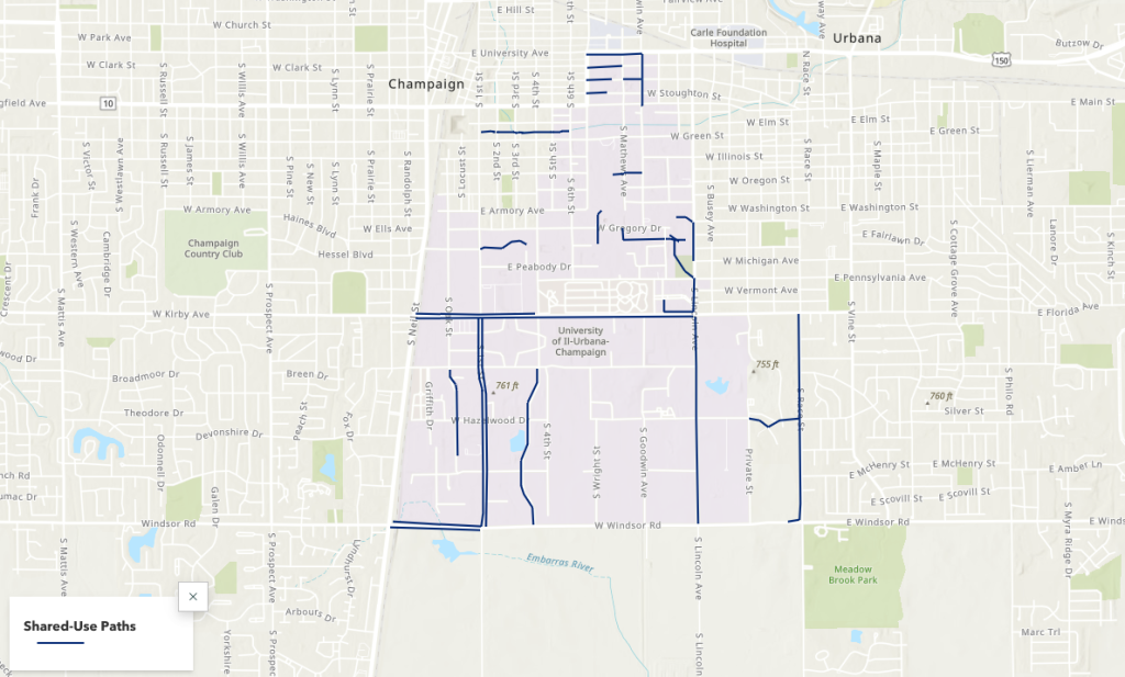
Screenshot of shared-use paths map

These maps, photos, and narrative elements came together to tell a story about biking on campus. To learn more about the campus bike network, the safety pros and cons of different bike route types, and campus navigation tips, you can explore the StoryMap here.

Unreadable: Challenges and Critical Pedagogy to Optical Character Recognition Software 

In the 21st century, Optical Character Recognition (OCR) software has fundamentally changed how we search for information. OCR is the process of taking images with text and making them searchable. The implications of OCR vary from allowing searchability on massive databases to promoting accessibility by making screen readers a possibility. While this is all incredibly helpful, it is not without fault, as there are still many challenges to the OCR process that create barriers for certain projects. There are also some natural limitations to using this software that especially have consequences for time-sensitive projects, but other factors within human control have negatively influenced the development of OCR technology in general. This blog post will explore two issues: the amount of human labor required on an OCR project and the Western biases of this kind of software. 

Some text in ABBYY FineReader. Not all of the appropriate text is contained within a box, indicating the human labor that needs to go in to correct this.
Public Domain Image

Human Labor Requirements 

While OCR can save an incredible amount of time, it is not a completely automated system. For printed documents from the 20th-21st century, most programs can guarantee a 95-99% accuracy rate. The same is not true, however, for older documents. OCR software works by recognizing pre-built characters the software was initially programmed to recognize. When a document does not follow that same pattern, the software cannot recognize it. Handwritten documents are a good example of this, in which the same letter may appear differently to the software, depending on how it was written. Some programs, such as ABBYY FineReader, have attempted to resolve this problem by incorporating a training program, which allows users to train the system to read specific types of handwriting. Even still, that training process requires human input, and there is still much work for individuals to put into ensuring that the processed document is accurate. As a result, OCR can be a time-consuming process that still requires plenty of human labor for a project.  

Western Biases  

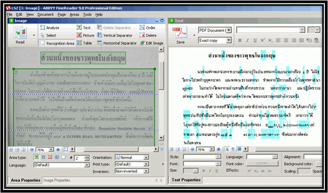
Another key issue with the OCR process is the Western biases that went into the creation of the software. Many common OCR programs were designed to handle projects with Latinized scripts. While helpful for some projects, this left barriers to documents with non-Latinized scripts, particularly from languages commonly used outside the West. While advances have been made on this front, the advancements are still far behind that of Latinized scripts. For example, ABBYY FineReader is one of the few software programs that will scan in non-western languages, but it cannot incorporate its training program when those scripts aren’t Latinized. Adobe Acrobat can also scan documents with languages that use non-Latinized scripts, but its precision is less consistent than with those languages that do.  

An old version of ABBYY FineReader. The text scanned on the left is a language with a non-Latinized script. The right side shows a variety of errors due to the system's lack of knowledge of that language.
Photo Credit: Paul Tafford 

Addressing the Issues with OCR 

Although OCR has performed many amazing tasks, there is still much development needed when it comes to projects related to this aspect of scholarly research. One crucial component when considering taking on an OCR project is to recognize the limitations of the software and to account for that when determining the scope of your project. At this stage, OCR technology is certainly a time-saver and fundamentally changing the possibilities of scholarship, but without human input, these projects fail to make an impact. Likewise, recognizing the inequality of processing for non-western languages in some of the more prevalent OCR software (which several developers have looked to offset by creating OCR programs specifically catered to specific non-Latinized languages). Acknowledging these issues can help us consider the scope of various projects and also allow us to address these issues to make OCR a more accessible field.

Explore the Possibilities with ArcGIS StoryMaps

ArcGIS StoryMaps is a handy tool for combining narrative, images, and maps to present information in an engaging way. Organizations have used StoryMaps for everything from celebrating their conservation achievements on their 25th anniversary to exploring urban diversity in Prague. The possibilities are vast, which can be both exciting and intimidating for people who are just getting started. I want to share some of my favorite StoryMap examples, which will demonstrate how certain StoryMap tools can be used and hopefully provide inspiration for your project.

A Homecoming for Gonarezhou’s Black Rhinos

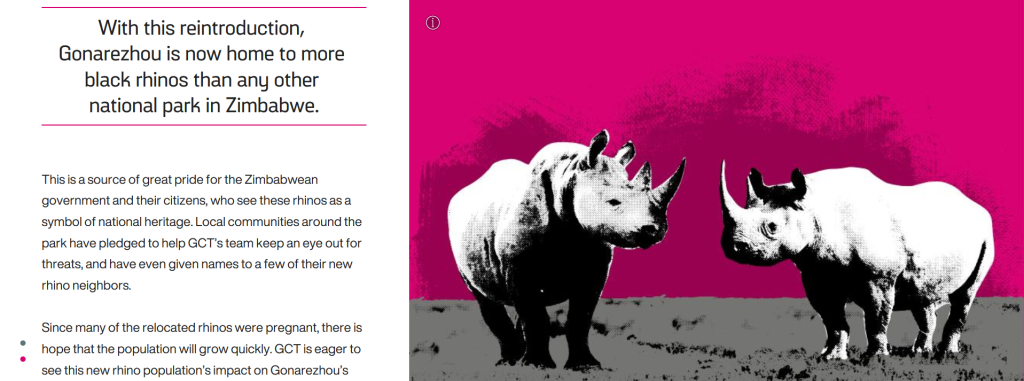
Screenshot of a storymap with text about and an image of rhinos.

If GIS and map creation are a bit outside your wheel-house, no worries! A Homecoming for Gonarezhou’s Black Rhinos is a StoryMap created by the Rhino Recovery Fund that is a great example of how a StoryMap can be made without using any maps. It’s also a good example of the timeline feature as well as making great use of a custom theme by incorporating the nonprofit’s signature pink into the story’s design.

Sounds of the Wild West

Screenshot of a storymap with text about and an image of the Yellowstone River.

Sounds of the Wild West is a StoryMap created by Acoustic Atlas that takes you on an audio tour of four different Montana ecosystems. This StoryMap is a lovely example of how powerful images and audio can immerse people in a location, enhancing their understanding of the information presented. The authors also made great use of the StoryMap sidecar, layering text, images, and audio to create their tour.

California’s Superbloom

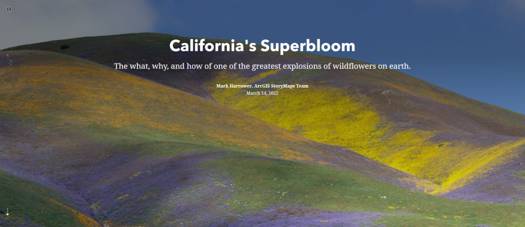
Header of the California's Superbloom StoryMap

Speaking of beautiful photos, this StoryMap about California’s Superbloom is full of them! It’s a great example of the StoryMap image gallery and “swipe” tools. The StoryMap swipe tool allows you to juxtapose different maps or images, revealing the difference between, for example, historical and modern photos, or satellite imagery during different times of year in the same region.

The Surprising State of Africa’s Giraffes

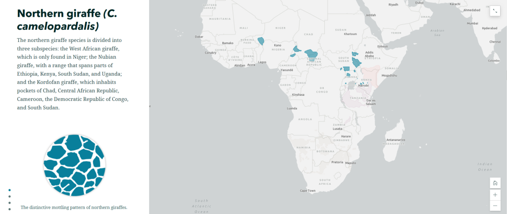
Screenshot of The Surprising State of Africa’s Giraffes StoryMap with a map highlighting the habitat of the Northern Giraffe

The Surprising State of Africa’s Giraffes is a StoryMap created by ESRI’s StoryMaps team that demonstrates another great use for the sidecar. As users scroll through the sidecar pictured above, different regions of the map are highlighted in an almost animated effect. This not only provides geographic context to the information, but does so in a dynamic way. This StoryMap also includes a great example of an express map, which is an easy way to make an interactive map without any GIS experience or complicated software.

Map Tour Examples

StoryMaps also features a tool that allows you to take users on a tour around the world – or just around your hometown. The map tour comes in two forms: a guided tour, like the one exemplified in Crowded Skies, Expanding Airports; and an explorer tour, such as The Things that Stay with Us.

StoryMaps Gallery

There are so many different forms a StoryMap can take! To see even more possibilities, check out the StoryMaps Gallery to explore nearly a hundred different examples. If you’re ready to get your feet wet but want a bit more support, keep an eye on the Savvy Researcher calendar for upcoming StoryMap workshops at the UIUC Main Library.

The University of Illinois Privacy Conference 2023

The Privacy Office, a team housed in the University of Illinois’s Technology Services geared towards data security and privacy for students, faculty, and staff, partnered with the Big Ten Academic Alliance to host their third annual Privacy Everywhere Conference and their first hybrid event. This conference, hosted at the Beckman Institute and conveyed over Zoom, focused on “Building Digital Trust,” diving into issues like understanding privacy issues as a layperson, higher education privacy initiatives, and digital surveillance.

In our current societal climate, internet use is ubiquitous and impossible to avoid if you want to be a part of social life. The Privacy Conference provided the opportunity for attendees to learn how “decisions about privacy affect our professional, educational, and personal lives.” I attended this event to educate myself on how data practices, policies, and ethics affect my autonomy and what I can do to protect my privacy.

Privacy Everywhere Logo
© Technology Services, Privacy & Cybersecurity

Conference points that stayed with me:

  • Data Minimization Principle – minimizing data collection and deleting data instead of storing, sharing, and selling it.  
  • Patron Burden – we are expected as service users to know all the proper steps and practices to protect our data, even when “Terms and Conditions” and service systems are purposely opaque.
  • Digital Surveillance & Legislation –  state legislation is focused on protecting children, leaving a loophole for law enforcement and companies to share and retain information
  • Awareness – as a layperson, there is a lot I don’t know about protecting my data, but I attended this conference to learn. Look into your state legislation on data protection and privacy and share the information you’ve learned with your circle.

If you missed the conference, you can watch the recording of each session via MediaSpace, if you’re affiliated with the University of Illinois. Be on the lookout for the 2024 conference. The conference welcomes university students, faculty, and staff!

Data Storytelling with Scholarly Commons

What is Data Storytelling? 

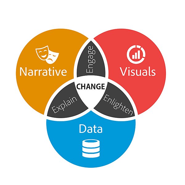
Oftentimes data is presented in a manner that is dry or incomprehensible to a general audience. Data storytelling is a more interactive and compelling way to present information. Data storytelling is defined as using visualizations to tell a narrative that communicates insights about data to a wider audience.  

Venn diagram with three circles which are narrative, visuals and data. Where visuals and narrative overlap says engage. Where visuals and data overlap says enlighten. Where narrative and data overlap says explain. In the intersection of all three circles says change.  
Brent Dykes, CC BY-SA 2.5, via Wikimedia Commons 
 

When writing a data story, start by collecting your data. Look for the most interesting trends and determine the main points you want to get across in your data story. A data story should have a complete narrative rather than being a series of barely connected data visualizations. Make sure the story you are telling is appropriate for your audience.  

Resources for Creating a Data Story: 

The Scholarly Commons Collection is located in the UIUC Main Stacks. Books in this collection are available to check out. The collection includes books that provide introductory information to data storytelling. 

  1. Effective data storytelling : how to drive change with data, narrative and visuals 

This resource is available to UIUC faculty, staff, and students online. It focuses especially on the narrative aspects of data storytelling rather than the visualization aspect. This book explains the psychology of why storytelling is such an effective communication tool.  

  1. Storytelling with data : a data visualization guide for business professionals 

This resource is only available as a physical book. Data storytelling is a method often used by business professionals to impart information in a more meaningful and persuasive way. This book speaks specifically to business professionals and explains how to consider context, determine the appropriate format for the story, and speak to an audience in a compelling way.  

  1. Storytelling with data : let’s practice! 

This book is also available online with an active illinois.edu email address. It provides over 100 hands-on exercises to help you to gain practice in choosing effective visuals, keeping your visualizations clean, and telling a story.  

Scholarly Commons also provides access to various software that can be accessed on the computers in Main Library room 220. These tools can also be accessed through UIUC Anyware. Useful software for data storytelling includes: 

  1. Tableau Public

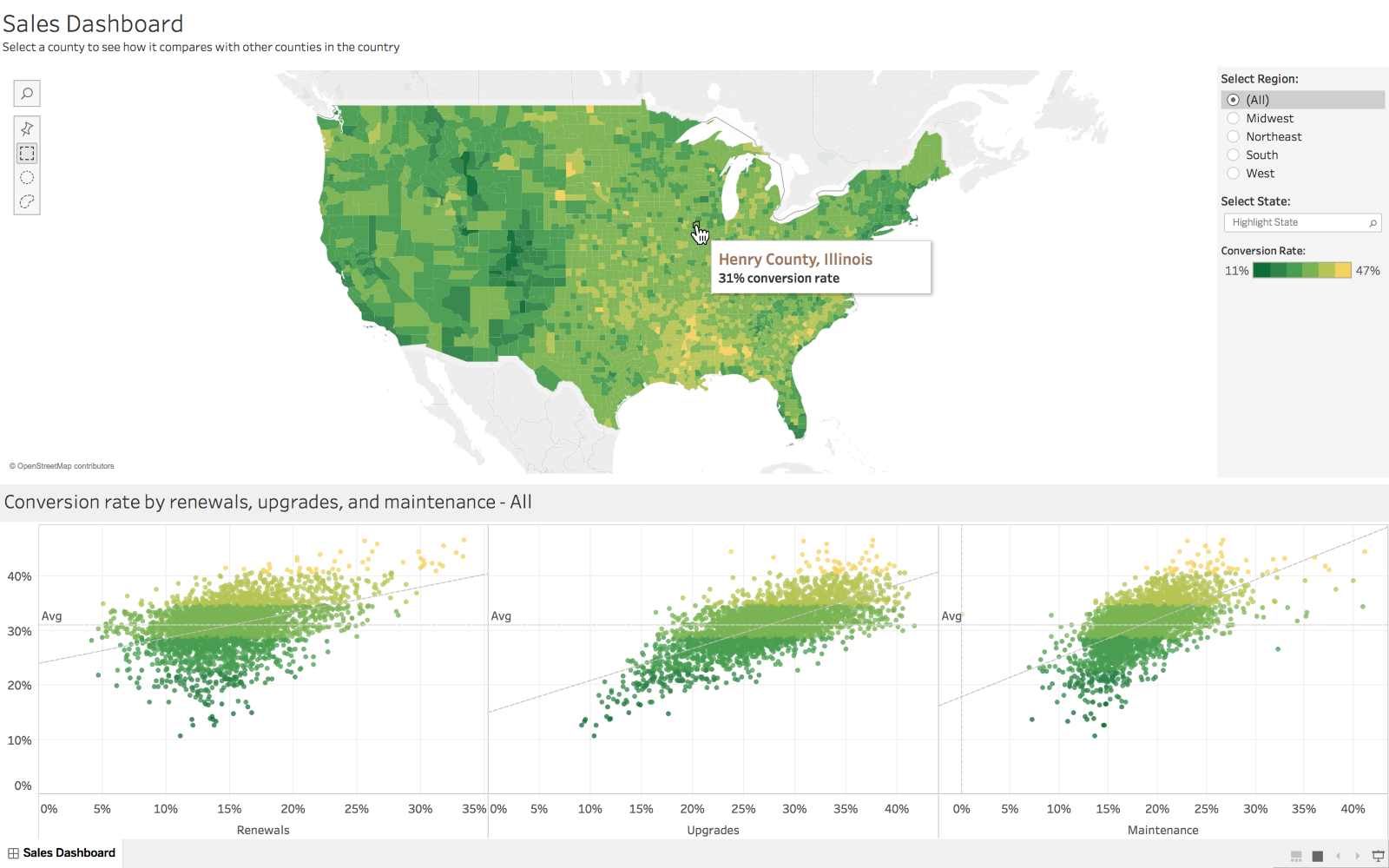
Tableau is a popular data visualization tool with many features useful for making many types of visualizations, such as histograms, pie charts, and boxplots. Tableau also allows users to create dashboards which create a comprehensive story by combining visuals and data.  

 Dashboard created in Tableau
Marissa-anna, CC BY-SA 4.0, via Wikimedia Commons 

  1. ArcGIS 

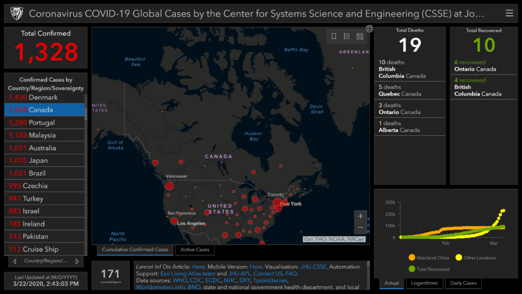
ArcGIS software allows you to create maps and add data to them. This tool would be especially useful if your data is geographically focused. ArcGIS StoryMaps is an additional tool that allows you to create a story using images, texts, maps, lists, videos and other forms of media.  

Map of Covid cases created in ArcGIS

Dennis Sylvester Hurd, CC-BY 2.0, via Flickr 

If you have data you need to share with an audience, consider sharing it through a data story. Data stories are often more visually appealing and engaging than other methods of sharing data. The Scholarly Commons has lots of useful tools to help you create a data story! 

Visualizing your love for data

This post is in celebration of the love data week between Feb-13-Feb 17, 2023. 

Analytics screen graph.
Photo by Luke Chesser on Unsplash 

What is Data visualization?  

For this author, it was love at first sight. Well, technically, it was love at first Visualization. So many say seeing is believing, and data visualization helps us accomplish that, especially at the rate at which data is increasing exponentially in our world. The truth is that data is everywhere, and for us to draw meaning from it, we need to present it in a clear and concise manner.  

Data visualization is the graphical representation of data. Data can be represented in various forms and shapes, such as maps, charts, infographics, graphs, heat maps, or sparklines. When data is presented through visual elements, it is easy to understand and analyze. It helps you to derive meaning from the data and make better decisions. Visualizing your data involves using certain tools; these tools help you fall more in love with data.  

Data Visualization tools are software that allow you to create graphical representations of your data.  

Here are some tools to help you get started. These have been selected based on their ease of use, features (such as capacity for large volumes of data), cost, and popularity.

  1. Data Wrapper: If you are just starting out with data Visualization and you are looking for a free tool to help you get started, Data wrapper is your plug. Data Wrapper is a beginner-friendly tool with a clean and intuitive user interface accessible online. It is straightforward to navigate and great for creating charts and maps that can be easily embedded into reports. It also allows you to upload your files in various formats such as CSV, .tsv, and .txt 

Pros: 

  • Great for beginners.
  • Free to use.
  • Accessible online tool.

Cons:  

  • It can be challenging to build complex charts. 
  • Limited features. 
  • Security is not guaranteed as it is an online tool.
  1. Infogram: If you are not super design-inclined, this visualization tool should be your best friend. It has an editor drag-and-drop feature that makes it super easy to create beautiful designs without having to worry about where you are with your design skills. Infographics, marketing reports, maps, social media posts, and many more are examples of what you can create with this powerful tool. In addition, your data output can be exported in various formats, such as. JPG, GIF, PNG, HTML, and . PDF.  

Pros:

  • Web-based. 
  • Drag-and-drop editor.
  • Easy to use.
  • Highly customizable.

Cons: 

  • Built-in data sources are limited.
  • Not suitable for complex visualization.
  1. Google charts: Google Charts is another free data visualization tool that is user-friendly and compatible with all browsers and platforms. If you like to play around with codes, then Google Charts provides you with that option. Google Charts are coded with SVG and HTML5, allowing it to produce several graphic and pictorial data visualizations, ranging from simple visualization such as pie charts, bars, charts, histograms, maps, and scatter graphs to more complex ones such as hierarchical tree maps, timelines, and gauges. Google fusion tables, spreadsheets, and SQL databases are examples of data sources that can be used with Google Charts.  

Pros:

  • It is free.
  • It is compatible with various browsers.
  • Compatible with google products.

Cons:

  • Technical support is limited.
  • It requires network connectivity for visualization. 
  • There is no room for customization. 
  1. Tableau: This is one of the most popular data visualization tools, mainly because of the free public version that this software provides. Tableau provides the option of a desktop app, server, and online versions. In addition, this software has several data importation options, such as CSV files for google ads. Similarly, if you are looking into presenting your data in various formats, such as multiple chart formats and mapping, then Tableau is the one for you.  

Pros:

  • Provides several options for data import. 
  • It is available for free (public version).

Cons:

  • Lack of Privacy in the public version. 
  • Paid versions are costly. 

5. Dundas BI: Although this is one of the oldest data visualization tools, it is still standing strong as one of the most powerful tools for visualizing data with interactive charts, tree maps, gauges, smart tables, and scorecards. This interactivity allows users to understand the data quickly. Dundas BI is also highly customizable. Dundas BI operates on the ground of responsive HTML5 web technology that allows users to connect, analyze and interact with their data on any device. This powerful tool also provides a built-in feature for extracting data from many data sources.  

Pros:

  • Highly flexible.
  • Provides a variety of visualization options.

Cons: 

  • It lacks predictive analysis. 
  • Does not support 3D charts.  

There you have it! Now you know the tools to ask out on a date when you are ready to visualize your data. As much as you love data, these tools can help make others fall in love with your data, too.   

Of Maps and Memes: A Bit of Cartographic Fun

Co-Authored by Zhaneille Green

We use maps to communicate all the time. Historically, they have been used to navigate the world and to stand as visual, physical manifestations of defined spaces and places. What do you think of when we say “map”: a topographic map1 a transportation map2 or a city map3?

You can use maps to represent just about anything you want to say, far beyond these typical examples. We wrote this blog to invite you to have a little cartographic fun of your own.

If you’re on any kind of social media, you’ve probably seen maps like the one below, highlighting anything from each state’s favorite kind of candy to what the continental US would look like if all of the states’ borders were drawn along rivers and mountain ranges. People definitely seem to enjoy sharing these maps, curious to see what grocery store most people shop at in their home state, or laughing about California’s lack of popularity with the states in the surrounding area.

Map of most popular halloween candy in each US state. View the interactive version on candystore.com

Try your hand at creating your own silly map by using our programs in the Scholarly Commons. Start a war by creating a map that ranks the Southern states with the best barbecue using Adobe Photoshop or Illustrator, or explore a personal hobby like creating a map of all the creatures Sam & Dean Winchester met through the 15 seasons of Supernatural using ArcGIS.

If you’re feeling a bit more serious, don’t fret! Even if these meme-like maps aren’t portraying the most critical information, they do demonstrate how maps can be a great tool for data visualization. In many ways, location can make data feel more personal, because we all have personal connections to place. Admit it: the first thing you checked on the favorite candy map was your home state. Maps also tend to be more visually engaging than a simple table with, for example, states in one column and favorite animal in the other.

Using geotagging data, each dot represents where a photo was taken: blue for locals, red for tourists, and yellow for unknown. Locals and Tourists #1 (GTWA #2): London. Erica Fischer, CC BY-SA 2.0 via Flickr.

Regardless of what you want to map, the Scholarly Commons has the tools to help bring your vision to life. Learn about software access on our website, and check out these LinkedIn Learning resources for an introduction to ArcGIS Online or Photoshop, which are available with University of Illinois login credentials. If you need more assistance, feel free to ask us questions. Go forth and meme!

You can’t analyze data if you ain’t cute: Data Visualization

Meme from Reno 911 with the original text stating "You can't fight crime if you ain't cute" but the "fight crime" is crossed out and above is written "analyze Data"

Humans are highly visual creatures, even more so in our hyper-graphic world of ultra-filtered images and short aesthetic videos. Great ideas are ignored into oblivion in favor of shiny graphics and slick illustrations, so even data analysts need to be aware of how they present their findings. A well-designed infographic will be much more impactful, widely shared, and remembered than columns and rows of numbers. Even a simple graph can help people better come to conclusions and absorb information than they ever would with just numbers alone. People who can not only crunch numbers but also create stunning communications about those numbers are a real asset on the job market, so it behooves any hopeful data analyst to at least learn the basics of visualization.

LinkedIn Learning 

  1. Learning Data Visualization 
    1. This course clocks in at just under two hours and aims to give learners the scaffolding for a strong understanding of data visualization. Geared towards true beginners, this course challenges learners to think about their data, audience, and goals to create visuals that maximize impact. Learners will also learn about visual perception and chart selection strategies, which in turn can set users up for a deep understanding of visualization. 
  1. Data Visualization: Best Practices 
    1. A poorly designed visualization can be criminally misleading, causing viewers to come to biased and inaccurate conclusions that can negatively affect everything from their investment choices to their health practices. This 98-minute course will give learners the tools to avoid common visualization missteps and the tricks to make their visualizations better fit their data, audience, and goals. This course uses Adobe Illustrator, so those who are unfamiliar with the program should first check out this quick start introduction to the program on LinkedIn Learning. Remember, UIUC students have free access many Adobe products, including Adobe Illustrator!  
  2. Excel Data Visualization: Mastering 20+ Charts and Graphs 
    1. Once again, we will focus on this data skillset within the context of a familiar software, Excel. While it is not the first software that comes to mind when thinking about visualization, Excel has surprisingly powerful visualization functions that will certainly come in handy when analyzing data. This course covers the humble pie chart to the complex geospatial heat maps and 3D power maps. In just two hours, learners will be able to quickly take their data from tables to graphics.  

O’Reilly Books and Videos

Make sure you are logged into O’Reilly before clicking these links. The best way to login is to go to the library catalog’s record for a book offered through O’Reilly (Like this book on Python) and then follow the instructions on this Libguide to log in.

  1. Fundamentals of Data Visualization 
    1. This handy book goes deep into the technical aspects of data visualizations. Learners will learn basic concepts like color theory along side more complex practices like redundant coding. This eBook also provides a helpful directory of visualizations so users can quickly find visualizations that fit their needs.
  2. The Data Visualization Lifecycle 
    1. This 4-hour course covers the basics of data visualization but looks at the actual process of professional data visualization that the other resources on this list do not address. Learners will gain technical skills in building visualization and a broader understanding of data visualization as a collaborative process based on external and internal stakeholders and audiences. This course teaches users how to interact with different data cultures, collaborate with colleagues, and how to treat visualization as a product.
  3. Interactive Data Visualization for the Web 
    1. Interactive data visualization is a trending skill in almost all fields that rely on data analysis and visualization of any kind. Allowing others to interact with your data and its visualization can make the data more accessible and memorable than ever before. This book gives users the skills to make interactive visuals with the fundamental concepts and methods of D3, the most powerful JavaScript library for expressing data visually in a web browser. Even those who are new to web programming will learn the basics of HTML, CSS, JavaScript, and SVG alongside the data visualization skills.

In the Catalog 

  1. #MakeoverMonday : improving how we visualize and analyze data, one chart at a time by Andrew Michael Kriebel and Eva Katharina Murray 
    1. Hashtags can be the start of beautiful movements, as those in the data analysis field learned as their #MakeoverMonday tag sparked a complete reimagining of how professionals approach data visualization. Readers will learn concepts of data visualization while viewing the real-life results of these concepts as shown by the hashtag-inspired graphics. #MakeoverMonday shows readers the “many ways to walk the line between simple reporting and design artistry to create exactly the visualization the situation requires”.  
  2. The functional art : an introduction to information graphics and visualization by Alberto Cairo 
    1. If there are data visualization celebrities, then Alberto Cairo is an A-lister. Known for his visualization journalism, he is a self-described information designer who has become famous for his gripping visualizations that stand as both formal art and excellent communication of data. This book allows users to learn the ins and outs of design all while strolling through a gallery of amazing visualization examples. This resource leans heavily on the theory of art and design, which makes it stand out from the other resources on this list. Alberto Cairo’s other works, The Truthful Art: data, charts, and maps for communication and How Charts Lie : getting smarter about visual information  are also worthwhile and insightful reads!  
  3. Data visualisation : a handbook for data driven design by Andy Kirk 
    1. Pivoting back to the more practical side of things, this handbook offers clear and useful processes for data driven designing. Readers will learn more about the visualization workflow, formulating briefs, working with data in the context of visualization, representing data accurately, integrating interactivity, and visualization literacy. 

And that’s it, folks!

With these visualization resources, the Winter Break Data Analysis series is ending on a pretty note. Hopefully, you have been able to keep your mind sharp and develop a new skill over the last month, but even if the timing was off, these resources and many more are available to students all year long! Did you enjoy one of these resources or posts? Do you have questions about any of these topics or suggestions for future series? Please tell us about it at sc@library.illinois.edu or on twitter at @ScholCommons. Thank you for joining this series and happy analyzing!  

*hacker voice* “I’m in” – Coding and Software for Data Analysis

While data analysis has existed in one form or another for centuries, its modern concept is highly tied to a digital environment, which means that people who are looking to move into the data science field will undoubtedly need some technology skills. In the data field, the primary coding languages include Python, R, and SQL. Software is a bit more complicated, with numerous different programs and services used depending on the situation, including Power BI, Spark, SAS, Excel, to name a few. While this is overwhelming, remember that it is not important to become an expert in all of the languages and software. Becoming skilled in one language and a few of the software options, depending on your interest or on the in-demand skills on job listings, will give you the transferable skills to quickly pick up the other languages and software as needed. If this still seems to be  an overwhelming prospect, remember that the best way to eat an elephant is one bite at a time. Take your time, break up the task, and focus on one step at a time! 

LinkedIn Learning

  1. Python for Data Science Essential Training Part 1 
    1.  This 6 hour course guides users through an entire data science project that includes web scrapers, data cleaning and reformatting, generate visualizations, preform simple data analysis and create interactive graphs. The project will have users coding in Python with confidence and give learners a foundation in the Plotly library. Once completed, learners will be able to design and run their own data science projects.  
  1. R for Excel Users 
    1. With Excel being a familiar platform for many interested in data, it is an ideal bridge to more technical skills, like coding in the R language. This course is specifically designed for data analytics with its focus on statistical tasks and operations. It will take user’s Excel skills to another level while also laying a solid foundation for their new R skills. Users will be able to switch between Excel and the R Desctools package to complete tasks seamlessly, using the best of each software to calculate descriptive statistics, run bivariate analyses, and more. This course is for people who are truly proficient in Excel but new to R, so if you need to brush up your Excel skills, go back to the first post in this series and go over the Excel resources!   
  1. SQL Essential Training 
    1. SQL is the language of relational databases, so it is of interest to anyone looking to expand their data handling skills. This training is designed to give data wranglers the tools they need to use SQL effectively using the SQLiteStudio Software. Learners will soon be able to create tables, define relationships, manipulate strings, use triggers to automate actions, and use sub selects and views. Real world examples are used throughout the course and learners will finish the course by building their own SQL application. If you want a gentler introduction to SQL, check out our earlier post on SQL Murder Mystery  

O’Reilly Books and Videos (Make sure to follow these instructions for logging in!) 

  1. Data Analysts Toolbox – Excel, Python, Power BI, Alteryx, Qlik Sense, R, Tableau 
    1. This 46 hour course is not for the faint of heart, but by the end, users will be a Swiss army knife data analyst. This isn’t for true beginners, but rather people who are already familiar with the basic data analysis concepts and have a good grasp of Excel. It is included in this list because it is a great source for learning the basics of the myriad of software and programming languages that data analysts are expected to know, all in one place. The course starts with teaching users about advanced pivot tables, so if users have already mastered the basic pivot table, they should be ready for this course.  
  1. Programming for Data Science: Beginner to Intermediate 
    1. This is an expert curated playlist of courses and book chapters that is designed to help people who are familiar with the math side of data analysis, but not the computer science side. This playlist gives users an introduction to NumPy, Pandas, Python, Spark and other technical data skills. Some previous experience with coding may be helpful in this course, but patience will make up for lack of experience.  

In the Catalog

  1. Python crash course : a hands-on, project-based introduction to programming 
    1. Python is often lauded as one of the most approachable coding languages to learn and its functionality makes it popular in the data science field. So it is no surprise that there are a lot of resources on and off campus for learning Python. This approachable guide is just one of the many resources available to UIUC students, but it stands out with its contents and overall outcomes. “Python Crash Course” covers general programming concepts, Python fundamentals, and problem solving. Unlike some other resources, this guide focuses on many of Python’s uses, not just its data analytics capabilities, which can be appealing to people who want to be more versatile with their skills. However, it is the three projects that make this resource stand out from the rest. Readers will be guided in how to create a simple video game, use data visualization techniques to make graphs and charts, and build an interactive web application.  
  1. The Book of R : a first course in programming and statistics 
    1. R is the most popular coding language for statistical analysis, so it’s clearly important for data analysts to learn. The Book of R is a comprehensive and beginner friendly guide designed for readers who have no previous programming experience or a shaky mathematical foundation as readers will learn both concurrently through the book’s lessons. Starting with writing simple programs and data handling skills, learners will then move forward to producing statistical summaries of data, preforming statistical tests and modeling, create visualizations with contributed packages like ggplot2 and ggvis, write data frames, create functions, and use variables, statements, and loops; statistical concepts like exploratory data analysis, probabilities, hypothesis tests, and regression modeling, and how to execute them in R; how to access R’s thousands of functions, libraries, and data sets; how to draw valid and useful conclusions from your data; and how to create publication-quality graphics of your results.  

Join us next week for our final installment of the Winter Break Data Analysis series: “You can’t analyze data if you ain’t cute: Data Visualization for Data Analysis”    

Learn Data Analysis: What’s Math Got to do With It?

What’s math got to do with data analysis? Unfortunately, for those of us who are chronic humanities people, math has a lot to do with it. This might seem like a daunting barrier, especially if the last time you looked at a math problem was in a high school algebra class. This is also true for learners who are already skilled with the technological aspect of data analysis but are not familiar with the mathematics side of thing. However, there are so many resources available to help self-directed students learn the basics and get up to speed for the purposes of data analytics! Using the resource platforms described in last week’s blog post, these resources will have even chronic humanities people playing with numbers in no time!  

LinkedIn Learning 

  • Learning Everyday Math 
    • Look, some of us did not absorb or retain the basic math lessons of our early education. That’s okay! This is a no-judgment zone, and this 2 hour course will help users learn how to calculate percentages for tips and taxes, compare prices while shopping, find the area and volume for home-improvement projects, and learn the basics of probability.  
  • Become a Data Scientist 
    • This 21 hour Learning Path is made up of 12 courses that focus more on the statistical side of data analysis than the technical steps of the process. This course is more geared toward users with experience in IT and computers, so it is not the best for people who do not have a strong technical background. However, for those who are familiar with computer science and want to pivot into data analytics, this is an ideal curriculum.   

O’Reilly Books and Videos (Make sure to follow these instructions for logging in!)

  • Essential Math for Data Science 
    • This eBook mixes basic coding skills with math lessons to cover the essential analytical skills needed for data science work. Relevant aspects of calculus, probability, linear algebra, and statistics and how they apply to techniques like linear regression, logistic regression, and neural networks are covered in plain English. The chapters include exercises with answers for self-assessment as well as career advice for budding data analysts.   
  • Statistics for Data Science using Python 
    • Besides books, O’Reilly also has expert curated playlists that consist of chapters of several different books, videos and more. This is a great way of getting the most out of several resources to focus on a single skill. This playlist covers the essential statistic concepts found in 11 different resources. Learn about Normal distribution, hypothesis tests, p-values, central limit theorem and more without having to dig for the resources yourself!  
  •   Data Science 101: Methodology, Python, and Essential Math 
    • On top of books and playlists, O’Reilly also has video-based courses. This course covers a lot of data analytics basics, but those who want to focus on the math aspect will benefit from Chapters 15-19. These chapters cover linear algebra, mathematical structures, probability, random variables and multiple variables, and statistical inference.  

In the Catalog 

Be sure to come back next week for the thrilling continuation with “*hacker voice* I’m In: Coding and Software for Data Analysis!