Unreadable: Challenges and Critical Pedagogy to Optical Character Recognition Software 

In the 21st century, Optical Character Recognition (OCR) software has fundamentally changed how we search for information. OCR is the process of taking images with text and making them searchable. The implications of OCR vary from allowing searchability on massive databases to promoting accessibility by making screen readers a possibility. While this is all incredibly helpful, it is not without fault, as there are still many challenges to the OCR process that create barriers for certain projects. There are also some natural limitations to using this software that especially have consequences for time-sensitive projects, but other factors within human control have negatively influenced the development of OCR technology in general. This blog post will explore two issues: the amount of human labor required on an OCR project and the Western biases of this kind of software. 

Some text in ABBYY FineReader. Not all of the appropriate text is contained within a box, indicating the human labor that needs to go in to correct this.
Public Domain Image

Human Labor Requirements 

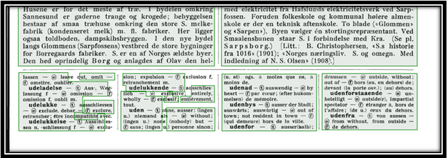
While OCR can save an incredible amount of time, it is not a completely automated system. For printed documents from the 20th-21st century, most programs can guarantee a 95-99% accuracy rate. The same is not true, however, for older documents. OCR software works by recognizing pre-built characters the software was initially programmed to recognize. When a document does not follow that same pattern, the software cannot recognize it. Handwritten documents are a good example of this, in which the same letter may appear differently to the software, depending on how it was written. Some programs, such as ABBYY FineReader, have attempted to resolve this problem by incorporating a training program, which allows users to train the system to read specific types of handwriting. Even still, that training process requires human input, and there is still much work for individuals to put into ensuring that the processed document is accurate. As a result, OCR can be a time-consuming process that still requires plenty of human labor for a project.  

Western Biases  

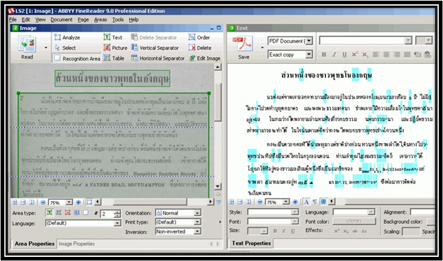
Another key issue with the OCR process is the Western biases that went into the creation of the software. Many common OCR programs were designed to handle projects with Latinized scripts. While helpful for some projects, this left barriers to documents with non-Latinized scripts, particularly from languages commonly used outside the West. While advances have been made on this front, the advancements are still far behind that of Latinized scripts. For example, ABBYY FineReader is one of the few software programs that will scan in non-western languages, but it cannot incorporate its training program when those scripts aren’t Latinized. Adobe Acrobat can also scan documents with languages that use non-Latinized scripts, but its precision is less consistent than with those languages that do.  

An old version of ABBYY FineReader. The text scanned on the left is a language with a non-Latinized script. The right side shows a variety of errors due to the system's lack of knowledge of that language.
Photo Credit: Paul Tafford 

Addressing the Issues with OCR 

Although OCR has performed many amazing tasks, there is still much development needed when it comes to projects related to this aspect of scholarly research. One crucial component when considering taking on an OCR project is to recognize the limitations of the software and to account for that when determining the scope of your project. At this stage, OCR technology is certainly a time-saver and fundamentally changing the possibilities of scholarship, but without human input, these projects fail to make an impact. Likewise, recognizing the inequality of processing for non-western languages in some of the more prevalent OCR software (which several developers have looked to offset by creating OCR programs specifically catered to specific non-Latinized languages). Acknowledging these issues can help us consider the scope of various projects and also allow us to address these issues to make OCR a more accessible field.

Tech Teaching: Pedagogies for Teaching Technology and other Software Tools to Learners

When I began my role as a graduate assistant at the Scholarly Commons, my background in technology was extremely limited. As I have worked in this space, however, I have not only had the opportunity to learn how to use technology myself but teach others how to use these same tools through consultations and workshops. As technology begins to encompass more of our lives, I wanted to share a few tips for providing instruction focused on digital technology and software. While these pedagogies also apply to other teaching contexts, specific examples in this post will cater to digital technology.

Photo of two people working together on laptops.
Photo Credit: Christina Morillo

Active Learning

A crucial component of learning technology is allowing learners to directly engage with the technology they are looking to understand. By having direct engagement with the tool, learners will have a better grasp of how that tool works instead of just hearing about its functions in the abstract. If possible, it is highly encouraged that the instructional session has users access the technology or software they are learning, so that they can follow along as they experience how to navigate the tool. If that is not possible though, a few other alternatives may include watching the tool work from either the instructor conducting a live demonstration or finding a video directly showing the technology at work.

Scaffolding

Since technology is often complex, it is very easy for learners to feel overwhelmed by the sheer number of options and possibilities of what certain resources can do. Scaffolding as an instructional concept is a practice of designing a lesson that segments information into smaller sections that build upon each other. When providing instruction for a software program, for example, scaffolding may look like first helping users navigate the options of the tool, following that up with a basic function of the program, then performing a more complex task. Each of these steps is meant to build on one another and guide the learner by both showing them new aspects of the topic while incorporating previously acquired knowledge.

Photo of two people in front of a computer, with one older person guiding the hand of the younger person.
Photo Credit: August de Richelieu

Inclusive Learning

While inclusivity is valued in every learning environment, it is especially vital that instructors provide inclusive environments for teaching digital technology. Neglecting these principles will ultimately create barriers for certain users learning new technology. For general instruction sessions, applying universal design models will help streamline the process so that the session is accessible and meaningful for all types of learners. Considerations for font size when presenting to a workshop/classroom setting, for example, often help those with visual impairments follow along more easily, whereas not taking these considerations makes the learning process more difficult for them. Accommodating specific needs also helps to create an equitable environment that fosters learning for those whose needs may not be accounted for otherwise.

Using These Pedagogies in Personal Learning

Even if you are not planning on teaching others how to use technology, these same methods can also help you learn. Finding opportunities to engage with a particular tool hands-on will help you learn how to use it, rather than just reading articles abstractly about it. Likewise, breaking the content into smaller sections will help prevent overloading and help you progress in mastery of the tool. Finally, recognizing your needs as a learner and finding tools that are relevant to your needs will lift certain barriers to learning certain technologies. As you seek to learn and teach new technology, be creative and have fun with it!

Copyright Enforcement Tools as Censorship

This week, Scholarly Commons graduate assistants Zhaneille Green and Ryan Yoakum, alongside Copyright Librarian Sara Benson, appeared as guest writers for the International Federation of Library Associations and Institutions’ blog as part of a series for Copyright Week. Their blog post looks at how the current copyright tools on platforms such as YouTube and Facebook allow large corporate or governmental entities to silence and suppress individual voices. You can read the full blog post on the IFLA blog website.

A Non-Data Scientist’s Take on Orange

Introduction

Coming from a background in the humanities, I have recently developed an interest in data analysis but am just learning how to code. While I have been working to remedy that, one of my professors showed me this program known as Orange. Created in 1996, Orange is primarily designed to help researchers through the data analysis process, whether that is by applying machine learning methods or visualizing data. It is an open-source program (meaning you can download it for free!) and uses a graphical user interface (GUI) that allows the user to perform their analysis by matching icons to one another instead of having to write code.

How it Works

Orange works by using a series of icons known as widgets to perform the various functions that a user would otherwise need to manually code if they were using a program such as Python or R. Each widget appears as a bubble that can be moved around the interface. Widgets are divided into various categories based on the different steps in the analysis process. You can draw lines between the widgets to create a sequence, which will determine the process for how that data is analyzed (which is also known as a workflow). In its current state, Orange contains 96 widgets, each with different customizable and interactive components, so there are many opportunities for performing different types of basic data analysis with this software.

To demonstrate, I will use a dataset about the nutrition facts in specific foods (courtesy of Kaggle) to see how accurately a machine learner can predict the food group a given item falls in based on its nutrients. The following diagram is the workflow I designed to analyze this data:

This is the workflow I designed to analyze a sample sheet of data. From left to right, the widgets placed are "File," "Logistic Regression," "Test and Score," and "Confusion Matrix."

On the left side of the screen are different tabs that each contain a series of widgets related to the task at hand. By clicking on the specific widgets, a pop-up window appears that allows you to interact with the widget. In this particular workflow, the “file” widget is where I can upload the file I want to analyze (there are a lot of different formats you can upload too; in this case, I uploaded an Excel spreadsheet). From there, I chose the machine learning method that I wanted to use to classify the data. The third widget tests the data using the classification method, and compares it to the original data. Finally, the results are visualized through the “confusion matrix” widget to show which cases the machine learner accurately predicted and which ones it got wrong.

A confusion matrix of the predicted classification of food items based on the amount of nutrients in them compared to the actual classifications .

The Limitations

While Orange is a helpful tool for those without a coding background, this system also presents some limitations when it comes to performing certain types of data analysis. One way Orange tries to reconcile this is by providing a widget where the user can insert some Python script into the workflow. While this feature may be helpful for those with a coding background, it would not really impact those who do not have a coding background, thereby limiting the ways they can analyze data.

Additionally, although Orange can visualize data, there are not many features that allow users to adjust the visualization’s appearance. Such limitations may require exporting the data and using another tool to create a more accessible or visually appealing data visualization, but for now, Orange is quite limited in this capacity. As a result, Orange is an incredibly useful tool for basic data visualization but struggles with more advanced types of data science work that may require using other tools or programming to accomplish.

Final Remarks

If you are looking to get involved in data analysis but are just starting to develop an interest in coding, then Orange is a great tool to use. Unlike most data analysis programs, the user-designed interface of Orange makes it easy to perform basic types of data analysis through its widgets. It is far from perfect though, and a lack of a coding background is going to limit the ways you can analyze and visualize your data. Nevertheless, Orange can be an incredibly useful tool if you are just starting to learn how to code and looking to understand the basics of data science!

Welcome Back to the Scholarly Commons!

The Scholarly Commons is excited to announce we have merged with the Media Commons! Our units have united to provide equitable access to innovative spaces, digital tools, and assistance for media creation, data visualization, and digital storytelling. We launched a new website this summer, and we’re thrilled to announce a new showcase initiative that highlights digital projects created by faculty and students. Please consider submitting your work to be featured on our website or digital displays. 

Looking to change up your office hours? Room 220 in the Main Library is a mixed-used space with comfortable seating and access to computers and screen-sharing technology that can be a great spot for holding office hours with students. 

Media Spaces

We are excited to announce new media spaces! These spaces are designed for video and audio recordings and equipped to meet different needs depending on the type of production. For quick and simple video projects, Room 220 has a green-screen wall on the southeast side of the room (adjacent to the Reading Room). The space allows anyone to have fun with video editing. You can use your phone to shoot a video of yourself in front of the green wall and use software to replace the green with a background of your choosing to be transported anywhere. No reservations required.

Green Screen Wall in Room 220. Next to it is some insignificant text for design purposes.

For a sound-isolated media experience, we are also introducing Self-Use Media Studios in Rooms 220 and 306 of the Main Library. These booths will be reservable and are equipped with an M1 Mac Studio computer, two professional microphones, 4K video capture, dual color-corrected monitors, an additional large TV display, and studio-quality speakers. Record a podcast or voiceover, collect interviews or oral histories, capture a video or give a remote stream presentation, and more at the Self-Use Media Studios.

Finally, we are introducing the Video Production Studio in Room 308. This is a high-end media creation studio complete with two 6K cameras, an 4K overhead camera, video inputs for computer-based presentation, professional microphones, studio-lighting, multiple backdrops, and a live-switching video controller for real-time presentation capture or streaming. Additionally, an M1 Mac Studio computer provides plenty of power to enable high-resolution video project editing. The Video Production Studio can be scheduled by arranged appointment and will be operated by Scholarly Commons staff once the space is ready to open. 

Stay tuned to our spaces page for more information about reserving these resources.

Loanable Tech

The Scholarly and Media Commons are pleased to announce the re-opening of loanable technology in Room 306 of the Main Library. Members of the UIUC community can borrow items such as cameras, phone chargers, laptops, and more from our loanable technology desk. The loanable technology desk is open 10:30 a.m. – 7:30 p.m. Mondays-Thursdays, 10:30 a.m. – 5:30 p.m. Fridays, and 2-6:30 p.m. on Sundays. Check out the complete list of loanable items for more on the range of technology we provide.

Drop-in Consultation Hours

Drop-in consultations have returned to Room 220. Consultations this semester include:

  • GIS with Wenjie Wang – Tuesdays 1 – 3 p.m. in Consultation Room A.
  • Copyright with Sara Benson – Tuesdays 11 a.m. – 12 p.m. in Consultation Room A.
  • Media and design with JP Goguen – Thursdays 10 a.m. – 12 p.m. in Consultation Room A.
  • Data analysis with the Cline Center for Advanced Social Research – Thursdays 1 – 3 p.m. in Consultation Room A.
  • Statistical consulting with the Center for Innovation, Technology, and Learning (CITL) – 10 a.m. – 5 p.m. Mondays, Tuesdays, Thursdays, and Fridays, as well as 10 a.m. – 4 p.m. Wednesdays in Consultation Room B.

Finally, a Technology Services help desk has moved into Room 220. They are available 10 a.m. – 5 p.m. Mondays-Fridays to assist patrons with questions about password security, email access, and other technology needs.

Spatial Computing and Immersive Media Studio

Later this fall, we will launch the Spatial Computing and Immersive Media Studio (SCIM Studio) in Grainger Library. SCIM Studio is a black-box space focused on emerging technologies in multimedia and human-centered computing. Equipped with 8K 360 cameras, VR and AR hardware, a 22-channel speaker system, Azure Kinect Depth Cameras, Greenscreen, and a Multi-Camera and display system for Video Capture & Livestreaming, SCIM Studio will cater to researchers and students interested in utilizing the cutting edge of multimedia technology. The Core i9 workstation equipped with Nvidia A6000 48GB GPU will allow for 3D modeling, Computer Vision processing, Virtual Production compositing, Data Visualization/Sonification, and Machine Learning workflows. Please reach out to Jake Metz if you have questions or a project you would like to pursue at the SCIM Studio and keep your eye on our website for launch information. 

Have Questions?

Please continue to contact us through email (sc@library.illinois.edu) for any questions about the Scholarly and Media Commons this year. Finally, you can check out the new Scholarly Commons webpage for more information about our services, as well as our staff directory to set up consultations for specific services. 

We wish you all a wonderful semester and look forward to seeing you here at the Scholarly and Media Commons!

A Different Kind of Data Cleaning: Making Your Data Visualizations Accessible

Introduction: Why Does Accessibility Matter?

Data visualizations are a fast and effective manner for communicating information and are increasingly becoming a more popular way for researchers to share their data with a broad audience. Because of this rising importance, it is also necessary to ensure that data visualizations are accessible to everyone. Accessible data visualizations not only help an audience who may require a screen reader or other accessible tool to read a document but are also helpful to the creators of the data visualization as it brings their data to a much wider audience than through a non-accessible data visualization. This post will offer three tips on how you can make your visualization accessible!

TIP #1: Color Selection

One of the most important choices when making a data visualization are the colors used in the chart. One suggestion would be to use a color blindness simulator to check the colors in the data visualization and experiment to find the right amount of contrast between colors. Look at the example regarding the top ice cream flavors:

A data visualization about the top flavors of ice cream. Chocolate was the top flavor (40%) followed by Vanilla (30%), Strawberry (20%), and Other (10%).

At first glance, these colors may seem acceptable to use for this kind of data. But when ran through the colorblindness simulator, one of the results creates an accessibility concern:

This is the same pie chart above, but placed under a tritanopia color blindness lens. The colors used for strawberry and vanilla now look the exact same and blend into one another because of this, making it harder to discern the amount of space they take in the pie chart.

Although the colors contrasted well enough in the normal view, the color palettes used for the strawberry and vanilla categories look the same for those with tritanopia color blindness. The result is that these sections blend into one another and make it more difficult to distinguish their values. Most color palettes incorporated in current data visualization software are already designed to ensure the colors do not contrast, but it is still a good practice to check to ensure the colors do not blend in with one another!

TIP #2: Adding Alt Text

Since most data visualizations often appear as images in either published work or reports, alt text is a crucial need for accessibility purposes. Take the visualization below. If there was no alt text provided, then the visualization is meaningless to those who rely on alt text to read a given document. Alt text should be short and summarize the key takeaways from the data (there is no need to describe each individual point, but it should provide enough information to describe the trends occurring in the data).

This is a chart showing the population size of each town in a given county. Towns are labeled A-E and continue to grow in population size as they go down the alphabet (town A has 1,000 people while town E has 100,000 people).

TIP #3: Clearly Labeling Your Data

A simple but crucial component of any visualization is having clear labels on your data. Let’s look at two examples to see what makes having labels a vital aspect of any data visualization:

This is a chart for how much money was earned/spent at a lemonade stand by month. There is no y-axis labels to describe how much money is earned/spent and no key to discern the two lines that represent the money made and the money spent.

There is nothing in this graph that provides any useful information regarding the money earned or spent at the lemonade stand. How much money was earned or spent each month? What do these two lines represent? Now, look at a more clearly labeled version of the same data:

This is a cleaned version of the previous visualization regarding how much money was earned/spent at a lemonade stand. The addition of a Y-axis and key now show that more money was spent in January/February than earned, but then changes in March peaking in July, and then continuing to fall until December where more money is spent than earned again.

In adding a labeled Y-axis, we can now quantify the difference in distance between the two lines at any point and have a better idea of the money earned/spent in any given month. Furthermore, the addition of a key at the bottom of the visualization distinguishes the lines telling the audience what each represents. By clearly labeling the data, it is now in a position where audience members can interpret and analyze it properly.

Conclusion: Can My Data Still be Visually Appealing?

While it may appear that some of these recommendations detract from the creative designs of data visualizations, this is not the case at all. Designing a visually appealing data visualization is another crucial aspect of data visualization and should be heavily considered when creating one. Accessibility concerns, however, should have priority over the visual appeal of the data visualization. That said, accessibility in many respects encourages creativity in the design, as it makes the creator carefully consider how they want to present their data in a way that is both accessible and visually appealing. Thus, accessibility makes for a more creative and transmissive data visualization and will benefit everyone!

Meet Our Graduate Assistants: Ryan Yoakum

In this interview series, we ask our graduate assistants questions for our readers to get to know them better. Our first interview this year is with Ryan Yoakum!

This is a headshot of Ryan Yoakum.

What is your background education and work experience?

I came to graduate school directly after receiving my bachelor’s degree in May 2021 in History and Religion here at the University of Illinois. During my undergraduate, I had taken a role working for the University of Illinois Residence Hall Libraries (which was super convenient as I lived in the same building I worked in!) and absolutely loved helping patrons find resources they were interested in. I eventually took a second position with them as a processing assistant, which gave me a taste for working on the back end as I primarily prepared materials bought to be shelved at each of the libraries within the system. I really loved my work with the Residence Hall Libraries and wanted to shift my career to working in a library of some form, which has led me here today!

What are your favorite projects you’ve worked on?

I have really enjoyed projects where I have gotten to work with data (both for patrons as well as internal data). Such projects have allowed me to explore my growing interest in data science (which is the last thing I would have initially expected when I began the master’s program in August 2021). I have also really enjoyed teaching some of the Savvy Researcher workshops, which have included ones on optical character recognition (OCR) and creative commons licensing!

What are some of your favorite underutilized Scholarly Commons resources that you would
recommend?

The two that come to mind are the software on our lab computers as well as our consultation services. If I were still in history, using ABBYY FineReader for OCR would have been a tremendous help as well as supplementing that with qualitative data analysis tools such as ATLAS.ti. I also appreciate the expertise of the many talented people who work here in the library. Carissa Phillips and Sandi Caldrone, for example, have been very influential in helping me explore my interests in data. Likewise, Wenjie Wang, JP Goguen, and Jess Hagman (all of whom now have drop-in consultation hours) have all guided me in working with software related to their specific interests, and I have benefitted greatly by bringing my questions to each of them.

When you graduate, what would your ideal job position look like?

I currently have two competing job interests in mind. The first is that I would love to work in a theological library. The theological library could be either in a seminary or an academic library focusing on religious studies. Pursuing the MSLIS has also shifted my interests in working with data, so I would also love to work a job where I can manage, analyze, and visualize data!

What is the one thing you would want people to know about your field?

Library and Information science is not a field limited to working in the stereotypical way society pictures what a librarian’s work looks like (there was a good satirical article recently on this). It is also far from being a dead field (and one that will likely gain more relevance over time). As part of the program, I am slowly gaining skills that have prepared me for working in data which can apply in any field. There are so many job opportunities for MSLIS students that I strongly encourage people to join the field if they are interested in library and information science but have doubts about its career prospects!

Introducing Drop-In Consultation Hours at the Scholarly Commons!

Do you have a burning question about data management, copyright, or even how to work Adobe Photoshop but do not have the time to set up an appointment? This semester, the Scholarly Commons is happy to introduce our new drop-in consultation hours! Each weekday, we will have an expert from a different scholarly subject have an open hour or two where you can bring any question you have about that’s expert’s specialty. These will all take place in room 220 in the Main Library in Group Room A (right next to the Scholarly Commons help desk). Here is more about each session:


Mondays 11 AM – 1 PM: Data Management with Sandi Caldrone

This is a photo of Sandi Caldrone, who works for Research Data Services and will be hosting the Monday consultation hours from 11 AM - 1 PMStarting us off, we have Sandi Caldrone from Research Data Services offering consultation hours on data management. Sandi can help with topics such as creating a data management plan, organizing/storing your data, data curation, and more. She can also help with questions around the Illinois Data Bank and the Dryad Repository.


Tuesdays 11 AM – 1 PM: GIS with Wenjie Wang

Next up, we have Wenjie Wang from the Scholarly Commons to offer consultation about Geographic Information Systems (GIS). Have a question about geocoding, geospatial analysis, or even where to locate GIS data? Wenjie can help! He can also answer any questions related to using ArcGIS or QGIS.


Wednesdays 11 AM – 12 PM: Copyright with Sara Benson

This is a photo of Copyright Librarian Sara Benson who will be hosting the Wednesday consultation hours from 11 AM - 12 PMDo you have questions relating to copyright and your dissertation, negotiating an author’s agreement, or seeking permission to include an image in your own work? Feel free to drop in during Copyright Librarian Sara Benson’s open copyright hours to discuss any copyright questions you may have.


Thursdays 1-3 PM: Qualitative Data Analysis with Jess Hagman

This is a photo of Jess Hagman, who works for the Social Science, Education, and Health Library and will be hosting the Thursday consultation hours from 1 PM - 3 PMJess Hagman from the Social Science, Health, and Education Library is here to help with questions related to performing qualitative data analysis (QDA). She can walk you through any stage of the qualitative data analysis process regardless of data or methodology. She can also assist in operating QDA software including NVivo, Atlas.ti, MAXQDA, Taguette, and many more! For more information, you can also visit the qualitative data analysis LibGuide.


Fridays 10 AM – 12 PM: Graphic Design and Multimedia with JP Goguen

To end the week, we have JP Goguen from the Scholarly/Media Commons with consultation hours related to graphic design and multimedia. Come to JP with any questions you may have about design or photo/video editing. You can also bring JP any questions related to software found on the Adobe Creative Cloud (such as Photoshop, InDesign, Premiere Pro, etc.).


Have another Scholarly Inquiry?

If there is another service you need help with, you are always welcome to stop by the Scholarly Commons help desk in room 220 of the Main Library between 10 AM – 6 PM Monday-Friday. From here, we can get you in contact with another specialist to guide you through your research inquiry. Whatever your question may be, we are happy to help you!

Halloween Data Visualizations!

It’s that time of year where everyone starts to enjoy all things spooky and scary – haunted houses, pumpkin picking, scary movies and…data visualizations! To celebrate Halloween, we have created a couple of data visualizations from a bunch of data sets. We hope you enjoy them!

Halloween Costumes

How do you decide what Halloween costume you wear? Halloween Costumes conducted a survey on this very topic. According to their data, the top way people choose their costume is based on what is easiest to make. Other inspirations include classic costumes, coordination with others, social media trends, and characters from either recent or classic movie or tv franchises.

Data on how people choose their Halloween Costumes. 39% of people base it on the easiest costume they can find, 21% on classic costumes (such as ghosts, witches, etc.), 14% on recent TV or movie characters, another 14% on couples/group/family coordination, 12% on older TV or movie characters, and 11% on social media trends.

The National Retail Federation also conducted a survey of the top costumes that adults were expected to wear in 2019 (there were no good data sets for 2020…). According to the survey, the most popular Halloween costume that year was a witch. Other classic costumes, such as vampires, zombies, and ghosts, ranked high too. Superheroes were also a popular costume choice, with many people dressing up as Spider-man or another Avengers character.


Data on the top 10 costumes of 2019. The top choice was dressing up as a witch, followed by a vampire, superhero, pirate, zombie, ghost, avengers character, princess, cat, and Spider-man.


Halloween Spending and Production

According to the National Retail Federation, Halloween spending has significantly increased between 2005 to this year, with the expected spending this year surpassing 10 billion dollars! That is up from fifteen years ago when the estimated Halloween spending averaged around 5 billion dollars.


This is data on expected Halloween spending between 2005 and 2021. In 2005, the expected spending was 3.3 Billion dollars. In 2006, it was 5 billion dollars. In 2007, it was 5.1 billion dollars. In 2008, it was 5.8 billion dollars. In 2009, it was 4.7 billion dollars. In 2010, it was 5.8 billion dollars again. In 2011, it was 6.9 billion dollars. In 2012, it was 8 billion dollars. In 2013, it was 7 billion dollars. In 2014, it was 7.4 billion dollars. In 2015, it was 6.9 billion dollars. In 2016, it was 8.4 billion dollars. In 2017, it was 9.1 billion dollars. In 2018, it was 9 billion dollars. In 2020, it was 8 billion dollars. Finally, in 2021, it is expected to be 10.1 billion dollars.

With much spending invested in Halloween, it would make sense that the production of Halloween-related items would likely grow too to meet this demand. The U.S. Department of Agriculture records each year the number of pumpkins produced in the United States. Besides one dip taken in 2015, it appears that pumpkin production has almost doubled in the past twenty years on average.


This is data on the number of pumpkins produced in the United States every year. In 2001, it was 8,460,000 pumpkins produced. In 2002, 8,509,000 Pumpkins were produced. In 2003, 8,085,000 pumpkins were produced. In 2004, 10,135,000 pumpkins were produced. In 2005, 10,756,000 pumpkins were produced. In 2006, 10,484,000 pumpkins were produced, in 2007, 11,458,000 pumpkins were produced. In 2008, 10,663,000 pumpkins were prodcued. In 2009, 9,311,000 pumpkins were produced. In 2010, 10,748,000 pumpkins were produced. In 2011, 10,705,000 pumpkins were produced. In 2012, 12,036,000 pumpkins were produced. In 2013, 11,221,000 pumpkins were prodcued. In 2014m 13,143,000 pumpkins were produced. In 2015, 7,538,000 pumpkins were prodcued. In 2016, 17,096,500 pumpkins were produced. In 2017, 15,600,600 pumpkins were produced. In 2018, 15,406,900 pumpkins were produced. In 2019, 13,450,900 pumpkins were produced. Finally, in 2020,, 13,751,500 pumpkins were produced.

Halloween Activities by Demographics

Finally, here are two statistics taken from the National Retail Federation again regarding how people celebrate activities based on age and region. As the data shows, younger people seem more likely to dress in costumes, visit haunted houses, or throw parties on Halloween. Meanwhile, older individuals are more likely to decorate their homes or hand out candy.

This is data about how people celebrate different Halloween activities by age. Those 65 and older are only 31% likely to carve a pumpkin (31%) as opposed to the 43-50% likelihood of other age groups. Those 55-64 are the most likely to decorate their homes/yard (58%) while 18-24 are the least likely (47%). Those 18-24 years old, however, are the most likely to dress in costume (69%) while only 18% of those 65 and older will dress in costumes. Those 25-34 are the most likely to dress their pets up at 30% with only 8% of those 65 and older doing the same. Those 65 and older are 81% likely to hand out candy, however, while only 51% of people 18-24 years of age will pass out candy. Those at ages 35-44 are 38% likely to take their children trick-or-treating, while only 13% of those 65 and older do so. The 18-24 year old demographic are the most likely to throw or attend a party (43%), while 11% of those 65 and older do the same. Similarly, 18-24 demographic are the most likely to attend a haunted house at 32% while only 3% of those in the 65 and older range do the same.

At the same time, there seems to be not too huge of a difference in celebrating by region, apart from those living on the west coast being more likely to dress up or those living in the northeast more likely to hand out candy. Other than those two differences, it seems that most regions celebrate the same Halloween activities in the same proportions.

This is data about how people celebrate different Halloween activities by region. 42-46% of people carve a pumpkin (with those in the Midwest on the higher end and the South on the lower end). 50-54% of people decorate their home or yard with the Midwest and Northeast on the higher end and the South on the lower end. 41-52% of people dress in costume with those living in the West on the higher end and the Midwest on the lower end. 19-22% of people dress their pets with those living in the West on the higher end and the Midwest on the lower end. 64-70% of people hand out candy with the Northeast on the higher end and the West and South tied on the lower end. 22-26% of people take their children trick-or treating with those living in the Midwest and South on the higher end and the West on the lower end. 25% of people throw or attend a party equally across regions. 17-19% of people visit a haunted house with the Midwest and South on the higher end and the West on the lower end.


We hope these data visualizations got you in the mood for spooky, Halloween fun! From all of us at the Scholarly Commons, Happy Halloween!

What Are the Digital Humanities?

Introduction

As new technology has revolutionized the ways all fields gather information, scholars have integrated the use of digital software to enhance traditional models of research. While digital software may seem only relevant in scientific research, digital projects play a crucial role in disciplines not traditionally associated with computer science. One of the biggest digital initiatives actually takes place in fields such as English, History, Philosophy, and more in what is known as the digital humanities. The digital humanities are an innovative way to incorporate digital data and computer science within the confines of humanities-based research. Although some aspects of the digital humanities are exclusive to specific fields, most digital humanities projects are interdisciplinary in nature. Below are three general impacts that projects within the digital humanities have enhanced the approaches to humanities research for scholars in these fields.

Digital Access to Resources

Digital access is a way of taking items necessary for humanities research and creating a system where users can easily access these resources. This work involves digitizing physical items and formatting them to store them on a database that permits access to its contents. Since some of these databases may hold thousands or millions of items, digital humanists also work to find ways so that users may locate these specific items quickly and easily. Thus, digital access requires both the digitization of physical items and their storage on a database as well as creating a path for scholars to find them for research purposes.

Providing Tools to Enhance Interpretation of Data and Sources

The digital humanities can also change how we can interpret sources and other items used in the digital humanities. Data Visualization software, for example, helps simplify large, complex datasets and presents this data in ways more visually appealing. Likewise, text mining software uncovers trends through analyzing text that potentially saves hours or even days for digital humanists had they analyzed the text through analog methods. Finally, Geographic Information Systems (GIS) software allows for users working on humanities projects to create special types of maps that can both assist in visualizing and analyzing data. These software programs and more have dramatically transformed the ways digital humanists interpret and visualize their research.

Digital Publishing

The digital humanities have opened new opportunities for scholars to publish their work. In some cases, digital publishing is simply digitizing an article or item in print to expand the reach of a given publication to readers who may not have direct access to the physical version. Other times, some digital publishing initiatives publish research that is only accessible in a digital format. One benefit to digital publishing is that it opens more opportunities for scholars to publish their research and expands the audience for their research than just publishing in print. As a result, the digital humanities provide scholars more opportunities to publish their research while also expanding the reach of their publications.

How Can I Learn More About the Digital Humanities?

There are many ways to get involved both at the University of Illinois as well as around the globe. Here is just a list of a few examples that can help you get started on your own digital humanities project:

  • HathiTrust is a partnership through the Big Ten Academic Alliance that holds over 17 million items in its collection.
  • Internet Archive is a public, multimedia database that allows for open access to a wide range of materials.
  • The Scholarly Commons page on the digital humanities offers many of the tools used for data visualization, text mining, GIS software, and other resources that enhance analysis within a humanities project. There are also a couple of upcoming Savvy Researcher workshops that will go over how to use software used in the digital humanities
  • Sourcelab is an initiative through the History Department that works to publish and preserve digital history projects. Many other humanities fields have equivalents to Sourcelab that serves the specific needs of a given discipline.