Introduction
Coming from a background in the humanities, I have recently developed an interest in data analysis but am just learning how to code. While I have been working to remedy that, one of my professors showed me this program known as Orange. Created in 1996, Orange is primarily designed to help researchers through the data analysis process, whether that is by applying machine learning methods or visualizing data. It is an open-source program (meaning you can download it for free!) and uses a graphical user interface (GUI) that allows the user to perform their analysis by matching icons to one another instead of having to write code.
How it Works
Orange works by using a series of icons known as widgets to perform the various functions that a user would otherwise need to manually code if they were using a program such as Python or R. Each widget appears as a bubble that can be moved around the interface. Widgets are divided into various categories based on the different steps in the analysis process. You can draw lines between the widgets to create a sequence, which will determine the process for how that data is analyzed (which is also known as a workflow). In its current state, Orange contains 96 widgets, each with different customizable and interactive components, so there are many opportunities for performing different types of basic data analysis with this software.
To demonstrate, I will use a dataset about the nutrition facts in specific foods (courtesy of Kaggle) to see how accurately a machine learner can predict the food group a given item falls in based on its nutrients. The following diagram is the workflow I designed to analyze this data:
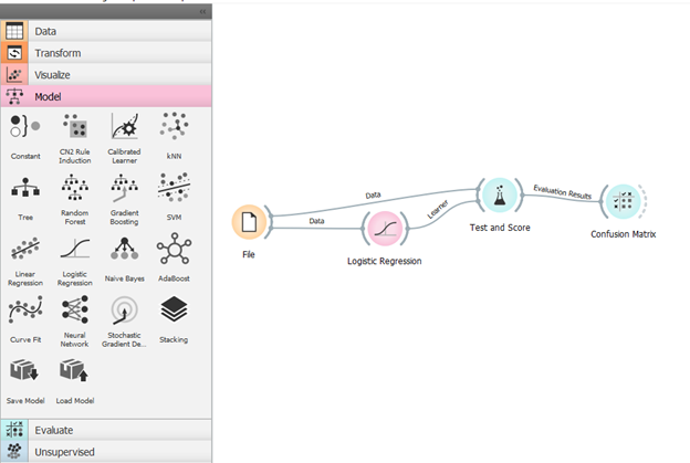
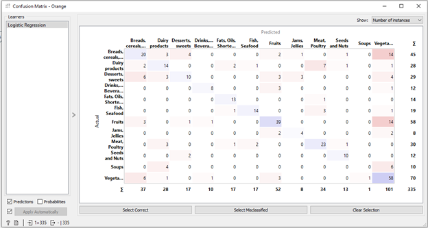
On the left side of the screen are different tabs that each contain a series of widgets related to the task at hand. By clicking on the specific widgets, a pop-up window appears that allows you to interact with the widget. In this particular workflow, the “file” widget is where I can upload the file I want to analyze (there are a lot of different formats you can upload too; in this case, I uploaded an Excel spreadsheet). From there, I chose the machine learning method that I wanted to use to classify the data. The third widget tests the data using the classification method, and compares it to the original data. Finally, the results are visualized through the “confusion matrix” widget to show which cases the machine learner accurately predicted and which ones it got wrong.
The Limitations
While Orange is a helpful tool for those without a coding background, this system also presents some limitations when it comes to performing certain types of data analysis. One way Orange tries to reconcile this is by providing a widget where the user can insert some Python script into the workflow. While this feature may be helpful for those with a coding background, it would not really impact those who do not have a coding background, thereby limiting the ways they can analyze data.
Additionally, although Orange can visualize data, there are not many features that allow users to adjust the visualization’s appearance. Such limitations may require exporting the data and using another tool to create a more accessible or visually appealing data visualization, but for now, Orange is quite limited in this capacity. As a result, Orange is an incredibly useful tool for basic data visualization but struggles with more advanced types of data science work that may require using other tools or programming to accomplish.
Final Remarks
If you are looking to get involved in data analysis but are just starting to develop an interest in coding, then Orange is a great tool to use. Unlike most data analysis programs, the user-designed interface of Orange makes it easy to perform basic types of data analysis through its widgets. It is far from perfect though, and a lack of a coding background is going to limit the ways you can analyze and visualize your data. Nevertheless, Orange can be an incredibly useful tool if you are just starting to learn how to code and looking to understand the basics of data science!