De-Stress with Scholarly Commons

The end of the semester is a stressful time with finals and preparing for the summer. During this time it is especially important to take care of your mental health and take some time for yourself. Here are some ways to relax using equipment from Scholarly Commons:

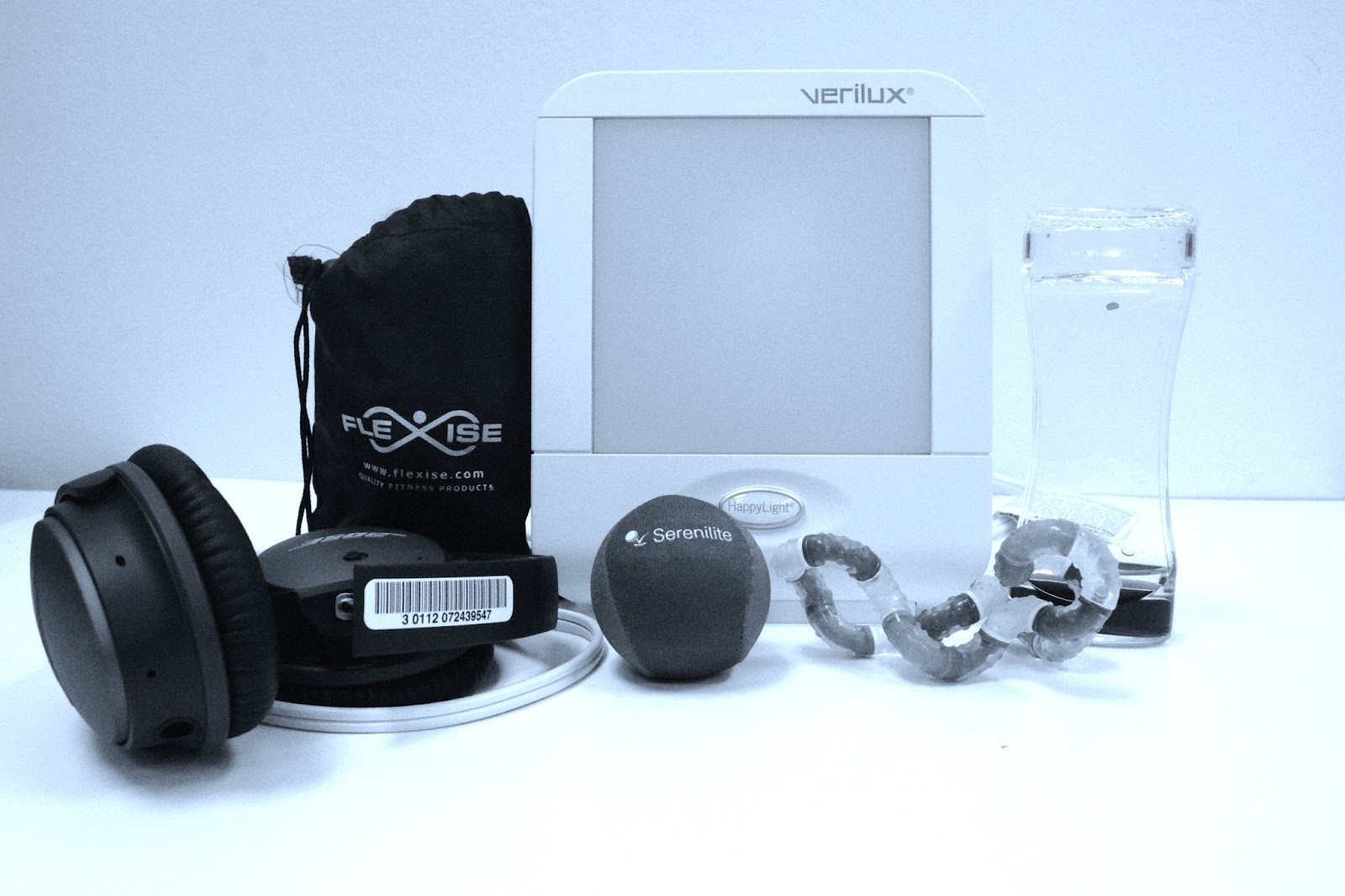
  1. Check out a Tranquility Kit to help with mental health during the stress of finals. This kit includes a Happy Light, headphones, exercise bands and an exercise guide, stress ball, and fidget toys. One of these kits is also available in the Orange Room on the first floor of the library. 
tranquility kit showing happy light, stress ball, fidget toys and headphones
Photo Credit: Media Commons
  1. Read a book on an Amazon Kindle. The Kindles have 4GB memory storage which is enough storage for thousands of books. 
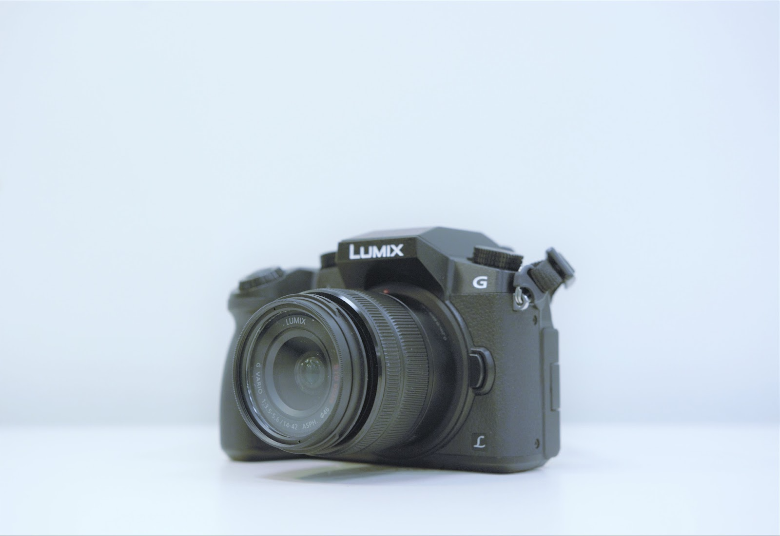
  2. Now that the weather is getting nice you can check out a camera and take a walk outside. Take pictures or videos of the campus or all the geese outside. 
image of Panasonic Lumix camera
Photo Credit: Media Commons
  1. Check out a projector and projector screen and watch a movie with friends.
  2. Try out our new Digital Drawing Kits with downloaded programs including Procreate, Sketchbook, Adobe Illustrator, Adult Coloring Book and Assembly.  
image of iPad with Apple Pencil
Photo Credit: Media Commons
  1. Check out Bluetooth speakers and headphones so that you can blast some music and have a dance party.
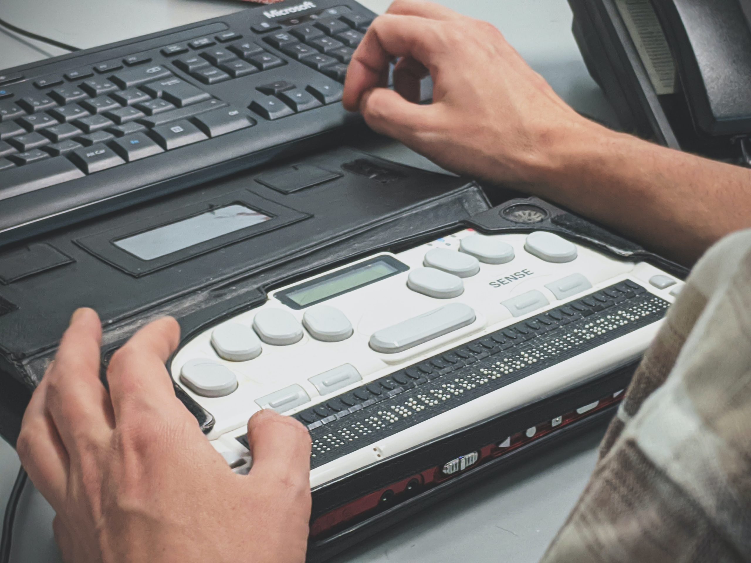
  2. Check out one of the sensory toys from the Orange Room while you study. Sensory toys available include a water wiggler, wacky tracks, and twisty tangles. Loanable technology from the Orange Room is available for two-hour check outs. 

Technology from Scholarly Commons is available for loans of up to 10 days. You can book in advance on the Scholarly Commons website or make a booking at the Tech Desk in room 306. To pick up equipment, make sure to bring a valid i-card. 

Good luck with finals! We’ll see you again next year!

Strategies for Accessible E-Learning

Why Teach Accessible Classes?

No matter if you’re teaching a full semester class or a one-off workshop, you will be teaching disabled learners, whether they disclose their disabilities or not. All of your students deserve an equitable learning experience and accessible practices eliminate barriers for all users.

man using a braille keyboard writer
Image by Sigmund on Unsplash

Web Content Accessibility Guidelines (WCAG)

One of the most important standards when it comes to accessibility on the web is the Web Content Accessibility Guidelines. These guidelines are split into four components: Perceivable, Operable, Understandable, and Robust, or POUR.

Perceivable

  • Everyone can identify your content not matter how they perceive information.
    • Use text, audio, and video alternatives for content.
    • Make your lessons adaptable for different student needs.

Operable

  • Learners should be able to navigate your course with ease.
    • Have large and obvious navigation buttons.
    • Give enough time or eliminate timed progression counters.
    • Make your content keyboard navigable.

Understandable

  • Content should be clear and concise.
    • Avoid using jargon and keep text content simple.
    • Use specific language: Instead of “click here” use “click next.”

Robust

  • Content can be accessed by assistive technologies (such as screen readers).
    • Make sure your content is compatible with assistive technology.
    • Update any dead links or finicky buttons.
    • Learners should be able to access course materials with reasonably outdated software.
a teacher with a student, pointing to something on a laptop
Image by Desola Lanre-Ologun on Unsplash

Best Practices

Now that I’ve gone over the basic web accessibility standards, here are some practical tips that use can use to make your class materials more accessible.

Course Structure

  • You want your course structure to be easily digestible, so break up lessons into manageable chunks.
  • Asynchronous courses are courses that allow learners to complete work and attend lectures at their own pace. You may want to consider some form of this to allow your students flexibility.

Text and Links

  • Headings and titles should be formatted properly. Instead of just bolding your text, use headings in numerical order. In Word, you can accomplish this by selecting Home > Styles and selecting the heading you want.
heading one and heading two in the Word styles interface

Images

  • Always include alt-text with your images. There will be different ways of doing this in different programs. Alt-text describes the image for users who cannot see it. For instance, in the alt-text I describe the image below as “a beagle with its tongue out.”
  • If the image is purely decorative, you can set it as such.
a beagle with its tongue out
Image by Milli on Unsplash

Videos

  • Videos should have error-free captioning. It can be useful to include a written transcription.
  • Video interfaces should be navigable using a keyboard (spacebar to start and stop).

Tables

  • Avoid using tables if you can, they can be challenging for screen readers to decipher.
  • Tables can be made accessible with proper web design. For a instructions on how to create accessible tables visit WebAIM’s Accessible Tables Guide.

Color Contrast

examples of good and bad color contrast
Image made with dopelycolors
  • Make sure that your content is readable, whatever colors you use. Avoid going wild: dark text on light backgrounds and light text on dark backgrounds are standard.
  • If you want to check your color contrast, try the WCAG Color Contrast Checker.
  • Avoid providing information that solely relies on the student being able to distinguish color i.e. red meaning “stop” and green meaning “go.”

Resources to Learn More

When it comes to accessible practices, there’s a lot of information to cover. If you want to learn more, here are some resources to get you started.

By working to make your classes accessible, you can create a better learning experience for all your students.

Unreadable: Challenges and Critical Pedagogy to Optical Character Recognition Software 

In the 21st century, Optical Character Recognition (OCR) software has fundamentally changed how we search for information. OCR is the process of taking images with text and making them searchable. The implications of OCR vary from allowing searchability on massive databases to promoting accessibility by making screen readers a possibility. While this is all incredibly helpful, it is not without fault, as there are still many challenges to the OCR process that create barriers for certain projects. There are also some natural limitations to using this software that especially have consequences for time-sensitive projects, but other factors within human control have negatively influenced the development of OCR technology in general. This blog post will explore two issues: the amount of human labor required on an OCR project and the Western biases of this kind of software. 

Some text in ABBYY FineReader. Not all of the appropriate text is contained within a box, indicating the human labor that needs to go in to correct this.
Public Domain Image

Human Labor Requirements 

While OCR can save an incredible amount of time, it is not a completely automated system. For printed documents from the 20th-21st century, most programs can guarantee a 95-99% accuracy rate. The same is not true, however, for older documents. OCR software works by recognizing pre-built characters the software was initially programmed to recognize. When a document does not follow that same pattern, the software cannot recognize it. Handwritten documents are a good example of this, in which the same letter may appear differently to the software, depending on how it was written. Some programs, such as ABBYY FineReader, have attempted to resolve this problem by incorporating a training program, which allows users to train the system to read specific types of handwriting. Even still, that training process requires human input, and there is still much work for individuals to put into ensuring that the processed document is accurate. As a result, OCR can be a time-consuming process that still requires plenty of human labor for a project.  

Western Biases  

Another key issue with the OCR process is the Western biases that went into the creation of the software. Many common OCR programs were designed to handle projects with Latinized scripts. While helpful for some projects, this left barriers to documents with non-Latinized scripts, particularly from languages commonly used outside the West. While advances have been made on this front, the advancements are still far behind that of Latinized scripts. For example, ABBYY FineReader is one of the few software programs that will scan in non-western languages, but it cannot incorporate its training program when those scripts aren’t Latinized. Adobe Acrobat can also scan documents with languages that use non-Latinized scripts, but its precision is less consistent than with those languages that do.  

An old version of ABBYY FineReader. The text scanned on the left is a language with a non-Latinized script. The right side shows a variety of errors due to the system's lack of knowledge of that language.
Photo Credit: Paul Tafford 

Addressing the Issues with OCR 

Although OCR has performed many amazing tasks, there is still much development needed when it comes to projects related to this aspect of scholarly research. One crucial component when considering taking on an OCR project is to recognize the limitations of the software and to account for that when determining the scope of your project. At this stage, OCR technology is certainly a time-saver and fundamentally changing the possibilities of scholarship, but without human input, these projects fail to make an impact. Likewise, recognizing the inequality of processing for non-western languages in some of the more prevalent OCR software (which several developers have looked to offset by creating OCR programs specifically catered to specific non-Latinized languages). Acknowledging these issues can help us consider the scope of various projects and also allow us to address these issues to make OCR a more accessible field.

Explore the Possibilities with ArcGIS StoryMaps

ArcGIS StoryMaps is a handy tool for combining narrative, images, and maps to present information in an engaging way. Organizations have used StoryMaps for everything from celebrating their conservation achievements on their 25th anniversary to exploring urban diversity in Prague. The possibilities are vast, which can be both exciting and intimidating for people who are just getting started. I want to share some of my favorite StoryMap examples, which will demonstrate how certain StoryMap tools can be used and hopefully provide inspiration for your project.

A Homecoming for Gonarezhou’s Black Rhinos

Screenshot of a storymap with text about and an image of rhinos.

If GIS and map creation are a bit outside your wheel-house, no worries! A Homecoming for Gonarezhou’s Black Rhinos is a StoryMap created by the Rhino Recovery Fund that is a great example of how a StoryMap can be made without using any maps. It’s also a good example of the timeline feature as well as making great use of a custom theme by incorporating the nonprofit’s signature pink into the story’s design.

Sounds of the Wild West

Screenshot of a storymap with text about and an image of the Yellowstone River.

Sounds of the Wild West is a StoryMap created by Acoustic Atlas that takes you on an audio tour of four different Montana ecosystems. This StoryMap is a lovely example of how powerful images and audio can immerse people in a location, enhancing their understanding of the information presented. The authors also made great use of the StoryMap sidecar, layering text, images, and audio to create their tour.

California’s Superbloom

Header of the California's Superbloom StoryMap

Speaking of beautiful photos, this StoryMap about California’s Superbloom is full of them! It’s a great example of the StoryMap image gallery and “swipe” tools. The StoryMap swipe tool allows you to juxtapose different maps or images, revealing the difference between, for example, historical and modern photos, or satellite imagery during different times of year in the same region.

The Surprising State of Africa’s Giraffes

Screenshot of The Surprising State of Africa’s Giraffes StoryMap with a map highlighting the habitat of the Northern Giraffe

The Surprising State of Africa’s Giraffes is a StoryMap created by ESRI’s StoryMaps team that demonstrates another great use for the sidecar. As users scroll through the sidecar pictured above, different regions of the map are highlighted in an almost animated effect. This not only provides geographic context to the information, but does so in a dynamic way. This StoryMap also includes a great example of an express map, which is an easy way to make an interactive map without any GIS experience or complicated software.

Map Tour Examples

StoryMaps also features a tool that allows you to take users on a tour around the world – or just around your hometown. The map tour comes in two forms: a guided tour, like the one exemplified in Crowded Skies, Expanding Airports; and an explorer tour, such as The Things that Stay with Us.

StoryMaps Gallery

There are so many different forms a StoryMap can take! To see even more possibilities, check out the StoryMaps Gallery to explore nearly a hundred different examples. If you’re ready to get your feet wet but want a bit more support, keep an eye on the Savvy Researcher calendar for upcoming StoryMap workshops at the UIUC Main Library.

HTML & CSS Games

Welcome back from Spring Break!

I’m fortunate to be taking Web Content Strategies & Management this semester with Dr. David Hopping. Here are some games and tools I learned about in class to help me practice my HTML and CSS knowledge. These games are helpful whether you’re just starting web development or looking to improve your skills.

Grid Garden

CSS Grid Garden Homepage

Grid Garden is a great way to practice placing items on a page using the CSS 2-dimensional grid layout. Water your carrots by moving the water placement on the grid using the grid-column-start property.

Flexbox Froggy

Flexbox Froggy Homepage

Flexbox Froggy teaches you how to justify items within a flexbox by writing CSS to move the frog to the lily pad.

CSS Diner

CSS Diner Homepage

When learning CSS, it’s essential to know how to select which specific items you want to change with your CSS code. In CSS diner, you can practice writing CSS selectors to select elements by their type.

CSS Challenges

CSS Challenges Homepage

See how far you can get in these CSS challenges! Try to copy the format shown in each example to progress.

W3 Schools

W3 Schools Homepage

For more resources on learning HTML, CSS, or other major web languages, visit W3Schools. This website has step-by-step lessons and tutorials for self-guided learning. If you get stuck on any of the previous games, W3 Schools might be able to help you figure it out.

These games and tools have helped me enjoy learning basic web development skills, I hope they help you have fun with the process too. Happy coding!

The University of Illinois Privacy Conference 2023

The Privacy Office, a team housed in the University of Illinois’s Technology Services geared towards data security and privacy for students, faculty, and staff, partnered with the Big Ten Academic Alliance to host their third annual Privacy Everywhere Conference and their first hybrid event. This conference, hosted at the Beckman Institute and conveyed over Zoom, focused on “Building Digital Trust,” diving into issues like understanding privacy issues as a layperson, higher education privacy initiatives, and digital surveillance.

In our current societal climate, internet use is ubiquitous and impossible to avoid if you want to be a part of social life. The Privacy Conference provided the opportunity for attendees to learn how “decisions about privacy affect our professional, educational, and personal lives.” I attended this event to educate myself on how data practices, policies, and ethics affect my autonomy and what I can do to protect my privacy.

Privacy Everywhere Logo
© Technology Services, Privacy & Cybersecurity

Conference points that stayed with me:

  • Data Minimization Principle – minimizing data collection and deleting data instead of storing, sharing, and selling it.  
  • Patron Burden – we are expected as service users to know all the proper steps and practices to protect our data, even when “Terms and Conditions” and service systems are purposely opaque.
  • Digital Surveillance & Legislation –  state legislation is focused on protecting children, leaving a loophole for law enforcement and companies to share and retain information
  • Awareness – as a layperson, there is a lot I don’t know about protecting my data, but I attended this conference to learn. Look into your state legislation on data protection and privacy and share the information you’ve learned with your circle.

If you missed the conference, you can watch the recording of each session via MediaSpace, if you’re affiliated with the University of Illinois. Be on the lookout for the 2024 conference. The conference welcomes university students, faculty, and staff!

Tech Teaching: Pedagogies for Teaching Technology and other Software Tools to Learners

When I began my role as a graduate assistant at the Scholarly Commons, my background in technology was extremely limited. As I have worked in this space, however, I have not only had the opportunity to learn how to use technology myself but teach others how to use these same tools through consultations and workshops. As technology begins to encompass more of our lives, I wanted to share a few tips for providing instruction focused on digital technology and software. While these pedagogies also apply to other teaching contexts, specific examples in this post will cater to digital technology.

Photo of two people working together on laptops.
Photo Credit: Christina Morillo

Active Learning

A crucial component of learning technology is allowing learners to directly engage with the technology they are looking to understand. By having direct engagement with the tool, learners will have a better grasp of how that tool works instead of just hearing about its functions in the abstract. If possible, it is highly encouraged that the instructional session has users access the technology or software they are learning, so that they can follow along as they experience how to navigate the tool. If that is not possible though, a few other alternatives may include watching the tool work from either the instructor conducting a live demonstration or finding a video directly showing the technology at work.

Scaffolding

Since technology is often complex, it is very easy for learners to feel overwhelmed by the sheer number of options and possibilities of what certain resources can do. Scaffolding as an instructional concept is a practice of designing a lesson that segments information into smaller sections that build upon each other. When providing instruction for a software program, for example, scaffolding may look like first helping users navigate the options of the tool, following that up with a basic function of the program, then performing a more complex task. Each of these steps is meant to build on one another and guide the learner by both showing them new aspects of the topic while incorporating previously acquired knowledge.

Photo of two people in front of a computer, with one older person guiding the hand of the younger person.
Photo Credit: August de Richelieu

Inclusive Learning

While inclusivity is valued in every learning environment, it is especially vital that instructors provide inclusive environments for teaching digital technology. Neglecting these principles will ultimately create barriers for certain users learning new technology. For general instruction sessions, applying universal design models will help streamline the process so that the session is accessible and meaningful for all types of learners. Considerations for font size when presenting to a workshop/classroom setting, for example, often help those with visual impairments follow along more easily, whereas not taking these considerations makes the learning process more difficult for them. Accommodating specific needs also helps to create an equitable environment that fosters learning for those whose needs may not be accounted for otherwise.

Using These Pedagogies in Personal Learning

Even if you are not planning on teaching others how to use technology, these same methods can also help you learn. Finding opportunities to engage with a particular tool hands-on will help you learn how to use it, rather than just reading articles abstractly about it. Likewise, breaking the content into smaller sections will help prevent overloading and help you progress in mastery of the tool. Finally, recognizing your needs as a learner and finding tools that are relevant to your needs will lift certain barriers to learning certain technologies. As you seek to learn and teach new technology, be creative and have fun with it!

Spaces Highlight: Interview in a Self-Use Media Booth

Media booth interior

Getting an interview is both exciting and nerve-wracking. While I was excited for the opportunity, I knew I would have to deal with the stressors involved with interviewing on Zoom: what to say, what to wear, and where to do the interview. I wanted a place where I could be sure I would not be interrupted, would not have to deal with loud noises, and that would look professional to the interviewers. I decided to take advantage of my workplace’s resources and try out the self-use media studios in Scholarly Commons. I made my appointment on the Scholarly Commons website

The self-use media studios are sound isolation booths with features including two Shure MV7 microphones, Insta360 4k Webcam, LED light banks, three large screens, mac studio, headphones, powered speakers, and Stream Deck. The studios are designed for video recording, podcasting, oral histories, streaming, interviews, video editing, and more. 

I checked into the booth thirty minutes before the start of my interview. The signs posted around the booth told me how to log in, control the audio, and adjust the camera to follow my movements. I experienced a small challenge, when I could not figure out how to get the camera to turn on. But, with the help of Scholarly Commons staff I was able to begin my interview on time and confident in both myself and the technology I was using. 

One of the first things the interviewers asked me was where I was zooming in from. They were extremely impressed with the set up and the professional setting helped me to stand out as a candidate. I felt comfortable speaking at a regular volume, trusting that those outside could not hear what I was saying as I could not hear anything from outside of the booth. The audio was clear on both my side and the interviewers’. 

If you are using the media studios for the first time, you might find these tips helpful: 

  1. Book in advance- the booths are first-come, first-serve and can fill up quickly
  2. Make your booking earlier than your meeting so that you have time to set up and be prepared in case of any challenges
  3. Make sure to read all the signage as they have instructions, helpful tips, and images which help make the booths easier to navigate
  4. If you are having difficulty, ask a staff member as they are happy to help

I found the self-use media studios in Scholarly Commons to be an excellent place to do my interview. If you have an interview coming up or a project that would benefit from the use of an audio booth, I would highly recommend booking one of the media studios. 

Making Infographics in Canva: a Guide and Review

Introduction

If you’ve ever had to design a poster for class, you’re probably familiar with Canva. This online and app-based graphic design tool, with free and subscription-based versions, features a large selection of templates and stock graphics that make it pretty easy to create decent-looking infographics. While it is far from perfect, the ease of use makes Canva worth trying out if you want to add a bit of color and fun to your data presentation.

Getting Started

Starting with a blank document can be intimidating, especially for someone without any graphic design experience. Luckily, Canva has a bunch of templates to help you get started.

Canva infographic templates

I recommend picking a template based on the color scheme and general aesthetic. It’s unlikely you’ll find a template that looks exactly how you want, so you can think of a template as a selection of colors, fonts, and graphics to use in your design, rather than something to just copy and paste things into. For example, see the image below – I recently used the template on the left to create the infographic on the right.

An infographic template compared to the resulting infographic

General Design Principles

Before you get started on your infographic, it’s important to remember some general design guidelines:

  1. Contrast. High levels of contrast between your background and foreground help keep everything legible.
  2. Simplicity. Too many different colors and fonts can be an eyesore. Stick to no more than two fonts at a time.
  3. Space. Leave whitespace to keep things from looking cluttered.
  4. Alignment and balance. People generally enjoy looking at things that are lined up neatly and don’t have too much visual weight on one side or another.
An exaggerated example of a design that ignores the above advice.

Adding Graphs and Graphics

Now that you have a template in hand and graphic design principles in mind, you can start actually creating your infographic. Under “Elements,” Canva includes several types of basic charts. Once you’ve added a chart to your graphic, you can edit the data associated with the chart directly in the provided spreadsheet, by uploading a csv file, or by linking to a google spreadsheet.

Canva interface for creating charts

The settings tab allows you to decide whether you want the chart to include a legend or labels. The options bar at the top allows for further customization of colors and bar or dot appearance. Finally, adding a few simple graphics from Canva’s library such as shapes and icons can make your infographic more interesting. 

Examples of charts available in Canva, with a variety of customizations.

Limitations and Frustrations

The main downsides to Canva are the number of features locked behind a paywall and the inability to see only the free options. Elements cannot be filtered by price and it seems that more and more graphics are being claimed by Canva Pro, so searching for graphics can be frustrating. Templates can be filtered, but it will still bring up results where the template itself is free, but there are paid elements within the template. So, you might choose a template based on a graphic that you really like, only to find out that you need a Canva Pro subscription to include that graphic.

The charts in Canva also have limitations. Pie charts do not allow for the selection of colors for each individual slice; you have to pick one color, and Canva will generate the rest. However, if you want to have more control over your charts, or wish to include more complicated data representations, you can upload charts to Canva, which even supports transparency.

Conclusion

As mentioned above, Canva has its downsides. However, Canva’s templates, graphics, and charts still make it a super useful tool for creating infographics that are visually appealing. Try it out the next time you need to present some data!

Drawing People: Practicing the Human Figure with Open Resources

It’s Open Access Week! Every year this international event brings the academic community together to discuss the benefits of free and immediate access to information, especially scholarly resources.

This week, I’ll be sharing open (and semi-open) resources for artists. When I’m not at the library desk, I like to draw, and I’m always on the hunt for high quality reference images. When learning how to draw people, you’ll often have to figure out a pose without the help of live models. References, however, are not always free or easy to find. Here some of the resources that I’ve found helpful over the years.

Practice and Reference

Line of Action

Provides both nude and clothed photos for study. Artists can start a drawing session by choosing the kinds of models, and the time intervals between photos. There are also posts here that give advice for improving your technique.

Bodies in Motion

This collection of motion images provides rapid sequence photographs of athletes and dancers. These images are a good way to study how the human body moves. Most of this content is only available with a subscription, but there are some free sequences. When browsing a section, click the “free” tab on the right-hand side of the page.

AdorkaStock

This stock photo collection has models with plenty of different body types. There are some fun poses in here: from fantasy to action, to sci-fi settings. All models are wearing clothing or flesh-tone bodysuits, so no need to worry about using it in a public space.

Sketch Daily

Provides a variety of photos in timed study sessions. You can choose to practice bodies, hands, feet, heads, or animals and structures. It’s a good tool for warm-up drawing with no fuss.

The Book of a Hundred Hands by George B. Bridgman

This book depicts musculature and examples of drawn hands in different positions. It can help you to focus-in on your hand drawing skills.

Figure Drawing for All It’s Worth by Andrew Loomis

Okay, so this one is from the 40’s and it shows; the majority of nude female figures are still sporting high heels. However, Loomis still offers many helpful tips. It contains an exhaustive instruction of perspective, musculature, the mechanics of motion, shading and lighting as well as exercises for practice.

Gesture Drawing

Gesture Drawing – The Ultimate Guide for Beginners

Practicing with the gesture technique can help you break out of “stiff” poses and figure out how to imbue your figures with character and expression. This guide contains an overview of gesture, videos of instruction, and a list of books on gesture.

Clothing

We Wear Culture

A good fashion reference site that showcases clothing through time and around the world. The information here gives context for clothing, bios of fashion icons, overviews of fashion movements, and the history of clothing items. It’s a good tool to inspire clothing design for the people and characters you draw.

History of Costume

You’ll have to create a free account on the Internet Archive to view this one. It’s a collection of costume plates from the 19th century. There are later editions of this book available, but this edition still contains original clothing pattern drafts.

Instruction

Love, Life, Drawing

This website provides free tutorials and podcasts on drawing topics with a focus on human figures. Sign up for the free “fresh eyes” drawing challenge, a ten-day course that teaches students to identify gesture and structure of the form.

FZD School

This resource isn’t human-figure specific but these videos are great resources for learning how to draw and design. Try “EP 30: Character Silhouettes” to buff up your character illustration skills. This channel is especially good for creatives interested in comics or illustration.

Muddy Colors

Muddy Colors posts helpful tips on all kinds of art topics from over 20 practicing artists. The site hosts paid classes from their contributing artists, but there is plenty of free advice here too.

Additional Resources

Character Design References

An independent website that showcases concept art from animation, games, and comics. There’s a little bit of everything here. I’d recommend checking out their visual library. There are anatomical references, character/creature design references, vehicles, props, and lighting/color tutorials.

Met Publications

The New York Met Gallery offers 609 publications of art, photography, sculpture and more, all free for download. This is an excellent place to find inspiration.

Happy Drawing!