Explore the Possibilities with ArcGIS StoryMaps

ArcGIS StoryMaps is a handy tool for combining narrative, images, and maps to present information in an engaging way. Organizations have used StoryMaps for everything from celebrating their conservation achievements on their 25th anniversary to exploring urban diversity in Prague. The possibilities are vast, which can be both exciting and intimidating for people who are just getting started. I want to share some of my favorite StoryMap examples, which will demonstrate how certain StoryMap tools can be used and hopefully provide inspiration for your project.

A Homecoming for Gonarezhou’s Black Rhinos

Screenshot of a storymap with text about and an image of rhinos.

If GIS and map creation are a bit outside your wheel-house, no worries! A Homecoming for Gonarezhou’s Black Rhinos is a StoryMap created by the Rhino Recovery Fund that is a great example of how a StoryMap can be made without using any maps. It’s also a good example of the timeline feature as well as making great use of a custom theme by incorporating the nonprofit’s signature pink into the story’s design.

Sounds of the Wild West

Screenshot of a storymap with text about and an image of the Yellowstone River.

Sounds of the Wild West is a StoryMap created by Acoustic Atlas that takes you on an audio tour of four different Montana ecosystems. This StoryMap is a lovely example of how powerful images and audio can immerse people in a location, enhancing their understanding of the information presented. The authors also made great use of the StoryMap sidecar, layering text, images, and audio to create their tour.

California’s Superbloom

Header of the California's Superbloom StoryMap

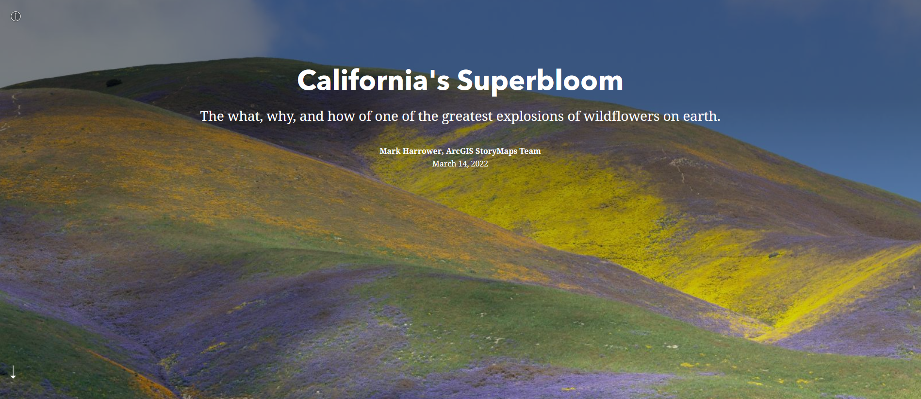
Speaking of beautiful photos, this StoryMap about California’s Superbloom is full of them! It’s a great example of the StoryMap image gallery and “swipe” tools. The StoryMap swipe tool allows you to juxtapose different maps or images, revealing the difference between, for example, historical and modern photos, or satellite imagery during different times of year in the same region.

The Surprising State of Africa’s Giraffes

Screenshot of The Surprising State of Africa’s Giraffes StoryMap with a map highlighting the habitat of the Northern Giraffe

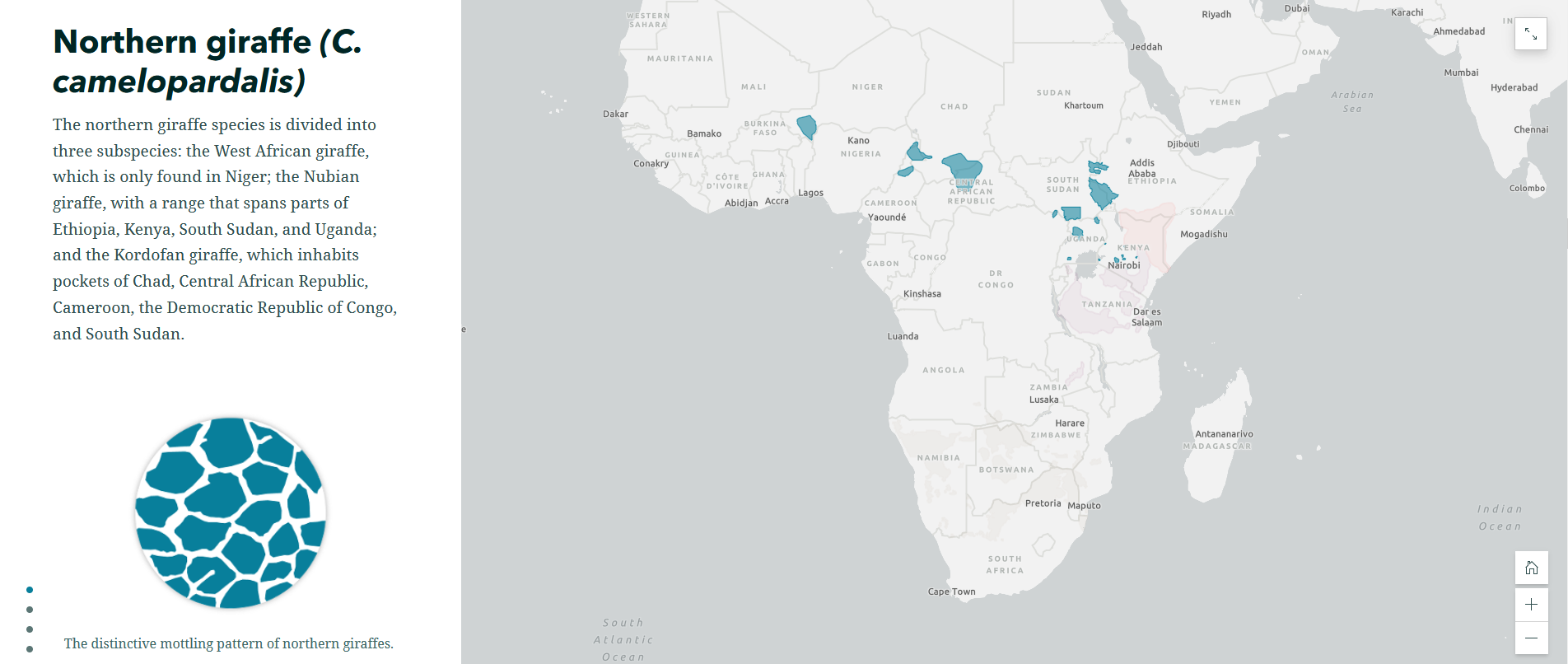
The Surprising State of Africa’s Giraffes is a StoryMap created by ESRI’s StoryMaps team that demonstrates another great use for the sidecar. As users scroll through the sidecar pictured above, different regions of the map are highlighted in an almost animated effect. This not only provides geographic context to the information, but does so in a dynamic way. This StoryMap also includes a great example of an express map, which is an easy way to make an interactive map without any GIS experience or complicated software.

Map Tour Examples

StoryMaps also features a tool that allows you to take users on a tour around the world – or just around your hometown. The map tour comes in two forms: a guided tour, like the one exemplified in Crowded Skies, Expanding Airports; and an explorer tour, such as The Things that Stay with Us.

StoryMaps Gallery

There are so many different forms a StoryMap can take! To see even more possibilities, check out the StoryMaps Gallery to explore nearly a hundred different examples. If you’re ready to get your feet wet but want a bit more support, keep an eye on the Savvy Researcher calendar for upcoming StoryMap workshops at the UIUC Main Library.

HTML & CSS Games

Welcome back from Spring Break!

I’m fortunate to be taking Web Content Strategies & Management this semester with Dr. David Hopping. Here are some games and tools I learned about in class to help me practice my HTML and CSS knowledge. These games are helpful whether you’re just starting web development or looking to improve your skills.

Grid Garden

CSS Grid Garden Homepage

Grid Garden is a great way to practice placing items on a page using the CSS 2-dimensional grid layout. Water your carrots by moving the water placement on the grid using the grid-column-start property.

Flexbox Froggy

Flexbox Froggy Homepage

Flexbox Froggy teaches you how to justify items within a flexbox by writing CSS to move the frog to the lily pad.

CSS Diner

CSS Diner Homepage

When learning CSS, it’s essential to know how to select which specific items you want to change with your CSS code. In CSS diner, you can practice writing CSS selectors to select elements by their type.

CSS Challenges

CSS Challenges Homepage

See how far you can get in these CSS challenges! Try to copy the format shown in each example to progress.

W3 Schools

W3 Schools Homepage

For more resources on learning HTML, CSS, or other major web languages, visit W3Schools. This website has step-by-step lessons and tutorials for self-guided learning. If you get stuck on any of the previous games, W3 Schools might be able to help you figure it out.

These games and tools have helped me enjoy learning basic web development skills, I hope they help you have fun with the process too. Happy coding!

A Brief Explanation of GitHub for Non-Software-Developers

GitHub is a platform mostly used by software developers for collaborative work. You might be thinking “I’m not a software developer, what does this have to do with me?” Don’t go anywhere! In this post I explain what GitHub is and how it can be applied to collaborative writing for non-programmers. Who knows, GitHub might become your new best friend.

Gif of a cat typing

You don’t need to be a computer wiz to get Git.

Picture this: you and some colleagues have similar research interests and want to collaborate on a paper. You have divided the writing work to allow each of you to work on a different element of the paper. Using a cloud platform like Google Docs or Microsoft Word online you compile your work, but things start to get messy. Edits are made on the document and you are unsure who made them or why. Elements get deleted and you do not know how to retrieve your previous work. You have multiple files saved on your computer with names like “researchpaper1.dox”, “researchpaper1 with edits.dox” and “research paper1 with new edits.dox”. Managing your own work is hard enough but when collaborators are added to the mix it just becomes unmanageable. After a never ending reply-all email chain and what felt like the longest meeting of all time, you and your colleagues are finally on the same page about the writing and editing of your paper. It just makes you think, there has got to be a better way to do this. Issues with collaboration are not exclusive to writing, they happen all the time in programming, which is why software-developers came up with version control systems like Git and GitHub.

Gif of Spongebob running around an office on fire with paper and filing cabinets on the floor

Managing versions of your work can be stressful. Don’t panic because GitHub can help.

GitHub allows developers to work together through branching and merging. Branching is the process by which the original file or source code is duplicated into clone files. These clones contain all the elements already in the original file and can be worked in independently. Developers use these clones to write and test code before combining it with the original code. Once their version of the code is ready they integrate or “push” it into the source code in a process called merging. Then, other members of the team are alerted of these changes and can “pull” the merged code from the source code into their respective clones. Additionally, every version of the project is saved after changes are made, allowing users to consult previous versions. Every version of your project is saved with with descriptions of what changes were made in that particular version, these are called commits. Now, this is a simplified explanation of what GitHub does but my hope is that you now understand GitHub’s applications because what I am about to say next might blow your mind: GitHub is not just for programmers! You do not need to know any coding to work with GitHub. After all, code and written language are very similar.

Even if you cannot write a single line of code, GitHub can be incredibly useful for a variety of reasons:
1. It allows you to electronically backup your work for free.
2. All the different versions of your work are saved separately, allowing you to look back at previous edits.
3. It alerts all collaborators when a change is made and they can merge that change into their own versions of the text.
4. It allows you to write using plain text, something commonly requested by publishers.

Hopefully, if you’ve made it this far into the article you’re thinking, “This sounds great, let’s get started!” For more information on using GitHub you can consult the Library’s guide on GitHub or follow the step by step instructions on GitHub’s Hello-World Guide.

Gif of man saying "check it out" and pointing to the right.

There are many resources on getting started with GitHub. Check them out!

Here are some links to what others have said about using GitHub for non-programmers:

An Introduction to Google MyMaps

Geographic information systems (GIS) are a fantastic way to visualize spatial data. As any student of geography will happily explain, a well-designed map can tell compelling stories with data which could not be expressed through any other format. Unfortunately, traditional GIS programs such as ArcGIS and QGIS are incredibly inaccessible to people who aren’t willing or able to take a class on the software or at least dedicate significant time to self-guided learning.

Luckily, there’s a lower-key option for some simple geospatial visualizations that’s free to use for anybody with a Google account. Google MyMaps cannot do most of the things that ArcMap can, but it’s really good at the small number of things it does set out to do. Best of all, it’s easy!

How easy, you ask? Well, just about as easy as filling out a spreadsheet! In fact, that’s exactly where you should start. After logging into your Google Drive account, open a new spreadsheet in Sheets. In order to have a functioning end product you’ll want at least two columns. One of these columns will be the name of the place you are identifying on the map, and the other will be its location. Column order doesn’t matter here- you’ll get the chance later to tell MyMaps which column is supposed to do what. Locations can be as specific or as broad as you’d like. For example, you could input a location like “Canada” or “India,” or you could choose to input “1408 W. Gregory Drive, Urbana, IL 61801.” The catch is that each location is only represented by a marker indicating a single point. So if you choose a specific address, like the one above, the marker will indicate the location of that address. But if you choose a country or a state, you will end up with a marker located somewhere over the center of that area.

So, let’s say you want to make a map showing the locations of all of the libraries on the University of Illinois’ campus. Your spreadsheet would look something like this:

Sample spreadsheet

Once you’ve finished compiling your spreadsheet, it’s time to actually make your map. You can access the Google MyMaps page by going to www.google.com/mymaps. From here, simply select “Create a New Map” and you’ll be taken to a page that looks suspiciously similar to Google Maps. In the top left corner, where you might be used to typing in directions to the nearest Starbucks, there’s a window that allows you to name your map and import a spreadsheet. Click on “Import,”  and navigate through Google Drive to wherever you saved your spreadsheet.

When you are asked to “Choose columns to position your placemarks,” select whatever column you used for your locations. Then select the other column when you’re prompted to “Choose a column to title your markers.” Voila! You have a map. Mine looks like this:  

Michael's GoogleMyMap

At this point you may be thinking to yourself, “that’s great, but how useful can a bunch of points on a map really be?” That’s a great question! This ultra-simple geospatial visualization may not seem like much. But it actually has a range of uses. For one, this type of visualization is excellent at giving viewers a sense of how geographically concentrated a certain type of place is. As an example, say you were wondering whether it’s true that most of the best universities in the U.S. are located in the Northeast. Google MyMaps can help with that!

Map of best universities in the United States

This map, made using the same instructions detailed above, is based off of the U.S. News and World Report’s 2019 Best Universities Ranking. Based on the map, it does in fact appear that more of the nation’s top 25 universities are located in the northeastern part of the country than anywhere else, while the West (with the notable exception of California) is wholly underrepresented.

This is only the beginning of what Google MyMaps can do: play around with the options and you’ll soon learn how to color-code the points on your map, add labels, and even totally change the appearance of the underlying base map. Check back in a few weeks for another tutorial on some more advanced things you can do with Google MyMaps!

Try it yourself!

Exploring Data Visualization #2

In this monthly series, I share a combination of cool data visualizations, useful tools and resources, and other visualization miscellany. The field of data visualization is full of experts who publish insights in books and on blogs, and I’ll be using this series to introduce you to a few of them. You can find previous posts by looking at the Exploring Data Visualization tag.

Welcome back to this blog series! Here are some of the things I read in March:

Chart showing that the sons of black families from the top 1 percent had about the same chance of being incarcerated on a given day as the sons of white families earning $36,000

From The New York Times, “Extensive Data Shows Punishing Reach of Racism for Black Boys”

1) The New York Times took data from a recent study about income inequality and designed a variety of compelling data visualizations. The article text and the visualizations complement each other to convey the pervasive insidiousness of racism, especially for black boys.

A chart legend with the categories

From Elijah Meeks, “Color Advice for Data Visualization with D3.js”

2) D3.js is an open JavaScript library that you can use to visualize data. A data visualization engineer at Netflix (what an interesting job!), Elijah Meeks provides some great advice when picking your colors in D3. More importantly, these tips are helpful no matter what visualization tool you use.

A demonstration of selecting bins for histograms, showing too few, too many, and just the right number

From Mikhail Popov, “Plotting the Course Through Charted Waters”

3) Want to learn some data visualization basics? Mikhail Popov from Wikimedia conducted a data visualization literacy workshop for Wikimedia Foundation’s All Hands 2018 staff conference, and he made the entire workshop available online.

I hope you enjoyed this data visualization news! If you have any data visualization questions, please feel free to email me and set up an appointment at the Scholarly Commons.

Preparing Your Data for Topic Modeling

In keeping with my series of blog posts on my research project, this post is about how to prepare your data for input into a topic modeling package. I used Twitter data in my project, which is relatively sparse at only 140 characters per tweet, but the principles can be applied to any document or set of documents that you want to analyze.

Topic Models:

Topic models work by identifying and grouping words that co-occur into “topics.” As David Blei writes, Latent Dirichlet allocation (LDA) topic modeling makes two fundamental assumptions: “(1) There are a fixed number of patterns of word use, groups of terms that tend to occur together in documents. Call them topics. (2) Each document in the corpus exhibits the topics to varying degree. For example, suppose two of the topics are politics and film. LDA will represent a book like James E. Combs and Sara T. Combs’ Film Propaganda and American Politics: An Analysis and Filmography as partly about politics and partly about film.”

Topic models do not have any actual semantic knowledge of the words, and so do not “read” the sentence. Instead, topic models use math. The tokens/words that tend to co-occur are statistically likely to be related to one another. However, that also means that the model is susceptible to “noise,” or falsely identifying patterns of cooccurrence if non-important but highly-repeated terms are used. As with most computational methods, “garbage in, garbage out.”

In order to make sure that the topic model is identifying interesting or important patterns instead of noise, I had to accomplish the following pre-processing or “cleaning” steps.

  • First, I removed the punctuation marks, like “,.;:?!”. Without this step, commas started showing up in all of my results. Since they didn’t add to the meaning of the text, they were not necessary to analyze.
  • Second, I removed the stop-words, like “I,” “and,” and “the,” because those words are so common in any English sentence that they tend to be over-represented in the results. Many of my tweets were emotional responses, so many authors wrote in the first person. This tended to skew my results, although you should be careful about what stop words you remove. Simply removing stop-words without checking them first means that you can accidentally filter out important data.
  • Finally, I removed too common words that were uniquely present in my data. For example, many of my tweets were retweets and therefore contained the word “rt.” I also ended up removing mentions to other authors because highly retweeted texts tended to mean that I was getting Twitter user handles as significant words in my results.

Cleaning the Data:

My original data set was 10 Excel files of 10,000 tweets each. In order to clean and standardize all these data points, as well as combining my file into one single document, I used OpenRefine. OpenRefine is a powerful tool, and it makes it easy to work with all your data at once, even if it is a large number of entries. I uploaded all of my datasets, then performed some quick cleaning available under the “Common Transformations” option under the triangle dropdown at the head of each column: I changed everything to lowercase, unescaped HTML characters (to make sure that I didn’t get errors when trying to run it in Python), and removed extra white spaces between words.

OpenRefine also lets you use regular expressions, which is a kind of search tool for finding specific strings of characters inside other text. This allowed me to remove punctuation, hashtags, and author mentions by running a find and replace command.

  • Remove punctuation: grel:value.replace(/(\p{P}(?<!’)(?<!-))/, “”)
    • Any punctuation character is removed.
  • Remove users: grel:value.replace(/(@\S*)/, “”)
    • Any string that begins with an @ is removed. It ends at the space following the word.
  • Remove hashtags: grel:value.replace(/(#\S*)/,””)
    • Any string that begins with a # is removed. It ends at the space following the word.

Regular expressions, commonly abbreviated as “regex,” can take a little getting used to in order to understand how they work. Fortunately, OpenRefine itself has some solid documentation on the subject, and I also found this cheatsheet valuable as I was trying to get it work. If you want to create your own regex search strings, regex101.com has a tool that lets you test your expression before you actually deploy it in OpenRefine.

After downloading the entire data set as a Comma Separated Value (.csv) file, I then used the Natural Language ToolKit (NLTK) for Python to remove stop-words. The code itself can be found here, but I first saved the content of the tweets as a single text file, and then I told NLTK to go over every line of the document and remove words that are in its common stop word dictionary. The output is then saved in another text file, which is ready to be fed into a topic modeling package, such as MALLET.

At the end of all these cleaning steps, my resulting data is essentially composed of unique nouns and verbs, so, for example, @Phoenix_Rises13’s tweet “rt @drlawyercop since sensible, national gun control is a steep climb, how about we just start with orlando? #guncontrolnow” becomes instead “since sensible national gun control steep climb start orlando.” This means that the topic modeling will be more focused on the particular words present in each tweet, rather than commonalities of the English language.

Now my data is cleaned from any additional noise, and it is ready to be input into a topic modeling program.

Interested in working with topic models? There are two Savvy Researcher topic modeling workshops, on December 6 and December 8, that focus on the theory and practice of using topic models to answer questions in the humanities. I hope to see you there!

Twine Review

Twine is a tool for digital storytelling platform originally created by Baltimore-based programmer Chris Klimas back in 2009. It’s also a very straightforward turn-based game creation engine typically used for interactive fiction.

Now, you may be thinking to yourself, “I’m a serious researcher who don’t got no time for games.” Well, games are increasingly being recognized as an important part of digital pedagogy in libraries, at least according to this awesome digital pedagogy LibGuide from University of Toronto. Plus, if you’re a researcher interested in presenting your story in a nonlinear way, letting readers explore the subject at their own pace and based on what they are interested in, this could be the digital scholarship platform for you! Twine is a very easy-to-use tool, and allows you to incorporate links to videos and diagrams as well. You can also create interactive workflows and tutorials for different subjects. It’s also a lot of fun, something I don’t often say about the tools I review for this blog.

Twine is open source and free. Currently, there are three versions of Twine maintained by different repositories.There is already a lot of documentation and tutorials available for Twine so I will not be reinventing the wheel, but rather showing some of Twine’s features and clarifying things that I found confusing. Twine 1 still exists and there are certain functions that are only possible there; however, we are going to be focusing on Twine 2, which is newer and updated.

Twine 2

An example of a story on Twine

What simple Twine games look like. You would click on a linked blue or purple text to go to the next page of the story.

The Desktop version is identical to the online version; however, stories are a lot less likely to be inadvertently deleted on the desktop version. If you want to work on stories offline, or often forget to archive, you may prefer this option.

Desktop version of Twine


Story editor in Twine 2, Desktop edition with all your options for each passage. Yes I named the story Desktop Version of Twine.

You start with an Untitled passage, which you can change the title and content of. Depending on the version of Twine you have set up, you write in a  text-based coding language, and connect the passages of your story using links written between brackets like [[link]] that automatically generate a new passage. There are ways to hide the destination. More advanced users can add logic-based elements such as “if” statements in order to create games.

You cannot install the desktop version on the computers in Scholarly Commons, so let’s look at the browser version. Twine will give you reminders, but it’s always important to know that if you clear your browser files while working on a Twine project, you will lose your story. However, you can archive your file as an HTML document to ensure that you can continue to access it. We recommend that you archive your files often.

Here’s a quick tutorial on how to archive your stories. Step 1: Click the “Home” icon.

Twine editor with link to home menu circled


Click “Archive”

Arrow pointing at archive in main Twine menu

This is also where you can start or import stories.

Save Your File

Save archive file in Twine for browser

Note: You should probably  move the file from Downloads and paste it somewhere more stable, such as a flashdrive or the Cloud.

When you are ready to start writing again you can import your story file, which will have been saved as an HTML document. Also, keep in mind if you’re using a public or shared computer, Twine is based on the browser, so it will be accessible to whoever is using the browser.

And if you’re interested in interactive fiction or text-based games, there are a lot of platforms you might want to explore in addition to Twine such as: http://inform7.com/ and https://textadventures.co.uk/  and http://www.inklestudios.com/inklewriter/ 

Let us know in the comments your thoughts on Twine and similar platforms as well as the role of games and interactive fiction in research!

Finding Digital Humanities Tools in 2017

Here at the Scholarly Commons we want to make sure our patrons know what options are out there for conducting and presenting their research. The digital humanities are becoming increasingly accepted and expected. In fact, you can even play an online game about creating a digital humanities center at a university. After a year of exploring a variety of digital humanities tools, one theme has emerged throughout: taking advantage of the capabilities of new technology to truly revolutionize scholarly communications is actually a really hard thing to do.  Please don’t lose sight of this.

Finding digital humanities tools can be quite challenging. To start, many of your options will be open source tools that you need a server and IT skills to run ($500+ per machine or a cloud with slightly less or comparable cost on the long term). Even when they aren’t expensive be prepared to find yourself in the command line or having to write code, even when a tool is advertised as beginner-friendly.

Mukurtu Help Page Screen Shot

I think this has been taken down because even they aren’t kidding themselves anymore.

There is also the issue of maintenance. While free and open source projects are where young computer nerds go to make a name for themselves, not every project is going to have the paid staff or organized and dedicated community to keep the project maintained over the years. What’s more, many digital humanities tool-building projects are often initiatives from humanists who don’t know what’s possible or what they are doing, with wildly vacillating amounts of grant money available at any given time. This is exacerbated by rapid technological changes, or the fact that many projects were created without sustainability or digital preservation in mind from the get-go. And finally, for digital humanists, failure is not considered a rite of passage to the extent it is in Silicon Valley, which is part of why sometimes you find projects that no longer work still listed as viable resources.

Finding Digital Humanities Tools Part 1: DiRT and TAPoR

Yes, we have talked about DiRT here on Commons Knowledge. Although the Digital Research Tools directory is an extensive resource full of useful reviews, over time it has increasingly become a graveyard of failed digital humanities projects (and sometimes randomly switches to Spanish). DiRT directory itself  comes from Project Bamboo, “… a  humanities cyber- infrastructure  initiative  funded  by  the  Andrew  W.  Mellon Foundation between 2008 and 2012, in order to enhance arts and humanities research through the development of infrastructure and support for shared technology services” (Dombrowski, 2014).  If you are confused about what that means, it’s okay, a lot of people were too, which led to many problems.

TAPoR 3, Text Analysis Portal for Research is DiRT’s Canadian counterpart, which also contains reviews of a variety of digital humanities tools, despite keeping text analysis in the name. Like DiRT, outdated sources are listed.

Part 2: Data Journalism, digital versions of your favorite disciplines, digital pedagogy, and other related fields.

A lot of data journalism tools crossover with digital humanities; in fact, there are even joint Digital Humanities and Data Journalism conferences! You may have even noticed how The Knight Foundation is to data journalism what the Mellon Foundation is to digital humanities. However, Journalism Tools and the list version on Medium from the Tow-Knight Center for Entrepreneurial Journalism at CUNY Graduate School of Journalism and the Resources page from Data Driven Journalism, an initiative from the European Journalism Centre and partially funded by the Dutch government, are both good places to look for resources. As with DiRT and TAPoR, there are similar issues with staying up-to-date. Also data journalism resources tend to list more proprietary tools.

Also, be sure to check out resources for “digital” + [insert humanities/social science discipline], such as digital archeology and digital history.  And of course, another subset of digital humanities is digital pedagogy, which focuses on using technology to augment educational experiences of both  K-12 and university students. A lot of tools and techniques developed for digital pedagogy can also be used outside the classroom for research and presentation purposes. However, even digital science resources can have a lot of useful tools if you are willing to scroll past an occasional plasmid sharing platform. Just remember to be creative and try to think of other disciplines tackling similar issues to what you are trying to do in their research!

Part 3: There is a lot of out-of-date advice out there.

There are librarians who write overviews of digital humanities tools and don’t bother test to see if they still work or are still updated. I am very aware of how hard things are to use and how quickly things change, and I’m not at all talking about the people who couldn’t keep their websites and curated lists updated. Rather, I’m talking about, how the “Top Tools for Digital Humanities Research” in the January/February 2017  issue of “Computers in Libraries” mentions Sophie, an interactive eBook creator  (Herther, 2017). However, Sophie has not updated since 2011 and the link for the fully open source version goes to “Watch King Kong 2 for Free”.

Screenshot of announcement for 2010 Sophie workshop at Scholarly Commons

Looks like we all missed the Scholarly Commons Sophie workshop by only 7 years.

The fact that no one caught that error either shows either how slowly magazines edit, or that no one else bothered check. If no one seems to have created any projects with the software in the past three years it’s probably best to assume it’s no longer happening; though, the best route is to always check for yourself.

Long term solutions:

Save your work in other formats for long term storage. Take your data management and digital preservation seriously. We have resources that can help you find the best options for saving your research.

If you are serious about digital humanities you should really consider learning to code. We have a lot of resources for teaching yourself these skills here at the Scholarly Commons, as well as a wide range of workshops during the school year. As far as coding languages, HTML/CSS, Javascript, Python are probably the most widely-used tools in the digital humanities, and the most helpful. Depending on how much time you put into this, learning to code can help you troubleshoot and customize your tools, as well as allow you contribute to and help maintain the open source projects that you care about.

Works Cited:

100 tools for investigative journalists. (2016). Retrieved May 18, 2017, from https://medium.com/@Journalism2ls/75-tools-for-investigative-journalists-7df8b151db35

Center for Digital Scholarship Portal Mukurtu CMS.  (2017). Support. Retrieved May 11, 2017 from http://support.mukurtu.org/?b_id=633

DiRT Directory. (2015). Retrieved May 18, 2017 from http://dirtdirectory.org/

Digital tools for researchers. (2012, November 18). Retrieved May 31, 2017, from http://connectedresearchers.com/online-tools-for-researchers/

Dombrowski, Q. (2014). What Ever Happened to Project Bamboo? Literary and Linguistic Computing. https://doi.org/10.1093/llc/fqu026

Herther, N.K. (2017). Top Tools for Digital Humanities Research. Retrieved May 18, 2017, from http://www.infotoday.com/cilmag/jan17/Herther–Top-Tools-for-Digital-Humanities-Research.shtml

Journalism Tools. (2016). Retrieved May 18, 2017 from http://journalismtools.io/

Lord, G., Nieves, A.D., and Simons, J. (2015). dhQuest. http://dhquest.com/

Resources Data Driven Journalism. (2017). Retrieved May 18, 2017, from http://datadrivenjournalism.net/resources
TAPoR 3. (2015). Retrieved May 18, 2017 from http://tapor.ca/home

Visel, D. (2010). Upcoming Sophie Workshops. Retrieved May 18, 2017, from http://sophie2.org/trac/blog/upcomingsophieworkshops

Neatline 101: Getting Started

Here at Commons Knowledge we love easy-to-use interactive map creation software! We’ve compared and contrasted different tools, and talked about StoryMap JS and Shanti Interactive. The Scholarly Commons is a great place to get help on GIS projects, from ArcGIS StoryMaps and beyond. But if you want something where you can have both a map and a timeline, and if you are willing to spend money on your own server, definitely consider using Neatline.

Neatline is a plugin created by Scholar’s Lab at University of Virginia that lets you create interactive maps and timelines in Omeka exhibits. My personal favorite example is the demo site by Paul Mawyer “‘I am it and it is I’: Lovecraft in Providence” with the map tiles from Stamen Design under CC-BY 3.0 license.

Screenshot of Lovecraft Neatline exhibit

*As far as the location of Lovecraft’s most famous creation, let’s just say “Ph’nglui mglw’nafh Cthulhu R’lyeh wgah’nagl fhtagn.”

Now one caveat — Neatline requires a server. I used Reclaim Hosting which is straightforward, and which I have used for Scalar and Mukurtu. The cheapest plan available on Reclaim Hosting was $32 a year. Once I signed up for the website and domain name, I took advantage of one nice feature of Reclaim Hosting, which lets you one-click install the Omeka.org content management system (CMS). The Omeka CMS is a popular choice for digital humanities users. Other popular content management systems include Wordpress and Scalar.

One click install of Omeka through Reclaim Hosting

BUT WAIT, WHAT ABOUT OMEKA THROUGH SCHOLARLY COMMONS?

Here at the Scholarly Commons we can set up an Omeka.net site for you. You can find more information on setting up an Omeka.net site through the Scholarly Commons here. This is a great option for people who want to create a regular Omeka exhibit. However, Neatline is only available as a plugin on Omeka.org, which needs a server to host. As far as I know, there is currently no Neatline plugin for Omeka.net and I don’t think that will be happening anytime soon. On Reclaim you can install Omeka on any LAMP server. And side advice from your very forgetful blogger, write down whatever username and password you make up when you set up your Omeka site, that will save you a lot of trouble later, especially considering how many accounts you end up with when you use a server to host a site.

Okay, I’m still interested, but what do I do once I have Omeka.org installed? 

So back to the demo. I used the instructions on the documentation page on Neatline, which were good for defining a lot of the terms but not so good at explaining exactly what to do. I am focusing on the original Neatline plugin but there are other Neatline plugins like NeatlineText depending on your needs. However all plugins are installed in a similar way. You can follow the official instructions here at Installing Neatline.

But I have also provided some because the official instructions just didn’t do it for me.

So first off, download the Neatline zip file.

Go to your Control Panel, cPanel in Reclaim Hosting, and click on “File Manager.”

File Manager circled on Reclaim Hosting

Sorry this looks so goofy, Windows snipping tool free form is only for those with a steady hand.

Navigate to the the Plugins folder.

arrow points at plugins folder in file manager

Double click to open the folder. Click Upload Files.

more arrows pointing at tiny upload option in Plugins folder

If you’re using Reclaim Hosting, IGNORE THE INSTRUCTIONS DO NOT UNZIP THE ZIP FILE ON YOUR COMPUTER JUST PLOP THAT PUPPY RIGHT INTO YOUR PLUGINS FOLDER.

Upload the entire zip file

                      Plop it in!

Go back to the Plugins folder. Right click the Neatline zip file and click extract. Save extracted files in Plugins.

Extract Neatline files in File Manager

Sign into your Omeka site at [yourdomainname].[com/name/whatever]/admin if you aren’t already.

Omeka dashboard with arrows pointing at Plugins

Install Neatline for real.

Omeka Plugins page

Still confused or having trouble with setup?

Check out these tutorials as well!

Open Street Maps is great and all but what if I want to create a fancy historical map?

To create historical maps on Neatline you have two options, only one of which is included in the actual documentation for Neatline.

Officially, you are supposed to use GeoServer. GeoServer is an open source server application built in Java. Even if you have your own server, it has a lot more dependencies to run than what’s required for Omeka / Neatline.

If you want one-click Neatline installation with GeoServer and have money to spend you might want to check out AcuGIS Neatline Cloud Hosting which is recommended in the Neatline documentation and the lowest cost plan starts at $250 a year.

Unofficially, there is a tutorial for this available at Lincoln Mullen’s blog “The Backward Glance” specifically his 2015 post “How to Use Neatline with Map Warper Instead of Geoserver.”

Let us know about the ways you incorporate geospatial data in your research!  And stay tuned for Neatline 102: Creating a simple exhibit!

Works Cited:

Extending Omeka with Plugins. (2016, July 5). Retrieved May 23, 2017, from http://history2016.doingdh.org/week-1-wednesday/extending-omeka-with-plugins/

Installing Neatline Neatline Documentation. (n.d.). Retrieved May 23, 2017, from http://docs.neatline.org/installing-neatline.html

Mawyer, Paul. (n.d.). “I am it and it is I”: Lovecraft in Providence. Retrieved May 23, 2017, from http://lovecraft.neatline.org/neatline-exhibits/show/lovecraft-in-providence/fullscreen

Mullen, Lincoln. (2015).  “How to Use Neatline with Map Warper Instead of Geoserver.” Retrieved May 23, 2017 from http://lincolnmullen.com/blog/how-to-use-neatline-with-map-warper-instead-of-geoserver/

Uploading Plugins to Omeka. (n.d.). Retrieved May 23, 2017, from https://community.reclaimhosting.com/t/uploading-plugins-to-omeka/195

Working with Omeka. (n.d.). Retrieved May 23, 2017, from https://community.reclaimhosting.com/t/working-with-omeka/194

Adventures at the Spring 2017 Library Hackathon

This year I participated in an event called HackCulture: A Hackathon for the Humanities, which was organized by the University Library. This interdisciplinary hackathon brought together participants and judges from a variety of fields.

This event is different than your average campus hackathon. For one, it’s about expanding humanities knowledge. In this event, teams of undergraduate and graduate students — typically affiliated with the iSchool in some way — spend a few weeks working on data-driven projects related to humanities research topics. This year, in celebration of the sesquicentennial of the University of Illinois at Urbana-Champaign, we looked at data about a variety of facets of university life provided by the University Archives.

This was a good experience. We got firsthand experience working with data; though my teammates and I struggled with OpenRefine and so we ended up coding data by hand. I now way too much about the majors that are available at UIUC and how many majors have only come into existence in the last thirty years. It is always cool to see how much has changed and how much has stayed the same.

The other big challenge we had was not everyone on the team had experience with design, and trying to convince folks not to fall into certain traps was tricky.

For an idea of how our group functioned, I outlined how we were feeling during the various checkpoints across the process.

Opening:

We had grand plans and great dreams and all kinds of data to work with. How young and naive we were.

Midpoint Check:

Laura was working on the Python script and sent a well-timed email about what was and wasn’t possible to get done in the time we were given. I find public speaking challenging so that was not my favorite workshop. I would say it went alright.

Final:

We prevailed and presented something that worked in public. Laura wrote a great Python script and cleaned up a lot of the data. You can even find it here. One day in the near future it will be in IDEALS as well where you can already check out projects from our fellow humanities hackers.

Key takeaways:

  • Choose your teammates wisely; try to pick a team of folks you’ve worked with in advance. Working with a mix of new and not-so-new people in a short time frame is hard.
  • Talk to your potential client base! This was definitely something we should have done more of.
  • Go to workshops and ask for help. I wish we had asked for more help.
  • Practicing your presentation in advance as well as usability testing is key. Yes, using the actual Usability Lab at Scholarly Commons is ideal but at the very least take time to make sure the instructions for using what you created are accurate. It’s amazing what steps you will leave off when you have used an app more than twice. Similarly make sure that you can run your program and another program at the same time because if you can’t chances are it means you might crash someone’s browser when they use it.

Overall, if you get a chance to participate in a library hackathon, go for it, it’s a great way to do a cool project and get more experience working with data!