Data Storytelling with Scholarly Commons

What is Data Storytelling? 

Oftentimes data is presented in a manner that is dry or incomprehensible to a general audience. Data storytelling is a more interactive and compelling way to present information. Data storytelling is defined as using visualizations to tell a narrative that communicates insights about data to a wider audience.  

Venn diagram with three circles which are narrative, visuals and data. Where visuals and narrative overlap says engage. Where visuals and data overlap says enlighten. Where narrative and data overlap says explain. In the intersection of all three circles says change.  
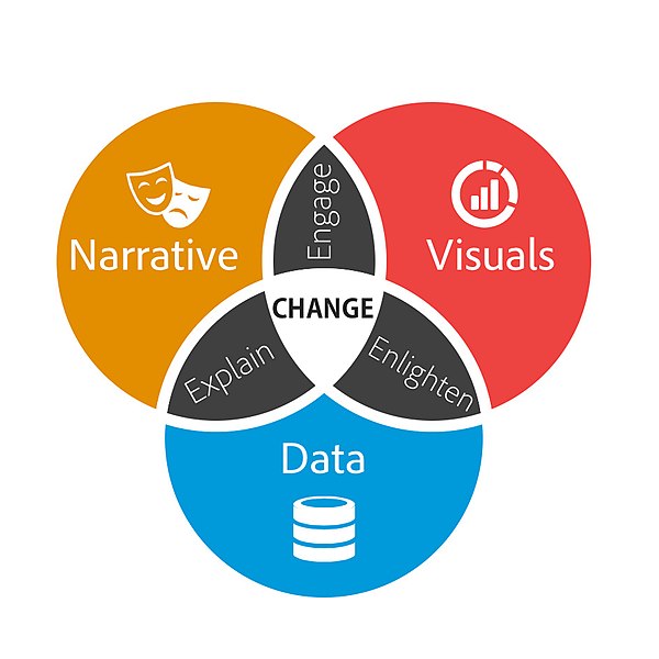
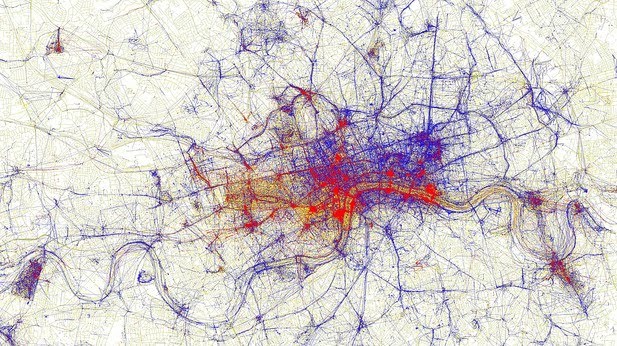
Brent Dykes, CC BY-SA 2.5, via Wikimedia Commons 
 

When writing a data story, start by collecting your data. Look for the most interesting trends and determine the main points you want to get across in your data story. A data story should have a complete narrative rather than being a series of barely connected data visualizations. Make sure the story you are telling is appropriate for your audience.  

Resources for Creating a Data Story: 

The Scholarly Commons Collection is located in the UIUC Main Stacks. Books in this collection are available to check out. The collection includes books that provide introductory information to data storytelling. 

  1. Effective data storytelling : how to drive change with data, narrative and visuals 

This resource is available to UIUC faculty, staff, and students online. It focuses especially on the narrative aspects of data storytelling rather than the visualization aspect. This book explains the psychology of why storytelling is such an effective communication tool.  

  1. Storytelling with data : a data visualization guide for business professionals 

This resource is only available as a physical book. Data storytelling is a method often used by business professionals to impart information in a more meaningful and persuasive way. This book speaks specifically to business professionals and explains how to consider context, determine the appropriate format for the story, and speak to an audience in a compelling way.  

  1. Storytelling with data : let’s practice! 

This book is also available online with an active illinois.edu email address. It provides over 100 hands-on exercises to help you to gain practice in choosing effective visuals, keeping your visualizations clean, and telling a story.  

Scholarly Commons also provides access to various software that can be accessed on the computers in Main Library room 220. These tools can also be accessed through UIUC Anyware. Useful software for data storytelling includes: 

  1. Tableau Public

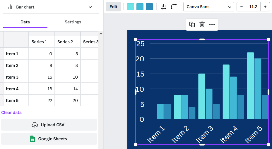
Tableau is a popular data visualization tool with many features useful for making many types of visualizations, such as histograms, pie charts, and boxplots. Tableau also allows users to create dashboards which create a comprehensive story by combining visuals and data.  

 Dashboard created in Tableau
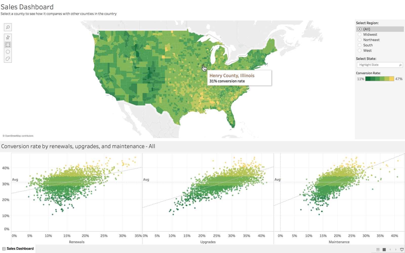
Marissa-anna, CC BY-SA 4.0, via Wikimedia Commons 

  1. ArcGIS 

ArcGIS software allows you to create maps and add data to them. This tool would be especially useful if your data is geographically focused. ArcGIS StoryMaps is an additional tool that allows you to create a story using images, texts, maps, lists, videos and other forms of media.  

Map of Covid cases created in ArcGIS

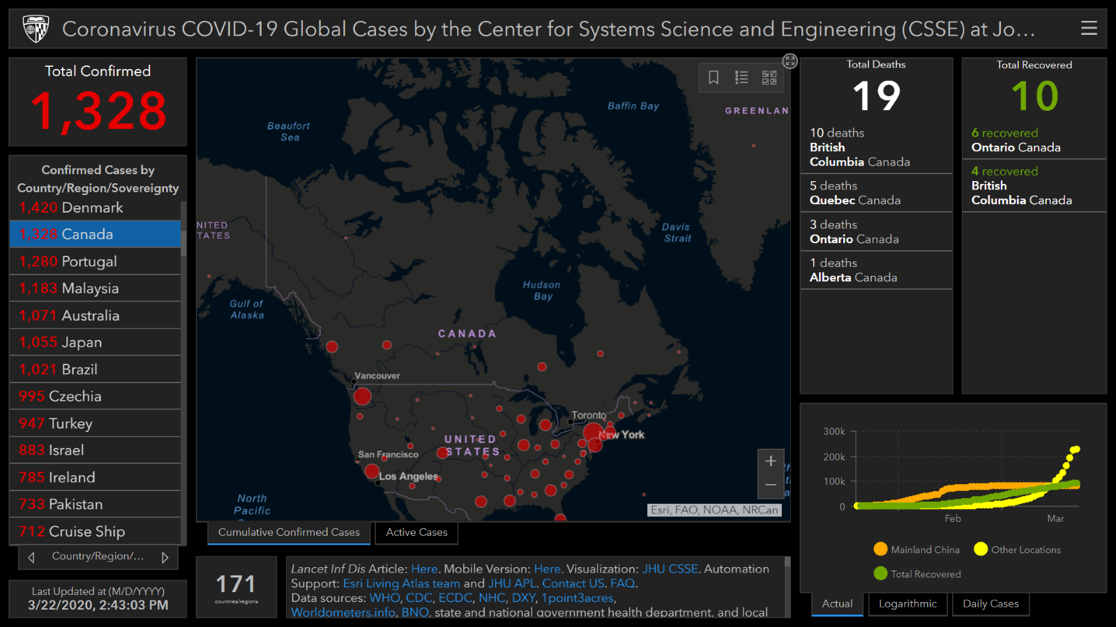
Dennis Sylvester Hurd, CC-BY 2.0, via Flickr 

If you have data you need to share with an audience, consider sharing it through a data story. Data stories are often more visually appealing and engaging than other methods of sharing data. The Scholarly Commons has lots of useful tools to help you create a data story! 

Visualizing your love for data

This post is in celebration of the love data week between Feb-13-Feb 17, 2023. 

Analytics screen graph.
Photo by Luke Chesser on Unsplash 

What is Data visualization?  

For this author, it was love at first sight. Well, technically, it was love at first Visualization. So many say seeing is believing, and data visualization helps us accomplish that, especially at the rate at which data is increasing exponentially in our world. The truth is that data is everywhere, and for us to draw meaning from it, we need to present it in a clear and concise manner.  

Data visualization is the graphical representation of data. Data can be represented in various forms and shapes, such as maps, charts, infographics, graphs, heat maps, or sparklines. When data is presented through visual elements, it is easy to understand and analyze. It helps you to derive meaning from the data and make better decisions. Visualizing your data involves using certain tools; these tools help you fall more in love with data.  

Data Visualization tools are software that allow you to create graphical representations of your data.  

Here are some tools to help you get started. These have been selected based on their ease of use, features (such as capacity for large volumes of data), cost, and popularity.

  1. Data Wrapper: If you are just starting out with data Visualization and you are looking for a free tool to help you get started, Data wrapper is your plug. Data Wrapper is a beginner-friendly tool with a clean and intuitive user interface accessible online. It is straightforward to navigate and great for creating charts and maps that can be easily embedded into reports. It also allows you to upload your files in various formats such as CSV, .tsv, and .txt 

Pros: 

  • Great for beginners.
  • Free to use.
  • Accessible online tool.

Cons:  

  • It can be challenging to build complex charts. 
  • Limited features. 
  • Security is not guaranteed as it is an online tool.
  1. Infogram: If you are not super design-inclined, this visualization tool should be your best friend. It has an editor drag-and-drop feature that makes it super easy to create beautiful designs without having to worry about where you are with your design skills. Infographics, marketing reports, maps, social media posts, and many more are examples of what you can create with this powerful tool. In addition, your data output can be exported in various formats, such as. JPG, GIF, PNG, HTML, and . PDF.  

Pros:

  • Web-based. 
  • Drag-and-drop editor.
  • Easy to use.
  • Highly customizable.

Cons: 

  • Built-in data sources are limited.
  • Not suitable for complex visualization.
  1. Google charts: Google Charts is another free data visualization tool that is user-friendly and compatible with all browsers and platforms. If you like to play around with codes, then Google Charts provides you with that option. Google Charts are coded with SVG and HTML5, allowing it to produce several graphic and pictorial data visualizations, ranging from simple visualization such as pie charts, bars, charts, histograms, maps, and scatter graphs to more complex ones such as hierarchical tree maps, timelines, and gauges. Google fusion tables, spreadsheets, and SQL databases are examples of data sources that can be used with Google Charts.  

Pros:

  • It is free.
  • It is compatible with various browsers.
  • Compatible with google products.

Cons:

  • Technical support is limited.
  • It requires network connectivity for visualization. 
  • There is no room for customization. 
  1. Tableau: This is one of the most popular data visualization tools, mainly because of the free public version that this software provides. Tableau provides the option of a desktop app, server, and online versions. In addition, this software has several data importation options, such as CSV files for google ads. Similarly, if you are looking into presenting your data in various formats, such as multiple chart formats and mapping, then Tableau is the one for you.  

Pros:

  • Provides several options for data import. 
  • It is available for free (public version).

Cons:

  • Lack of Privacy in the public version. 
  • Paid versions are costly. 

5. Dundas BI: Although this is one of the oldest data visualization tools, it is still standing strong as one of the most powerful tools for visualizing data with interactive charts, tree maps, gauges, smart tables, and scorecards. This interactivity allows users to understand the data quickly. Dundas BI is also highly customizable. Dundas BI operates on the ground of responsive HTML5 web technology that allows users to connect, analyze and interact with their data on any device. This powerful tool also provides a built-in feature for extracting data from many data sources.  

Pros:

  • Highly flexible.
  • Provides a variety of visualization options.

Cons: 

  • It lacks predictive analysis. 
  • Does not support 3D charts.  

There you have it! Now you know the tools to ask out on a date when you are ready to visualize your data. As much as you love data, these tools can help make others fall in love with your data, too.   

Of Maps and Memes: A Bit of Cartographic Fun

Co-Authored by Zhaneille Green

We use maps to communicate all the time. Historically, they have been used to navigate the world and to stand as visual, physical manifestations of defined spaces and places. What do you think of when we say “map”: a topographic map1 a transportation map2 or a city map3?

You can use maps to represent just about anything you want to say, far beyond these typical examples. We wrote this blog to invite you to have a little cartographic fun of your own.

If you’re on any kind of social media, you’ve probably seen maps like the one below, highlighting anything from each state’s favorite kind of candy to what the continental US would look like if all of the states’ borders were drawn along rivers and mountain ranges. People definitely seem to enjoy sharing these maps, curious to see what grocery store most people shop at in their home state, or laughing about California’s lack of popularity with the states in the surrounding area.

Map of most popular halloween candy in each US state. View the interactive version on candystore.com

Try your hand at creating your own silly map by using our programs in the Scholarly Commons. Start a war by creating a map that ranks the Southern states with the best barbecue using Adobe Photoshop or Illustrator, or explore a personal hobby like creating a map of all the creatures Sam & Dean Winchester met through the 15 seasons of Supernatural using ArcGIS.

If you’re feeling a bit more serious, don’t fret! Even if these meme-like maps aren’t portraying the most critical information, they do demonstrate how maps can be a great tool for data visualization. In many ways, location can make data feel more personal, because we all have personal connections to place. Admit it: the first thing you checked on the favorite candy map was your home state. Maps also tend to be more visually engaging than a simple table with, for example, states in one column and favorite animal in the other.

Using geotagging data, each dot represents where a photo was taken: blue for locals, red for tourists, and yellow for unknown. Locals and Tourists #1 (GTWA #2): London. Erica Fischer, CC BY-SA 2.0 via Flickr.

Regardless of what you want to map, the Scholarly Commons has the tools to help bring your vision to life. Learn about software access on our website, and check out these LinkedIn Learning resources for an introduction to ArcGIS Online or Photoshop, which are available with University of Illinois login credentials. If you need more assistance, feel free to ask us questions. Go forth and meme!

You can’t analyze data if you ain’t cute: Data Visualization

Meme from Reno 911 with the original text stating "You can't fight crime if you ain't cute" but the "fight crime" is crossed out and above is written "analyze Data"

Humans are highly visual creatures, even more so in our hyper-graphic world of ultra-filtered images and short aesthetic videos. Great ideas are ignored into oblivion in favor of shiny graphics and slick illustrations, so even data analysts need to be aware of how they present their findings. A well-designed infographic will be much more impactful, widely shared, and remembered than columns and rows of numbers. Even a simple graph can help people better come to conclusions and absorb information than they ever would with just numbers alone. People who can not only crunch numbers but also create stunning communications about those numbers are a real asset on the job market, so it behooves any hopeful data analyst to at least learn the basics of visualization.

LinkedIn Learning 

  1. Learning Data Visualization 
    1. This course clocks in at just under two hours and aims to give learners the scaffolding for a strong understanding of data visualization. Geared towards true beginners, this course challenges learners to think about their data, audience, and goals to create visuals that maximize impact. Learners will also learn about visual perception and chart selection strategies, which in turn can set users up for a deep understanding of visualization. 
  1. Data Visualization: Best Practices 
    1. A poorly designed visualization can be criminally misleading, causing viewers to come to biased and inaccurate conclusions that can negatively affect everything from their investment choices to their health practices. This 98-minute course will give learners the tools to avoid common visualization missteps and the tricks to make their visualizations better fit their data, audience, and goals. This course uses Adobe Illustrator, so those who are unfamiliar with the program should first check out this quick start introduction to the program on LinkedIn Learning. Remember, UIUC students have free access many Adobe products, including Adobe Illustrator!  
  2. Excel Data Visualization: Mastering 20+ Charts and Graphs 
    1. Once again, we will focus on this data skillset within the context of a familiar software, Excel. While it is not the first software that comes to mind when thinking about visualization, Excel has surprisingly powerful visualization functions that will certainly come in handy when analyzing data. This course covers the humble pie chart to the complex geospatial heat maps and 3D power maps. In just two hours, learners will be able to quickly take their data from tables to graphics.  

O’Reilly Books and Videos

Make sure you are logged into O’Reilly before clicking these links. The best way to login is to go to the library catalog’s record for a book offered through O’Reilly (Like this book on Python) and then follow the instructions on this Libguide to log in.

  1. Fundamentals of Data Visualization 
    1. This handy book goes deep into the technical aspects of data visualizations. Learners will learn basic concepts like color theory along side more complex practices like redundant coding. This eBook also provides a helpful directory of visualizations so users can quickly find visualizations that fit their needs.
  2. The Data Visualization Lifecycle 
    1. This 4-hour course covers the basics of data visualization but looks at the actual process of professional data visualization that the other resources on this list do not address. Learners will gain technical skills in building visualization and a broader understanding of data visualization as a collaborative process based on external and internal stakeholders and audiences. This course teaches users how to interact with different data cultures, collaborate with colleagues, and how to treat visualization as a product.
  3. Interactive Data Visualization for the Web 
    1. Interactive data visualization is a trending skill in almost all fields that rely on data analysis and visualization of any kind. Allowing others to interact with your data and its visualization can make the data more accessible and memorable than ever before. This book gives users the skills to make interactive visuals with the fundamental concepts and methods of D3, the most powerful JavaScript library for expressing data visually in a web browser. Even those who are new to web programming will learn the basics of HTML, CSS, JavaScript, and SVG alongside the data visualization skills.

In the Catalog 

  1. #MakeoverMonday : improving how we visualize and analyze data, one chart at a time by Andrew Michael Kriebel and Eva Katharina Murray 
    1. Hashtags can be the start of beautiful movements, as those in the data analysis field learned as their #MakeoverMonday tag sparked a complete reimagining of how professionals approach data visualization. Readers will learn concepts of data visualization while viewing the real-life results of these concepts as shown by the hashtag-inspired graphics. #MakeoverMonday shows readers the “many ways to walk the line between simple reporting and design artistry to create exactly the visualization the situation requires”.  
  2. The functional art : an introduction to information graphics and visualization by Alberto Cairo 
    1. If there are data visualization celebrities, then Alberto Cairo is an A-lister. Known for his visualization journalism, he is a self-described information designer who has become famous for his gripping visualizations that stand as both formal art and excellent communication of data. This book allows users to learn the ins and outs of design all while strolling through a gallery of amazing visualization examples. This resource leans heavily on the theory of art and design, which makes it stand out from the other resources on this list. Alberto Cairo’s other works, The Truthful Art: data, charts, and maps for communication and How Charts Lie : getting smarter about visual information  are also worthwhile and insightful reads!  
  3. Data visualisation : a handbook for data driven design by Andy Kirk 
    1. Pivoting back to the more practical side of things, this handbook offers clear and useful processes for data driven designing. Readers will learn more about the visualization workflow, formulating briefs, working with data in the context of visualization, representing data accurately, integrating interactivity, and visualization literacy. 

And that’s it, folks!

With these visualization resources, the Winter Break Data Analysis series is ending on a pretty note. Hopefully, you have been able to keep your mind sharp and develop a new skill over the last month, but even if the timing was off, these resources and many more are available to students all year long! Did you enjoy one of these resources or posts? Do you have questions about any of these topics or suggestions for future series? Please tell us about it at sc@library.illinois.edu or on twitter at @ScholCommons. Thank you for joining this series and happy analyzing!  

Making Infographics in Canva: a Guide and Review

Introduction

If you’ve ever had to design a poster for class, you’re probably familiar with Canva. This online and app-based graphic design tool, with free and subscription-based versions, features a large selection of templates and stock graphics that make it pretty easy to create decent-looking infographics. While it is far from perfect, the ease of use makes Canva worth trying out if you want to add a bit of color and fun to your data presentation.

Getting Started

Starting with a blank document can be intimidating, especially for someone without any graphic design experience. Luckily, Canva has a bunch of templates to help you get started.

Canva infographic templates

I recommend picking a template based on the color scheme and general aesthetic. It’s unlikely you’ll find a template that looks exactly how you want, so you can think of a template as a selection of colors, fonts, and graphics to use in your design, rather than something to just copy and paste things into. For example, see the image below – I recently used the template on the left to create the infographic on the right.

An infographic template compared to the resulting infographic

General Design Principles

Before you get started on your infographic, it’s important to remember some general design guidelines:

  1. Contrast. High levels of contrast between your background and foreground help keep everything legible.
  2. Simplicity. Too many different colors and fonts can be an eyesore. Stick to no more than two fonts at a time.
  3. Space. Leave whitespace to keep things from looking cluttered.
  4. Alignment and balance. People generally enjoy looking at things that are lined up neatly and don’t have too much visual weight on one side or another.
An exaggerated example of a design that ignores the above advice.

Adding Graphs and Graphics

Now that you have a template in hand and graphic design principles in mind, you can start actually creating your infographic. Under “Elements,” Canva includes several types of basic charts. Once you’ve added a chart to your graphic, you can edit the data associated with the chart directly in the provided spreadsheet, by uploading a csv file, or by linking to a google spreadsheet.

Canva interface for creating charts

The settings tab allows you to decide whether you want the chart to include a legend or labels. The options bar at the top allows for further customization of colors and bar or dot appearance. Finally, adding a few simple graphics from Canva’s library such as shapes and icons can make your infographic more interesting. 

Examples of charts available in Canva, with a variety of customizations.

Limitations and Frustrations

The main downsides to Canva are the number of features locked behind a paywall and the inability to see only the free options. Elements cannot be filtered by price and it seems that more and more graphics are being claimed by Canva Pro, so searching for graphics can be frustrating. Templates can be filtered, but it will still bring up results where the template itself is free, but there are paid elements within the template. So, you might choose a template based on a graphic that you really like, only to find out that you need a Canva Pro subscription to include that graphic.

The charts in Canva also have limitations. Pie charts do not allow for the selection of colors for each individual slice; you have to pick one color, and Canva will generate the rest. However, if you want to have more control over your charts, or wish to include more complicated data representations, you can upload charts to Canva, which even supports transparency.

Conclusion

As mentioned above, Canva has its downsides. However, Canva’s templates, graphics, and charts still make it a super useful tool for creating infographics that are visually appealing. Try it out the next time you need to present some data!