Introductions: What is Digital Scholarship, anyways?

This is the beginning of a new series where we introduce you to the various topics that we cover in the Scholarly Commons. Maybe you’re new to the field or you’re just to the point where you’re just too afraid to ask… Fear not! We are here to take it back to the basics!

What is digital scholarship, anyways?

Digital scholarship is an all-encompassing term and it can be used very broadly. Digital scholarship refers to the use of digital tools, methods, evidence, or any other digital materials to complete a scholarly project. So, if you are using digital means to construct, analyze, or present your research, you’re doing digital scholarship!

It seems really basic to say that digital scholarship is any project that uses digital means because nowadays, isn’t that every project? Yes and No. We use the term digital quite liberally…If you used Microsoft Word to just write your essay about a lab you did during class – that is not digital scholarship however if you used specialized software to analyze the results from a survey you used to gather data then you wrote about it in an essay that you then typed in Microsoft Word, then that is digital scholarship! If you then wanted to get this essay published and hosted in an online repository so that other researchers can find your essay, then that is digital scholarship too!

Many higher education institutions have digital scholarship centers at their campus that focus on providing specialized support for these types of projects. The Scholarly Commons is a digital scholarship space in the University Main Library! Digital scholarship centers are often pushing for new and innovative means of discovery. They have access to specialized software and hardware and provide a space for collaboration and consultations with subject experts that can help you achieve your project goals.

At the Scholarly Commons, we support a wide array of topics that support digital and data-driven scholarship that this series will cover in the future. We have established partners throughout the library and across the wider University campus to support students, staff, and faculty in their digital scholarship endeavors.

Here is a list of the digital scholarship service points we support:

You can find a list of all the software the Scholarly Commons has to support digital scholarship here and a list of the Scholarly Commons hardware here. If you’re interested in learning more about the foundations of digital scholarship follow along to our Introductions series as we got back to the basics.

As always, if you’re interested in learning more about digital scholarship and how to  support your own projects you can fill out a consultation request form, attend a Savvy Researcher Workshop, Live Chat with us on Ask a Librarian, or send us an email. We are always happy to help!

Simple NetInt: A New Data Visualization Tool from Illinois Assistant Professor, Juan Salamanca

Juan Salamanca Ph.D, Assistant Professor in the School of Art and Design at the University of Illinois Urbana-Champaign recently created a new data visualization tool called Simple NetInt. Though developed from a tool he created a few years ago, this tool brings entirely new opportunities to digital scholarship! This week we had the chance to talk to Juan about this new tool in data visualization. Here’s what he said…

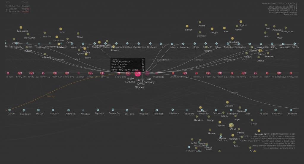
Simple NetInt is a JavaScript version of NetInt, a Java-based node-link visualization prototype designed to support the visual discovery of patterns across large dataset by displaying disjoint clusters of vertices that could be filtered, zoomed in or drilled down interactively. The visualization strategy used in Simple NetInt is to place clustered nodes in independent 3D spaces and draw links between nodes across multiple spaces. The result is a simple graphic user interface that enables visual depth as an intuitive dimension for data exploration.

Simple NetInt InterfaceCheck out the Simple NetInt tool here!

In collaboration with Professor Eric Benson, Salamanca tested a prototype of Simple NetInt with a dataset about academic publications, episodes, and story locations of the Sci-Fi TV series Firefly. The tool shows a network of research relationships between these three sets of entities similar to a citation map but on a timeline following the episodes chronology.

What inspired you to create this new tool?

This tool is an extension of a prototype I built five years ago for the visualization of financial transactions between bank clients. It is a software to visualize networks based on the representation of entities and their relationships and nodes and edges. This new version is used for the visualization of a totally different dataset:  scholarly work published in papers, episodes of a TV Series, and the narrative of the series itself. So, the network representation portrays relationships between journal articles, episode scripts, and fictional characters. I am also using it to design a large mural for the Siebel Center for Design.

What are your hopes for the future use of this project?

The final goal of this project is to develop an augmented reality visualization of networks to be used in the field of digital humanities. This proof of concept shows that scholars in the humanities come across datasets with different dimensional systems that might not be compatible across them. For instance, a timeline of scholarly publications may encompass 10 or 15 years, but the content of what is been discussed in that body of work may encompass centuries of history. Therefore, these two different temporal dimensions need to be represented in such a way that helps scholars in their interpretations. I believe that an immersive visualization may drive new questions for researchers or convey new findings to the public.

What were the major challenges that came with creating this tool?

The major challenge was to find a way to represent three different systems of coordinates in the same space. The tool has a universal space that contains relative subspaces for each dataset loaded. So, the nodes instantiated from each dataset are positioned in their own coordinate system, which could be a timeline, a position relative to a map, or just clusters by proximities. But the edges that connect nodes jump from one coordinate system to the other. This creates the idea of a system of nested spaces that works well with few subspaces, but I am still figuring out what is the most intuitive way to navigate larger multidimensional spaces.

What are your own research interests and how does this project support those?

My research focuses on understanding how designed artifacts affect the viscosity of social action. What I do is to investigate how the design of artifacts facilitates or hinders the cooperation of collaboration between people. I use visual analytics methods to conduct my research so the analysis of networks is an essential tool. I have built several custom-made tools for the observation of the interaction between people and things, and this is one of them.

If you would like to learn more about Simple NetInt you can find contact information for Professor Juan Salamanca here and more information on his research!

If you’re interested in learning more about data visualizations for your own projects, check out our guide on visualizing your data, attend a Savvy Researcher Workshop, Live Chat with us on Ask a Librarian, or send us an email. We are always happy to help!
Happy Open Education Week 2021!

Every March, librarians around the world celebrate Open Education Week, a time to raise awareness of the need for and use of Open Educational Resources on our campuses. Many libraries are engaged in promoting these resources to faculty and administrators in order to help reduce the cost of course materials for students.

OEWeek 2021 Logo

“Open Education Week Logo.” OEWeek. https://www.openeducationweek.org/page/materials. Licensed under a CC-BY 4.0 license.

Open Educational Resources are learning materials that are published without copyright restrictions, meaning they can be freely distributed, reused, and modified. Faculty who assign Open Educational Resources in their classes help eliminate the barriers to academic success students can face when they cannot afford their course materials. The Florida Virtual Campus survey has demonstrated over several iterations of their survey how these costs negatively impact students – whether it’s dropping or failing a course, changing major, or struggling academically.

OpenStax is one of the most well-known publishers of OER and is often used by librarians as an example of high-quality, low-cost textbooks. While librarians often work as OER advocates on their campus, we are not always the ones publishing our own, original OER. This makes the publishing of Instruction in Libraries and Information Centers: An Introduction in July 2020 a unique and exciting accomplishment that will benefit Library and Information Science students for years to come.

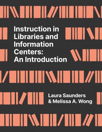
Front cover of Instruction in Libraries by Saunder and Wong

This textbook, authored by Laura Saunders, Associate Professor of Library and Information Science at Simmons College and Melissa Wong, Adjunct Lecturer of Library and Information Sciences at UIUC, is freely available for students to read online, download, and print. The book is the first open access textbook to be published by Windsor and Downs press through IOPN, the University Library’s publishing unit. Other open access books available through the press include Sara Benson’s The Sweet Public Domain: Celebrating Copyright Expiration with the Honey Bunch Series.

Interested in the ways libraries are celebrating these accomplishments and bringing attention to the need to continue our advocacy? Check out the Twitter hashtag #OEWeek to join the conversation.

Thinking Beyond the Four Factors

Every year, libraries and other information professionals recognize Fair Use Week, a week dedicated to educating our communities about the power of Fair Use to help them make informed and responsible decisions about their use of copyrighted materials.

Fair Use week in white text on black background

For example, the University Library at the University of Illinois will be sponsoring a Fair Use Week Game Show, hosted by Copyright Librarian Sara Benson. This event will teach participants about how to conduct a Fair Use analysis in a fun and engaging manner in hopes of getting our campus excited about the possibilities that Fair Use opens.

When considering whether your use of a copyrighted work is a Fair Use, there are 4 main factors to consider: Purpose, Nature, Amount, and Effect.

Purpose refers to your intended use of a work and specifically considers whether you are using it for educational purposes, which is more likely to be considered a fair use, or for profit, which weighs against Fair Use. Nature refers to the work itself. Factual and published works are more likely to be considered a Fair Use than creative or unpublished works.

Amount considers how much of the work you intend to use. Using a small or less important portion of the work is more likely to be a Fair Use, while using the whole work or the “heart” of the work is less likely to be a Fair Use. Lastly, Effect looks at the potential market impact of your use of the work. If it is likely your use would impact the original creator’s ability to profit off their work, your use is less likely to be considered a Fair Use.

In order to make a Fair Use determination, courts weigh each of the four factors holistically to decide whether your use of a copyrighted work is allowed. However, could there be more to a fair use than the four factors used by the courts?

Graphic image of balace scales

“File:Johnny-automatic-scales-of-justice.svg” by johnny_automatic is marked with CC0 1.0

Using another person’s copyrighted material may not just be a legal question, but an ethical one. For example, many libraries make cultural artifacts taken from indigenous people available to the world. As these items get digitized, libraries are typically the copyright owners for the digital version. While doing your Fair Use analysis, it may be worthwhile to also consider whether the community these items were taken from would approve of your use of the material, even if a court would rule that your use is fair.

Another example is the use of personal photos, which the internet makes readily available online. While your use of these photos may be considered a Fair Use after weighing the four factors, is it ethical to include images of other people’s faces in your work without their permission?

Fair Use gives us guidance about how to avoid being sued for copyright infringement and arguments to defend ourselves if we do. But, Fair Use may not always be enough to tell you whether your use is ethical. When in doubt, you can ask your local librarian for tips and resources on using someone else’s copyrighted materials ethically and responsibly.

In the meantime, you can check out the Fair Use page on our Copyright Reference Guide, which contains several resources to help you think through your own Fair Use analysis. Happy Fair Use week!

The Art Institute of Chicago Launches Public API

Application Programming Interfaces, or APIs, are a major feature of the web today. Almost every major website has one, including Google Maps, Facebook, Twitter, Spotify, Wikipedia, and Netflix. If you Google the name of your favorite website and API, chances are you will find an API for it.

Last week, another institution joined the millions of public APIs available today: The Art Institute of Chicago. While they are not the first museum to release a public API, their blog article announcing the release of the API states that it holds the largest amount of data released to the public through an API from a museum. It is also the first museum API to hold all of their public data in one location, including data about their art collection, every exhibition ever held by the Institute since 1879, blog articles, full publication texts, and more than 1,000 gift shop products.

But what exactly is an API, and why should we be excited that we can now interact with the Art Institute of Chicago in this way? An API is basically a particular way to interact with a software application, usually a website. Normally when you visit a website in a browser, such as wikipedia.org, the browser requests an HTML document in order to render the images, fonts, text, and many other bits of data related to the appearance of the web page. This is a useful way to interact as a human consuming information, but if you wanted to perform some sort of data analysis on the data it would be much more difficult to do it this way. For example, if you wanted to answer even a simple question like “Which US president has the longest Wikipedia article?” it would be time consuming to do it the traditional way of viewing webpages.

Instead, an API allows you or other programs to request just the data from a web server. Using a programming language, you could use the Wikipedia API to request the text of each US President’s Wikipedia page and then simply calculate which text is the longest. API responses usually come in the form of data objects with various attributes. The format of these objects vary between websites.

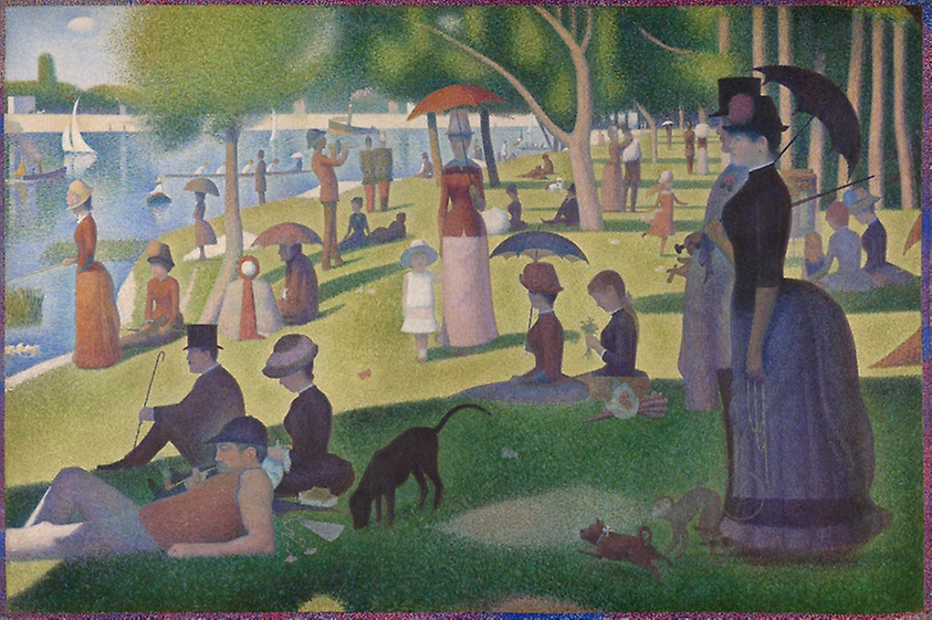
“A Sunday on La Grande Jatte” by Georges Seurat, the data for which is now publicly available from the Art Institute of Chicago’s API.

The same is now true for the vast collections of the Art Institute of Chicago. As a human user you can view the web page for the work “A Sunday on La Grande Jatte” by Georges Seurat at this URL:

 https://www.artic.edu/artworks/27992/a-sunday-on-la-grande-jatte-1884

If you wanted to get the data for this work through an API to do data analysis though, you could make an API request at this URL:

https://api.artic.edu/api/v1/artworks/27992

Notice how both URLs contain “27992”, which is the unique ID for that artwork.

If you open that link in a browser, you will get a bunch of formatted text (if you’re interested, it’s formatted as JSON, a format that is designed to be manipulated by a programming language). If you were to request this data in a program, you could then perform all sorts of analysis on it.

To get an idea of what’s possible with an art museum API, check out this FiveThirtyEight article about the collections of New York’s Metropolitan Museum of Art, which includes charts of which countries are most represented at the Met and which artistic mediums are most popular.

It is possible now to ask the same questions about the Art Institute of Chicago’s collections, along with many others, such as “what is the average size of an impressionist painting?” or “which years was surrealist art most popular?” The possibilities are endless.

To get started with their API, check out their documentation. If you’re familiar with Python and possibly python’s data analysis library pandas, you could check out this article about using APIs in python to perform data analysis to start playing with the Art Institute’s API. You may also want to look at our LibGuide about qualitative data analysis to see what you could do with the data once you have it.