Introductions: What is Data Analysis, anyway?

This post is part of a series where we introduce you to the various topics that we cover in the Scholarly Commons. Maybe you’re new to the field or you’re just to the point where you’re just too afraid to ask… Fear not! We are here to take it back to the basics!

So, what is Data Analysis, anyway?

Data analysis is the process of examining, cleaning, transforming, and modeling data in order to make discoveries and, in many cases, support decision making. One key part of the data analysis process is separating the signal (meaningful information you are trying to discover) from the noise (random, meaningless variation) in the data.

The form and methods of data analysis can vary widely, and some form of data analysis is present in nearly every academic field. Here are some examples of data analysis projects:

  • Taylor Arnold, Lauren Tilton, and Annie Berke in “Visual Style in Two Network Era Sitcoms” (2019) used large-scale facial recognition and image analysis to examine the centrality of characters in the 1960s sitcoms Bewitched and I Dream of Jeannie. They found that Samantha is the distinctive lead character of Bewitched, while Jeannie is positioned under the domination of Tony in I Dream of Jeannie.
  • Allen Kim, Charuta Pethe, Steven Skiena in “What time is it? Temporal Analysis of Novels(2020) used the full text of 52,183 fiction books from Project Gutenberg and the HaithiTrust to examine the time of day that events in the book took place during. They found that events from 11pm to 1am became more common after 1880, which the authors attribute to the invention of electric lighting.
  • Wouter Haverals and Lindsey Geybels in “A digital inquiry into the age of the implied readership of the Harry Potter series” (2021) used various statistical methods to examine whether the Harry Potter books did in fact progressively become more mature and adult with successive books, as often believed by literature scholars and reviewers. While they did find that the text of the books implied a more advanced reader with later books, the change was perhaps not as large as would be expected.

How can Scholarly Commons help?

If all of this is new to you, don’t worry! The Scholarly Commons can help you get started.

Here are various aspects of our data services in the Scholarly Commons:

As always, if you’re interested in learning more about data analysis and how to support your own projects you can fill out a consultation request form, attend a Savvy Researcher Workshop, Live Chat with us on Ask a Librarian, or send us an email. We are always happy to help!

Comparison: Human vs. Computer Transcription of an “It Takes a Campus” Episode

Providing transcripts of audio or video content is critical for making these experiences accessible to a wide variety of audiences, especially those who are deaf or hard of hearing. Even those with perfect hearing might prefer to skim over a transcript of text rather than listen to audio sometimes. However, often times the slowest part of the audio and video publishing process is the transcribing portion of the workflow. This was certainly true with the recent interview I did with Ted Underwood, which I conducted on March 2 but did not release until March 31. The majority of that time was spent transcribing the interview; editing and quality control were significantly less time consuming.

Theoretically, one way we could speed up this process is to have computers do it for us. Over the years I’ve had many people ask me whether automatic speech-to-text transcription is a viable alternative to human transcription in dealing with oral history or podcast transcription. The short answer to that question is: “sort of, but not really.”

Speech to text or speech recognition technology has come a long way particularly in recent years. Its performance has improved to the point where human users can give auditory commands to a virtual assistant such as Alexa, Siri, or Google Home, and the device usually gives an appropriate response to the person’s request. However, recognizing a simple command like “Remind me at 5 pm to transcribe the podcast” is not quite the same as correctly recognizing and transcribing a 30-minute interview. It has to handle differences between two speakers and lengthy blocks of text.

To see how good of a job the best speech recognition tools do today, I decided to have one of these tools attempt to transcribe the Ted Underwood podcast interview and compare it to the actual transcript I did by hand. The specific tool I selected was Amazon Transcribe, which is part of the Amazon Web Services (AWS) suite of tools. This service is considered one of the best options available and uses cloud computing to convert audio data to textual data, presumably like how Amazon’s Alexa works.

It’s important to note that Amazon Transcribe is not free, however, it only costs $0.0004 per second of text, so Ted Underwood’s interview only cost me 85 cents to transcribe. For more on Amazon Transcribe’s costs, see this page.

In any case, here is a comparison between my manual transcript vs. Amazon Transcribe. To begin, here is the intro to the podcast as spoken and later transcribed by me:

Ben Ostermeier: Hello and welcome back to another episode of “It Takes
a Campus.” My name is Ben, and I am currently a graduate assistant at
the Scholarly Commons, and today I am joined with Dr. Ted Underwood,
who is a professor at the iSchool here at the University of Illinois.
Dr. Underwood, welcome to the podcast and thank you for taking time
to talk to me today.

And here is Amazon Transcribe’s interpretation of that same section of audio, with changes highlighted:

Hello and welcome back to another episode of it takes a campus. My
name is Ben, and I am currently a graduate assistant at Scali Commons.
And today I'm joined with Dr Ted Underwood, who is a professor 
at the high school here at the University of Illinois. 
Dr. Underwood, welcome to the podcast. Thank you for taking 
time to talk to me today.

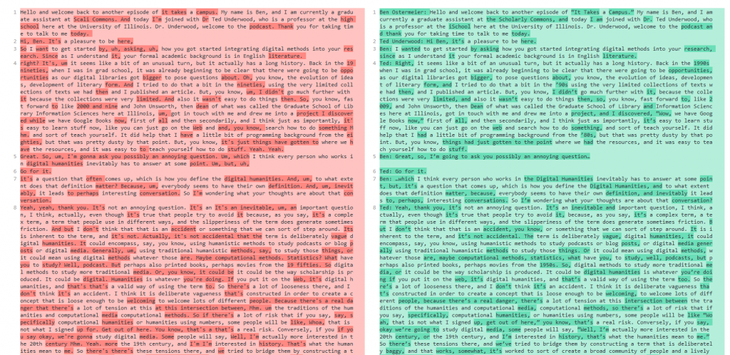
As you can see, Amazon Transcribe did a pretty good job, but there are some mistakes and changes from the transcript I hand wrote. It particularly had trouble with proper nouns like “Scholarly Commons” and “iSchool,” along with some minor issues like not putting a dot after “Dr” and missing an “and” conjunction in the last sentence.

Screenshot of text comparison between Amazon-generated and human-generated transcripts.

Screenshot of text comparison between Amazon-generated (left) and human-generated (right) transcripts of the podcast episode.

You can see the complete changes between the two transcripts at this link.

Please note that the raw text I received from Amazon Transcribe was not separated into paragraphs initially. I had to do that myself in order to make the comparison easier to see.

In general, Amazon Transcribe does a pretty good job in recognizing speech but makes a decent number of mistakes that require cleaning up afterwards. For me, I actually find it faster and less frustrating to transcribe by hand instead of correcting a ‘dirty’ transcript, but others may prefer the alternative. Additionally, in some cases an institution may have a very large number of untranscribed oral histories, for example, and if the choice is between having a dirty transcript vs. no transcript at all, a dirty transcript is naturally preferable.

Also, while I did not have time to do this, there are ways to train Amazon Transcribe to do a better job with your audio, particularly with proper nouns like “Scholarly Commons.” You can read more about it on the AWS blog.

That said, there is very much an art to transcription, and I’m not sure if computers will ever be able to totally replicate it. When transcribing, I often have to make judgement calls about whether to include aspects of speech like “um”s and “uh”s. People also tend to start a thought and then stop and say something else, so I have to decide whether to include “false starts” like these or not. All of these judgement calls can have a significant impact on how researchers interpret a text, and to me it is crucial that a human sensitive to their implications makes these decisions. This is especially critical when transcribing an oral history that involves a power imbalance between the interviewer and interviewee.

In any case, speech to text technology is becoming increasingly powerful, and there may come a day, perhaps very soon, when computers can do just as good of a job as humans. In the meantime, though, we will still need to rely in at least some human input to make sure transcripts are accurate.

Meet our Graduate Assistants: Ben Ostermeier

What is your background education and work experience?

I graduated from Southern Illinois University Edwardsville with a Bachelor of Arts in History, with a minor in Computer Science. I was also the first SIUE student to receive an additional minor in Digital Humanities and Social Sciences. In undergrad I worked on a variety of digital humanities projects with the IRIS Center for the digital humanities, and after graduating I was hired as the technician for the IRIS Center. In that role, I was responsible for supporting the technical needs of digital humanities projects affiliated with the IRIS Center and provided guidance to professors and students starting their own digital scholarship projects.

What led you to your field?

I have been drawn to applied humanities, particularly history, since high school, and I have long enjoyed tinkering with software and making information available online. When I was young this usually manifested in reading and writing information on fan wikis. More recently, I have particularly enjoyed working on digital archives that focus on local community history, such as the SIUE Madison Historical project at madison-historical.siue.edu.

What are your favorite projects you’ve worked on?

While working for the Scholarly Commons, I have had the opportunity to work with my fellow graduate assistant Mallory Untch to publish our new podcast, It Takes a Campus, on iTunes and other popular podcast libraries. Recently, I recorded and published an episode with Dr. Ted Underwood. Mallory and I also created an interactive timeline showcasing the history of the Scholarly Commons for the unit’s tenth anniversary last fall.

What are some of your favorite underutilized Scholarly Commons resources that you would recommend?

We offer consultations to patrons looking for in-depth assistance with their digital scholarship. You can request a consultation through our online form!

When you graduate, what would your ideal job position look like?

I would love to work as a Digital Archivist in some form, responsible for ensuring the long term preservation of digital artifacts, as well as the best way to make these objects accessible to users. It is especially important to me that these digital spaces relate to and are accessible to the people and cultures represented in the items, so I hope I am able to make these sorts of community connections wherever I end up working.

The Art Institute of Chicago Launches Public API

Application Programming Interfaces, or APIs, are a major feature of the web today. Almost every major website has one, including Google Maps, Facebook, Twitter, Spotify, Wikipedia, and Netflix. If you Google the name of your favorite website and API, chances are you will find an API for it.

Last week, another institution joined the millions of public APIs available today: The Art Institute of Chicago. While they are not the first museum to release a public API, their blog article announcing the release of the API states that it holds the largest amount of data released to the public through an API from a museum. It is also the first museum API to hold all of their public data in one location, including data about their art collection, every exhibition ever held by the Institute since 1879, blog articles, full publication texts, and more than 1,000 gift shop products.

But what exactly is an API, and why should we be excited that we can now interact with the Art Institute of Chicago in this way? An API is basically a particular way to interact with a software application, usually a website. Normally when you visit a website in a browser, such as wikipedia.org, the browser requests an HTML document in order to render the images, fonts, text, and many other bits of data related to the appearance of the web page. This is a useful way to interact as a human consuming information, but if you wanted to perform some sort of data analysis on the data it would be much more difficult to do it this way. For example, if you wanted to answer even a simple question like “Which US president has the longest Wikipedia article?” it would be time consuming to do it the traditional way of viewing webpages.

Instead, an API allows you or other programs to request just the data from a web server. Using a programming language, you could use the Wikipedia API to request the text of each US President’s Wikipedia page and then simply calculate which text is the longest. API responses usually come in the form of data objects with various attributes. The format of these objects vary between websites.

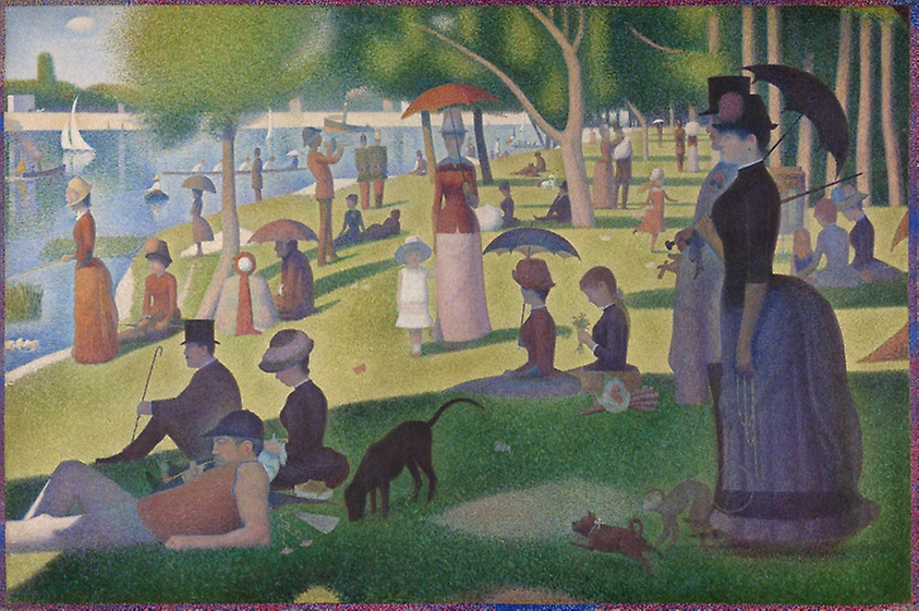
“A Sunday on La Grande Jatte” by Georges Seurat, the data for which is now publicly available from the Art Institute of Chicago’s API.

The same is now true for the vast collections of the Art Institute of Chicago. As a human user you can view the web page for the work “A Sunday on La Grande Jatte” by Georges Seurat at this URL:

 https://www.artic.edu/artworks/27992/a-sunday-on-la-grande-jatte-1884

If you wanted to get the data for this work through an API to do data analysis though, you could make an API request at this URL:

https://api.artic.edu/api/v1/artworks/27992

Notice how both URLs contain “27992”, which is the unique ID for that artwork.

If you open that link in a browser, you will get a bunch of formatted text (if you’re interested, it’s formatted as JSON, a format that is designed to be manipulated by a programming language). If you were to request this data in a program, you could then perform all sorts of analysis on it.

To get an idea of what’s possible with an art museum API, check out this FiveThirtyEight article about the collections of New York’s Metropolitan Museum of Art, which includes charts of which countries are most represented at the Met and which artistic mediums are most popular.

It is possible now to ask the same questions about the Art Institute of Chicago’s collections, along with many others, such as “what is the average size of an impressionist painting?” or “which years was surrealist art most popular?” The possibilities are endless.

To get started with their API, check out their documentation. If you’re familiar with Python and possibly python’s data analysis library pandas, you could check out this article about using APIs in python to perform data analysis to start playing with the Art Institute’s API. You may also want to look at our LibGuide about qualitative data analysis to see what you could do with the data once you have it.

Holiday Data Visualizations

The fall 2020 semester is almost over, which means that it is the holiday season again! We would especially like to wish everyone in the Jewish community a happy first night of Hanukkah tonight.

To celebrate the end of this semester, here are some fun Christmas and Hanukkah-related data visualizations to explore.

Popular Christmas Songs

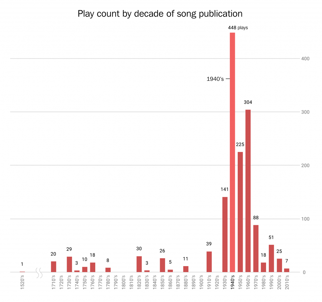
First up, in 2018 data journalist Jon Keegan analyzed a dataset of 122 hours of airtime from a New York radio station in early December. He was particularly interested in discovering if there was a particular “golden age” of Christmas music, since nowadays it seems that most artists who release Christmas albums simply cover the same popular songs instead of writing a new song. This is a graph of what he discovered:

Based on this dataset, 65% of popular Christmas songs were originally released in the 1940s, 50s, and 60s. Despite the notable exception of Mariah Carey’s “All I Want for Christmas is You” from the 90s, most of the beloved “Holiday Hits” come from the mid-20th century.

As for why this is the case, the popular webcomic XKCD claims that every year American culture tries to “carefully recreate the Christmases of Baby Boomers’ childhoods.” Regardless of whether Christmas music reflects the enduring impact of the postwar generation on America, Keegan’s dataset is available online to download for further exploration.

Christmas Trees

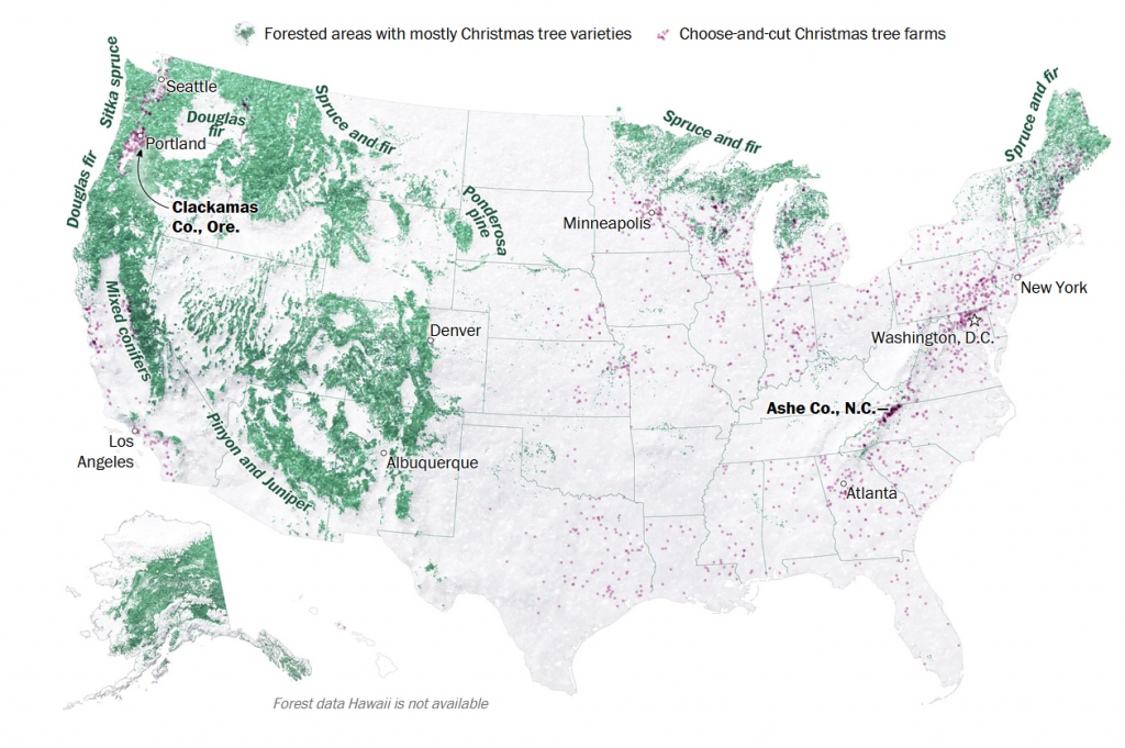
Last year, Washington Post reporters Tim Meko and Lauren Tierney wrote an article about where Americans get their live Christmas trees from. The article includes this map:

The green areas are forests primarily composed of evergreen Christmas trees, and purple dots represent Choose-and-cut Christmas tree farms. 98% of Christmas trees in America are grown on farms, whether it’s a choose-and-cut farm where Americans come to select themselves or a farm that ships trees to stores and lots.

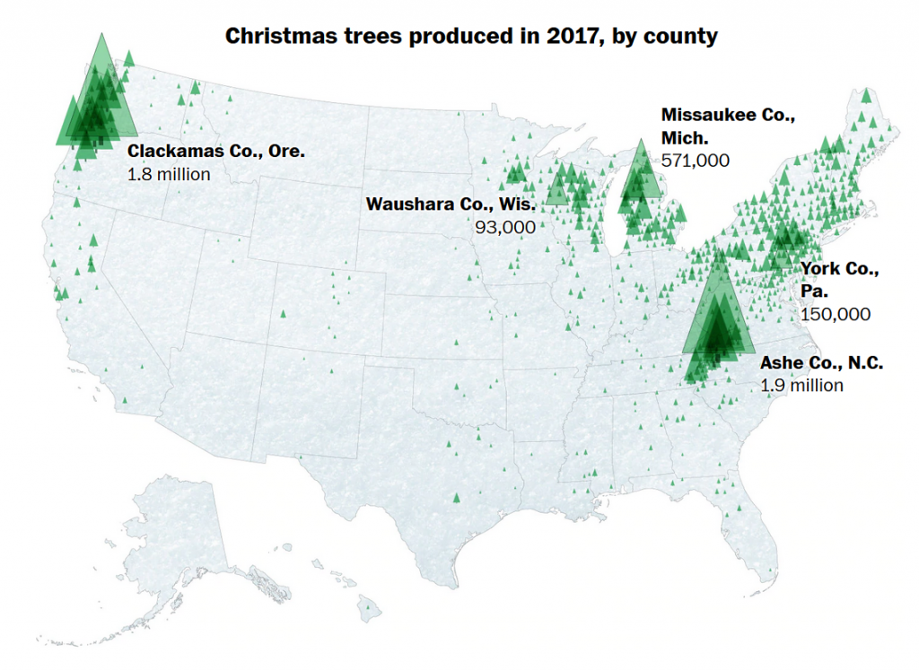
This next map shows which counties produce the most Christmas trees:

As you can see, the biggest Christmas tree producing areas are New England, the Appalachians, the Upper Midwest, and the Pacific Northwest, though there are farms throughout the country.

The First Night of Hanukkah

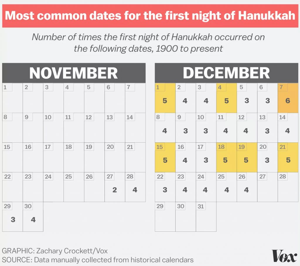
This year, Hanukkah starts tonight, December 10, but its start date varies every year. However, this is not the case on the primarily lunar-based Hebrew Calendar, in which Hanukkah starts on the 25th night of the month of Kislev. As a result, the days of Hanukkah vary year-to-year on other calendars, particularly the solar-based Gregorian calendar. It can occur as early as November 28 and as late as December 26.

In 2016, Hannukah began on December 24, Christmas Eve, so Vox author Zachary Crockett created this graphic to show the varying dates on which the first night of Hannukah has taken place from 1900 to 2016:

The Spelling of Hanukkah

Hanukkah is a Hebrew word, so as a result there is no definitive spelling of the word in the Latin alphabet I am using to write this blog post. In Hebrew it is written as חנוכה and pronounced hɑːnəkə in the phonetic alphabet.

According to Encyclopædia Britannica, when transliterating the pronounced word into English writing, the first letter ח, for example, is pronounced like the ch in loch. As a result, 17th century transliterations spell the holiday as Chanukah. However, ח does not sounds like the way ch does when its at the start of an English word, such as in chew, so in the 18th century the spelling Hanukkah became common. However, the H on its own is not quite correct either. More than twenty other spelling variations have been recorded due to various other transliteration issues.

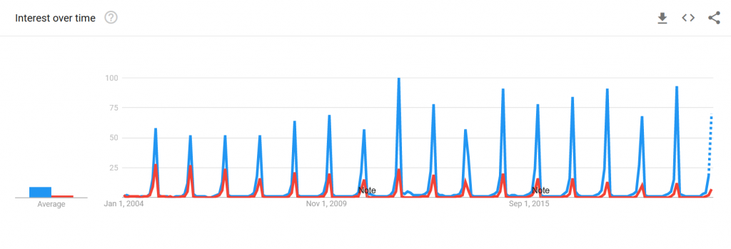
It’s become pretty common to use Google Trends to discover which spellings are most common, and various journalists have explored this in past years. Here is the most recent Google search data comparing the two most commons spellings, Hanukkah and Chanukah going back to 2004:

You can also click this link if you are reading this article after December 2020 and want even more recent data.

As you would expect, the terms are more common every December. It warrants further analysis, but it appears that Chanukah is becoming less common in favor of Hanukkah, possibly reflecting some standardization going on. At some point, the latter may be considered the standard term.

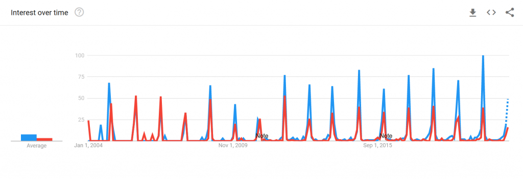
You can also use Google Trends to see what the data looks like for Google searches in Israel:

Again, here is a link to see the most recent version of this data.

In Israel, it also appears as though the Hanukkah spelling is also becoming increasingly common, though early on there were years in which Chanukah was the more popular spelling.


I hope you’ve enjoyed seeing these brief explorations into data analysis related to Christmas and Hanukkah and the quick discoveries we made with them. But more importantly, I hope you have a happy and relaxing holiday season!