Making presentations accessible is important, whether in a classroom, in a meeting, or any situation you find yourself delivering information to an audience. Now, more learning than ever is taking place online where inaccessible content can create unequal learning opportunities.
Do you want to learn what it takes to make an accessible presentation? Read on for information about creating accessible slides for both live and recorded presentations!
Thinking about Universal Design
Universal Design is the idea that things should be created so that the most people possible can make use of them. What might be considered an accommodation for one person may benefit many others. The following tips can be considered ways to improve the learning experience for all participants.
Live and Recorded Presentations
Whether your presentation is happening in-person, live virtually, or asynchronously, there are several steps you can take to make your slides accessible.
1. Use a large font size.
During in-person presentations, participants may have trouble seeing if they are sitting far away or have impaired sight. In the virtual environment, participants may be tuning in on a phone or tablet and a larger font will help them see better on a small screen.

Example of text that is too small to read from a distance, phone, or tablet in 12 point font.
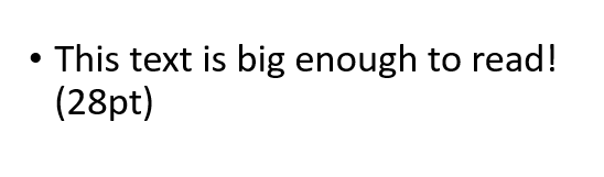
Example of text that is big enough to read from a distance in 28 point font.
2. Use sans serif fonts.
Fonts like Calibri, Franklin Gothic Book, Lucida Sans, and Segoe are the most accessible to people with reading comprehension disabilities. Leaving plenty of white space makes your slides both more readable and more visually appealing.
3. Minimize text on slides.
People who can’t see the slides may be missing out on important content, and too much text can distract from what you’re saying. When you do include text, read everything out loud.
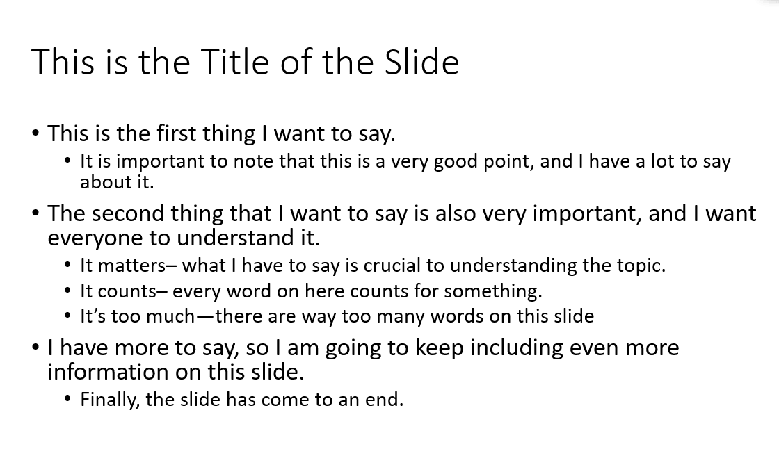
Example of a slide with too much text.
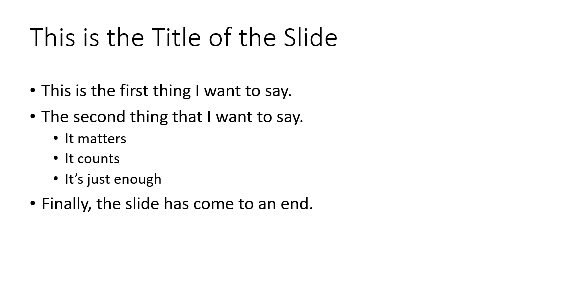
Example of a slide with the right amount of text.
4. Use high contrast colors.
High contrast colors can more easily be seen by someone with a visual impairment (black and white is a reliable option). Always explain your color-codes for people who can’t see them and so all participants are on the same page.
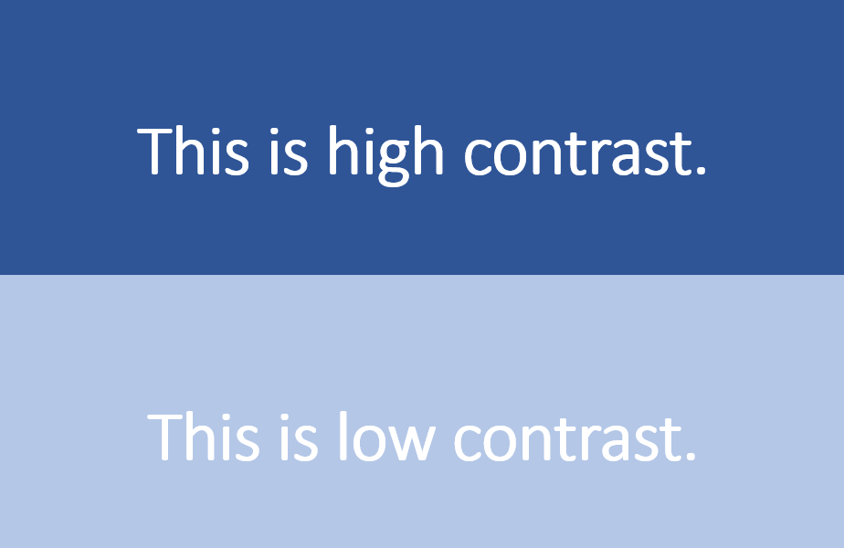
Examples of slide font and background using high and low contrast colors.
5. Summarize all charts and images.
Images and charts should also be explained fully so that all participants understand what you are communicating.
6. Use closed captions.
For recorded presentations, both PowerPoint and Google slides allow you to add closed captions to your video or audio file. For live sessions, consider using subtitles or creating a live transcription. Technology Services offers instructions on how activate subtitles for Zoom meetings.
Posting Slides Online
Virtual presentations should be recorded when possible as our usual participants may be in other time zones, experiencing technology issues, or dealing with a countless list of challenges brought on by the pandemic or life.
Posting your slides online in an accessible format is another way to make that information available.
1. Use built in slide designs.
Slide designs built into PowerPoint and Google Slides are formatted to be read in the correct order by a screen reader. If you need to make adjustments, PowerPoint allows you to check over and adjust the reading order of your slides.
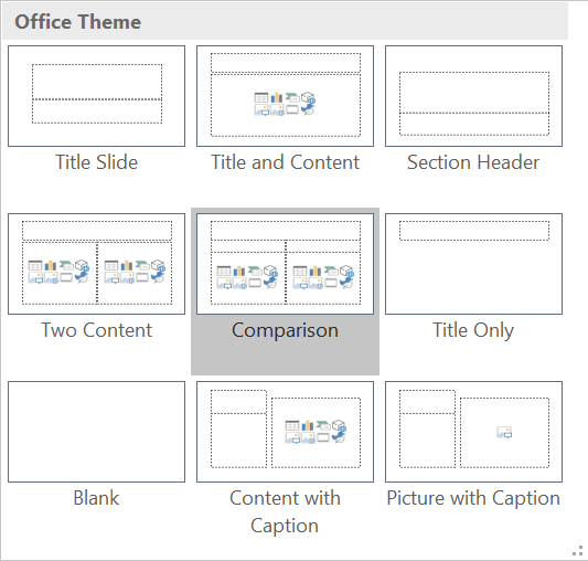
Built-in slide designs in MS PowerPoint.
2. Give all slides a title.
Titles assist people who are reading the document with a screen reader or are taking notes and allow all readers to navigate the document more easily.
3. Add alt-text to all images.
Alternative text allows screen readers to describe images. Use concise, descriptive language that captures the motivation for including the image on the slide.
4. Use meaningful hyperlinks.
Both screen readers and the human eye struggle to read long hyperlinks. Instead, use descriptive hyperlinks that make clear where the link is going to take the reader.

Examples of inaccessible or non-descriptive hyperlinks.

Example of an accessible and descriptive hyperlink.
5. Create a handout and save it as a PDF.
Finally, always include your speaker’s notes when posting slides online as the slides themselves only contain a fraction of what you will be communicating in your presentation.

Example of a slide with speaker’s notes saved as a handout.
It is always easier to make your presentation accessible from the start. By keeping these tips in mind, you can make sure your content can be used by the widest audience possible and help create a more inclusive learning environment!
For more information about how to use and apply these features, check out the following resources:
- Make your PowerPoint presentations accessible to people with disabilities (MS PowerPoint)
- Create more accessible slides (MS PowerPoint)
- Make your document or presentations more accessible (Google Slides)
- How can you make your presentation accessible? (General)