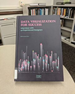
Data visualization is where the humanities and sciences meet: viewers are dazzled by the presentation yet informed by research. Lovingly referred to as “the poster child of interdisciplinarity” by Steven Braun, data visualization brings these two fields closer together than ever to help provide insights that may have been impossible without the other. In his book Data Visualization for Success, Braun sits down with forty designers with experience in the field to discuss their approaches to data visualization, common techniques in their work, and tips for beginners.
Braun’s collection of interviews provides an accessible introduction into data visualization. Not only is the book filled with rich images, but each interview is short and meant to offer an individual’s perspective on their own work and the field at large. Each interview begins with a general question about data visualization to contribute to the perpetual debate of what data visualization is and can be moving forward.
Antonio Farach, one of the designers interviewed in the book, calls data visualization “the future of storytelling.” And when you see his work – or really any of the work in this book – you can see why. Each new image has an immediate draw, but it is impossible to move past without exploring a rich narrative. Visualizations in this book cover topics ranging from soccer matches to classic literature, economic disparities, selfie culture, and beyond.
Each interview ends by asking the designer for their advice to beginners, which not only invites new scholars and designers to participate in the field but also dispels any doubt of the hard work put in by these designers or the science at the root of it all. However, Barbara Hahn and Christine Zimmermann of Han+Zimmermann may have put it best, “Data visualization is not making boring data look fancy and interesting. Data visualization is about communicating specific content and giving equal weight to information and aesthetics.”
A leisurely, stunning, yet informative read, Data Visualization for Success offers anyone interested in this explosive field an insider’s look from voices around the world. This wonderful read is available for checkout from the Scholarly Commons collection in the Main Stacks.