4 Singular Spectrum Analysis (SSA)

Now we are going to explore the results of running Singular Spectrum Analysis (SSA) on the time series.
SSA is used to extract cycles from a time series. Specifically we are going to try and extract the (yearly) seasonal cycle.
I am going to use the Rssa package. So if you don’t have it installed.
install.packages('Rssa')
I don’t want to go over too much detail about SSA because that would take a lot of time and might not be as helpful as just going over how to use it.

So there are two steps to running SSA on R, with the Rssa package.
1. Decompose the Time Series
Then put it back together using the eigenvalues of your choice.
2. Put it Back Together
This is not scientific or mathematical vernacular for the process but my general overview.

require(Rssa)
decomposed=ssa(clean_data$avgTemp)
plot(decomposed)

ssa_decomposed_eigenvalues

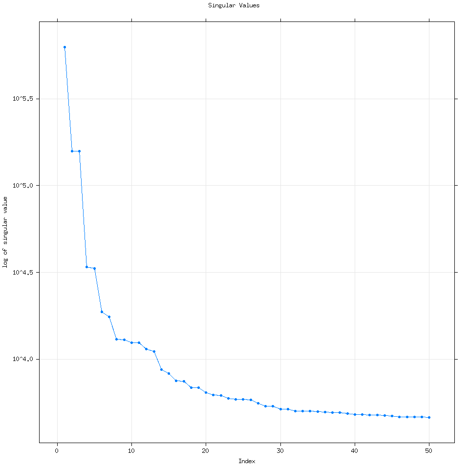
By default Rssa will use the minimum of three variables to determine the number of eigenvalues to calculate: (Length of the time series, number of time series for mSSA or multivariate SSA or 50). Every time I have used R it has wound up computing 50 eigenvalues but it can compute more if the user specifies how many.
require(Rssa)
decomposed=ssa(clean_data$avgTemp,neig=100)
plot(decomposed)

ssa_decomposed_eigenvalues_100

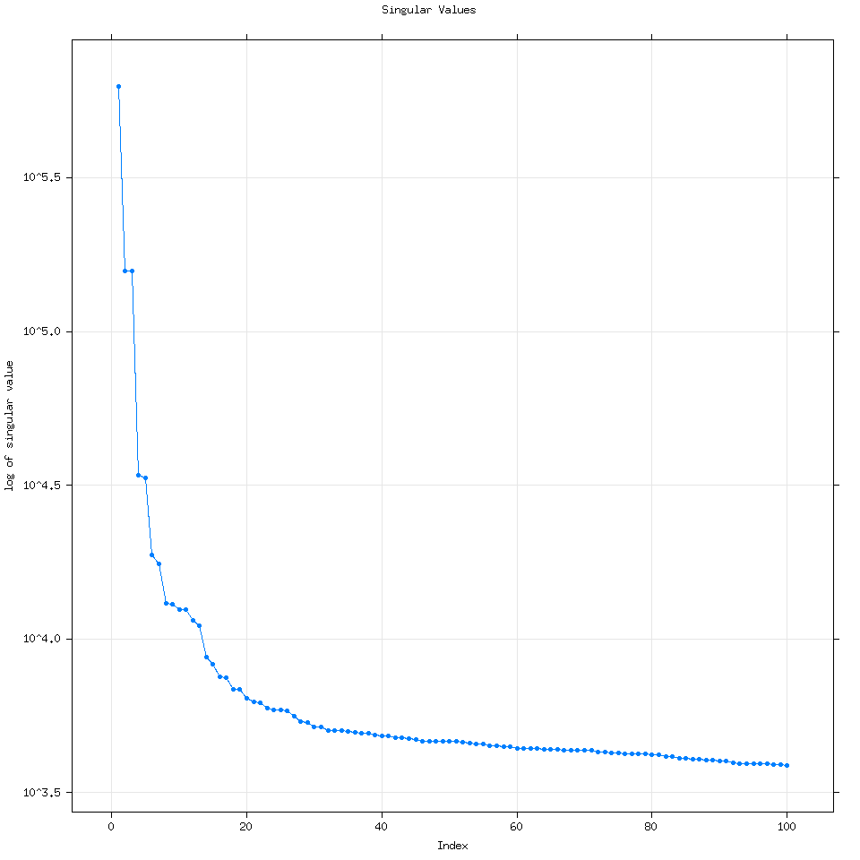
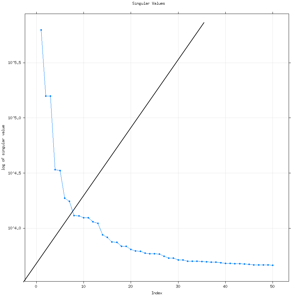
We can see that increasing the number of eigenvalues used doesn’t really change the analysis.
Going back to the vanilla 50 eigenvalue plot, how I think about this plot is that each dot corresponds to a time series. For example let’s consider the first 7 eigenvalues. ssa_decomposed_eigenvalues_labeled
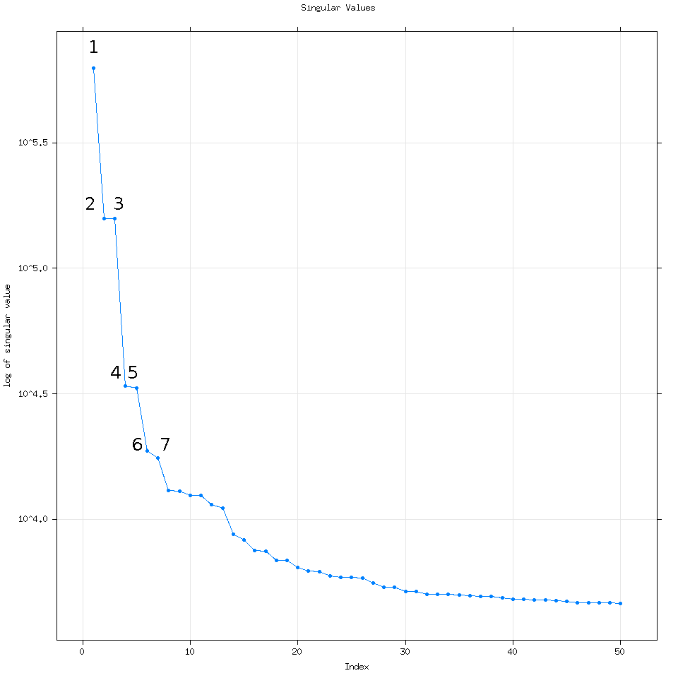
If we reconstruct the time series (putting it back together) using these seven eigenvalues let’s examine what their corresponding time series are:
SSAconstruct=reconstruct(decomposed,groups=list(one=1,two=2,three=3,four=4 ,five=5,six=6,seven=7,eight=8))
plot(SSAconstruct, plot.method = "xyplot", add.residuals = FALSE,superpose = TRUE, auto.key = list(columns = 2))

ssa_reconstructed1_8
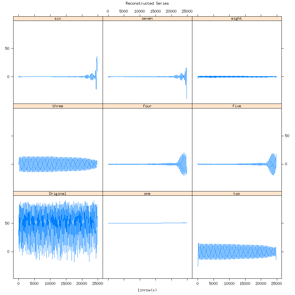
When I first saw this my reaction was “Oh wow SSA is detecting the splining we performed towards the end of the time series”.

Going back to the plot(decomposed) graph, quickly, eigenvalue pairs or pairs of dots with the same magnitude are very good because they mean SSA detected the same signal but at different frequencies.
Here I have groups of dots circled to help show you what I mean. As we get to larger groups of eigenvalues with lower magnitude though it is very likely that those eigenvalues represent signals detected from noise.
ssa_decomposed_eigenvalues_groups_circled
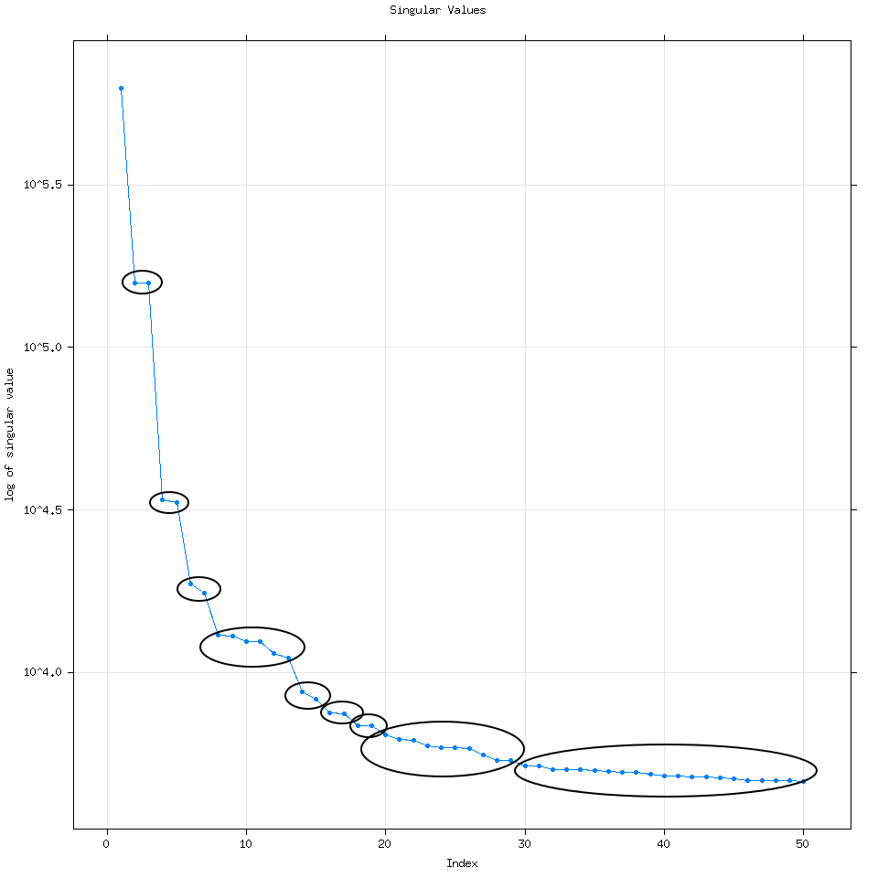
We can model the noise using SSA if we wanted to use SSA forecasting by increasing the number of eigenvalues we use to say 300 or 500.

An analogy I came up with was from economics, in the classes I had for my accounting degree, we studied consumer choice curves.
Consumer Choice Curves
Consumers try to maximize their utility or happiness.
And in this case we are trying to find the optimal balance between true signal and signals from noise, where we have just enough information to reconstruct the seasonal cycle.

ssa_decomposed_eigenvalues_diagonal_line_only

One indeed has to be careful about SSA detecting signals from noise. But I’m not going to go into more significant tests here, what I will show is how do we find the eigenvalues that best represent the seasonal cycle from the data?

SSA decomposition also works on XTS variables which is great for us. But be careful Rssa chokes if you try using XTS data to create the graph of the time series for eigenvalues 1 through 7. ie this line plot(SSAconstruct, plot.method = "xyplot", add.residuals = FALSE,superpose = TRUE, auto.key = list(columns = 2))
If we try and reconstruct the time series using only eigenvalues 1-3.
decomposedXTS=ssa(avgTempXTS)
SSAconstruct1_3=reconstruct(decomposedXTS,groups=list(one=1:3))
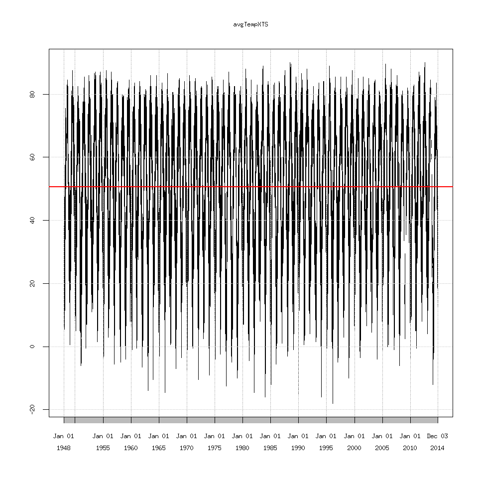
plot(avgTempXTS)
lines(SSAconstruct1_3$one,lty=2,col='red')

ssa_xts_reconstructed1_3_compare

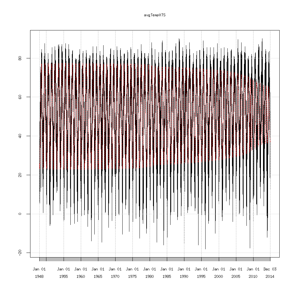
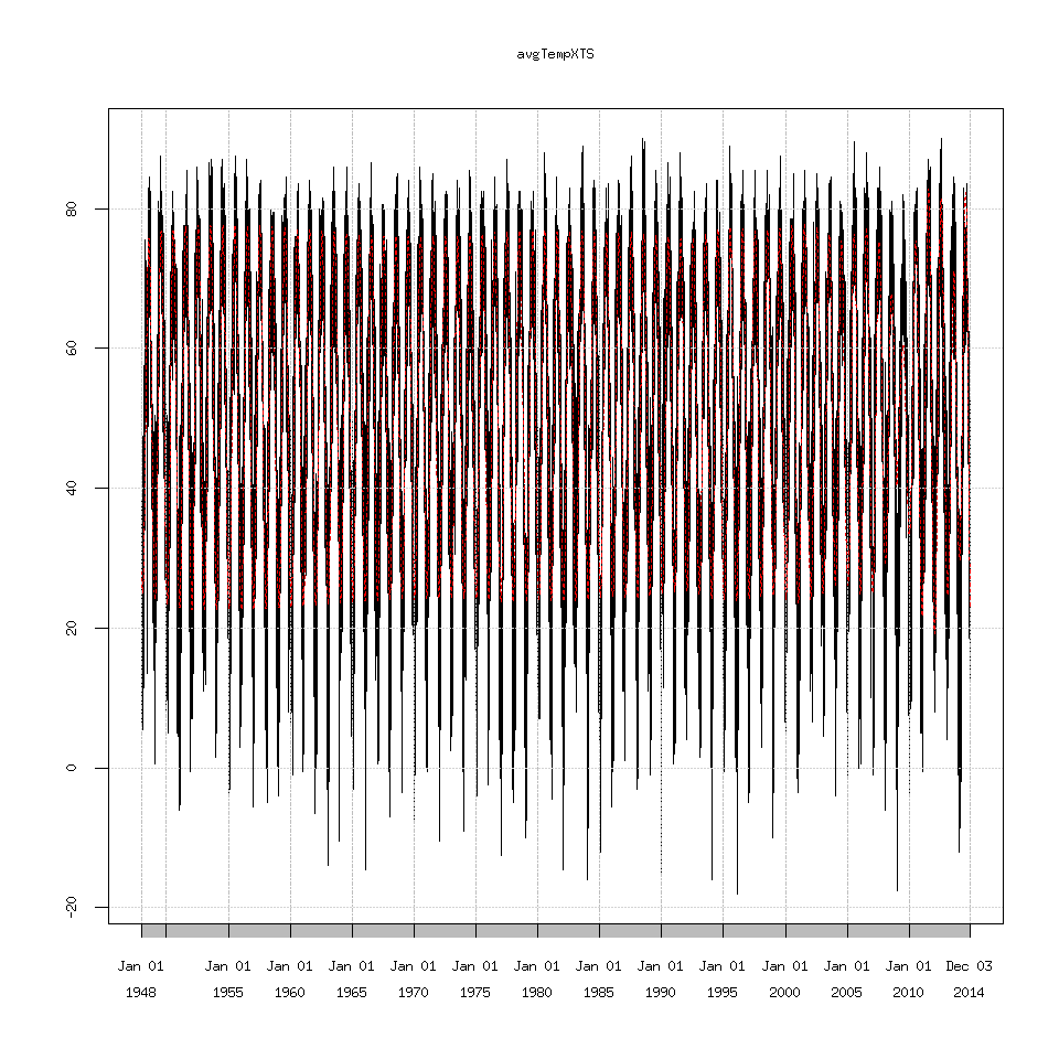
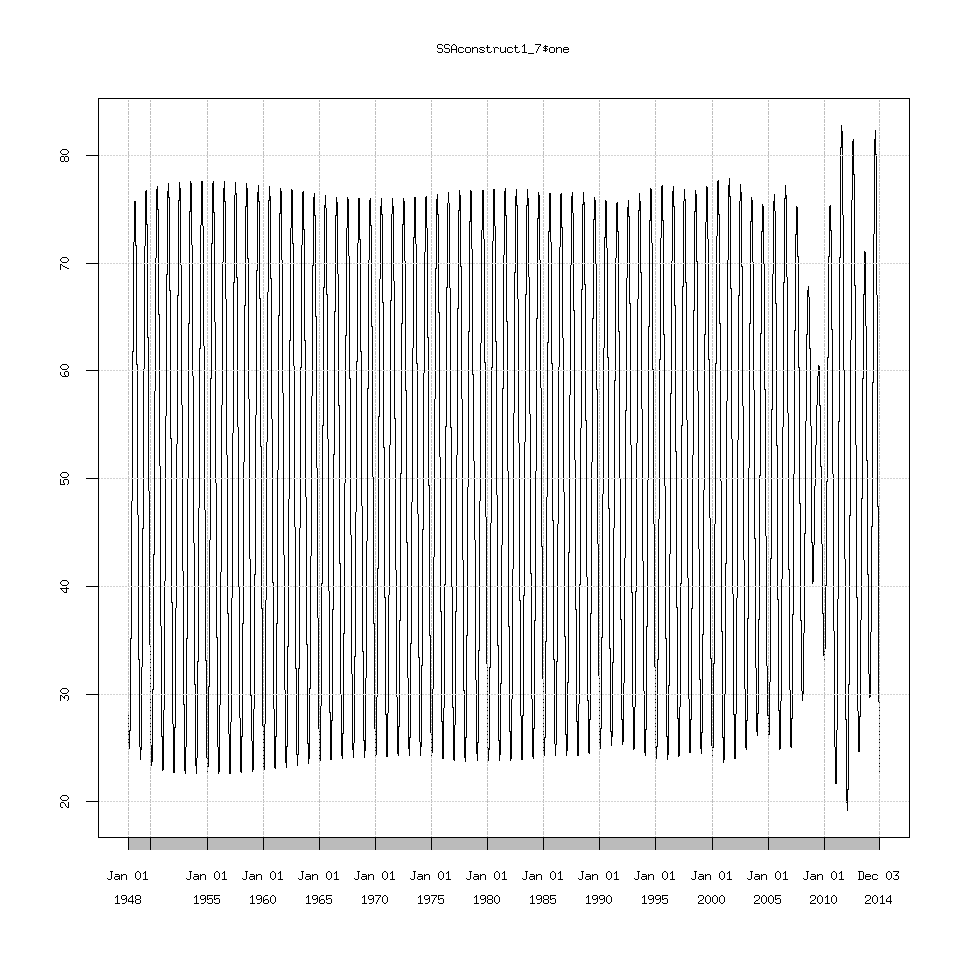
Which we can see the decreasing amplitude doesn’t match the seasonal cycle at all. I’m not going to show every graph possible because there are too many. Suffice to say eigenvalues 1 through 7 seem to recreate the seasonal cycle as best as possible but I have no idea why 2009 causes SSA to choke.
SSAconstruct1_7=reconstruct(decomposedXTS,groups=list(one=1:7))
### this is the original data plotted against the extracted signal
plot(avgTempXTS)
lines(SSAconstruct1_7$one,lty=2,col='red')

ssa_xts_reconstructed1_7_compare

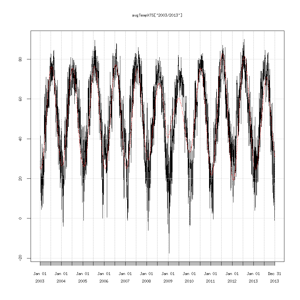
plot(avgTempXTS['2003/2013'])
lines(SSAconstruct1_7$one['2003/2013'],lty=2,col='red')

ssa_xts_reconstructed1_7_zoom_compare

Reading the documentation for Rssa suggests that perhaps the time series is too long and I should write my own custom decomposition function.
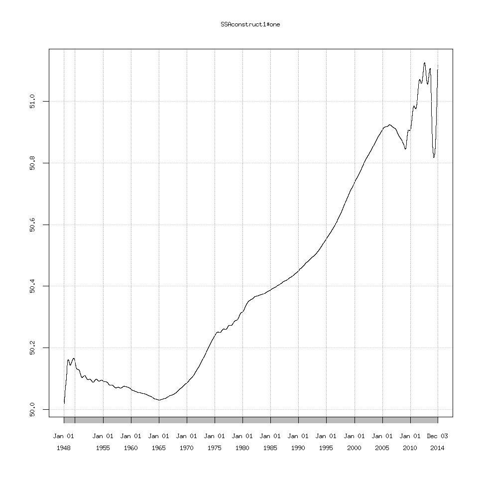
Another option is that the trend (eigenvalue one) that Rssa detects is linear (a 50.0 to 51.0 deg F line) and SSA can struggle with extracting a linear trend.
SSAconstruct1=reconstruct(decomposedXTS,groups=list(one=1))
plot(SSAconstruct1$one)

ssa_xts_reconstructed1

I explored changing the projection options which the documentation suggests can help extract a linear trend but I didn’t find any important changes.
The options are:
column.projector=’centering’ -> 1D SSA with centering
column.projector=’centering’ and row.projector=’centering’ -> 1D SSA with double centering
other options are: ’none’, ’constant’ (or ’centering’), ’linear’, ’quadratic’ or ’qubic’
The default is ’none’

decomposed_projected=ssa(clean_data$avgTemp,column.projector='centering')
#or
decomposed_projected=ssa(clean_data$avgTemp,column.projector='centering',row.projector='centering')

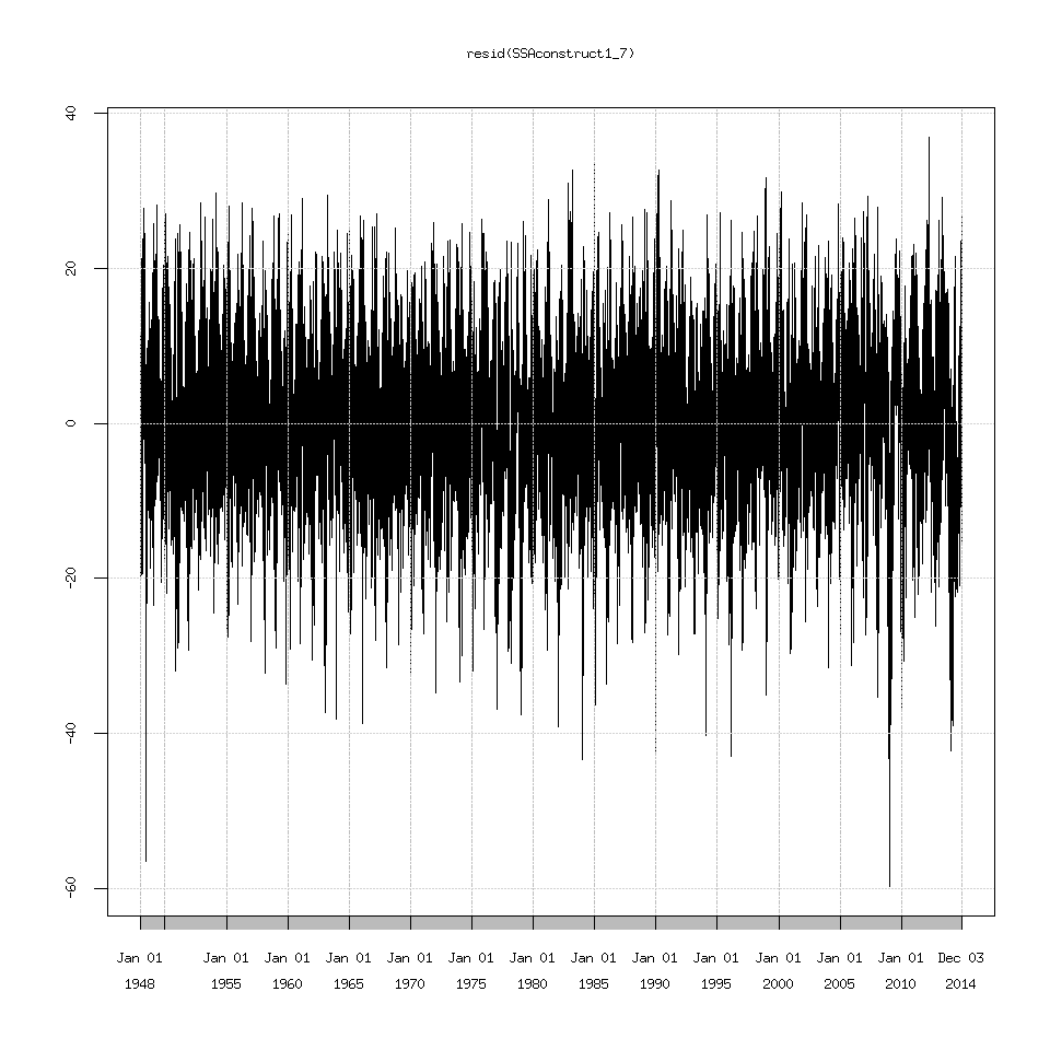
Lastly I should mention if you want to explore everything after the seasonal cycle then use the function resid() to extract them.
plot(SSAconstruct1_7$one)
ssa_xts_signal

plot(resid(SSAconstruct1_7))
ssa_xts_resid

If you try plotting the signal+residuals and then overlay the signal on this graph. You will get the same graph from above where I plotted the original data and overlaid the SSA extracted signal. In other words:
#This
plot(avgTempXTS)
lines(SSAconstruct1_7$one,lty=2,col='red')
# matches this
plot(SSAconstruct1_7$one+resid(SSAconstruct1_7))
lines(SSAconstruct1_7$one,lty=2,col='red')

Anyway that is everything I have for an introduction on how to perform SSA in R, with all of the caveats or gotchas I know of mentioned.
Good luck!

3 Exploring Daily Avg Temperatures

So I decided to tackle the easier of my two suggested posts first. In this post we are going to explore what combinations of max and min daily temperatures give us the same daily average temperature.

So after loading the data from 2.5 Complete Recap.
Let’s explore the daily average temperature in more detail.
Previously we averaged the max and min daily temperatures to integers (-1,0,1,2…) before taking the simple average. When taking the mean of a set of numbers, as I currently understand it, we have one higher decimal place of accuracy, so the simple average should be accurate to the first decimal place. Let’s check this.
table(round(clean_data$avgTemp,1))
#A small slice of what this returns rearranged for the web page.
Temp->Freq
28.5 ->164
28.7 –>2
29 —>137
29.3 –>1
29.5 ->145

So we have most numbers either falling as integers at 0.5 (28, 28.5 , 29 , 29.5 , 30). I expect that anything else is a result of floating point division. Let’s check this.
clean_data$TMAX[clean_data$avgTemp==29.3]
#this returns
numeric(0)

which means there is no average temperature at 29.3 deg F. But if we round it.
clean_data$round_avgTemp=round(clean_data$avgTemp,1)
clean_data$TMAX[clean_data$round_avgTemp==29.3]
## returns
18.81024

Wait what? But we called round() on TMAX which by default should round to 0 decimal places. Why is it returning a decimal? Because it is type num Check this with str(clean_data$TMAX) even though it prints out integers, because it is a num variable it is actually storing decimal places so we need to convert to integer after we round.
As an aside:
3b What happens if we try converting to integer before rounding?
For sure we must convert to integer after rounding.

clean_data$TMAX=as.integer(round(clean_data$TMAX))
clean_data$TMIN=as.integer(round(clean_data$TMIN))
## then recompute the daily avg temperature
clean_data$avgTemp=((clean_data$TMAX+clean_data$TMIN)/2.0)
## then check it
table(clean_data$avgTemp)
## this returns
28.5 29 29.5
167 137 128

So the 0.3 and 0.7 we saw previously are gone now, which is great.
To explore which combinations of max and min temperatures give us the same daily average temperature, we are going to loop over all of the average temperatures and plot the max and min temperatures associated with the current daily average temperature.

So after playing around with this, I decided to use the R animation package to generate GIFs and save them out rather than suggest people watch the animations in the plot windows themselves. On slow computers, like the laptop I’m working on, watching the animations in the plot windows results in the graphs flashing each time they are drawn to the screen, which is just unacceptable.
So I was originally going to just post this..
Press Ctrl+C where you type R commands to kill the loop if this bothers you too much.

#To create the vector of average temperatures to loop over:
uniqAvgTemp=sort(unique(clean_data$avgTemp))
xRange=c(-30,110)
for (temp in uniqAvgTemp){
minTemps=clean_data$TMIN[clean_data$avgTemp==temp]
maxTemps=clean_data$TMAX[clean_data$avgTemp==temp]

freq1=hist(minTemps,plot=F,breaks=10)
freq2=hist(maxTemps,plot=F,breaks=10)

plot(freq1,col=rgb(0,0,1,1/4),xlim=c(xRange[1],xRange[2]),main=paste('Histogram of Max and Min Temperatures \n Avgerage Temperature ',toString(temp),' (n=',toString(length(minTemps)),')',sep=''))
abline(v=temp)
plot(freq2,col=rgb(1,0,0,1/4),xlim=c(xRange[1],xRange[2]),add=T)
Sys.sleep(1.5)
}

You can decrease the time between average temperature plots by changing Sys.sleep(1.5) to Sys.sleep(1.0) . Be careful going any lower if you are seizure sensitive and are working on a slow or remote computer. If you look closely at the code you will see I have plot() and then plot(,add=T) and it just combines the plots together like magic. When I first saw this I expected it to work every time when combining plots, but it doesn’t Stack Overflow: Why add=T does not work all the time.

But let’s figure out how to create GIF animations rather than deal with the graph window drawing each and every plot.
First install the R animation package.
install.packages('animation')
Then:

require(animation)
uniqAvgTemp=sort(unique(clean_data$avgTemp))
xRange=c(-30,110)
saveGIF({
for (temp in uniqAvgTemp){
minTemps=clean_data$TMIN[clean_data$avgTemp==temp]
maxTemps=clean_data$TMAX[clean_data$avgTemp==temp]

freq1=hist(minTemps,plot=F,breaks=10)
freq2=hist(maxTemps,plot=F,breaks=10)

plot(freq1,col=rgb(0,0,1,1/4),xlim=c(xRange[1],xRange[2]),main=paste('Histogram of Max and Min Temperatures \n Avgerage Temperature ',toString(temp),' (n=',toString(length(minTemps)),')',sep=''))
abline(v=temp,lwd=3)
plot(freq2,col=rgb(1,0,0,1/4),xlim=c(xRange[1],xRange[2]),add=T)
}
},movie.name = "daily_avg_temp.gif",interval=0.5)

If the graph gets outputted correctly ani.options("convert") should not return NULL.

Here is what the GIF looks like. At low sample volumes (n<10) the bar widths get messed up but it looks pretty good once it gets going.
daily_avg_temp

I realized after posting this that the x axis label is not correct it, should just be xlab='daily temperatures' in the first plot call.

3b What happens if we try converting to integer before rounding?

So converting variables from one type to another is also known as casting variables in computer science.
So we are going to cast floating point ie num to integer or int.
I’m really telling you this so you know what to try and google when working in other programming languages.
In reality my definition above is quite poor and for some languages there is a difference between casting and converting variables.
But the difference can be subtle and I’m not going to go over it here in more detail.

Back to the question at hand to explore converting to integer first reload the data.
clean_data=read.csv("ncdc_galesburg_daily_clean.csv",stringsAsFactors=FALSE)
clean_data$Date=as.Date(clean_data$Date)
## then enter
table(as.integer(clean_data$TMAX))
#this returns
-11 -9 -7 -5 -4 -2 0 1 3 5 6 8 10 12 14 15
4 5 2 4 1 9 8 16 30 28 44 54 81 103 50 139
17 19 21 23 24 26 28 30 32 33 35 37 39 41 42 44
136 198 205 99 276 342 436 520 306 657 678 634 606 277 621 593
46 48 50 51 53 55 57 59 60 62 64 66 68 69 71 73
554 498 263 515 549 553 580 296 593 579 590 616 306 758 733 806
75 77 78 80 82 84 86 87 89 91 93 95 96 98 100 102
855 396 967 1080 1113 1066 436 812 638 450 276 79 104 37 21 3

As you can see when we try converting to integer before rounding we lose daily average temperatures.
For example where are -10,-8,-6,-3,-1,2,4,7,9 ? Now let’s try rounding before we convert.
table(as.integer(round(clean_data$TMAX)))
#this returns
-12 -11 -10 -9 -8 -6 -5 -4 -3 -2 -1 0 1 2 3 4 5 6 7 8
2 2 3 2 2 1 3 1 3 6 4 4 9 7 8 22 28 20 24 26
9 10 11 12 13 14 15 16 17 18 19 20 21 22 23 24 25 26 27 28
28 50 31 47 56 50 78 61 74 62 92 106 93 112 99 135 141 165 177 221
29 30 31 32 33 34 35 36 37 38 39 40 41 42 43 44 45 46 47 48
215 261 259 306 334 323 353 325 320 314 289 317 277 307 314 325 268 282 272 252
49 50 51 52 53 54 55 56 57 58 59 60 61 62 63 64 65 66 67 68
246 263 232 283 281 268 292 261 269 311 296 306 287 300 279 273 317 278 338 306
69 70 71 72 73 74 75 76 77 78 79 80 81 82 83 84 85 86 87 88
397 361 361 372 413 393 445 410 396 504 463 569 511 546 567 519 547 436 425 387
89 90 91 92 93 94 95 96 97 98 99 100 101 102
339 299 240 210 151 125 79 67 37 17 20 17 4 3

This is what we would expect.
Back to Step 3.

3c Start-up Code Recap

Hey, so after implementing the changes with rounding and converting to integers the start-up script should now look like this.
clean_data=read.csv("ncdc_galesburg_daily_clean.csv",stringsAsFactors=FALSE)
clean_data$Date=as.Date(clean_data$Date)

require(zoo)
clean_data$PRCP[is.na(clean_data$PRCP)]=0
clean_data$TMAX=na.spline(clean_data$TMAX)
clean_data$TMIN=na.spline(clean_data$TMIN)
## See Exploring Daily Avg Temperatures
clean_data$TMAX=as.integer(round(clean_data$TMAX))
clean_data$TMIN=as.integer(round(clean_data$TMIN))

clean_data$avgTemp=((clean_data$TMAX+clean_data$TMIN)/2.0)

require(xts)
avgTempXTS=xts(x=clean_data$avgTemp,order.by=clean_data$Date)

2b Complete Code Recap

Hey there,
After the Step 2 Part 2 post 2. Dealing with Missing Data in R: Omit, Approx, or Spline Part 2
I was thinking it would be helpful to put together several pieces of code across several posts, here is what we have so far.

clean_data=read.csv("ncdc_galesburg_daily_clean.csv",stringsAsFactors=FALSE)
clean_data$Date=as.Date(clean_data$Date)

clean_data$TMAX=round(clean_data$TMAX)
clean_data$TMIN=round(clean_data$TMIN)

clean_data$avgTemp=((clean_data$TMAX+clean_data$TMIN)/2.0)

clean_data$PRCP[is.na(clean_data$PRCP)]=0
clean_data$TMAX=na.spline(clean_data$TMAX)
clean_data$TMIN=na.spline(clean_data$TMIN)
clean_data$avgTemp=na.spline(clean_data$avgTemp)

require(xts)
avgTempXTS=xts(x=clean_data$avgTemp,order.by=clean_data$Date)

If you want to you could export this data as R binary format:
see saveRDS() and loadRDS()
or as csv
write.csv(clean_data,file='ncdc_galesburg_daily_splined.csv',row.names = F)

For future importing.

2. Dealing with Missing Data in R: Omit, Approx, or Spline Part 2

So I decided to try and spline the missing temperature data after going over na.omit(), na.approx() and na.spline() in part 1.
2. Dealing with Missing Data in R: Omit, Approx, or Spline Part 1

Reaching way back to step 1. Let’s revisit the missing data in February 2014 and 2013.

plot(avgTempXTS['2014'])
points(avgTempXTS['2014'])
## yup there is the missing data

2014_daily_avg_temp_plot_xts_with_points
## let's create a new splined XTS variable to see how polynomial interpolation does
avgTempSplineXTS=na.spline(avgTempXTS)
## to have 2 graph windows open at the same time
dev.new()
plot(avgTempSplineXTS['2014'])
points(avgTempSplineXTS['2014'])
### this looks good I don't see any crazy jumps to -200 or -300 or something
plot(avgTempSplineXTS)
points(avgTempSplineXTS)
## to compare to the original data, first change back to graph window 2
dev.set(2)
plot(avgTempXTS)
points(avgTempXTS)

temp_spline_2014

I don’t see the splined data changing any of the record highs or lows for daily average temperature so in that aspect it looks good to me.
There are more rigorous ways to check exactly what we are introducing into the data for sure, but for my purposes here (with 2% of the data missing)
this is an acceptable approach to me. The main thing to look for would be the spline output saying it was 90 degrees in January for example. Let’s quickly check for this.

### save the locations (or indices)
### where the missing data is in the vector
missingTempDataIndices=which(is.na(clean_data$avgTemp))
### output only the interpolated times
avgTempSplineXTS[missingTempDataIndices]
### scrolling quickly through this list
### the 1.23 deg in Dec 31st 1998 caught my eye
### so using the magic of XTS
avgTempSplineXTS['1998-12-25/1999-01-05']
[,1]
1998-12-26 23.000000
1998-12-27 34.500000
1998-12-28 28.000000
1998-12-29 20.000000
1998-12-30 4.000000
1998-12-31 1.230667
1999-01-01 9.500000
1999-01-02 16.500000
1999-01-03 8.000000
1999-01-04 -10.000000
1999-01-05 0.000000
## Note for the above slice of data only
## Dec 31st 1998 is missing everything else should be good.

Apparently we have no data from Nov 2nd 2008 to May 21st 2009, that is a lot of missing data. Looking at the temperatures closely the -17.5 deg F that was interpolated for 2009-01-16 caught my eye, and the 1.23 deg F on Dec 31st 1998. Would I expect these to be accurate? No I wouldn’t expect them to be. Given the large block of missing data, perhaps using the climate average of each and every day would be better justified than relying on polynomial interpolation for such a large chuck of data.
But for the scope of this project and the missing data being only 2% of the total record, I’m going to keep it simple and use na.spline.
Let’s quickly compare it to linear interpolation and see if it does better.

avgTempLinearInterpXTS=na.approx(avgTempXTS)
avgTempLinearInterpXTS[missingTempDataIndices]
### this outputs the same temperature for 2009-01-16 = -17.5
avgTempLinearInterpXTS['1998-12-25/1999-01-05']
### But for Dec 31st 1998 this outputs 6.5 instead of 1.23 which does seem better, so it's a bit of wash
[,1]
1998-12-26 23.00
1998-12-27 34.50
1998-12-28 28.00
1998-12-29 20.00
1998-12-30 4.00
1998-12-31 6.75
1999-01-01 9.50
1999-01-02 16.50
1999-01-03 8.00
1999-01-04 -10.00
1999-01-05 0.00

Rather than declaring one method superior to the other, let’s take another perspective: dealing with missing data has already introduced some uncertainty into the analysis and we haven’t really done anything yet. I view this as another parameter to consider. Either na.omit(), na.approx() or na.spline() depending on how uncomfortable you are with interpolating data. If you want to be absolutely sure it doesn’t change the output of what you’re looking at, where possible, you would want to re-run your test or plot with all three of the NA functions and see if the results differ. If the results don’t change under all three cases then I would argue that the results are robust.

Next let’s compare 2013 as well.
dev.set(2)
plot(avgTempXTS['2013'])
points(avgTempXTS['2013'])

2013_daily_avg_temp_plot_xts
dev.set(3) # or dev.new() if it doesn't exist
plot(avgTempSplineXTS['2013'])
points(avgTempSplineXTS['2013'])

temp_spline_2013
The results for the second half of 2013 look really good.

Lastly about the missing data for precipitation, I would argue the best step if we don’t want to throw out 25 days of temperature data because of missing precip data is to just set the missing precip data = 0. Interpolating either linearly or splining a daily sum precipitation time series is wildly inappropriate. Unless we had radar data to suggest it was raining continuously over Galesburg before, during and after the missing days.

To update the dataframe appropriately.

### before
summary(clean_data)
###
clean_data$PRCP[is.na(clean_data$PRCP)]=0
clean_data$TMAX=na.spline(clean_data$TMAX)
clean_data$TMIN=na.spline(clean_data$TMIN)
clean_data$avgTemp=na.spline(clean_data$avgTemp)
### after
summary(clean_data)

Now we have to remember we splined the data. But at long last we are ready to rumble!
Stay tuned!

See the code recap for what we have so far.
2b Complete Code Recap

2. Dealing with Missing Data in R: Omit, Approx, or Spline Part 1

So I decided to split this post into two parts to avoid a very long webpage.

Previously I went over
mean(clean_data$avgTemp,na.rm=T)
#This Returns
[1] 50.58537

In 1.7 All About Missing Data and Datatypes in R.

How does this work? Well reading the documentation about the mean() function
with ?mean
says
“na.rm: a logical value(True/False) indicating whether ‘NA’ values should be
stripped before the computation proceeds.”

How does R strip the NA values? With the function na.omit()
?na.omit() says this function returns the object with incomplete cases removed.

Let’s dig into this
str(na.omit(clean_data$avgTemp))
## we can see that yes the NA are omitted [1:541] 542 indices (the position of the NA in the vector or column)
## can we use na.omit to get the same result
## as mean(clean_data$avgTemp,na.rm=T)?
mean(na.omit(clean_data$avgTemp))
## yup

So now we have one option under our belts of how to deal with NA’s: remove them completely.
However this is a poor option when dealing with a time series, if you have ordered data, i.e. every second or day, na.omit() will remove days from the dataset. For a single time series as we have been working with (technically we have two as we have precip data) we won’t necessarily miss those days we will simply have less data, but for larger data sets are we throwing out good data from one variable because we are missing a lot of data in another?

Let’s check if the precipitation data is missing at the same time as temperature data.
clean_data$PRCP[is.na(clean_data$avgTemp)]

We haven’t even analyzed the precipitation data up until this point. Very quickly.
summary(clean_data$PRCP)
#We can see that the bad data flag is clearly -999.900.
#So.. set those to NA
clean_data$PRCP[clean_data$PRCP==-999.9]=NA

There are only 25 missing days of data for precipitation but 542 days of temperature. So yes we will be removing a lot of good precipitation data if we try and omit the NA from the temperature data in the dataframe.
## if we want to omit NA from the data frame...
#clean_data=na.omit(clean_data)
## but we don't so just examine the output
str(na.omit(clean_data))

Examining the output using str() we can see that we will throwing out 566 days of data, which is hardly acceptable especially as the data frame will be missing a lot (well 2% in total) of temperature and precipitation data, especially from recent years.

So what are some other options?
Well we really only have one other option: either we omit (or ignore the NA’s present) or we fill in the missing data somehow.
Let’s explore filling in missing data. The best package I have found to fill in missing data is with the Zoo package, so if you don’t have it.
### first install it (you only need to do this once)
install.packages('zoo')
### then load it up
require(zoo)

In zoo there are a few more NA functions in particular:
na.locf()
na.appox()
na.spline()

Let’s explore these functions on a vector with some missing data and plots.
missingData=c(10,NA,7,NA,NA,11)
plot(missingData)

na_spline_example_base_data

na.locf() stands for last observation carried forward and does just what it says the last observation before NA or a string of NA is used to replace the NA
for example if you have 10,NA,7,NA,NA,NA then this will output 10,10,7,7,7 you can even test this after loading zoo
na.locf(missingData)
plot( na.locf(missingData),type='l')
points(na.locf(missingData))

na_locf_example2

na.approx() uses linear interpolation to fill in missing data try
na.approx(c(10,NA,7,NA,NA,NA,11))
#this returns
[1] "10.0 8.5 7.0 8.0 9.0 10.0 11.0"
plot(na.approx(missingData))

na_approx_example

na.spline() uses polynomial interpolation to fill in missing data. Let’s explore spline interpolation.
na.spline(c(10,NA,7,NA,NA,NA,11))
plot(na.spline(missingData),type='l')
points(na.spline(missingData))

na_spline_example

I was very impressed with the capabilities for NA interpolation from R (well the zoo package) once I started working with the above functions.
Based on my experiences let’s try na.spline() on the temperature data and see how that looks, this would be my go to option if I was missing some hours of temperature in an hourly temperature record, because hourly temperature has a daily cycle to it, polynomial splining would be extremely appropriate.

Continued in Part 2.
2. Dealing with Missing Data in R: Omit, Approx, or Spline Part 2

1.7b What are dataframes?

This originally was going to be a very long aside in 1.7
I just decided to create a new post.

What are data frames?
str(clean_data)
They are a data structure in R, one of the most important ones. Basically I tell students to think of a data frame as an excel sheet.
Except there is no whitespace (empty cells) and each column of the “excel sheet” must be the same length.

Also each column must be defined as a certain variable type.

For example clean_data$avgTemp can’t have something like … ,25,”hello”,35 .

Well I decided to check what I said.
clean_data$avgTemp[2]='hello'
str(clean_data)

This actually converts the entire vector or column to “chr” (character) type.

Now if you try adding 33.5+30 from this data R returns:
clean_data$avgTemp[1] + clean_data$avgTemp[3]
"Error in clean_data$avgTemp[1] + clean_data$avgTemp[3] :
non-numeric argument to binary operator"

Because you can’t add strings in R, this is not Python "hello"+"ma'am" does not work.

If you want to concatenate (combine) strings in R one uses the paste() function.
Note the comma seperates strings (there is no + sign here).
paste(clean_data$avgTemp[1],clean_data$avgTemp[3])

Suppose you accidently insert a string. Let’s try and convert it back.
clean_data$avgTemp[2]='hello'
## Woops, let's convert that back to num (number or decimal) type.
clean_data$avgTemp=as.numeric(clean_data$avgTemp)
### So R introduces NA when converting characters to decimal that's really nice behavior!
### Next let's try adding numbers together again.
clean_data$avgTemp[1] + clean_data$avgTemp[3]
#This returns:
63.5
# yay!

Since we don’t have very much data let’s just recompute the entire average column.
clean_data$avgTemp=((clean_data$TMAX+clean_data$TMIN)/2.0)
and now we are back to where we started.
Done, phew.

1.7 All About Missing Data (NA) and Datatypes in R.

Previous Post 1.5 Tabling the Data and the need to Round
So by default R is very conservative with missing data, as it should be.

If I try to compute the mean of the entire Galesburg daily average temperature time series.

mean(clean_data$avg_temp)
"[1] NA
Warning message:
In mean.default(clean_data$avg_temp) :
argument is not numeric or logical: returning NA"

Which means I entered a typo (the variable doesn’t exist).

Instead enter:
mean(clean_data$avgTemp)
#This returns:
"[1] NA"

What? Why?
If there is even one NA value in a vector, R by default will return NA when computing the mean.
This is good conservative behavior.

Okay so how many NA values are we dealing with here?

In R here are the two most common functions used to diagnose variables:
str()
summary()

The str() or structure function tells you about the variable; whether it’s float(decimal) or integer or character(text). Similar to is* functions in matlab or var_dump() in PHP.
And summary() prints a synopsis of the variable.

str(clean_data$avgTemp)
#This returns:
num [1:24789] 33.5 30.5 30 30 32.5 30 34.5 38.5 34 28.5

We can read this as the “column” avgTemp of the dataframe clean_data is number (num) i.e. floating point number or decimal with 24,789 data points and then it lists some of the values at the start.

Aside: What are data frames?
1.7b What are dataframes in R?

Well how many NA’s are there?
summary(clean_data$avgTemp)
## 542 out of
str(clean_data$avgTemp)
## 542/24789 or ~2% of the data is missing.
## we can ignore these NA with the agrument na.rm=T or True
## i.e remove NA= TRUE
mean(clean_data$avgTemp,na.rm=T)
## returns [1] 50.58537

So the mean daily avg temperature for all of the data that we have is 50.6 degrees Fahrenheit. This corresponds to a horizontal line y=50.6 across the time series.

meanDailyAvgTemp=mean(clean_data$avgTemp,na.rm=T)
abline(h=meanDailyAvgTemp,col='red',lwd=3)

avg_temp_xts_with_mean

How does adding na.rm=T actually work?
2. Dealing with Missing Data in R: Omit, Approx, or Spline Part 1

1.5 Tabling the Data and the need to Round

So when I left off we had just seen that missing data was going to be a problem.
1. Exploring the Data
Before I discuss the options for dealing with missing data, when I started looking at the data again I realized we need to round the data as well.
Examining the data in tabular form:

table(clean_data$TMAX)

#Read the output like this...

Value: -11.92 -11.02 -9.94 -9.04 ...
Number of Occurances: 2 2 3 2 ...
Value: ...
Number of Occurances: ...
so on and so forth

Aside:
The table function output can take a bit of getting used to read from but it’s incredibly helpful if you want try to maximize your console window (assuming you’re working from the command line) you will find that R will still only display 80 characters per line to increase this enter:

options(width=160)
However on my machine this sometime leads to trouble later on if I start entering commands that are longer than 160 characters.
:Aside done.

Back to rounding if you look carefully at the table output you can see how the decimal places are not random (we don’t see all possible values from 0.1 to 0.9 for any single temperature), this is an artifact of converting from tenth of a decimal celsius (which gives us single digit Fahrenheit temperature precision).

So in the clean up script I should have included two more lines.
Starting from reading the csv from step 0 would now look like:

clean_data=read.csv("ncdc_galesburg_daily_clean.csv",stringsAsFactors=FALSE)
clean_data$Date=as.Date(clean_data$Date)
## new
clean_data$TMAX=round(clean_data$TMAX)
clean_data$TMIN=round(clean_data$TMIN)
##
clean_data$avgTemp=((clean_data$TMAX+clean_data$TMIN)/2.0)

Look’s great now. All is well in the land of unit conversions.
Let’s examine that missing data problem next.
1.7 All About Missing Data and Datatypes in R