
So now that we have some data to play around with the first step in any statistical analysis is to plot your data.
To load the data from step 0. Getting Started
Use the code below:
clean_data=read.csv("ncdc_galesburg_daily_clean.csv",stringsAsFactors=FALSE)

clean_data$Date=as.Date(clean_data$Date)

#or if you are just continuing straight from step 0

clean_data=raw_data
Before we plot let’s create the daily average temperature as it became important in my research.
clean_data$avgTemp=((clean_data$TMAX+clean_data$TMIN)/2.0)
I call the average temperature in this case the simple average temperature because it is simply averaging the max and min daily temperature.
A question I had during my research was how much does the simple average differ from a daily average temperature computed using 24 hourly temperatures?
It turns out not to differ from the simple average very often at all. If I have time I will attach a histogram of the difference of these two averages for ~7 years of Champaign Urbana data.
Let’s examine the data in its entirety. The best way to plot a time series in R is with the XTS package.
To install XTS for first time use in R. Enter the command
install.packages('xts')

#followed by to load the package or library

require(xts)
Next let’s create the xts object or variable and plot it.
avgTempXTS=xts(x=clean_data$avgTemp,order.by=clean_data$Date)

#plot it

plot(avgTempXTS)

This is really hard to interpret so let’s zoom onto the last 10 years or so.
plot(avgTempXTS['2004/2014'])
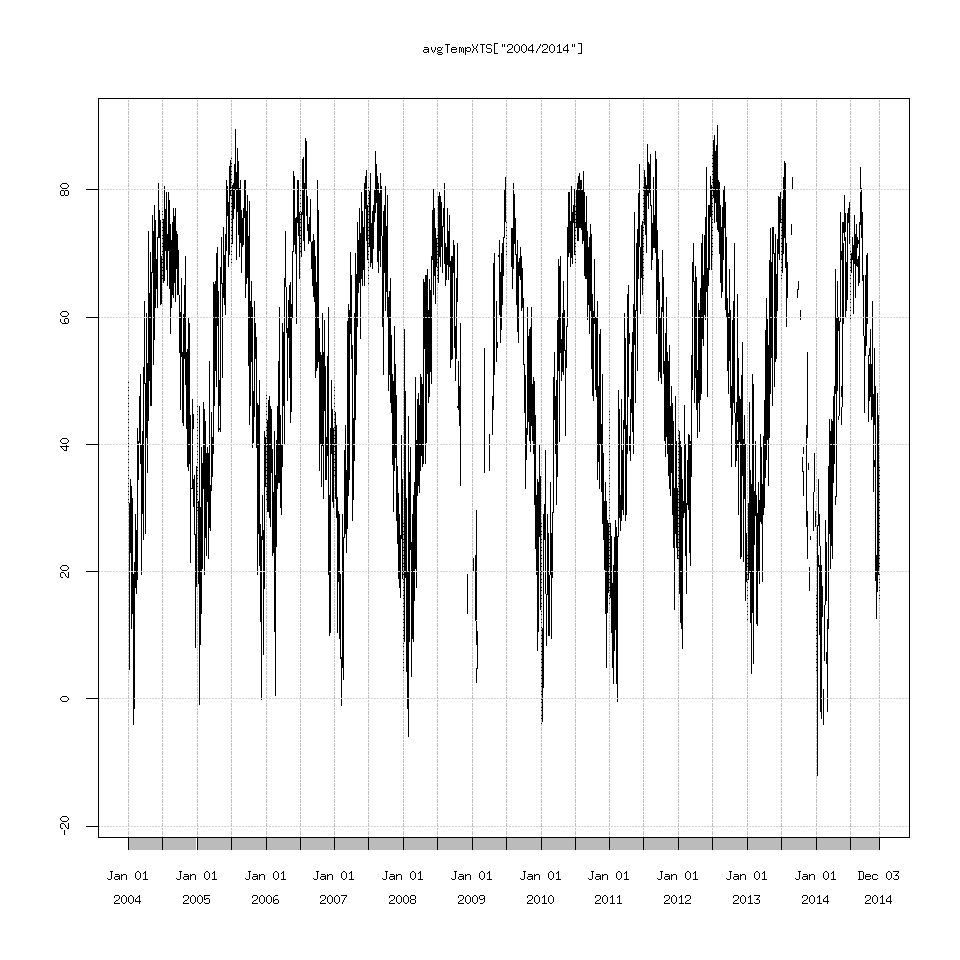
Now we can see that we are actually missing some data for recent years, quite a bit actually.
Let’s zoom in a bit further.
plot(avgTempXTS['2014'])

Man we are missing a lot of data here, but let’s plot points to double check this.
To add points to the line graph.
plot(avgTempXTS['2014'])

points(avgTempXTS['2014'])
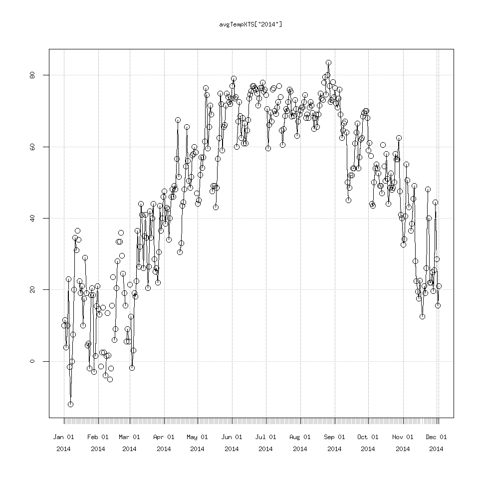
We can see some points that were missing when the line graph alone was plotted.
To discuss the points() function in R further.
These are equivalent in R:
### plot a line graph

plot(x,y,type='l')

## then add points

points(x,y)

or

### plot a scatterplot

plot(x,y)

### and add lines

lines(x,y)
You may be asking why does ” plot(avgTempXTS) ” plot a line graph by default?
If you are familiar with object orientated programming, when you call “plot(avgTempXTS)” because avgTempXTS is an xts object or variable, the xts object has its own plot routine, I would expect it to be called xts.plot() or something similar. That’s what is going on in the background here.
So I’m going to finish this post with a question, it seems there is enough missing data for it to be a serious hindrance to our analysis, what should we do about this?
Turns out we need to do some more preprocessing.
1.5 Tabling and the Need to Round