In this monthly series, I share a combination of cool data visualizations, useful tools and resources, and other visualization miscellany. The field of data visualization is full of experts who publish insights in books and on blogs, and I’ll be using this series to introduce you to a few of them. You can find previous posts by looking at the Exploring Data Visualization tag.
Creating weather predictions is a complex tasks that requires global collaboration and advanced scientific technologies. Most people know very little about how a weather prediction is put together and what is required to make it possible. NASA gives us a little glimpse into the complexities of finding out just how we know if it’s going to rain or snow anywhere in the world.
What would happen if we had no leap days?
Every four years, we make up for the fact that the timing of our days and years don’t exactly match up and keep our calendar on track with a Leap Day. But what would happen if we hadn’t decided to make this calendar correction? Ivan Lokhov of Datawrapper crunched the numbers and made a chart to look at how the world would be different without a leap day.
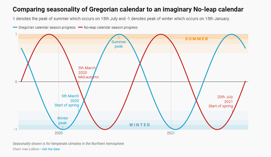
The same date in one calendar takes place in a different season than the other.
How to make a better pie chart
Pie charts are some of the most common data visualizations out there and because of this ubiquity they can often be more complicated to get right. Elizabeth Ricks from Storytelling with Data made a post on how pie charts in Excel can be improved and tweaked to ensure they are telling a story in the most effective way. Follow her tips like using color sparingly and eliminating the legend to make your pie charts that much better!
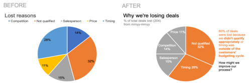
Some quick changes to color and layout make it clear which factors lead to more deals being lost.
I hope you enjoyed this data visualization news! If you have any data visualization questions, please feel free to email the Scholarly Commons.