This post is in celebration of the love data week between Feb-13-Feb 17, 2023.
What is Data visualization?
For this author, it was love at first sight. Well, technically, it was love at first Visualization. So many say seeing is believing, and data visualization helps us accomplish that, especially at the rate at which data is increasing exponentially in our world. The truth is that data is everywhere, and for us to draw meaning from it, we need to present it in a clear and concise manner.
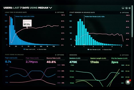
Data visualization is the graphical representation of data. Data can be represented in various forms and shapes, such as maps, charts, infographics, graphs, heat maps, or sparklines. When data is presented through visual elements, it is easy to understand and analyze. It helps you to derive meaning from the data and make better decisions. Visualizing your data involves using certain tools; these tools help you fall more in love with data.
Data Visualization tools are software that allow you to create graphical representations of your data.
Here are some tools to help you get started. These have been selected based on their ease of use, features (such as capacity for large volumes of data), cost, and popularity.
- Data Wrapper: If you are just starting out with data Visualization and you are looking for a free tool to help you get started, Data wrapper is your plug. Data Wrapper is a beginner-friendly tool with a clean and intuitive user interface accessible online. It is straightforward to navigate and great for creating charts and maps that can be easily embedded into reports. It also allows you to upload your files in various formats such as CSV, .tsv, and .txt
Pros:
- Great for beginners.
- Free to use.
- Accessible online tool.
Cons:
- It can be challenging to build complex charts.
- Limited features.
- Security is not guaranteed as it is an online tool.
- Infogram: If you are not super design-inclined, this visualization tool should be your best friend. It has an editor drag-and-drop feature that makes it super easy to create beautiful designs without having to worry about where you are with your design skills. Infographics, marketing reports, maps, social media posts, and many more are examples of what you can create with this powerful tool. In addition, your data output can be exported in various formats, such as. JPG, GIF, PNG, HTML, and . PDF.
Pros:
- Web-based.
- Drag-and-drop editor.
- Easy to use.
- Highly customizable.
Cons:
- Built-in data sources are limited.
- Not suitable for complex visualization.
- Google charts: Google Charts is another free data visualization tool that is user-friendly and compatible with all browsers and platforms. If you like to play around with codes, then Google Charts provides you with that option. Google Charts are coded with SVG and HTML5, allowing it to produce several graphic and pictorial data visualizations, ranging from simple visualization such as pie charts, bars, charts, histograms, maps, and scatter graphs to more complex ones such as hierarchical tree maps, timelines, and gauges. Google fusion tables, spreadsheets, and SQL databases are examples of data sources that can be used with Google Charts.
Pros:
- It is free.
- It is compatible with various browsers.
- Compatible with google products.
Cons:
- Technical support is limited.
- It requires network connectivity for visualization.
- There is no room for customization.
- Tableau: This is one of the most popular data visualization tools, mainly because of the free public version that this software provides. Tableau provides the option of a desktop app, server, and online versions. In addition, this software has several data importation options, such as CSV files for google ads. Similarly, if you are looking into presenting your data in various formats, such as multiple chart formats and mapping, then Tableau is the one for you.
Pros:
- Provides several options for data import.
- It is available for free (public version).
Cons:
- Lack of Privacy in the public version.
- Paid versions are costly.
5. Dundas BI: Although this is one of the oldest data visualization tools, it is still standing strong as one of the most powerful tools for visualizing data with interactive charts, tree maps, gauges, smart tables, and scorecards. This interactivity allows users to understand the data quickly. Dundas BI is also highly customizable. Dundas BI operates on the ground of responsive HTML5 web technology that allows users to connect, analyze and interact with their data on any device. This powerful tool also provides a built-in feature for extracting data from many data sources.
Pros:
- Highly flexible.
- Provides a variety of visualization options.
Cons:
- It lacks predictive analysis.
- Does not support 3D charts.
There you have it! Now you know the tools to ask out on a date when you are ready to visualize your data. As much as you love data, these tools can help make others fall in love with your data, too.