In this monthly series, I share a combination of cool data visualizations, useful tools and resources, and other visualization miscellany. The field of data visualization is full of experts who publish insights in books and on blogs, and I’ll be using this series to introduce you to a few of them. You can find previous posts by looking at the Exploring Data Visualization tag.
The unspoken rules of visualization

Kaiser Fung, author of the blog “Junk Charts,” wrote a long form essay on various chart-making conventions and how they assist our understanding of data visualizations. As Fung describes, “It’s an essay on the following observation: The efficiency and multidimensionality of the visual medium arise from a set of conventions and rules, which regularises the communications between producers of data visualisation and its consumers. These conventions and rules are often unspoken: it’s the visual equivalent of saying ’it goes without saying’.” These unspoken rules make charts easier to read for new viewers, and when they are broken unintentionally that causes confusion. The essay covers conventions on aesthetics, broken down into chart type with a mention to color; conventions on guides like axes, labels, and annotations; and a section on when to ignore conventions.
Crafting temperature charts
Cold winter days and morning commutes are the perfect time to settle down with a small craft project. For some, the cold weather and the train’s timing can also serve as inspiration for the craft project they are working on. In the last several months, Twitter and Reddit users have been sharing their data inspired crafting projects. Check out the examples below!
[OC] I made this blanket. It’s the daily high/low temperatures for Denver in 1992. from dataisbeautiful
I decided that this year, every day, I would knit a row on a scarf to mark the corresponding daily temperature/weather of my town. It felt like a good way to engage with the changing climate and with the changing year. A way to notice and not look away. Here's January then. pic.twitter.com/XQ9scIMX5c
— Josie George (@porridgebrain) February 2, 2020
Meine Mutter ist Pendlerin im Münchner Umland. Und begeisterte Strickerin. 2018 hat sie einen "Bahn-Verspätungsschal" gestrickt. Pro Tag zwei Reihen: Grau bei unter 5 Minuten, rosa bei 5 bis 30 Minuten Verspätung, rot bei Verspätung auf beiden Fahrten oder einmal über 30 Minuten. pic.twitter.com/PpGJiiU8AS
— Sara Weber (@sara__weber) January 6, 2019
Reference books
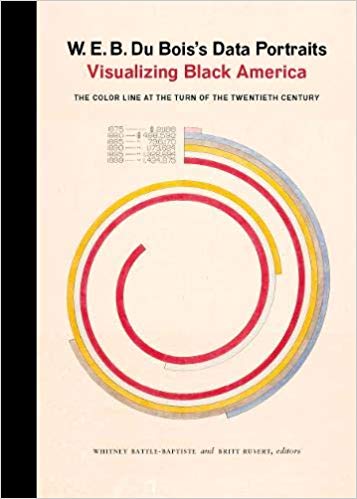
Here in the Scholarly Commons, we have a print reference collection available for use in our workspace which features a lot of books on many aspects of design and visualization. Some of our favorites are Information Graphics by Sandra Rendgen, Visual Explanations by Edward Tufte, and W.E.B. DuBois’s Data Portraits: Visualizing Black America. Come by the Scholarly Commons to see if we have a reference book that suits your needs!
I hope you enjoyed this data visualization news! If you have any data visualization questions, please feel free to email the Scholarly Commons.