 Maps are our visual representations of the world, and they shape our understanding of the world in a lot of ways. While maps can be a wonderful teaching tool, helping us to visualize our world and our place in it, misrepresentations in maps can have profound effects on our worldview. From a historical perspective, maps from different points in time illustrate the mapmakers’ priorities – what did they find important enough to include, to emphasize, to depict as larger or smaller on the map? Historian Dirk Raat, in describing how Old World peoples created maps, states that “medieval Europeans and their New World counterparts organized space according to philosophical and religious principles” (285). Meaning that their maps not only represented land mass, but how they viewed themselves and their beliefs in relation to the land that they occupied. So from this early point, maps inherently held social and political weight.
In 1569, European mapmaker Gerhardus Mercator devised a new world map projection, which became hugely popular and is to this day a widely-used representation of the world. In the Mercator projection, straight lines on the map represent constant directions on the Earth’s surface, which is hugely helpful for navigational purposes (one of the big reasons the Mercator projection became so popular at its creation). The Mercator projection, however, while utilitarian, does not accurately depict area. The map stretches the parts of the world that are nearer to the North and South poles (including Europe and North America), making them appear larger than they truly are. When using a world map as a teaching tool for conceptualizing the world, the Mercator map can be problematic because it distorts the size of landmasses.
In the twentieth century, especially as many nations in the equatorial regions of the globe were gaining independence from imperial powers such as the United Kingdom and the United States, the Mercator projection began drawing criticism for its misrepresentation of land masses. Since many developing nations are near the equator and therefore represented as much smaller than their actual size, critics argued that a map that more accurately depicted true land mass was needed. New projections such as Goode’s Homolosine and the Gall-Peters Projection (among many others) depicted the world more accurately in terms of land mass, and have become a more popular way to teach world geography.
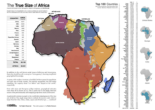
Nevertheless, many argue that ignorance of world geography (or as Kai Krause calls it, “immappancy”) is still prevalent, especially among first-world peoples. This image, The True Size of Africa*, by Krause, illustrates a point that has been discussed for decades about the implications of misrepresenting land mass area in world map projections. Krause’s map makes us stop and question our view of world geography, and what effects that view could have on social and political issues. This discussion is one that will likely continue for some time, and one that carries many implications in the realm of global studies. Check out the resources below to investigate this topic further.
* It is important to point out that Krause actually used the Mercator projection country shapes in his illustration, something that has drawn some criticism from cartographers.
Books at UIUC Library:
Johnson, Jenny Marie. (2003). Geographic information :how to find it, how to use it. Westport, Conn. : Greenwood Press.
Barber, Peter.Harper, Tom. (2010). Magnificent maps :power, propaganda and art. London : British Library.
Garfield, Simon. (2013). On the map : a mind-expanding exploration of the way the world looks. New York, N.Y. : Gotham Books.
Piper, Karen Lynnea. (2002). Cartographic fictions :maps, race, and identity. New Brunswick, N.J. : Rutgers University Press.
Wood, Denis.Fels, John. (2008). The natures of maps :cartographic constructions of the natural world. Chicago : University of Chicago Press.
Articles:
Raat, W. (2004). Innovative Ways to Look at New World Historical Geography. History Teacher, 37(3), 281-306.
Stephens, David. (February 2002). Making Sense of Maps. In History Matters: The U.S. Survey Course on the Web. Retrieved from http://historymatters.gmu.edu/mse/maps/.
Walbert, David. (2010) Projections and Propaganda. In Map skills and higher-order thinking. Retrieved from http://www.learnnc.org/lp/editions/mapping/6434
Awesome websites on maps and cartography:
BU African Studies Center – Teaching Africa – How Big is Africa?
Maps as Instruments of Propaganda
