What We Will Be Covering
Do not convey information by color alone.
Color Contrast Testing
We follow Web Content Accessibility Guidelines (WCAG) rules for digital accessibility.
Here are a few you will want to know:
- WCAG 2.0 level AA requires a contrast ratio of at least 4.5:1 for normal text and 3:1 for large text. (Currently required at UIUC.)
- WCAG 2.1 adds the requirement for a contrast ratio of at least 3:1 for graphics and user interface components (such as form input borders). (Internally suggested to follow at UIUC.)
- WCAG 2.1 Level AAA requires a contrast ratio of at least 7:1 for normal text and 4.5:1 for large text. (Currently, UIUC doesn’t require AAA standards.)
Sound complicated?
It boils down to knowing 2 things.
- Difference between large text and regular text
- How to use a color contrast checker
Large text is defined as:
- Bold: 14 point (typically 18.66px) and bold or larger, (I just use 19px to make it easier to remember)
- Normal: 18 point (typically 24px) or larger.
- Note the difference between points and pixels.
Regular text is defined as:
- Bold: anything smaller than 14 point (typically 18.66px)
- Normal: anything smaller than 18 point (typically 24px)
- Note the difference between points and pixels.
Applying these rules to the Illinois color palette and more
Illini Orange
We can only use Illini Orange text for large text, ie-some headings, on a white background for all media.
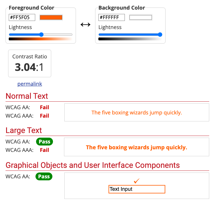
Illini Orange hex code is #FF5F05. (Recently changed from #FF552E)
Using a color contrast checker, the comparison for Illini Orange to White (#FFFFFF) is 3.05. That means it passes for large text on AA standards only since it is greater than 1:3.
Quick demonstration: checking Illini Orange on white
Sample Heading 2 to Check
So, what size is large text? Do you remember?
Normal text is at least ___ points or ___ pixels?
How about bold text? At least ___ points or ___ pixels?
How about Illini Blue on Illini Orange?
Illini Orange and Illini Blue color combinations work on both sizes. They pass the color contrast ratios for normal text and large text.
Why we have Altgeld and how we should use it.
We typically use Alteged color #C84113 for normal text. You will see this a lot in hover or focus states for normal text.
Since Illini Orange doesn’t pass the contrast ratio of 3:1 to use as normal text, we substitute Altgeld instead. It’s a bit darker than the Illini Orange so from a branding standpoint, we use it in smaller sections as needed. It shouldn’t be a color used in large quantities.
Illini Blue
Since Illini Blue is a dark color, the lighter colors work best. You can use white or Illini Orange on Illini Blue at all sizes.
How about Illini Blue color combinations? White is great at all sizes.
Here’s Illini Orange on Illini Blue in normal text and it also passes.
Gray
Why we have Altgeld and how we should use it.
How about Illini Blue color combinations? It’s is great at all sizes.
Altgeld will work on this gray #F4F4F4, but remember, usually only used as a hover or focus color.
Example showing a darker gray color.
This sentence is showing normal text in blue.
This color combination just barely passes for normal text, but is still a little hard to read, so I encourage you to go for more than the minimum.
This blue and gray combination actually passes the AAA standards!
Is this easier to read? Try to dim your monitor or go outside and see the difference between the two.
White fails on this gray in case you are wondering.
Your Color Cheatsheet & Resources
Explore the XD themes document for the Illinois branded web theme style guide. Take a look at orange. We actually use multiple shades of orange to pass accessibility on different background colors at different sizes.
What about text on top of images?
The same rules apply! I’m sure you noticed the pattern: on dark colors, use light colors, and vice versa.
Images with Text
An image of text refers to readable text that is embedded in an image or a flattened file as most designers might say. It’s one that a user can’t select the text or a screen reader can’t reference the text without alt text.
The Web Content Accessibility Guidelines (WCAG) recommend avoiding using images of text if you intend the text to be read by the user, unless it’s essential or necessary. An essential example is a logo or brand name and alt text is required.