Free, Open Source Optical Character Recognition with gImageReader

Optical Character Recognition (OCR) is a powerful tool to transform scanned, static images of text into machine-readable data, making it possible to search, edit, and analyze text. If you’re using OCR, chances are you’re working with either ABBYY FineReader or Adobe Acrobat Pro. However, both ABBYY and Acrobat are propriety software with a steep price tag, and while they are both available in the Scholarly Commons, you may want to perform OCR beyond your time at the University of Illinois.

Thankfully, there’s a free, open source alternative for OCR: Tesseract. By itself, Tesseract only works through the command line, which creates a steep learning curve for those unaccustomed to working with a command-line interface (CLI). Additionally, it is fairly difficult to transform a jpg into a searchable PDF with Tesseract.

Thankfully, there are many free, open source programs that provide Tesseract with a graphical user interface (GUI), which not only makes Tesseract much easier to use, some of them come with layout editors that make it possible to create searchable PDFs. You can see the full list of programs on this page.

The program logo for gImageReader

The program logo for gImageReader

In this post, I will focus on one of these programs, gImageReader, but as you can see on that page, there are many options available on multiple operating systems. I tried all of the Windows-compatible programs and decided that gImageReader was the closest to what I was looking for, a free alternative to ABBYY FineReader that does a pretty good job of letting you correct OCR mistakes and exporting to a searchable PDF.

Installation

gImageReader is available for Windows and Linux. Though they do not include a Mac compatible version in the list of releases, it may be possible to get it to work if you use a package manager for Mac such as Homebrew. I have not tested this though, so I do not make any guarantees about how possible it is to get a working version of gImageReader on Mac.

To install gImageReader on Windows, go to the releases page on Windows. From there, go to the most recent release of the program at the top and click Assets to expand the list of files included with the release. Then select the file that has the .exe extension to download it. You can then run that file to install the program.

Manual

The installation of gImageReader comes with a manual as an HTML file that can be opened by any browser. As of the date of this post, the Fossies software archive is hosting the manual on its website.

Setting OCR Mode

gImageReader has two OCR modes: “Plain Text” and “hOCR, PDF”. Plain Text is the default mode and only recognizes the text itself without any formatting or layout detection. You can export this to a text file or copy and paste it into another program. This may be useful in some cases, but if you want to export a searchable PDF, you will need to use hOCR, PDF mode. hOCR is a standard for formatting OCR text using either XML or HTML and includes layout information, font, OCR result confidence, and other formatting information.

To set the recognition to hOCR, PDF mode, go to the toolbar at the top. It includes a section for “OCR mode” with a dropdown menu. From there, click the dropdown and select hOCR, PDF:

gImageReader Toolbar

This is the toolbar for gImageReader. You can set OCR mode by using the dropdown that is the third option from the right.

Adding Images, Performing Recognition, and Setting Language

If you have images already scanned, you can add them to be recognized by clicking the Add Images button on the left panel, which looks like a folder. You can then select multiple images if you want to create a multipage PDF. You can always add more images later by clicking that folder button again.

On that left panel, you can also click the Acquire tab button, which allows you to get images directly from a scanner, if the computer you’re using has a scanner connected.

Once you have the images you want, click the Recognize button to recognize the text on the page. Please note that if you have multiple images added, you’ll need to click this button for every page.

If you want to perform recognition on a language other than English, click the arrow next to Recognize. You’ll need to have that language installed, but you can install additional languages by clicking “Manage Languages” in the dropdown appears. If the language is already installed, you can go to the first option listed in the dropdown to select a different language.

Viewing the OCR Result

In this example, I will be performing OCR on this letter by Franklin D. Roosevelt:

Raw scanned image of a typewritten letter signed by Franklin Roosevelt

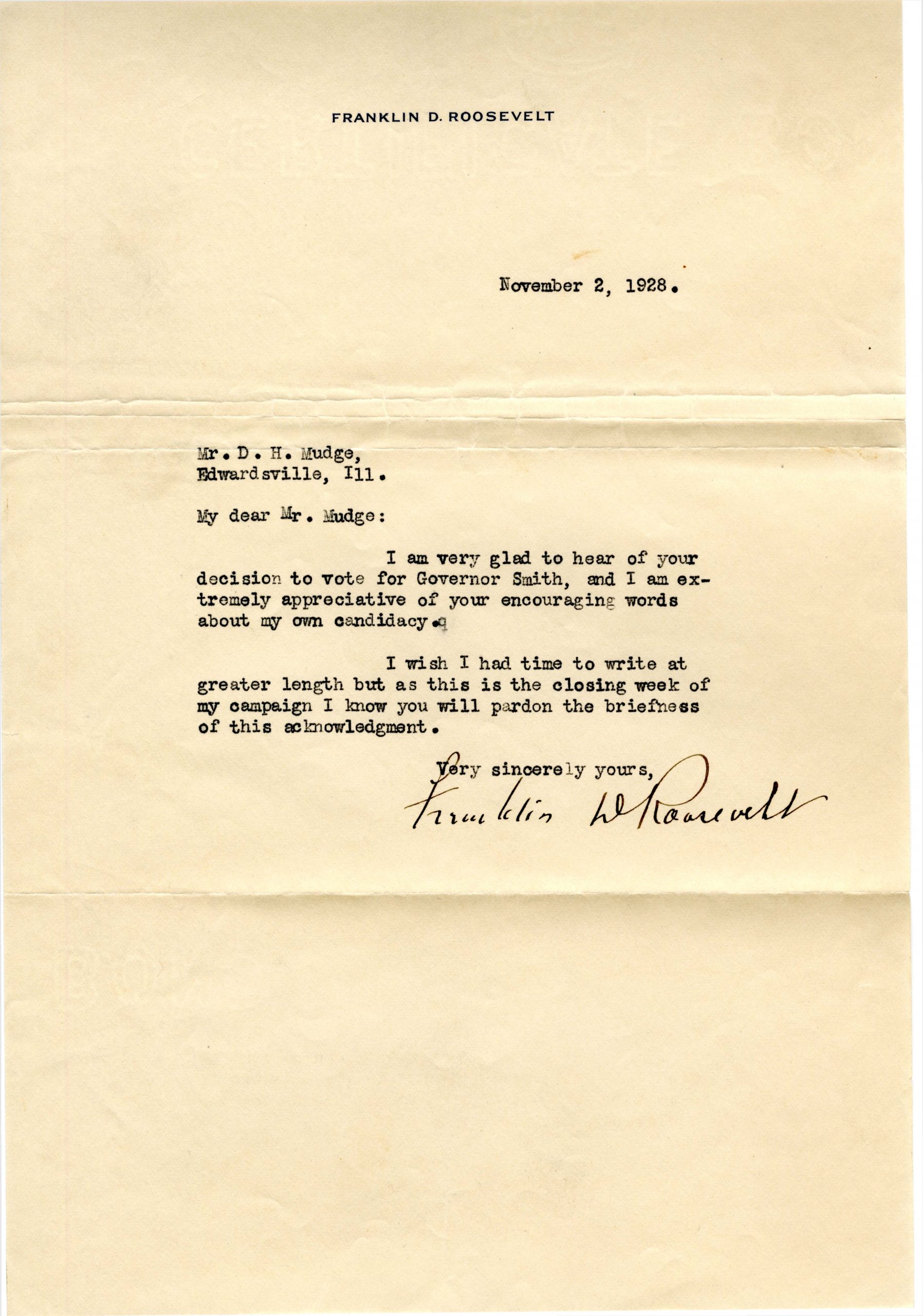
This 1928 letter from Franklin D. Roosevelt to D. H. Mudge Sr. is courtesy of Madison Historical: The Online Encyclopedia and Digital Archive for Madison County Illinois. https://madison-historical.siue.edu/archive/items/show/819

Once you’ve performed OCR, there will be an output panel on the right. There are a series of buttons above the result. Click the button on the far right to view the text result overlaid on top of the image:

The text result of performing OCR on the FDR letter overlaid on the original scan.

Here is the the text overlaid on an image of the original scan. Note how the scan is slightly transparent now to make the text easier to read.

Correcting OCR

The OCR process did a pretty good job with this example, but it there are a handful of errors. You can click on any of the words of text to show them on the right panel. I will click on the “eclnowledgment” at the end of the letter to correct it. It will then jump to that part of the hOCR “tree” on the right:

hOCR tree in gImageReader, which shows the recognition result of each word in a tree-like structure.

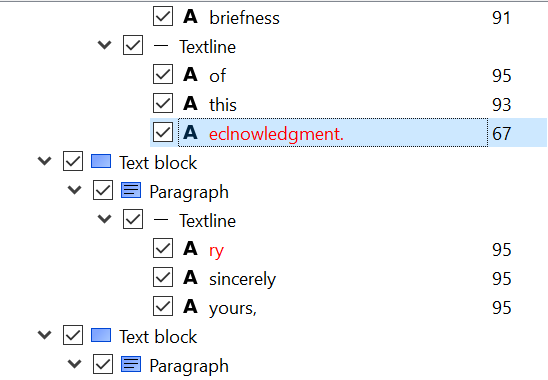
The hOCR tree in gImageReader, which also shows OCR result.

Note in this screenshot I have clicked the second button from the right to show the confidence values, where the higher the number, the higher the confidence Tesseract has with the result. In this case, it is 67% sure that eclnowledgement is correct. Since it obviously isn’t correct, we can type new text by double-clicking on the word in this panel and type “acknowledgement.” You can do this for any errors on the page.

Other correction tips:

  1. If there are any regions that are not text that it is still recognizing, you can right click them on the right and delete them.
  2. You can change the recognized font and its size by going to the bottom area labeled “Properties.” Font size is controlled by the x_fsize field, and x_font has a dropdown where you can select a font.
  3. It is also possible to change the area of the blue word box once it is selected, simply by clicking and dragging the edges and corners.
  4. If there is an area of text that was not captured by the recognition, you can also right click in the hOCR “tree” to add text blocks, paragraphs, textlines, and words to the document. This allows you to draw a box on image and then type what the text says.

Exporting to PDF

Once you are done making OCR corrections, you can export to a searchable PDF. To do so, click the Export button above the hOCR “tree,” which is the third button from the left. Then, select export to PDF. It then gives you several options to set the compression and quality of the PDF image, and once you click OK, it should export the PDF.

Conclusion

Unfortunately, there are some limitations to gImageViewer, as can often be the case with free, open source software. Here are some potential problems you may have with this program:

  1. While you can add new areas to recognize with OCR, there is not a way to change the order of these elements inside the hOCR “tree,” which could be an issue if you are trying to make the reading order clear for accessibility reasons. One potential workaround could be to use the Reading Order options on Adobe Acrobat, which you can read about in this libguide.
  2. You cannot show the areas of the document that are in a recognition box unless you click on a word, unlike ABBYY FineReader which shows all recognition areas at once on the original image.
  3. You cannot perform recognition on all pages at once. You have to click the recognition button individually for each page.
  4. Though there are some image correction options to improve OCR, such as brightness, contrast, and rotation, it does not have as many options as ABBYY FineReader.

gImageViewer is not nearly as user friendly or have all of the features that ABBYY FineReader has, so you will probably want to use ABBYY if it is available to you. However, I find gImageViewer a pretty good program that can meet most general OCR needs.

Scholarly Commons Software: Open Source Alternatives

Hello from home to all my fellow (new) work-from-homers!

In light of measures taken to protect public health, it can feel as though our work schedules have been shaken up. However, we are here to help you get back on track and the first thing to do is make sure you have all the tools necessary to be successful at home.

Continue reading

A Brief Explanation of GitHub for Non-Software-Developers

GitHub is a platform mostly used by software developers for collaborative work. You might be thinking “I’m not a software developer, what does this have to do with me?” Don’t go anywhere! In this post I explain what GitHub is and how it can be applied to collaborative writing for non-programmers. Who knows, GitHub might become your new best friend.

Gif of a cat typing

You don’t need to be a computer wiz to get Git.

Picture this: you and some colleagues have similar research interests and want to collaborate on a paper. You have divided the writing work to allow each of you to work on a different element of the paper. Using a cloud platform like Google Docs or Microsoft Word online you compile your work, but things start to get messy. Edits are made on the document and you are unsure who made them or why. Elements get deleted and you do not know how to retrieve your previous work. You have multiple files saved on your computer with names like “researchpaper1.dox”, “researchpaper1 with edits.dox” and “research paper1 with new edits.dox”. Managing your own work is hard enough but when collaborators are added to the mix it just becomes unmanageable. After a never ending reply-all email chain and what felt like the longest meeting of all time, you and your colleagues are finally on the same page about the writing and editing of your paper. It just makes you think, there has got to be a better way to do this. Issues with collaboration are not exclusive to writing, they happen all the time in programming, which is why software-developers came up with version control systems like Git and GitHub.

Gif of Spongebob running around an office on fire with paper and filing cabinets on the floor

Managing versions of your work can be stressful. Don’t panic because GitHub can help.

GitHub allows developers to work together through branching and merging. Branching is the process by which the original file or source code is duplicated into clone files. These clones contain all the elements already in the original file and can be worked in independently. Developers use these clones to write and test code before combining it with the original code. Once their version of the code is ready they integrate or “push” it into the source code in a process called merging. Then, other members of the team are alerted of these changes and can “pull” the merged code from the source code into their respective clones. Additionally, every version of the project is saved after changes are made, allowing users to consult previous versions. Every version of your project is saved with with descriptions of what changes were made in that particular version, these are called commits. Now, this is a simplified explanation of what GitHub does but my hope is that you now understand GitHub’s applications because what I am about to say next might blow your mind: GitHub is not just for programmers! You do not need to know any coding to work with GitHub. After all, code and written language are very similar.

Even if you cannot write a single line of code, GitHub can be incredibly useful for a variety of reasons:
1. It allows you to electronically backup your work for free.
2. All the different versions of your work are saved separately, allowing you to look back at previous edits.
3. It alerts all collaborators when a change is made and they can merge that change into their own versions of the text.
4. It allows you to write using plain text, something commonly requested by publishers.

Hopefully, if you’ve made it this far into the article you’re thinking, “This sounds great, let’s get started!” For more information on using GitHub you can consult the Library’s guide on GitHub or follow the step by step instructions on GitHub’s Hello-World Guide.

Gif of man saying "check it out" and pointing to the right.

There are many resources on getting started with GitHub. Check them out!

Here are some links to what others have said about using GitHub for non-programmers:

Google MyMaps Part II: The Problem with Projections

Back in October, we published a blog post introducing you to Google MyMaps, an easy way to display simple information in map form. Today we’re going to revisit that topic and explore some further ways in which MyMaps can help you visualize different kinds of data!

One of the most basic things that students of geography learn is the problem of projections: the earth is a sphere, and there is no perfect way to translate an image from the surface of a sphere to a flat plane. Nevertheless, cartographers over the years have come up with many projection systems which attempt to do just that, with varying degrees of success. Google Maps (and, by extension, Google MyMaps) uses perhaps the most common of these, the Mercator projectionDespite its ubiquity, the Mercator projection has been criticized for not keeping area uniform across the map. This means that shapes far away from the equator appear to be disproportionately larger in comparison with shapes on the equator.

Luckily, MyMaps provides a method of pulling up the curtain on Mercator’s distortion. The “Draw a line” tool,  , located just below the search bar at the top of the MyMaps screen, allows users to create a rough outline of any shape on the map, and then drag that outline around the world to compare its size. Here’s how it works: After clicking on “Draw a line,” select “Add line or shape” and begin adding points to the map by clicking. Don’t worry about where you’re adding your points just yet, once you’ve created a shape you can move it anywhere you’d like! Once you have three or four points, complete the polygon by clicking back on top of your first point, and you should have a shape that looks something like this:

A block drawn in MyMaps and placed over Illinois

Now it’s time to create a more detailed outline. Click and drag your shape over the area you want to outline, and get to work! You can change the size of your shape by dragging on the points at the corners, and you can add more points by clicking and dragging on the transparent circles located midway between each corner. For this example, I made a rough outline of Greenland, as you can see below.

Area of Greenland made in MyMaps

You can get as detailed as you want with the points on your shapes, depending on how much time you want to spend clicking and dragging points around on your computer screen. Obviously I did not perfectly trace the exact coastline of Greenland, but my finished product is at least recognizable enough. Now for the fun part! Click somewhere inside the boundary of your shape, drag it somewhere else on the map, and see Mercator’s distortion come to life before your eyes.

Area of Greenland placed over Africa

Here you can see the exact same shape as in the previous image, except instead of hovering over Greenland at the north end of the map, it is placed over Africa and the equator. The area of the shape is exactly the same, but the way it is displayed on the map has been adjusted for the relative distortion of the particular position it now occupies on the map. If that hasn’t sufficiently shaken your understanding of our planet, MyMaps has one more tool for illuminating the divide between the map and reality. The “Measure distances and areas” tool, , draws a “straight” line between any two (or more) points on the map. “Straight” is in quotes there because, as we’re about to see, a straight line on the globe (and therefore in reality) doesn’t typically align with straight lines on the map. For example, if I wanted to see the shortest distance between Chicago and Frankfurt, Germany, I could display that with the Measure tool like so:

Distance line, Chicago to Frankfurt, Germany

The curve in this line represents the curvature of the earth, and demonstrates how the actual shortest distance is not the same as a straight line drawn on the map. This principle is made even more clear through using the Measure tool a little farther north.

Distance line, Chicago to Frankfurt, Germany, set over Greenland

The beginning and ending points of this line are roughly directly north of Chicago and Frankfurt, respectively, however we notice two differences between this and the previous measurement right away. First, this is showing a much shorter distance than Chicago to Frankfurt, and second, the curve in the line is much more distinct. Both of these differences arise, once again, from the difficulty of displaying a sphere on a flat surface. Actual distances get shorter the closer you get to the north (or south) ends of the map, which in turn causes all of the distortions we have seen in this post.

How might a better understanding of projection systems improve your own research? What are some other ways in which the Mercator projection (or any other) have deceived us? Explore for yourself and let us know!

An Introduction to Google MyMaps

Geographic information systems (GIS) are a fantastic way to visualize spatial data. As any student of geography will happily explain, a well-designed map can tell compelling stories with data which could not be expressed through any other format. Unfortunately, traditional GIS programs such as ArcGIS and QGIS are incredibly inaccessible to people who aren’t willing or able to take a class on the software or at least dedicate significant time to self-guided learning.

Luckily, there’s a lower-key option for some simple geospatial visualizations that’s free to use for anybody with a Google account. Google MyMaps cannot do most of the things that ArcMap can, but it’s really good at the small number of things it does set out to do. Best of all, it’s easy!

How easy, you ask? Well, just about as easy as filling out a spreadsheet! In fact, that’s exactly where you should start. After logging into your Google Drive account, open a new spreadsheet in Sheets. In order to have a functioning end product you’ll want at least two columns. One of these columns will be the name of the place you are identifying on the map, and the other will be its location. Column order doesn’t matter here- you’ll get the chance later to tell MyMaps which column is supposed to do what. Locations can be as specific or as broad as you’d like. For example, you could input a location like “Canada” or “India,” or you could choose to input “1408 W. Gregory Drive, Urbana, IL 61801.” The catch is that each location is only represented by a marker indicating a single point. So if you choose a specific address, like the one above, the marker will indicate the location of that address. But if you choose a country or a state, you will end up with a marker located somewhere over the center of that area.

So, let’s say you want to make a map showing the locations of all of the libraries on the University of Illinois’ campus. Your spreadsheet would look something like this:

Sample spreadsheet

Once you’ve finished compiling your spreadsheet, it’s time to actually make your map. You can access the Google MyMaps page by going to www.google.com/mymaps. From here, simply select “Create a New Map” and you’ll be taken to a page that looks suspiciously similar to Google Maps. In the top left corner, where you might be used to typing in directions to the nearest Starbucks, there’s a window that allows you to name your map and import a spreadsheet. Click on “Import,”  and navigate through Google Drive to wherever you saved your spreadsheet.

When you are asked to “Choose columns to position your placemarks,” select whatever column you used for your locations. Then select the other column when you’re prompted to “Choose a column to title your markers.” Voila! You have a map. Mine looks like this:  

Michael's GoogleMyMap

At this point you may be thinking to yourself, “that’s great, but how useful can a bunch of points on a map really be?” That’s a great question! This ultra-simple geospatial visualization may not seem like much. But it actually has a range of uses. For one, this type of visualization is excellent at giving viewers a sense of how geographically concentrated a certain type of place is. As an example, say you were wondering whether it’s true that most of the best universities in the U.S. are located in the Northeast. Google MyMaps can help with that!

Map of best universities in the United States

This map, made using the same instructions detailed above, is based off of the U.S. News and World Report’s 2019 Best Universities Ranking. Based on the map, it does in fact appear that more of the nation’s top 25 universities are located in the northeastern part of the country than anywhere else, while the West (with the notable exception of California) is wholly underrepresented.

This is only the beginning of what Google MyMaps can do: play around with the options and you’ll soon learn how to color-code the points on your map, add labels, and even totally change the appearance of the underlying base map. Check back in a few weeks for another tutorial on some more advanced things you can do with Google MyMaps!

Try it yourself!

Exploring Data Visualization #3

In this monthly series, I share a combination of cool data visualizations, useful tools and resources, and other visualization miscellany. The field of data visualization is full of experts who publish insights in books and on blogs, and I’ll be using this series to introduce you to a few of them. You can find previous posts by looking at the Exploring Data Visualization tag.

Welcome back to this blog series! Here are some of the things I read in April:

a photograph of a knit pattern in a very strange shape, using green yarn

“Make Caows and Shapcho” pattern knit by MeganAnn (https://www.ravelry.com/projects/MeganAnn/skyknit-the-collection)

1) Janelle Shane, who has created a new kind of humor based on neural networks, trained a neural network to generate knitting patterns. Experienced knitters then attempted these patterns so we can see what the computer generated, ranging from reasonable to silly to downright creepy creations.

map showing that many areas of the United States get their first leaf earlier than in the past

from NASA Earth Observatory, “Spring is Arriving Earlier in National Parks”

2) Considering we had snowfall in April, you might not think spring began early this year (I know I don’t!). But broadly speaking, climate change has caused spring to begin earlier and earlier across the United States. The NASA Earth Observatory looked at data published in 2016 to create maps that visualize how climate change has changed the timing of spring.

3) If you want to learn a new tool but aren’t sure what to choose, have a look at Nathan Yau’s suggestions in his post What I Use to Visualize Data. He even divides his list into categories based on where he is in the process, such as initial data processing versus final visualizations.

Finding Digital Humanities Tools in 2017

Here at the Scholarly Commons we want to make sure our patrons know what options are out there for conducting and presenting their research. The digital humanities are becoming increasingly accepted and expected. In fact, you can even play an online game about creating a digital humanities center at a university. After a year of exploring a variety of digital humanities tools, one theme has emerged throughout: taking advantage of the capabilities of new technology to truly revolutionize scholarly communications is actually a really hard thing to do.  Please don’t lose sight of this.

Finding digital humanities tools can be quite challenging. To start, many of your options will be open source tools that you need a server and IT skills to run ($500+ per machine or a cloud with slightly less or comparable cost on the long term). Even when they aren’t expensive be prepared to find yourself in the command line or having to write code, even when a tool is advertised as beginner-friendly.

Mukurtu Help Page Screen Shot

I think this has been taken down because even they aren’t kidding themselves anymore.

There is also the issue of maintenance. While free and open source projects are where young computer nerds go to make a name for themselves, not every project is going to have the paid staff or organized and dedicated community to keep the project maintained over the years. What’s more, many digital humanities tool-building projects are often initiatives from humanists who don’t know what’s possible or what they are doing, with wildly vacillating amounts of grant money available at any given time. This is exacerbated by rapid technological changes, or the fact that many projects were created without sustainability or digital preservation in mind from the get-go. And finally, for digital humanists, failure is not considered a rite of passage to the extent it is in Silicon Valley, which is part of why sometimes you find projects that no longer work still listed as viable resources.

Finding Digital Humanities Tools Part 1: DiRT and TAPoR

Yes, we have talked about DiRT here on Commons Knowledge. Although the Digital Research Tools directory is an extensive resource full of useful reviews, over time it has increasingly become a graveyard of failed digital humanities projects (and sometimes randomly switches to Spanish). DiRT directory itself  comes from Project Bamboo, “… a  humanities cyber- infrastructure  initiative  funded  by  the  Andrew  W.  Mellon Foundation between 2008 and 2012, in order to enhance arts and humanities research through the development of infrastructure and support for shared technology services” (Dombrowski, 2014).  If you are confused about what that means, it’s okay, a lot of people were too, which led to many problems.

TAPoR 3, Text Analysis Portal for Research is DiRT’s Canadian counterpart, which also contains reviews of a variety of digital humanities tools, despite keeping text analysis in the name. Like DiRT, outdated sources are listed.

Part 2: Data Journalism, digital versions of your favorite disciplines, digital pedagogy, and other related fields.

A lot of data journalism tools crossover with digital humanities; in fact, there are even joint Digital Humanities and Data Journalism conferences! You may have even noticed how The Knight Foundation is to data journalism what the Mellon Foundation is to digital humanities. However, Journalism Tools and the list version on Medium from the Tow-Knight Center for Entrepreneurial Journalism at CUNY Graduate School of Journalism and the Resources page from Data Driven Journalism, an initiative from the European Journalism Centre and partially funded by the Dutch government, are both good places to look for resources. As with DiRT and TAPoR, there are similar issues with staying up-to-date. Also data journalism resources tend to list more proprietary tools.

Also, be sure to check out resources for “digital” + [insert humanities/social science discipline], such as digital archeology and digital history.  And of course, another subset of digital humanities is digital pedagogy, which focuses on using technology to augment educational experiences of both  K-12 and university students. A lot of tools and techniques developed for digital pedagogy can also be used outside the classroom for research and presentation purposes. However, even digital science resources can have a lot of useful tools if you are willing to scroll past an occasional plasmid sharing platform. Just remember to be creative and try to think of other disciplines tackling similar issues to what you are trying to do in their research!

Part 3: There is a lot of out-of-date advice out there.

There are librarians who write overviews of digital humanities tools and don’t bother test to see if they still work or are still updated. I am very aware of how hard things are to use and how quickly things change, and I’m not at all talking about the people who couldn’t keep their websites and curated lists updated. Rather, I’m talking about, how the “Top Tools for Digital Humanities Research” in the January/February 2017  issue of “Computers in Libraries” mentions Sophie, an interactive eBook creator  (Herther, 2017). However, Sophie has not updated since 2011 and the link for the fully open source version goes to “Watch King Kong 2 for Free”.

Screenshot of announcement for 2010 Sophie workshop at Scholarly Commons

Looks like we all missed the Scholarly Commons Sophie workshop by only 7 years.

The fact that no one caught that error either shows either how slowly magazines edit, or that no one else bothered check. If no one seems to have created any projects with the software in the past three years it’s probably best to assume it’s no longer happening; though, the best route is to always check for yourself.

Long term solutions:

Save your work in other formats for long term storage. Take your data management and digital preservation seriously. We have resources that can help you find the best options for saving your research.

If you are serious about digital humanities you should really consider learning to code. We have a lot of resources for teaching yourself these skills here at the Scholarly Commons, as well as a wide range of workshops during the school year. As far as coding languages, HTML/CSS, Javascript, Python are probably the most widely-used tools in the digital humanities, and the most helpful. Depending on how much time you put into this, learning to code can help you troubleshoot and customize your tools, as well as allow you contribute to and help maintain the open source projects that you care about.

Works Cited:

100 tools for investigative journalists. (2016). Retrieved May 18, 2017, from https://medium.com/@Journalism2ls/75-tools-for-investigative-journalists-7df8b151db35

Center for Digital Scholarship Portal Mukurtu CMS.  (2017). Support. Retrieved May 11, 2017 from http://support.mukurtu.org/?b_id=633

DiRT Directory. (2015). Retrieved May 18, 2017 from http://dirtdirectory.org/

Digital tools for researchers. (2012, November 18). Retrieved May 31, 2017, from http://connectedresearchers.com/online-tools-for-researchers/

Dombrowski, Q. (2014). What Ever Happened to Project Bamboo? Literary and Linguistic Computing. https://doi.org/10.1093/llc/fqu026

Herther, N.K. (2017). Top Tools for Digital Humanities Research. Retrieved May 18, 2017, from http://www.infotoday.com/cilmag/jan17/Herther–Top-Tools-for-Digital-Humanities-Research.shtml

Journalism Tools. (2016). Retrieved May 18, 2017 from http://journalismtools.io/

Lord, G., Nieves, A.D., and Simons, J. (2015). dhQuest. http://dhquest.com/

Resources Data Driven Journalism. (2017). Retrieved May 18, 2017, from http://datadrivenjournalism.net/resources
TAPoR 3. (2015). Retrieved May 18, 2017 from http://tapor.ca/home

Visel, D. (2010). Upcoming Sophie Workshops. Retrieved May 18, 2017, from http://sophie2.org/trac/blog/upcomingsophieworkshops