Co-Authored by Zhaneille Green
We use maps to communicate all the time. Historically, they have been used to navigate the world and to stand as visual, physical manifestations of defined spaces and places. What do you think of when we say “map”: a topographic map1 a transportation map2 or a city map3?

Image 1. Map of the Isle of Man. Eric Gaba (Sting – fr:Sting), CC BY-SA 3.0 via Wikimedia Commons 
Image 2. Trans-African Highway Map. I, Rexparry sydney, CC BY-SA 3.0 via Wikimedia Commons 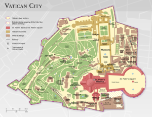
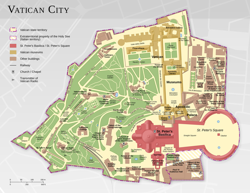
Image 3. Map of the Vatican City. Thomas Römer/OpenStreetMap data, CC BY-SA 3.0 via Wikimedia Commons
You can use maps to represent just about anything you want to say, far beyond these typical examples. We wrote this blog to invite you to have a little cartographic fun of your own.
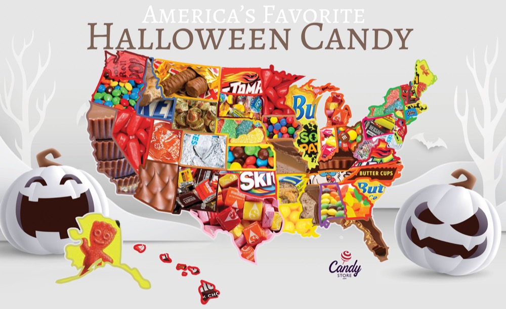
If you’re on any kind of social media, you’ve probably seen maps like the one below, highlighting anything from each state’s favorite kind of candy to what the continental US would look like if all of the states’ borders were drawn along rivers and mountain ranges. People definitely seem to enjoy sharing these maps, curious to see what grocery store most people shop at in their home state, or laughing about California’s lack of popularity with the states in the surrounding area.
Try your hand at creating your own silly map by using our programs in the Scholarly Commons. Start a war by creating a map that ranks the Southern states with the best barbecue using Adobe Photoshop or Illustrator, or explore a personal hobby like creating a map of all the creatures Sam & Dean Winchester met through the 15 seasons of Supernatural using ArcGIS.
If you’re feeling a bit more serious, don’t fret! Even if these meme-like maps aren’t portraying the most critical information, they do demonstrate how maps can be a great tool for data visualization. In many ways, location can make data feel more personal, because we all have personal connections to place. Admit it: the first thing you checked on the favorite candy map was your home state. Maps also tend to be more visually engaging than a simple table with, for example, states in one column and favorite animal in the other.
Regardless of what you want to map, the Scholarly Commons has the tools to help bring your vision to life. Learn about software access on our website, and check out these LinkedIn Learning resources for an introduction to ArcGIS Online or Photoshop, which are available with University of Illinois login credentials. If you need more assistance, feel free to ask us questions. Go forth and meme!