
I approach data visualization with a pragmatic philosophy. I favor simple, clear visualizations over flashy ones. I emphasize purpose and utility over style. Data visualizations need to be connected to a broader research context or pedagogical goal. Axes must be properly labeled and figures must be named with an appropriate caption. As someone who is colorblind, I am sensitive to the accessibility of visualizations. In both practice and teaching, then, I aim for visualizations to adhere to the guidelines for universal design. To teach visualizations, I typically use Edward Tufte’s books and selections from Brumberger and Northcut’s Designing Texts: Teaching Visual Communication. I draw on L. Dee Fink’s course design to help me teach computer programs that are unfamiliar to students. Here is a representative example of my work in the context of a recent presentation.
Representative Example
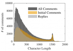
Below is a visualization (histogram) of approximately half a million comments from The New York Times. After web-scraping, I ran these comments through MatLab to identify the distribution of comment length because the averages do not accurately depict the typical length of comments due the the newspaper’s 1500 character limit (hence the spike around this number). This example shows how visualizations can give a more complete story than averages alone.
Rich Media Resources
D3.js (data-driven documents using javascript)
Three.js (javascript 3-D library)
Visualizing Algorithms (from Mike Bostock)
Simple Resources
Floating Sheep (maps)
Gephi (open source graph visualization)
38 resources for visualization