Simple NetInt: A New Data Visualization Tool from Illinois Assistant Professor, Juan Salamanca

Juan Salamanca Ph.D, Assistant Professor in the School of Art and Design at the University of Illinois Urbana-Champaign recently created a new data visualization tool called Simple NetInt. Though developed from a tool he created a few years ago, this tool brings entirely new opportunities to digital scholarship! This week we had the chance to talk to Juan about this new tool in data visualization. Here’s what he said…

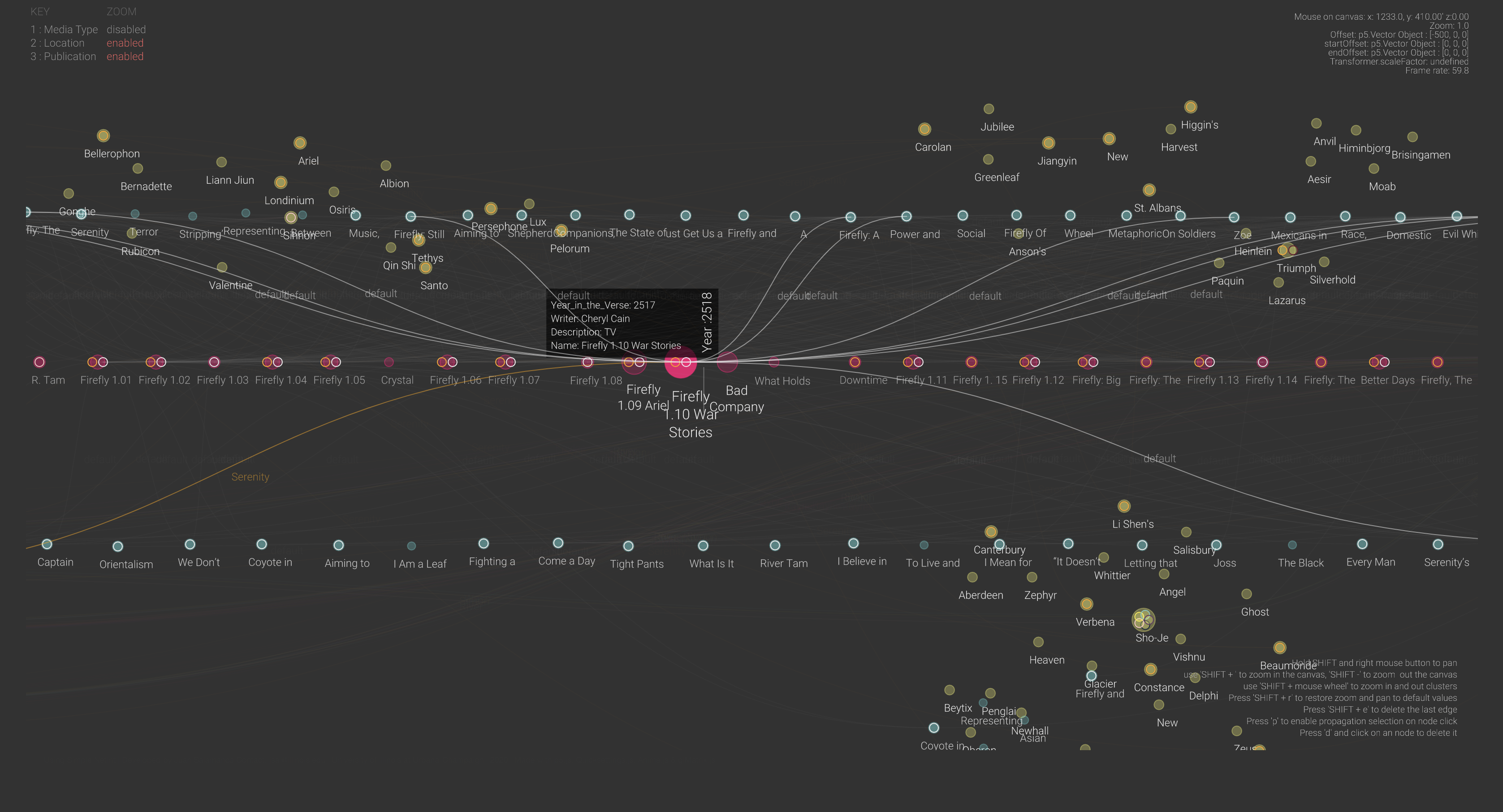
Simple NetInt is a JavaScript version of NetInt, a Java-based node-link visualization prototype designed to support the visual discovery of patterns across large dataset by displaying disjoint clusters of vertices that could be filtered, zoomed in or drilled down interactively. The visualization strategy used in Simple NetInt is to place clustered nodes in independent 3D spaces and draw links between nodes across multiple spaces. The result is a simple graphic user interface that enables visual depth as an intuitive dimension for data exploration.

Simple NetInt InterfaceCheck out the Simple NetInt tool here!

In collaboration with Professor Eric Benson, Salamanca tested a prototype of Simple NetInt with a dataset about academic publications, episodes, and story locations of the Sci-Fi TV series Firefly. The tool shows a network of research relationships between these three sets of entities similar to a citation map but on a timeline following the episodes chronology.

What inspired you to create this new tool?

This tool is an extension of a prototype I built five years ago for the visualization of financial transactions between bank clients. It is a software to visualize networks based on the representation of entities and their relationships and nodes and edges. This new version is used for the visualization of a totally different dataset:  scholarly work published in papers, episodes of a TV Series, and the narrative of the series itself. So, the network representation portrays relationships between journal articles, episode scripts, and fictional characters. I am also using it to design a large mural for the Siebel Center for Design.

What are your hopes for the future use of this project?

The final goal of this project is to develop an augmented reality visualization of networks to be used in the field of digital humanities. This proof of concept shows that scholars in the humanities come across datasets with different dimensional systems that might not be compatible across them. For instance, a timeline of scholarly publications may encompass 10 or 15 years, but the content of what is been discussed in that body of work may encompass centuries of history. Therefore, these two different temporal dimensions need to be represented in such a way that helps scholars in their interpretations. I believe that an immersive visualization may drive new questions for researchers or convey new findings to the public.

What were the major challenges that came with creating this tool?

The major challenge was to find a way to represent three different systems of coordinates in the same space. The tool has a universal space that contains relative subspaces for each dataset loaded. So, the nodes instantiated from each dataset are positioned in their own coordinate system, which could be a timeline, a position relative to a map, or just clusters by proximities. But the edges that connect nodes jump from one coordinate system to the other. This creates the idea of a system of nested spaces that works well with few subspaces, but I am still figuring out what is the most intuitive way to navigate larger multidimensional spaces.

What are your own research interests and how does this project support those?

My research focuses on understanding how designed artifacts affect the viscosity of social action. What I do is to investigate how the design of artifacts facilitates or hinders the cooperation of collaboration between people. I use visual analytics methods to conduct my research so the analysis of networks is an essential tool. I have built several custom-made tools for the observation of the interaction between people and things, and this is one of them.

If you would like to learn more about Simple NetInt you can find contact information for Professor Juan Salamanca here and more information on his research!

If you’re interested in learning more about data visualizations for your own projects, check out our guide on visualizing your data, attend a Savvy Researcher Workshop, Live Chat with us on Ask a Librarian, or send us an email. We are always happy to help!

Free, Open Source Optical Character Recognition with gImageReader

Optical Character Recognition (OCR) is a powerful tool to transform scanned, static images of text into machine-readable data, making it possible to search, edit, and analyze text. If you’re using OCR, chances are you’re working with either ABBYY FineReader or Adobe Acrobat Pro. However, both ABBYY and Acrobat are propriety software with a steep price tag, and while they are both available in the Scholarly Commons, you may want to perform OCR beyond your time at the University of Illinois.

Thankfully, there’s a free, open source alternative for OCR: Tesseract. By itself, Tesseract only works through the command line, which creates a steep learning curve for those unaccustomed to working with a command-line interface (CLI). Additionally, it is fairly difficult to transform a jpg into a searchable PDF with Tesseract.

Thankfully, there are many free, open source programs that provide Tesseract with a graphical user interface (GUI), which not only makes Tesseract much easier to use, some of them come with layout editors that make it possible to create searchable PDFs. You can see the full list of programs on this page.

The program logo for gImageReader

The program logo for gImageReader

In this post, I will focus on one of these programs, gImageReader, but as you can see on that page, there are many options available on multiple operating systems. I tried all of the Windows-compatible programs and decided that gImageReader was the closest to what I was looking for, a free alternative to ABBYY FineReader that does a pretty good job of letting you correct OCR mistakes and exporting to a searchable PDF.

Installation

gImageReader is available for Windows and Linux. Though they do not include a Mac compatible version in the list of releases, it may be possible to get it to work if you use a package manager for Mac such as Homebrew. I have not tested this though, so I do not make any guarantees about how possible it is to get a working version of gImageReader on Mac.

To install gImageReader on Windows, go to the releases page on Windows. From there, go to the most recent release of the program at the top and click Assets to expand the list of files included with the release. Then select the file that has the .exe extension to download it. You can then run that file to install the program.

Manual

The installation of gImageReader comes with a manual as an HTML file that can be opened by any browser. As of the date of this post, the Fossies software archive is hosting the manual on its website.

Setting OCR Mode

gImageReader has two OCR modes: “Plain Text” and “hOCR, PDF”. Plain Text is the default mode and only recognizes the text itself without any formatting or layout detection. You can export this to a text file or copy and paste it into another program. This may be useful in some cases, but if you want to export a searchable PDF, you will need to use hOCR, PDF mode. hOCR is a standard for formatting OCR text using either XML or HTML and includes layout information, font, OCR result confidence, and other formatting information.

To set the recognition to hOCR, PDF mode, go to the toolbar at the top. It includes a section for “OCR mode” with a dropdown menu. From there, click the dropdown and select hOCR, PDF:

gImageReader Toolbar

This is the toolbar for gImageReader. You can set OCR mode by using the dropdown that is the third option from the right.

Adding Images, Performing Recognition, and Setting Language

If you have images already scanned, you can add them to be recognized by clicking the Add Images button on the left panel, which looks like a folder. You can then select multiple images if you want to create a multipage PDF. You can always add more images later by clicking that folder button again.

On that left panel, you can also click the Acquire tab button, which allows you to get images directly from a scanner, if the computer you’re using has a scanner connected.

Once you have the images you want, click the Recognize button to recognize the text on the page. Please note that if you have multiple images added, you’ll need to click this button for every page.

If you want to perform recognition on a language other than English, click the arrow next to Recognize. You’ll need to have that language installed, but you can install additional languages by clicking “Manage Languages” in the dropdown appears. If the language is already installed, you can go to the first option listed in the dropdown to select a different language.

Viewing the OCR Result

In this example, I will be performing OCR on this letter by Franklin D. Roosevelt:

Raw scanned image of a typewritten letter signed by Franklin Roosevelt

This 1928 letter from Franklin D. Roosevelt to D. H. Mudge Sr. is courtesy of Madison Historical: The Online Encyclopedia and Digital Archive for Madison County Illinois. https://madison-historical.siue.edu/archive/items/show/819

Once you’ve performed OCR, there will be an output panel on the right. There are a series of buttons above the result. Click the button on the far right to view the text result overlaid on top of the image:

The text result of performing OCR on the FDR letter overlaid on the original scan.

Here is the the text overlaid on an image of the original scan. Note how the scan is slightly transparent now to make the text easier to read.

Correcting OCR

The OCR process did a pretty good job with this example, but it there are a handful of errors. You can click on any of the words of text to show them on the right panel. I will click on the “eclnowledgment” at the end of the letter to correct it. It will then jump to that part of the hOCR “tree” on the right:

hOCR tree in gImageReader, which shows the recognition result of each word in a tree-like structure.

The hOCR tree in gImageReader, which also shows OCR result.

Note in this screenshot I have clicked the second button from the right to show the confidence values, where the higher the number, the higher the confidence Tesseract has with the result. In this case, it is 67% sure that eclnowledgement is correct. Since it obviously isn’t correct, we can type new text by double-clicking on the word in this panel and type “acknowledgement.” You can do this for any errors on the page.

Other correction tips:

  1. If there are any regions that are not text that it is still recognizing, you can right click them on the right and delete them.
  2. You can change the recognized font and its size by going to the bottom area labeled “Properties.” Font size is controlled by the x_fsize field, and x_font has a dropdown where you can select a font.
  3. It is also possible to change the area of the blue word box once it is selected, simply by clicking and dragging the edges and corners.
  4. If there is an area of text that was not captured by the recognition, you can also right click in the hOCR “tree” to add text blocks, paragraphs, textlines, and words to the document. This allows you to draw a box on image and then type what the text says.

Exporting to PDF

Once you are done making OCR corrections, you can export to a searchable PDF. To do so, click the Export button above the hOCR “tree,” which is the third button from the left. Then, select export to PDF. It then gives you several options to set the compression and quality of the PDF image, and once you click OK, it should export the PDF.

Conclusion

Unfortunately, there are some limitations to gImageViewer, as can often be the case with free, open source software. Here are some potential problems you may have with this program:

  1. While you can add new areas to recognize with OCR, there is not a way to change the order of these elements inside the hOCR “tree,” which could be an issue if you are trying to make the reading order clear for accessibility reasons. One potential workaround could be to use the Reading Order options on Adobe Acrobat, which you can read about in this libguide.
  2. You cannot show the areas of the document that are in a recognition box unless you click on a word, unlike ABBYY FineReader which shows all recognition areas at once on the original image.
  3. You cannot perform recognition on all pages at once. You have to click the recognition button individually for each page.
  4. Though there are some image correction options to improve OCR, such as brightness, contrast, and rotation, it does not have as many options as ABBYY FineReader.

gImageViewer is not nearly as user friendly or have all of the features that ABBYY FineReader has, so you will probably want to use ABBYY if it is available to you. However, I find gImageViewer a pretty good program that can meet most general OCR needs.

Meet Spencer Keralis, Digital Humanities Librarian

Spencer Keralis teaches a class.

This latest installment of our series of interviews with Scholarly Commons experts and affiliates features one of the newest members of our team, Spencer Keralis, Digital Humanities Librarian.


What is your background and work experience?

I have a Ph.D. in English and American Literature from New York University. I started working in libraries in 2011 as a Council on Library and Information Resources (CLIR) Fellow with the University of North Texas Libraries, doing research on data management policy and practice. This turned into a position as a Research Associate Professor working to catalyze digital scholarship on campus, which led to the development of Digital Frontiers, which is now an independent non-profit corporation. I serve as the Executive Director of the organization and help organize the annual conference. I have previous experience working as a project manager in telecom and non-profits. I’ve also taught in English and Communications at the university level since 2006.

What led you to this field?

My CLIR Fellowship really sparked the career change from English to libraries, but I had been considering libraries as an alternate career path prior to that. My doctoral research was heavily archives-based, and I initially thought I’d pursue something in rare books or special collections. My interest in digital scholarship evolved later.

What is your research agenda?

My current project explores how the HIV-positive body is reproduced and represented in ephemera and popular culture in the visual culture of the early years of the AIDS epidemic. In American popular culture, representations of the HIV-positive body have largely been defined by Therese Frare’s iconic 1990 photograph of gay activist David Kirby on his deathbed in an Ohio hospital, which was later used for a United Colors of Benetton ad. Against this image, and other representations which medicalized or stigmatized HIV-positive people, people living with AIDS and their allies worked to remediate the HIV-positive body in ephemera including safe sex pamphlets, zines, comics, and propaganda. In my most recent work, I’m considering the reclamation of the erotic body in zines and comics, and how the HIV-positive body is imagined as an object of desire differently in these underground publications than they are in mainstream queer comics representing safer sex. I also consider the preservation and digitization of zines and other ephemera as a form of remediation that requires a specific ethical positioning in relation to these materials and the community that produced them, engaging with the Zine Librarians’ Code of Conduct, folksonomies and other metadata schema, and collection and digitization policies regarding zines from major research libraries. This research feels very timely and urgent given rising rates of new infection among young people, but it’s also really fun because the materials are so eclectic and often provocative. You can check out a bit of this research on the UNT Comics Studies blog.

 Do you have any favorite work-related duties?

I love working with students and helping them develop their research questions. Too often students (and sometimes faculty, let’s be honest) come to me and ask “What tools should I learn?” I always respond by asking them what their research question is. Not every research question is going to be amenable to digital tools, and not every tool works for every research question. But having a conversation about how digital methods can potentially enrich a student’s research is always rewarding, and I always learn so much from these conversations.

 What are some of your favorite underutilized resources that you would recommend to researchers?

I think comics and graphic novels are generally underappreciated in both pedagogy and research. There are comics on every topic, and historical comics go back much further than most people realize. I think the intersection of digital scholarship with comics studies has a lot of potential, and a lot of challenges that have yet to be met – the technical challenge of working with images is significant, and there has yet to be significant progress on what digital scholarship in comics might look like. I also think comics belong more in classes – all sorts of classes, there are comics on every topic, from math and physics, to art and literature – than they are now because they reach students differently than other kinds of texts.

 If you could recommend one book or resource to beginning researchers in your field, what would you recommend?

I’m kind of obsessed with Liz Losh and Jacque Wernimont’s edited collection Bodies of Information: Intersectional Feminism and Digital Humanities because it’s such an important intervention in the field. I’d rather someone new to DH start there than with some earlier, canonical works because it foregrounds alternative perspectives and methodologies without centering a white, male perspective. Better, I think, to start from the margins and trouble some of the traditional narratives in the discipline right out the gate. I’m way more interested in disrupting monolithic or hegemonic approaches to DH than I am in gatekeeping, and Liz and Jacque’s collection does a great job of constructively disrupting the field.

Preparing Your Data for Topic Modeling

In keeping with my series of blog posts on my research project, this post is about how to prepare your data for input into a topic modeling package. I used Twitter data in my project, which is relatively sparse at only 140 characters per tweet, but the principles can be applied to any document or set of documents that you want to analyze.

Topic Models:

Topic models work by identifying and grouping words that co-occur into “topics.” As David Blei writes, Latent Dirichlet allocation (LDA) topic modeling makes two fundamental assumptions: “(1) There are a fixed number of patterns of word use, groups of terms that tend to occur together in documents. Call them topics. (2) Each document in the corpus exhibits the topics to varying degree. For example, suppose two of the topics are politics and film. LDA will represent a book like James E. Combs and Sara T. Combs’ Film Propaganda and American Politics: An Analysis and Filmography as partly about politics and partly about film.”

Topic models do not have any actual semantic knowledge of the words, and so do not “read” the sentence. Instead, topic models use math. The tokens/words that tend to co-occur are statistically likely to be related to one another. However, that also means that the model is susceptible to “noise,” or falsely identifying patterns of cooccurrence if non-important but highly-repeated terms are used. As with most computational methods, “garbage in, garbage out.”

In order to make sure that the topic model is identifying interesting or important patterns instead of noise, I had to accomplish the following pre-processing or “cleaning” steps.

  • First, I removed the punctuation marks, like “,.;:?!”. Without this step, commas started showing up in all of my results. Since they didn’t add to the meaning of the text, they were not necessary to analyze.
  • Second, I removed the stop-words, like “I,” “and,” and “the,” because those words are so common in any English sentence that they tend to be over-represented in the results. Many of my tweets were emotional responses, so many authors wrote in the first person. This tended to skew my results, although you should be careful about what stop words you remove. Simply removing stop-words without checking them first means that you can accidentally filter out important data.
  • Finally, I removed too common words that were uniquely present in my data. For example, many of my tweets were retweets and therefore contained the word “rt.” I also ended up removing mentions to other authors because highly retweeted texts tended to mean that I was getting Twitter user handles as significant words in my results.

Cleaning the Data:

My original data set was 10 Excel files of 10,000 tweets each. In order to clean and standardize all these data points, as well as combining my file into one single document, I used OpenRefine. OpenRefine is a powerful tool, and it makes it easy to work with all your data at once, even if it is a large number of entries. I uploaded all of my datasets, then performed some quick cleaning available under the “Common Transformations” option under the triangle dropdown at the head of each column: I changed everything to lowercase, unescaped HTML characters (to make sure that I didn’t get errors when trying to run it in Python), and removed extra white spaces between words.

OpenRefine also lets you use regular expressions, which is a kind of search tool for finding specific strings of characters inside other text. This allowed me to remove punctuation, hashtags, and author mentions by running a find and replace command.

  • Remove punctuation: grel:value.replace(/(\p{P}(?<!’)(?<!-))/, “”)
    • Any punctuation character is removed.
  • Remove users: grel:value.replace(/(@\S*)/, “”)
    • Any string that begins with an @ is removed. It ends at the space following the word.
  • Remove hashtags: grel:value.replace(/(#\S*)/,””)
    • Any string that begins with a # is removed. It ends at the space following the word.

Regular expressions, commonly abbreviated as “regex,” can take a little getting used to in order to understand how they work. Fortunately, OpenRefine itself has some solid documentation on the subject, and I also found this cheatsheet valuable as I was trying to get it work. If you want to create your own regex search strings, regex101.com has a tool that lets you test your expression before you actually deploy it in OpenRefine.

After downloading the entire data set as a Comma Separated Value (.csv) file, I then used the Natural Language ToolKit (NLTK) for Python to remove stop-words. The code itself can be found here, but I first saved the content of the tweets as a single text file, and then I told NLTK to go over every line of the document and remove words that are in its common stop word dictionary. The output is then saved in another text file, which is ready to be fed into a topic modeling package, such as MALLET.

At the end of all these cleaning steps, my resulting data is essentially composed of unique nouns and verbs, so, for example, @Phoenix_Rises13’s tweet “rt @drlawyercop since sensible, national gun control is a steep climb, how about we just start with orlando? #guncontrolnow” becomes instead “since sensible national gun control steep climb start orlando.” This means that the topic modeling will be more focused on the particular words present in each tweet, rather than commonalities of the English language.

Now my data is cleaned from any additional noise, and it is ready to be input into a topic modeling program.

Interested in working with topic models? There are two Savvy Researcher topic modeling workshops, on December 6 and December 8, that focus on the theory and practice of using topic models to answer questions in the humanities. I hope to see you there!

Neatline 101: Getting Started

Here at Commons Knowledge we love easy-to-use interactive map creation software! We’ve compared and contrasted different tools, and talked about StoryMap JS and Shanti Interactive. The Scholarly Commons is a great place to get help on GIS projects, from ArcGIS StoryMaps and beyond. But if you want something where you can have both a map and a timeline, and if you are willing to spend money on your own server, definitely consider using Neatline.

Neatline is a plugin created by Scholar’s Lab at University of Virginia that lets you create interactive maps and timelines in Omeka exhibits. My personal favorite example is the demo site by Paul Mawyer “‘I am it and it is I’: Lovecraft in Providence” with the map tiles from Stamen Design under CC-BY 3.0 license.

Screenshot of Lovecraft Neatline exhibit

*As far as the location of Lovecraft’s most famous creation, let’s just say “Ph’nglui mglw’nafh Cthulhu R’lyeh wgah’nagl fhtagn.”

Now one caveat — Neatline requires a server. I used Reclaim Hosting which is straightforward, and which I have used for Scalar and Mukurtu. The cheapest plan available on Reclaim Hosting was $32 a year. Once I signed up for the website and domain name, I took advantage of one nice feature of Reclaim Hosting, which lets you one-click install the Omeka.org content management system (CMS). The Omeka CMS is a popular choice for digital humanities users. Other popular content management systems include Wordpress and Scalar.

One click install of Omeka through Reclaim Hosting

BUT WAIT, WHAT ABOUT OMEKA THROUGH SCHOLARLY COMMONS?

Here at the Scholarly Commons we can set up an Omeka.net site for you. You can find more information on setting up an Omeka.net site through the Scholarly Commons here. This is a great option for people who want to create a regular Omeka exhibit. However, Neatline is only available as a plugin on Omeka.org, which needs a server to host. As far as I know, there is currently no Neatline plugin for Omeka.net and I don’t think that will be happening anytime soon. On Reclaim you can install Omeka on any LAMP server. And side advice from your very forgetful blogger, write down whatever username and password you make up when you set up your Omeka site, that will save you a lot of trouble later, especially considering how many accounts you end up with when you use a server to host a site.

Okay, I’m still interested, but what do I do once I have Omeka.org installed? 

So back to the demo. I used the instructions on the documentation page on Neatline, which were good for defining a lot of the terms but not so good at explaining exactly what to do. I am focusing on the original Neatline plugin but there are other Neatline plugins like NeatlineText depending on your needs. However all plugins are installed in a similar way. You can follow the official instructions here at Installing Neatline.

But I have also provided some because the official instructions just didn’t do it for me.

So first off, download the Neatline zip file.

Go to your Control Panel, cPanel in Reclaim Hosting, and click on “File Manager.”

File Manager circled on Reclaim Hosting

Sorry this looks so goofy, Windows snipping tool free form is only for those with a steady hand.

Navigate to the the Plugins folder.

arrow points at plugins folder in file manager

Double click to open the folder. Click Upload Files.

more arrows pointing at tiny upload option in Plugins folder

If you’re using Reclaim Hosting, IGNORE THE INSTRUCTIONS DO NOT UNZIP THE ZIP FILE ON YOUR COMPUTER JUST PLOP THAT PUPPY RIGHT INTO YOUR PLUGINS FOLDER.

Upload the entire zip file

                      Plop it in!

Go back to the Plugins folder. Right click the Neatline zip file and click extract. Save extracted files in Plugins.

Extract Neatline files in File Manager

Sign into your Omeka site at [yourdomainname].[com/name/whatever]/admin if you aren’t already.

Omeka dashboard with arrows pointing at Plugins

Install Neatline for real.

Omeka Plugins page

Still confused or having trouble with setup?

Check out these tutorials as well!

Open Street Maps is great and all but what if I want to create a fancy historical map?

To create historical maps on Neatline you have two options, only one of which is included in the actual documentation for Neatline.

Officially, you are supposed to use GeoServer. GeoServer is an open source server application built in Java. Even if you have your own server, it has a lot more dependencies to run than what’s required for Omeka / Neatline.

If you want one-click Neatline installation with GeoServer and have money to spend you might want to check out AcuGIS Neatline Cloud Hosting which is recommended in the Neatline documentation and the lowest cost plan starts at $250 a year.

Unofficially, there is a tutorial for this available at Lincoln Mullen’s blog “The Backward Glance” specifically his 2015 post “How to Use Neatline with Map Warper Instead of Geoserver.”

Let us know about the ways you incorporate geospatial data in your research!  And stay tuned for Neatline 102: Creating a simple exhibit!

Works Cited:

Extending Omeka with Plugins. (2016, July 5). Retrieved May 23, 2017, from http://history2016.doingdh.org/week-1-wednesday/extending-omeka-with-plugins/

Installing Neatline Neatline Documentation. (n.d.). Retrieved May 23, 2017, from http://docs.neatline.org/installing-neatline.html

Mawyer, Paul. (n.d.). “I am it and it is I”: Lovecraft in Providence. Retrieved May 23, 2017, from http://lovecraft.neatline.org/neatline-exhibits/show/lovecraft-in-providence/fullscreen

Mullen, Lincoln. (2015).  “How to Use Neatline with Map Warper Instead of Geoserver.” Retrieved May 23, 2017 from http://lincolnmullen.com/blog/how-to-use-neatline-with-map-warper-instead-of-geoserver/

Uploading Plugins to Omeka. (n.d.). Retrieved May 23, 2017, from https://community.reclaimhosting.com/t/uploading-plugins-to-omeka/195

Working with Omeka. (n.d.). Retrieved May 23, 2017, from https://community.reclaimhosting.com/t/working-with-omeka/194

Spotlight: Shanti Interactive

sint_logo

If you’re looking for tools that will help you create web-based visualizations, images or maps, Shanti Interactive may have exactly what you need. Shanti Interactive, a suite of tools made available from the University of Virginia’s Sciences, Humanities & Arts Network of Technological Initiatives (SHANTI), is free to use and a helpful resource for individuals seeking to show their data visually.

The Shanti Interactive suite includes five programs: Qmedia, SHIVA, MapScholar, VisualEyes, and VisualEyes 5. Qmedia creates instructional and scholarly videos. SHIVA creates “data-driven visualizations,” such as charts, graphs, maps, image montages and timelines. MapScholar creates geospatial visualizations while VisualEyes — arguably the most well-known tool from the suite — creates historic visualizations by weaving images, maps, charts, video and data into online exhibits. While we could write an entire post on each member of the suite (and maybe someday we will), I will quickly go over some of the main functions of the Shanti Interactive suite.

Qmedia

A screenshot of QMedia's demo video.

A screenshot of Qmedia’s live demo.

Qmedia creates an interactive video experience. The screen is broken up into various, customizable boxes, which the user can then interact with. In its own words, Qmedia “delineraizes” the video, allowing it to be scanned. Tools in Qmedia include table of contents, clickable, searchable transcripts, graphical concept maps, images, live maps, interactive visualizations, web apps and websites! While this list can be a little overwhelming, you can see the incredible results with Qmedia’s live demo.

SHIVA

SHIVA's timeline capability.

SHIVA’s timeline capability.

Think of SHIVA as a multi-faceted data visualization tool. It can create charts, maps, timelines, videos, images, graphs, subway maps, word clouds as well as plain text. SHIVA works with open source and open access web tools, such as Google’s Visualization Toolkit and Maps, YouTube, and Flickr. When a user inputs data, they do so through Google Docs. One fantastic feature in SHIVA is the ability to add on layers of annotations onto your data. For more on SHIVA’s capabilities and partners, see the SHIVA about page.

MapScholar

MapScholar is a great tool for creating what they call digital “atlases,” allowing scholars to use historic maps to compare and contrast how different areas have been depicted by mapmakers through time. For example, here is the base map on the eastern United States:

And here is that map overlayed with a Native American map from 1721:

VisualEyes and VisualEyes 5

VisualEyes is a multi-faceted online exhibit toolkit, which helps create interactive websites to display data. There are two versions: Flash-based VisualEyes, and HTML5-based VisualEyes 5, which is recommended. In many ways, VisualEyes is a combination of the rest of the suite’s tools, providing a platform for some incredible integration of sources. VisualEyes’ current example is a tour of Thomas Jefferson’s life (as the program was created at the University of Virginia), and worth a look if you’re interested in the program’s capabilities! It is far more interactive than one screengrab can communicate.

This project includes historic and modern maps, a timeline, and text, which all work together to create the story of Thomas Jefferson’s life.

Shanti Interactive includes diverse, free resources that can transform the way that you present your data to the world. If you need help getting started, or want to brainstorm ideas, stop by the Scholarly Commons and we’ll have someone ready to chat!

Text Analysis Basics – See Your Words in Voyant!

Interested in doing basic text analysis but have no or limited programming experience? Do you feel intimidated by the command line? One way to get started with text analysis, visualization, and uncovering patterns in large amounts of text is with browser-based programs! And today we have a mega blockbuster blog post extravaganza about Voyant Tools!

Voyant is a great solid browser based tool for text analysis. It is part of the Text Analysis Portal for Research (TAPoR)  http://tapor.ca/home. The current project leads are Stéfan Sinclair at McGill University (one of the minds behind BonPatron!) and Geoffrey Rockwell at the University of Alberta.

Analyzing a corpus:

I wanted to know what I needed to know to get a job so I got as many job ads as I could and ran them through very basic browser-based text analysis tools (to learn more about Word Clouds check out this recent post for Commons Knowledge all about them!) in order to see if what I needed to study in library school would emerge and I could then use that information to determine which courses I should take. This was an interesting idea and I mostly found that jobs prefer you have an ALA-accredited degree, which was consistent with what I had heard from talking to librarians. Now I have collected even more job ads (around December from the ALA job list mostly with a few from i-Link and elsewhere) to see what I can find out (and hopefully figure out some more skills I should be developing while I’m still in school).

Number of job ads = 300 there may be a few duplicates and this is not the cleanest data.

Uploading a corpus:

Voyant Tools is found at https://voyant-tools.org.

Voyant Home Page

For small amounts of text, copy and paste into the “Add Text” box. Otherwise, add files by clicking “Upload” and choosing the Word or Text files you want to analyze. Then click “Reveal”.

So I added in my corpus and here’s what comes up:

To choose a different view click  the small rectangle icon and choose from a variety of views. To save the visualization you created in order to later incorporate it into your research click the arrow and rectangle “Upload” icon and choose which aspect of the visualization you want to save.

Mode change option circled

“Stop words” are words excluded because they are very common words such as “the” or “and” that don’t always tell us anything significant about the content of our corpus. If you are interested in adding stop words beyond the default settings, you can do that with the following steps:

Summary button on Voyant circled

1. Click on Summary

Home screen for Voyant with the edit settings circled

2. Click on the define options button

Clicking on edit list in Voyant

3. If you want to add more words to the default StopList click Edit List

Edit StopList window in Voyant

4. Type in new words and edit the ones already there in the default StopList and click Save to save.

Mouse click on New User Defined List

5. Or to add your own list click New User Defined List and paste in your own list in the Edit list feature instead of editing the default list.

Here are some of the cool different views you can choose from in Voyant:

Word Cloud:

The Links mode, which shows connections between different words and how often they are paired with the thickness of the line between them.

My favorite mode is TextArc based on the text analysis and visualization project of the same name created by W. Brad Paley in the early 2000s. More information about this project can be found at http://www.textarc.org/, where you can also find Text arc versions of classic literature.

Voyant is pretty basic, it will give you a bunch of stuff you probably already knew, such as to get a library job it helps to have library experience. The advantage of the TextArc setting is that it puts everything out there and lets you see the connections between different words. And okay, it looks really cool too.

Check it out the original animated below! Warning this may slow down or even crash your browser:  https://voyant-tools.org/?corpus=3de9f7190e781ce7566e01454014a969&view=TextualArc

I also like the Bubbles feature (not to be confused with the Bubblelines feature) though none of the other GAs or staff here do, one going so far as to refer to it as an “abomination”.

Circles with corpus words (also listed in side pane) on inside

Truly abominable

The reason I have not included a link to this is DEFAULT VERSION MAY NOT MEET WC3 WEB DESIGN EPILEPSY GUIDELINES. DO NOT TRY IF YOU ARE PRONE TO PHOTOSENSITIVE SEIZURES. It is adapted from the much less flashy “Letter Pairs” project created by Martin Ignacio Bereciartua. This mode can also crash your browser.

To learn more about applying for jobs we have a Savvy Researcher workshop!

If you thought these tools were cool, to learn more advanced text mining techniques we have an upcoming Savvy Researcher workshop, also on March 6 :

Happy text mining and job searching! Hope to see some of you here at Scholarly Commons on March 6!

Spotlight on DiRT Directory: Digital Research Tools

The DiRT logo.

As a researcher, it can sometimes be frustrating knowing that someone out there has created a useful tool that will help you with what you’re working on, but being unable to find it. Google searches prove fruitless, and your network of friends don’t necessarily know what you’re talking about. In that moment of panic and frustration, you may just need to get a little DiRT-y.

DiRT Directory: Digital Research Tools is a directory of research tools for scholarly use. Using TaDiRAH (the Taxonomy of Digital Research Activities in the Humanities), DiRT breaks down the stages of a research project, and groups tools that are relevant to each stage: Capture, Creation, Enrichment, Analysis, Interpretation, Storage, and Dissemination. Users can either search for tools using these categories — broken down into subcategories whose specificity helps to narrow down the many tools found in the DiRT Directory — through a search box or by tag. Personally, I feel that searching through the TaDiRAH categories allows you to find relevant tools, but also allows you to explore options that you may not have previously thought of as being available, making it the most fruitful way to browse tools.

One nice aspect of DiRT is its search platform. After you choose your category, you have the option to search within the category for these criteria: Platform, Cost, Exclude, License, and Research Objects, as well as sort order. For researchers concerned with cost, this tool is especially useful, as you can limit your search to what is in your budget.

After you complete your search, you are offered a list of different tools. Tools range from well-known sources, like Google Docs, to things you have probably never heard of before. Each source includes a description, outlining what kind of tool it is — online, software, etc. — what its capabilities are, and in many cases, a note on its past or future development. Each entry also includes a link to the tool’s website, their license, and the date of DiRT’s most recent update on the source information.

An example tool entry on DiRT for Scrivener writing software.

An example tool entry on DiRT for Scrivener writing software on the search page.

Finally, each tool has its own page that you can access from the search function. This page holds a wealth of information, including an expanded description that outlines the nitty gritty aspects of the tool — from platforms to cost bracket to tags. It also includes screenshots of the tool in action, a list of recent edits to the page, and a comments section. However, not all tools have the same level of detail in their pages.

capture2

Scrivener’s page, which includes a description, screenshots, a list of contributors, and a comments section.

While the selection presented on DiRT can be almost overwhelming, digging through DiRT can help you find the perfect tools for your project.

If you still can’t find what you want in DiRT Directory, or need some guidance in what to search for in the first place, stop by the Scholarly Commons, located in Main Library Room 306, open from 9am-6pm on weekdays. Or, email us! We are always happy to help you with your research needs.