Exploring Data Visualization #18

In this monthly series, I share a combination of cool data visualizations, useful tools and resources, and other visualization miscellany. The field of data visualization is full of experts who publish insights in books and on blogs, and I’ll be using this series to introduce you to a few of them. You can find previous posts by looking at the Exploring Data Visualization tag.

Painting the World with Water

Creating weather predictions is a complex tasks that requires global collaboration and advanced scientific technologies. Most people know very little about how a weather prediction is put together and what is required to make it possible. NASA gives us a little glimpse into the complexities of finding out just how we know if it’s going to rain or snow anywhere in the world.

Continue reading

Exploring Data Visualization #17

In this monthly series, I share a combination of cool data visualizations, useful tools and resources, and other visualization miscellany. The field of data visualization is full of experts who publish insights in books and on blogs, and I’ll be using this series to introduce you to a few of them. You can find previous posts by looking at the Exploring Data Visualization tag.

The unspoken rules of visualization

Title header of essay "The unspoken rules of data visualization" by Kaiser Fung. White text on a black background with green and red patches Continue reading

R vs. SPSS for Data Analysis

As you do research with larger amounts of data, it becomes necessary to graduate from doing your data analysis in Excel and find a more powerful software. It can seem like a really daunting task, especially if you have never attempted to analyze big data before. There are a number of data analysis software systems out there, but it is not always clear which one will work best for your research. The nature of your research data, your technological expertise, and your own personal preferences are all going to play a role in which software will work best for you. In this post I will explain the pros and cons of R and SPSS with regards to quantitative data analysis and provide links to additional resources. Both data analysis software mentioned in this post are available for University of Illinois students, faculty, and staff through the Scholarly Commons computers and you can schedule a consultation with CITL if you have specific questions.

Short video loop of a kid sitting at a computer and putting on sun glasses
Rock your research with the right tools!

R logo. Blue capital letter R wrapped with a gray oval.

R and its graphical user interface companion R Studio are incredibly popular software for a number of reasons. The first and probably most important is that it is a free open-source software that is compatible with any operating system. As such, there is a strong and loyal community of users who share their work and advice online. It has a point-and-click user interface, a command line, savable files, and strong data analysis and visualization capabilities. Users with more technical expertise can program new functions with R to use it for different types of data and projects. The problem a lot of people run into with R is that it is not easy to learn. The programming language it operates on is not intuitive and it is prone to errors. Despite this steep learning curve, there is an abundance of free online resources for learning R.

Pros

Cons

Free open-source softwareSteep learning curve
Strong online user communityCan be slow
Programmable with more functions
for data analysis
 

Additional Resources:

  • Introduction to R Library Guide: Find valuable overviews and tutorials on this guide published by the University of Illinois Library.
  • Quick-R by DataCamp: This website offers tutorials and examples of syntax for a whole host of data analysis functions in R. Everything from installing the package to advanced data visualizations.
  • Learn R on Code Academy: A free self-paced online class for learning to use R for data science and beyond.
  • Nabble forum: A forum where individuals can ask specific questions about using R and get answers from the user community.

SPSS

SPSS logo. Red background with white block lettering spelling SPSS.

SPSS is an IBM product that is used for quantitative data analysis. It does not have a command line feature but rather has a user interface that is entirely point-and-click and somewhat resembles Microsoft Excel. Although it looks a lot like Excel, it can handle larger data sets faster and with more ease. One of the main complaints about SPSS is that it is prohibitively expensive to use, with individual packages ranging from $1,290 to $8,540 a year. To make up for how expensive it is, it is incredibly easy to learn. As a non-technical person I learned how to use it in under an hour by following an online tutorial from the University of Illinois Library. However, my take on this software is that unless you really need a more powerful tool just stick to Excel. They are too similar to justify seeking out this specialized software.

Pros

Cons

Quick and easy to learnBy far the most expensive
Can handle large amounts of dataLimited functionality
Great user interfaceVery similar to Excel

Additional Resources:

Gif of Kermit the frog dancing and flailing his arms with the words "Yay Statistics" in block letters above

Thanks for reading! Let us know in the comments if you have any thoughts or questions about any of these data analysis software programs. We love hearing from our readers!

Exploring Data Visualization #16

Daylight Saving Time Gripe Assistant Tool

Clocks fell back this weekend, which means the internet returns once again to the debate of whether or not we still need Daylight Saving Time. Andy Woodruff, a cartographer for Axis Maps, created a handy tool for determining how much you can complain about the time change. You input your ideal sunset and sunrise times, select whether the sunset or sunrise time you chose is more important, and the tool generates a map that shows whether DST should be gotten rid of, used year-round, or if no changes need to be made based on where you live. The difference a half hour makes is surprising for some of the maps, making this a fun data viz to play around with and examine your own gripes with DST.

A map of the United States with different regions shaded in different colors to represent if they should keep (gray) or get rid of (gold) changing the clocks for Daylight Saving Time. Blue represents areas that should always use Daylight Saving Time.

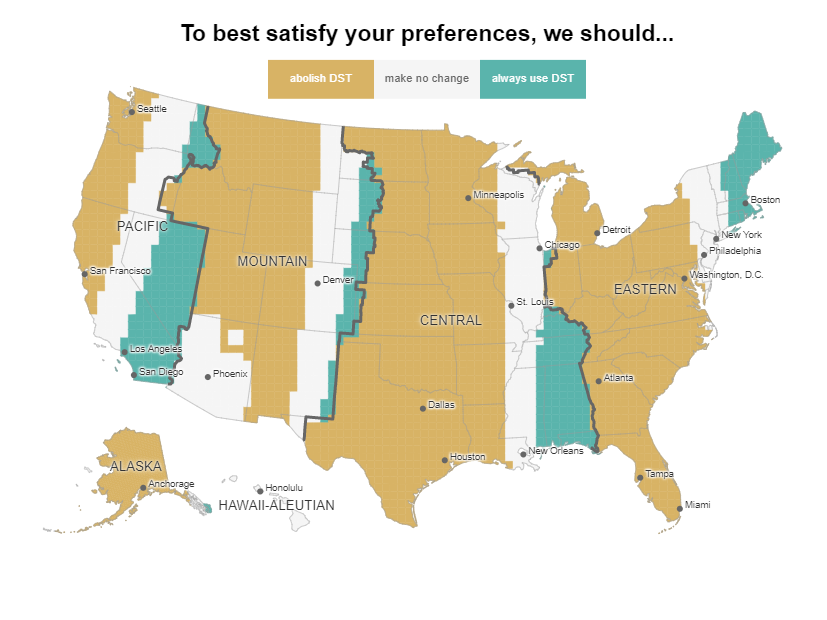
This shows an ideal sunrise of 7:00 am and an ideal sunset of 6:00 pm.

Laughing Online

Conveying tone through text can be stressful—finding the right balance of friendly and assertive in a text is a delicate operation that involves word choice and punctuation equally. Often, we make our text more friendly through exclamations points! Or by adding a quick laugh, haha. The Pudding took note of how varied our use of text-based laughs can be and put together a visual essay on how often we use different laughs and whether all of them actually mean we are “laughing out loud.” The most common laugh on Reddit is “lol,” while “hehe,” “jaja,” and “i’m laughing” are much less popular expressions of mirth.

A proportional area chart showing which text laughs are most used on Reddit.

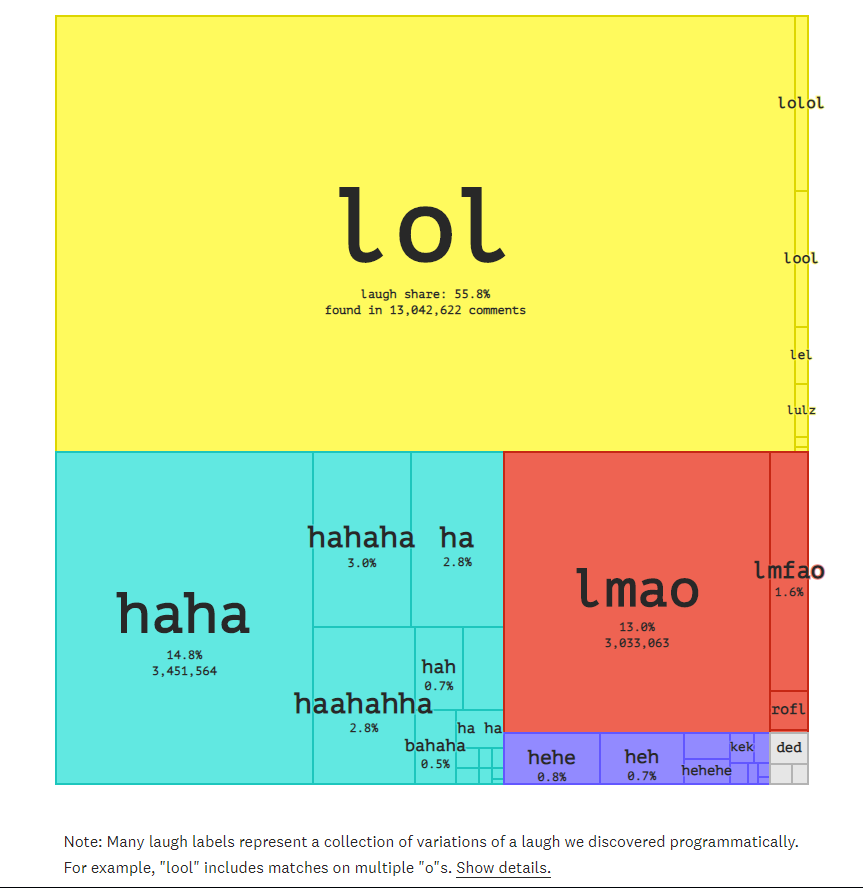
“ha” is the expression most likely to be used to indicate fake laughter or hostility

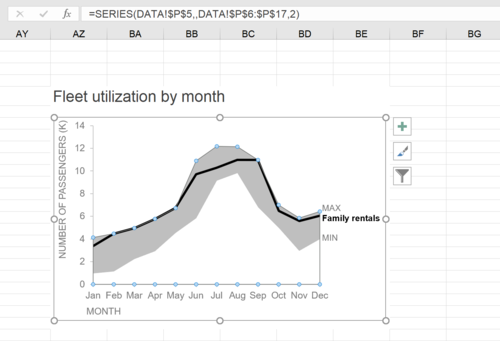
how to do it in Excel: a shaded range

Here’s a quick tip for making more complex graphs using Excel! Storytelling with Data’s Elizabeth Ricks put together a great how-to article on making Excel show a shaded range on a graph. This method involves some “brute force” to make Excel’s functions work in your favor, but results in a clean chart that shows a shaded range rather than a cluster of multiple lines.

A shaded area chart in Excel

Pixelation to represent endangered species counts

On Imgur, user JJSmooth44 created a photo series to demonstrate the current status of endangered species using pixilation. The number of squares represent the approximate number of that species that remains in the world. The more pixelated the image, the fewer there are left.

A pixelated image of an African Wild Dog. The pixelation represents approximately how many of this endangered species remain in the wild (estimated between 3000 and 5500). The Wild Dog is still distinguishable, but is not clearly visible due to the pixelation.

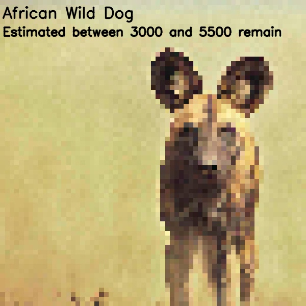
The African Wild Dog is one of the images in which the animal is still mostly recognizable.

Lightning Review: Data Visualization for Success

Data visualization is where the humanities and sciences meet: viewers are dazzled by the presentation yet informed by research. Lovingly referred to as “the poster child of interdisciplinarity” by Steven Braun, data visualization brings these two fields closer together than ever to help provide insights that may have been impossible without the other. In his book Data Visualization for Success, Braun sits down with forty designers with experience in the field to discuss their approaches to data visualization, common techniques in their work, and tips for beginners.

Braun’s collection of interviews provides an accessible introduction into data visualization. Not only is the book filled with rich images, but each interview is short and meant to offer an individual’s perspective on their own work and the field at large. Each interview begins with a general question about data visualization to contribute to the perpetual debate of what data visualization is and can be moving forward.

Picture of Braun's "Data Visualization for Success"

Antonio Farach, one of the designers interviewed in the book, calls data visualization “the future of storytelling.” And when you see his work – or really any of the work in this book – you can see why. Each new image has an immediate draw, but it is impossible to move past without exploring a rich narrative. Visualizations in this book cover topics ranging from soccer matches to classic literature, economic disparities, selfie culture, and beyond.

Each interview ends by asking the designer for their advice to beginners, which not only invites new scholars and designers to participate in the field but also dispels any doubt of the hard work put in by these designers or the science at the root of it all. However, Barbara Hahn and Christine Zimmermann of Han+Zimmermann may have put it best, “Data visualization is not making boring data look fancy and interesting. Data visualization is about communicating specific content and giving equal weight to information and aesthetics.”

A leisurely, stunning, yet informative read, Data Visualization for Success offers anyone interested in this explosive field an insider’s look from voices around the world. This wonderful read is available for checkout from the Scholarly Commons collection in the Main Stacks.