Introduction: Why Does Accessibility Matter?
Data visualizations are a fast and effective manner for communicating information and are increasingly becoming a more popular way for researchers to share their data with a broad audience. Because of this rising importance, it is also necessary to ensure that data visualizations are accessible to everyone. Accessible data visualizations not only help an audience who may require a screen reader or other accessible tool to read a document but are also helpful to the creators of the data visualization as it brings their data to a much wider audience than through a non-accessible data visualization. This post will offer three tips on how you can make your visualization accessible!
TIP #1: Color Selection
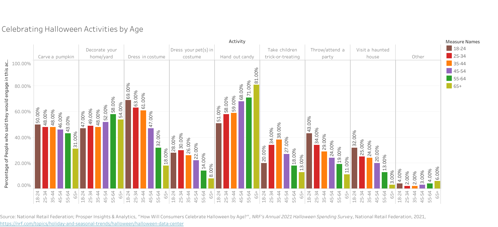
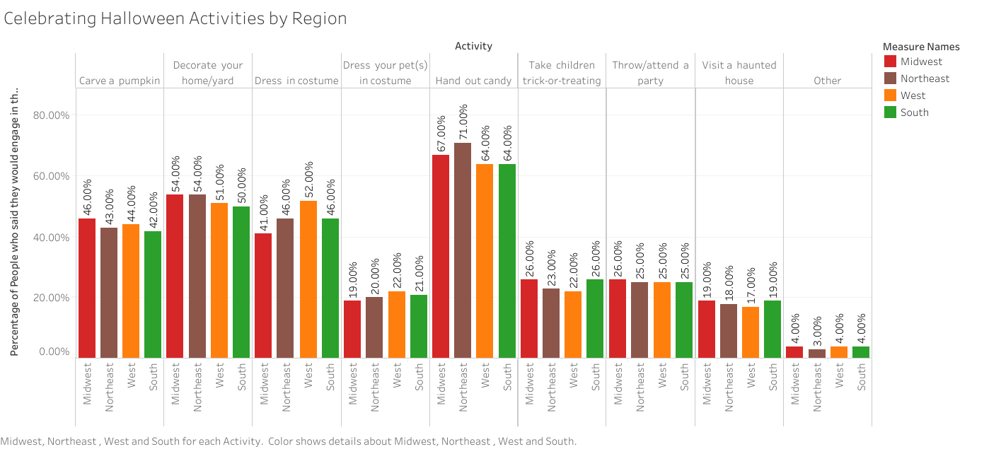
One of the most important choices when making a data visualization are the colors used in the chart. One suggestion would be to use a color blindness simulator to check the colors in the data visualization and experiment to find the right amount of contrast between colors. Look at the example regarding the top ice cream flavors:

At first glance, these colors may seem acceptable to use for this kind of data. But when ran through the colorblindness simulator, one of the results creates an accessibility concern:
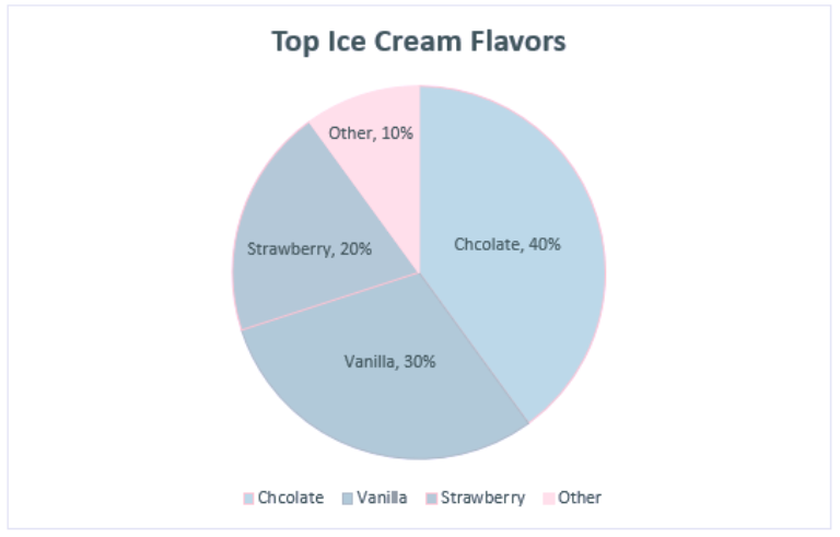
Although the colors contrasted well enough in the normal view, the color palettes used for the strawberry and vanilla categories look the same for those with tritanopia color blindness. The result is that these sections blend into one another and make it more difficult to distinguish their values. Most color palettes incorporated in current data visualization software are already designed to ensure the colors do not contrast, but it is still a good practice to check to ensure the colors do not blend in with one another!
TIP #2: Adding Alt Text
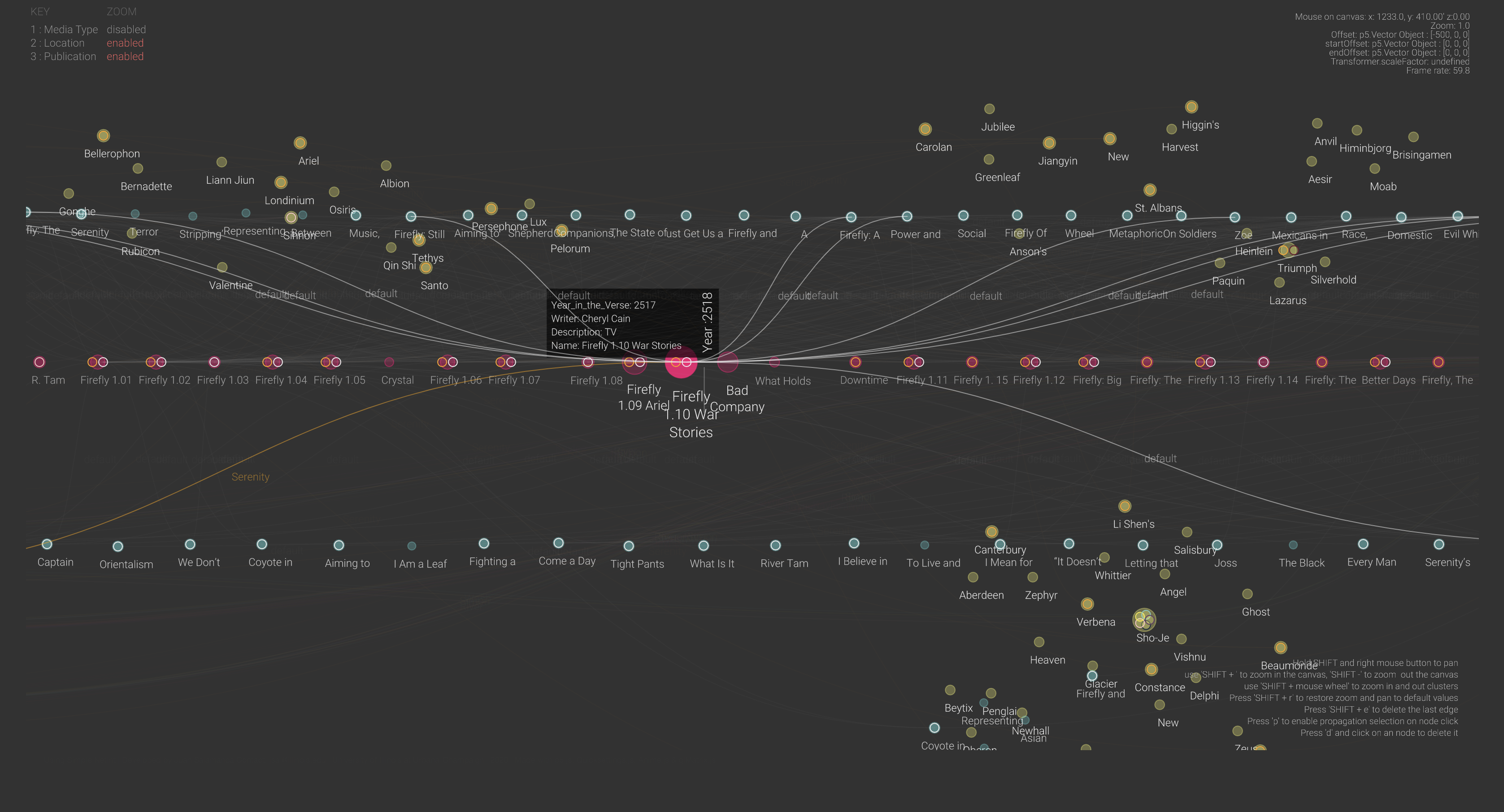
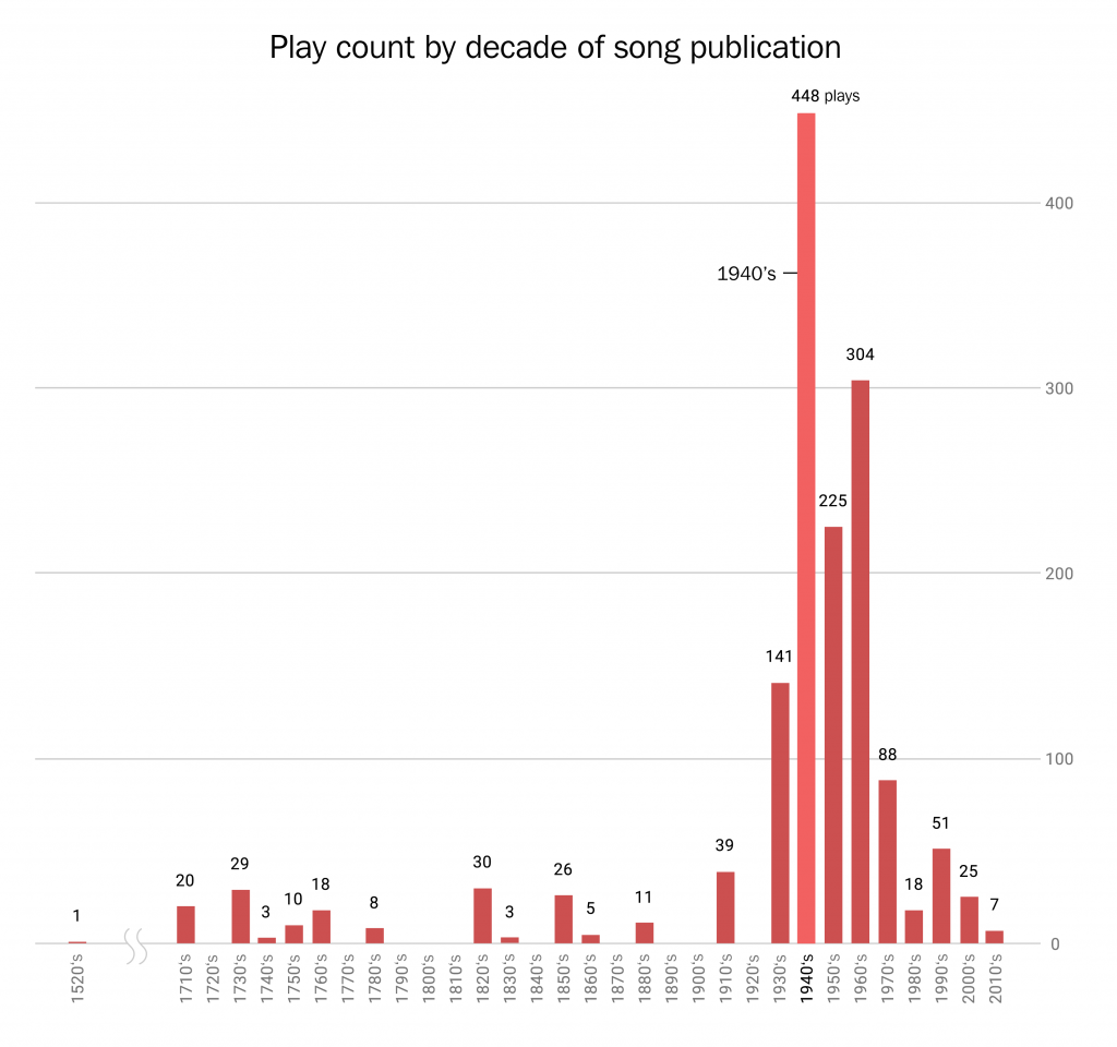
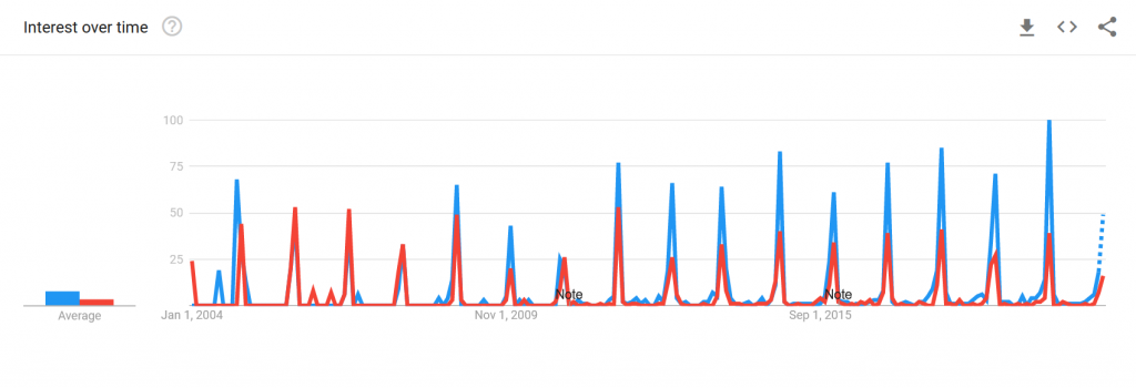
Since most data visualizations often appear as images in either published work or reports, alt text is a crucial need for accessibility purposes. Take the visualization below. If there was no alt text provided, then the visualization is meaningless to those who rely on alt text to read a given document. Alt text should be short and summarize the key takeaways from the data (there is no need to describe each individual point, but it should provide enough information to describe the trends occurring in the data).
TIP #3: Clearly Labeling Your Data
A simple but crucial component of any visualization is having clear labels on your data. Let’s look at two examples to see what makes having labels a vital aspect of any data visualization:
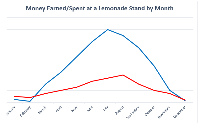
There is nothing in this graph that provides any useful information regarding the money earned or spent at the lemonade stand. How much money was earned or spent each month? What do these two lines represent? Now, look at a more clearly labeled version of the same data:
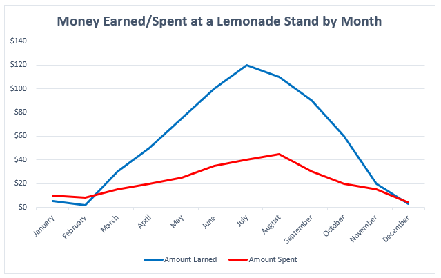
In adding a labeled Y-axis, we can now quantify the difference in distance between the two lines at any point and have a better idea of the money earned/spent in any given month. Furthermore, the addition of a key at the bottom of the visualization distinguishes the lines telling the audience what each represents. By clearly labeling the data, it is now in a position where audience members can interpret and analyze it properly.
Conclusion: Can My Data Still be Visually Appealing?
While it may appear that some of these recommendations detract from the creative designs of data visualizations, this is not the case at all. Designing a visually appealing data visualization is another crucial aspect of data visualization and should be heavily considered when creating one. Accessibility concerns, however, should have priority over the visual appeal of the data visualization. That said, accessibility in many respects encourages creativity in the design, as it makes the creator carefully consider how they want to present their data in a way that is both accessible and visually appealing. Thus, accessibility makes for a more creative and transmissive data visualization and will benefit everyone!