There’s been a Murder in SQL City!

by Libby Cave
Detective faces board with files, a map and pictures connected with red string.

If you are interested in data or relational databases, then you have heard of SQL. SQL, or Structured Query Language, is designed to handle structured data in order to assist in data query, data manipulation, data definition and data access control. It is a very user-friendly language to learn with a simple code structure and minimal use of special characters. Because of this, SQL is the industry standard for database management, and this is reflected in the job market as there is a strong demand for employees with SQL skills.  

Enter SQL Murder Mystery

In an effort to promote the learning of this valuable language, Knight Labs, a specialized subsidiary of Northwestern University, created SQL Murder Mystery. Combining the known benefits of gamification and the popularity of whodunit detective work, SQL Murder Mystery aims to help SQL beginners become familiar with the language and have some fun with a normally dry subject. Players take on the role of a gumshoe detective tasked with solving a murder. The problem is you have misplaced the crime scene report and you now must dive into the police department’s database to find the clues. For true beginners with no experience, the website provides a walkthrough to help get players started. More experienced learners can jump right in and practice their skills. 

I’m on the case!

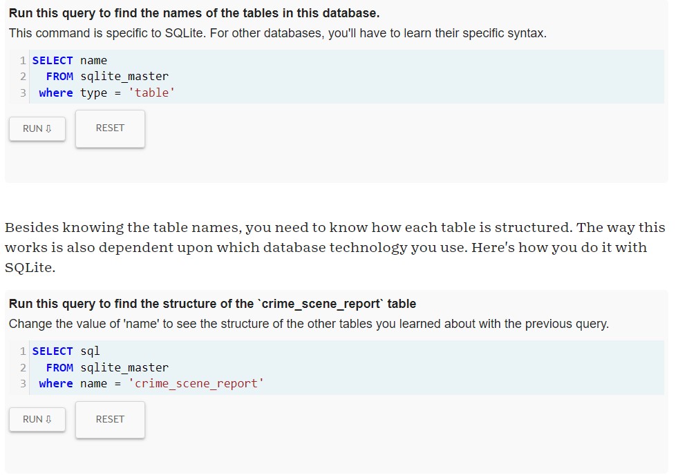
I have no experience with SQL but I am interested in database design and information retrieval, so I knew it was high time that I learn the basics. As a fan of both games and detective stories, SQL Murder Mystery seemed like a great place to start. Since I am a true beginner, I started with the walkthrough. As promised on the website, this walkthrough did not give me a complete, exhaustive introduction to SQL as a language, but instead gave me the tools needed to get started on the case. SQL as a language, relational databases and Entity Relationship Diagrams (ERD) were briefly explained in an approachable manner. In the walk through, I was introduced to vital SQL functions like “Select:, “Where”, wildcards, and “Between”. My one issue with the game was in the joining tables section. I learned later that the reason I was having issues was due to the tables each having columns with the same title, which is apparently a foundational SQL feature. The guide did not explain that this could be an issue and I had to do some digging on my own to find out how to fix it. It seems like the walkthrough should have anticipated this issue and mentioned it. That aside, By the end of the walkthrough, I could join tables, search for partial information matches, and search within ranges. With some common sense, the database’s ERD, and the new SQL coding skills, I was able to solve the crime! If users weren’t challenged enough with that task, there is an additional challenge that suggests users find the accomplice while only using 2 queries.

User interface of SQL Murder Mystery
Example of SQL Murder Mystery user interface

The Verdict is In

I really loved this game! It served as a great introduction to a language I had never used before but still managed to be really engaging. It reminded me of those escape room mystery boxes like Hunt a Killer that has users solve puzzles to get to a larger final solution. Anyone who loves logic puzzles or mysteries will enjoy this game, even if they have no experience with or even interest in coding or databases.  If you have some free time and a desire to explore a new skill, you should absolutely give SQL Murder Mystery a try!

A Different Kind of Data Cleaning: Making Your Data Visualizations Accessible

Introduction: Why Does Accessibility Matter?

Data visualizations are a fast and effective manner for communicating information and are increasingly becoming a more popular way for researchers to share their data with a broad audience. Because of this rising importance, it is also necessary to ensure that data visualizations are accessible to everyone. Accessible data visualizations not only help an audience who may require a screen reader or other accessible tool to read a document but are also helpful to the creators of the data visualization as it brings their data to a much wider audience than through a non-accessible data visualization. This post will offer three tips on how you can make your visualization accessible!

TIP #1: Color Selection

One of the most important choices when making a data visualization are the colors used in the chart. One suggestion would be to use a color blindness simulator to check the colors in the data visualization and experiment to find the right amount of contrast between colors. Look at the example regarding the top ice cream flavors:

A data visualization about the top flavors of ice cream. Chocolate was the top flavor (40%) followed by Vanilla (30%), Strawberry (20%), and Other (10%).

At first glance, these colors may seem acceptable to use for this kind of data. But when ran through the colorblindness simulator, one of the results creates an accessibility concern:

This is the same pie chart above, but placed under a tritanopia color blindness lens. The colors used for strawberry and vanilla now look the exact same and blend into one another because of this, making it harder to discern the amount of space they take in the pie chart.

Although the colors contrasted well enough in the normal view, the color palettes used for the strawberry and vanilla categories look the same for those with tritanopia color blindness. The result is that these sections blend into one another and make it more difficult to distinguish their values. Most color palettes incorporated in current data visualization software are already designed to ensure the colors do not contrast, but it is still a good practice to check to ensure the colors do not blend in with one another!

TIP #2: Adding Alt Text

Since most data visualizations often appear as images in either published work or reports, alt text is a crucial need for accessibility purposes. Take the visualization below. If there was no alt text provided, then the visualization is meaningless to those who rely on alt text to read a given document. Alt text should be short and summarize the key takeaways from the data (there is no need to describe each individual point, but it should provide enough information to describe the trends occurring in the data).

This is a chart showing the population size of each town in a given county. Towns are labeled A-E and continue to grow in population size as they go down the alphabet (town A has 1,000 people while town E has 100,000 people).

TIP #3: Clearly Labeling Your Data

A simple but crucial component of any visualization is having clear labels on your data. Let’s look at two examples to see what makes having labels a vital aspect of any data visualization:

This is a chart for how much money was earned/spent at a lemonade stand by month. There is no y-axis labels to describe how much money is earned/spent and no key to discern the two lines that represent the money made and the money spent.

There is nothing in this graph that provides any useful information regarding the money earned or spent at the lemonade stand. How much money was earned or spent each month? What do these two lines represent? Now, look at a more clearly labeled version of the same data:

This is a cleaned version of the previous visualization regarding how much money was earned/spent at a lemonade stand. The addition of a Y-axis and key now show that more money was spent in January/February than earned, but then changes in March peaking in July, and then continuing to fall until December where more money is spent than earned again.

In adding a labeled Y-axis, we can now quantify the difference in distance between the two lines at any point and have a better idea of the money earned/spent in any given month. Furthermore, the addition of a key at the bottom of the visualization distinguishes the lines telling the audience what each represents. By clearly labeling the data, it is now in a position where audience members can interpret and analyze it properly.

Conclusion: Can My Data Still be Visually Appealing?

While it may appear that some of these recommendations detract from the creative designs of data visualizations, this is not the case at all. Designing a visually appealing data visualization is another crucial aspect of data visualization and should be heavily considered when creating one. Accessibility concerns, however, should have priority over the visual appeal of the data visualization. That said, accessibility in many respects encourages creativity in the design, as it makes the creator carefully consider how they want to present their data in a way that is both accessible and visually appealing. Thus, accessibility makes for a more creative and transmissive data visualization and will benefit everyone!

Open Education Week 2022

Open Education Week

Open Education Week brings awareness to the Open Educational Resources (OER) movement and to the how OER transforms teaching and learning for instructors and students alike.

What is OER?

OER refers to open access, openly licensed instructional materials that are used for teaching, learning or research.

Why is OER Important?

OER provides free resources to institutions, teachers, and students. When incorporated into the classroom, OER can:

  • Lower the cost of education for students
  • Reinforce open pedagogy
    • Allow educators to update and adapt materials to fit their needs
    • Encourages students’ interaction with, and creation of, educational materials
  • Encourage open knowledge dissemination

OER Incentive Grant

The University is giving faculty an incentive to adopt, adapt, or create OER for their courses instead of using expensive materials. The OER Incentive Grants will fund faculty teaching undergraduate courses. Instructors can submit applications in three tiers:

  • Tier 1: Adopt – incorporate an existing open textbook into a course
  • Tier 2 Adapt – incorporate portions of multiple existing open textbooks, along with other freely available educational resources, modifications of existing open education materials/textbooks, or development of new open education materials
  • Tier 3: Create – write new openly licensed textbooks

The preferred deadline to submit a proposal is March 11th. If you are interested in submitting a grant but cannot make this deadline, please reach out to Sara Benson at srbenson@illinois.edu. To learn more about this program see the webpage on the Faculty OER Incentive Program.

Upcoming OER Publication

In conjunction with Sara Benson, copyright librarian at UIUC, and the Illinois Open Publishing Network (IOPN), co-authors Christy Bazan, Brandi Barnes, Ryan Santens, and Emily Verone will publish an OER textbook, titled Drug Use and Misuse: A Community Health Perspective. This book explores drug use and abuse through the lens of community health and the impact of drug use and abuse on community health. Drug Use and Misuse is the third publication in IOPN’s Windsor & Downs Press OPN Textbook series. See the video below to learn more about the process of creating this textbook.

It Matters How We Open Knowledge: Open Access Week 2021

It’s that time of year again! Open Access Week is October 25-31, and the University of Illinois Library is excited to participate. Open Access Week is an international event where the academic and research community come together to learn about Open Access and to share that knowledge with others. The theme guiding this year’s discussion of open access will be “It Matters How We Open Knowledge: Building Structural Equity.”

These discussions will build on last year’s theme of “Open with Purpose: Taking Action to Build Structural Equity and Inclusion.” While last year’s theme was intended to get people thinking about the ways our current information systems marginalize and exclude, this year’s theme is focused on information equity as it relates to governance.

OA Week digital banner with theme name and date

Specifically, this year’s theme intentionally aligns with the recently released United Nations Educational, Scientific and Cultural Organization (UNESCO) recommendation on Open Science, which encompasses practices such as publishing open research, campaigning for open access, and generally making it easier to publish and communicate scientific knowledge.

Circulated in draft form following discussion by representatives of UNESCO’s 193 member countries, the recommendation powerfully articulates and centers the importance of equity in pursuing a future for scholarship that is open by default. As the first global standard-setting framework on Open Science, the UNESCO Recommendation will provide an important guide for governments around the world as they move from aspiration to the implementation of open research practices.

UNESCO Icon

While the University of Illinois is not hosting any formal events for open access, the Library encourages students, staff, and faculty to familiarize themselves with existing open access resources, including:

  • IDEALS: The Illinois Digital Environment for Access to Learning and Scholarship, collects, disseminates, and provides persistent and reliable access to the research and scholarship of faculty, staff, and students at Illinois. Once an article is deposited in IDEALS, it may be efficiently and effectively accessed by researchers around the world, free of charge.
  • Copyright: Scholarly Communication and Publishing offers workshops and consultation services on issues related to copyright. While the Library cannot offer legal advice, we can help you to identify information and issues you may want to consider in addressing your copyright question.
  • Illinois Open Publishing Network: The Illinois Open Publishing Network (IOPN) is a set of digital publishing initiatives that are hosted and coordinated at the University of Illinois at Urbana-Champaign Library. IOPN offers a suite of publishing services to members of the University of Illinois at Urbana-Champaign community and aims to facilitate the dissemination of high-quality, open access scholarly publications. IOPN services include infrastructure and support for publishing open access journals, monographs, born-digital projects that integrate multimedia and interactive content.

IOPN logo

For more information on how to support access at the University of Illinois, please reach out to the Scholarly Commons or the Scholarly Communication and Publishing unit. For more information about International Open Access Week, please visit www.openaccessweek.org. Get the latest updates on Open Access events on twitter using the hashtag #OAWeek.

Making Your Work Accessible Online

A person uses a braille reader

Unsplash @Sigmund

What is Web Accessibility?

Web Accessibility is the ability for individuals with vision, hearing, cognitive, and mobility disabilities to access web content online via their preferred methods.

WCAG defines web content as:

  • Natural information such as text, images, and sounds
  • Code or markup that defines structure, presentation, etc.

The essential components of web accessibility include:

  • Content
  • Web browsers
  • Assistive Technology
  • Users’ Experience
  • Developers
  • Authoring Tools
  • Evaluation Tools

Why It Matters

Individuals with disabilities not only use the web but also contribute to its functions. Website accessibility focuses on the needs of people with disabilities. However, by considering how to make information more available, interactive, and easy to use, we also make content more accessible for everyone.

A website that uses best practices for accessibility provides equitable access and opportunities to all its users, creates a great user experience, increases website interaction (multi-modal interaction), and enhances the overall usability of the site.

Introducing Web Content Accessibility Guidelines (WCAG)

The WCAG developed out of the World Wide Web Consortium’s (WC3) mission of developing international standards for the continued development of the web and the W3C Web Accessibility Initiative’s (WAI) mission to gather people from varying organizations to create guidelines and resources for people with disabilities.

The WCAG create “a single shared standard for web content accessibility that meets the needs of individuals, organizations, and governments” worldwide.

The WCAG has four accessibility principles, which forms the acronym, POUR:

  • Principle 1: Perceivable
    • The information and methods of interacting with hardware and software must be presented in ways that users can perceive. Examples include having text alternatives and using captioning in videos.
  • Principle 2: Operable
    • The hardware and software elements and navigation must be practical for users. Examples include ensuring keyboard accessibility and allowing users enough time to read and understand content.
  • Principle 3: Understandable
    • The information and the operation of hardware and software must be readable and understandable for users. Examples include ensuring that the text is easy to read and retaining the same style of program selections on different pages.
  • Principle 4: Robust
    • The content must have high compatibility so it can be interpreted by a variety of software used to access the web, including assistive technologies. Examples include parsing, that is, ensuring that html elements have start and end tags and screen readers.

Tips: Validate the accessibility of your website using these tools: Web Accessibility Evaluation Tools List

What has the University of Illinois Done to Meet these Standards?

University of Illinois web developers adhere to these web accessibility standards:

  • The Illinois Information Technology Accessibility Act (IITAA)
  • Section 508 of the Reauthorized Rehabilitation Act of 1998
  • The Web Content Accessibility Guidelines (WCAG)

The Main Library provides technological assistance via:

  • Hardware
    • Large Screen Monitors and Adjustable Tables
    • Clearview+ Magnification System
    • Braille Display
    • Tranquility Kits
  • Software
    • JAWS (Job Access With Speech)
    • Kurzweil 3000
    • ZoomText Magnifier/Reader
    • OpenBook
    • Dolphin EasyReader
    • OpenDyslexie

Please see Accessibility and Assistive Technology LibGuide for more information.

If you are interested in learning more about web accessibility and the WCAG, visit the WCAG website: https://www.w3.org/WAI/standards-guidelines/wcag/