The fall 2020 semester is almost over, which means that it is the holiday season again! We would especially like to wish everyone in the Jewish community a happy first night of Hanukkah tonight.
To celebrate the end of this semester, here are some fun Christmas and Hanukkah-related data visualizations to explore.
Popular Christmas Songs
First up, in 2018 data journalist Jon Keegan analyzed a dataset of 122 hours of airtime from a New York radio station in early December. He was particularly interested in discovering if there was a particular “golden age” of Christmas music, since nowadays it seems that most artists who release Christmas albums simply cover the same popular songs instead of writing a new song. This is a graph of what he discovered:
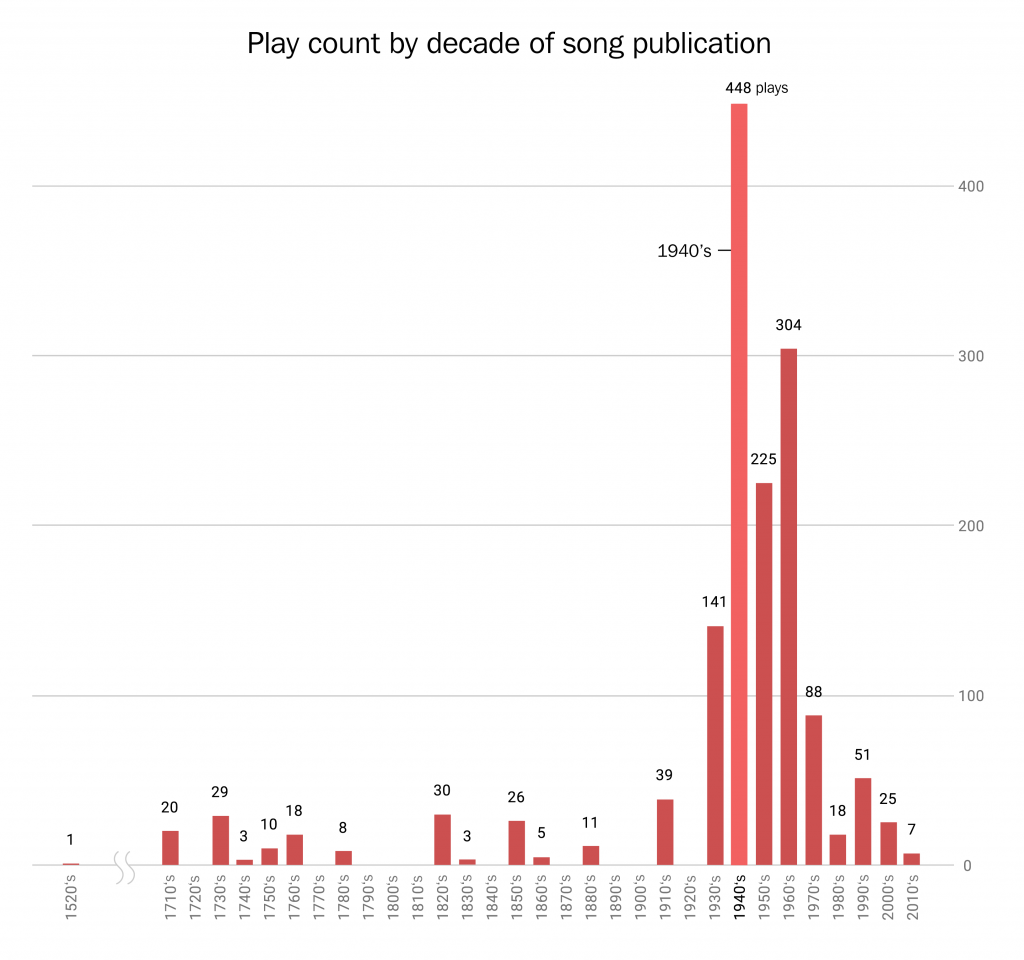
Based on this dataset, 65% of popular Christmas songs were originally released in the 1940s, 50s, and 60s. Despite the notable exception of Mariah Carey’s “All I Want for Christmas is You” from the 90s, most of the beloved “Holiday Hits” come from the mid-20th century.
As for why this is the case, the popular webcomic XKCD claims that every year American culture tries to “carefully recreate the Christmases of Baby Boomers’ childhoods.” Regardless of whether Christmas music reflects the enduring impact of the postwar generation on America, Keegan’s dataset is available online to download for further exploration.
Christmas Trees
Last year, Washington Post reporters Tim Meko and Lauren Tierney wrote an article about where Americans get their live Christmas trees from. The article includes this map:
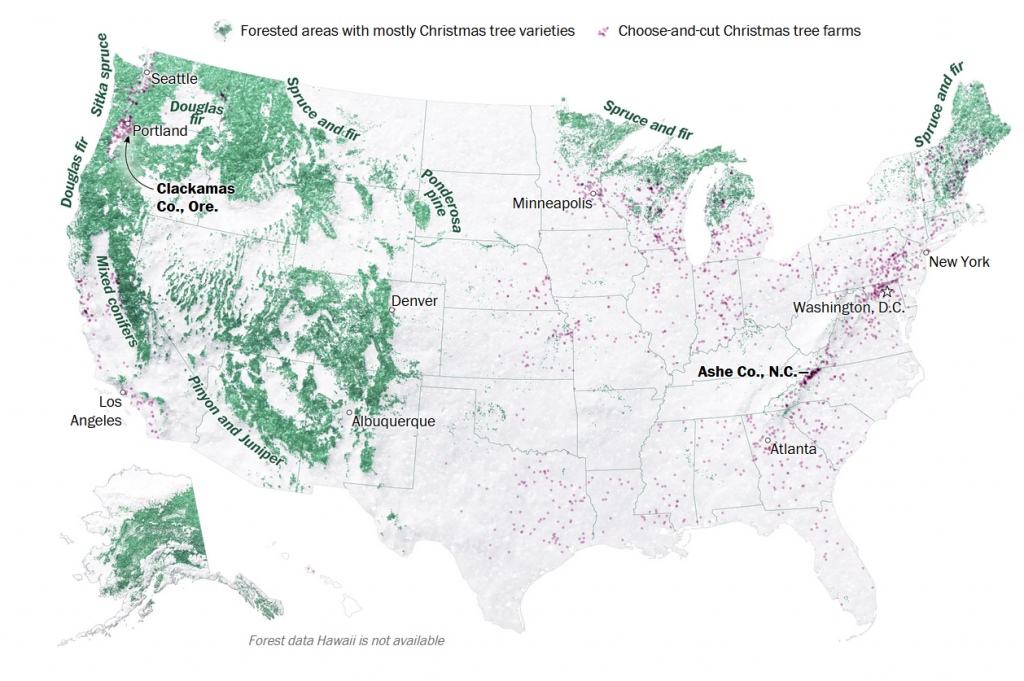
The green areas are forests primarily composed of evergreen Christmas trees, and purple dots represent Choose-and-cut Christmas tree farms. 98% of Christmas trees in America are grown on farms, whether it’s a choose-and-cut farm where Americans come to select themselves or a farm that ships trees to stores and lots.
This next map shows which counties produce the most Christmas trees:
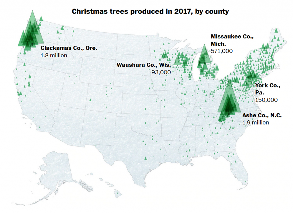
As you can see, the biggest Christmas tree producing areas are New England, the Appalachians, the Upper Midwest, and the Pacific Northwest, though there are farms throughout the country.
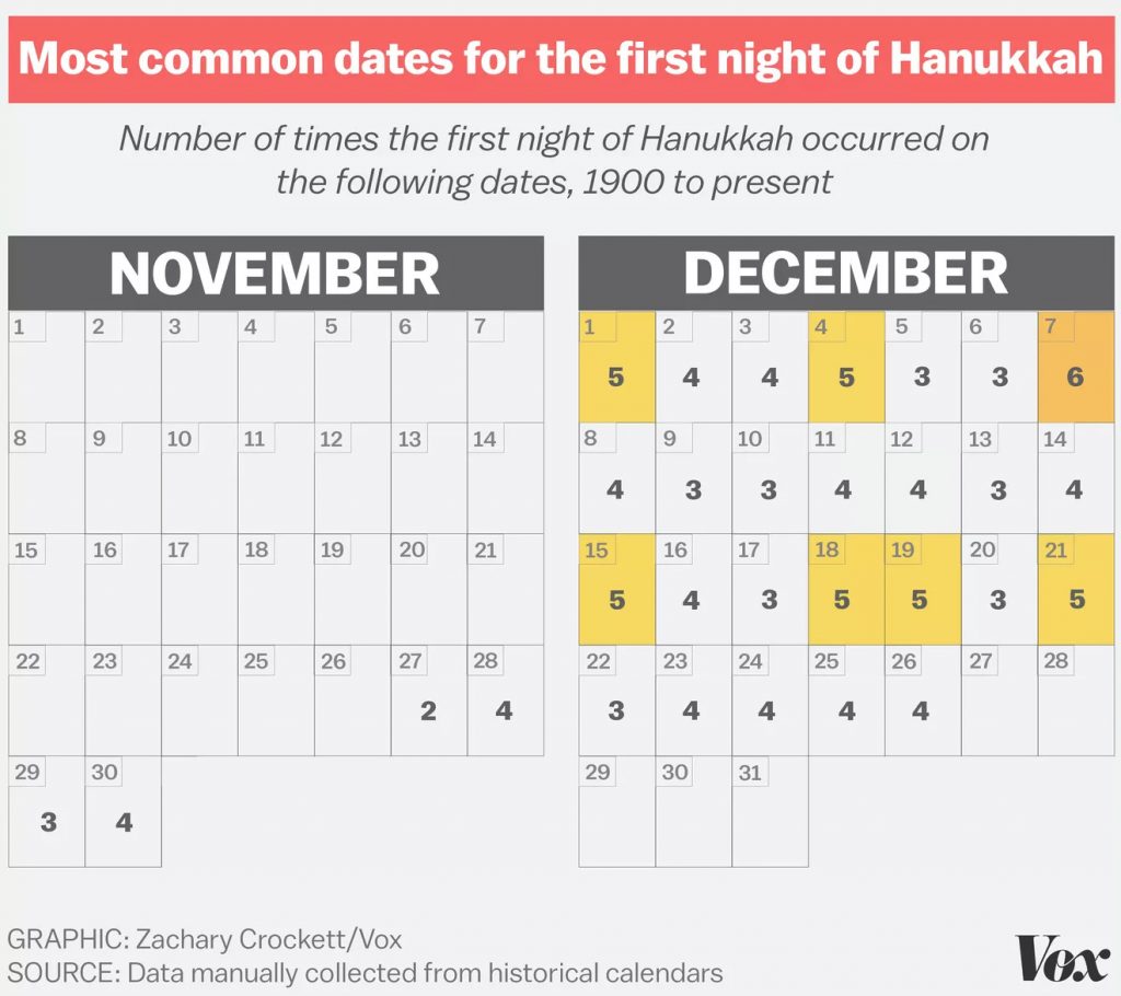
The First Night of Hanukkah
This year, Hanukkah starts tonight, December 10, but its start date varies every year. However, this is not the case on the primarily lunar-based Hebrew Calendar, in which Hanukkah starts on the 25th night of the month of Kislev. As a result, the days of Hanukkah vary year-to-year on other calendars, particularly the solar-based Gregorian calendar. It can occur as early as November 28 and as late as December 26.
In 2016, Hannukah began on December 24, Christmas Eve, so Vox author Zachary Crockett created this graphic to show the varying dates on which the first night of Hannukah has taken place from 1900 to 2016:
The Spelling of Hanukkah
Hanukkah is a Hebrew word, so as a result there is no definitive spelling of the word in the Latin alphabet I am using to write this blog post. In Hebrew it is written as חנוכה and pronounced hɑːnəkə in the phonetic alphabet.
According to Encyclopædia Britannica, when transliterating the pronounced word into English writing, the first letter ח, for example, is pronounced like the ch in loch. As a result, 17th century transliterations spell the holiday as Chanukah. However, ח does not sounds like the way ch does when its at the start of an English word, such as in chew, so in the 18th century the spelling Hanukkah became common. However, the H on its own is not quite correct either. More than twenty other spelling variations have been recorded due to various other transliteration issues.
It’s become pretty common to use Google Trends to discover which spellings are most common, and various journalists have explored this in past years. Here is the most recent Google search data comparing the two most commons spellings, Hanukkah and Chanukah going back to 2004:
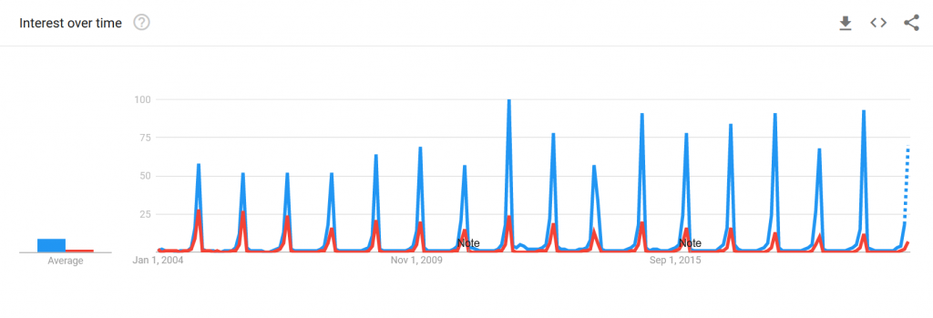
You can also click this link if you are reading this article after December 2020 and want even more recent data.
As you would expect, the terms are more common every December. It warrants further analysis, but it appears that Chanukah is becoming less common in favor of Hanukkah, possibly reflecting some standardization going on. At some point, the latter may be considered the standard term.
You can also use Google Trends to see what the data looks like for Google searches in Israel:
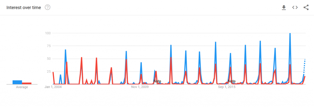
Again, here is a link to see the most recent version of this data.
In Israel, it also appears as though the Hanukkah spelling is also becoming increasingly common, though early on there were years in which Chanukah was the more popular spelling.
I hope you’ve enjoyed seeing these brief explorations into data analysis related to Christmas and Hanukkah and the quick discoveries we made with them. But more importantly, I hope you have a happy and relaxing holiday season!