Biking at UIUC: the Creation of a StoryMap

The 651 total buildings owned by the University of Illinois at Urbana-Champaign stretch across an area of 9.9 square miles, or 6,370 acres. With a campus as large as ours, it’s no wonder the students, faculty, and staff use so many different means of transportation. Cars, bikes, skateboards, public transit, scooters – you name it!

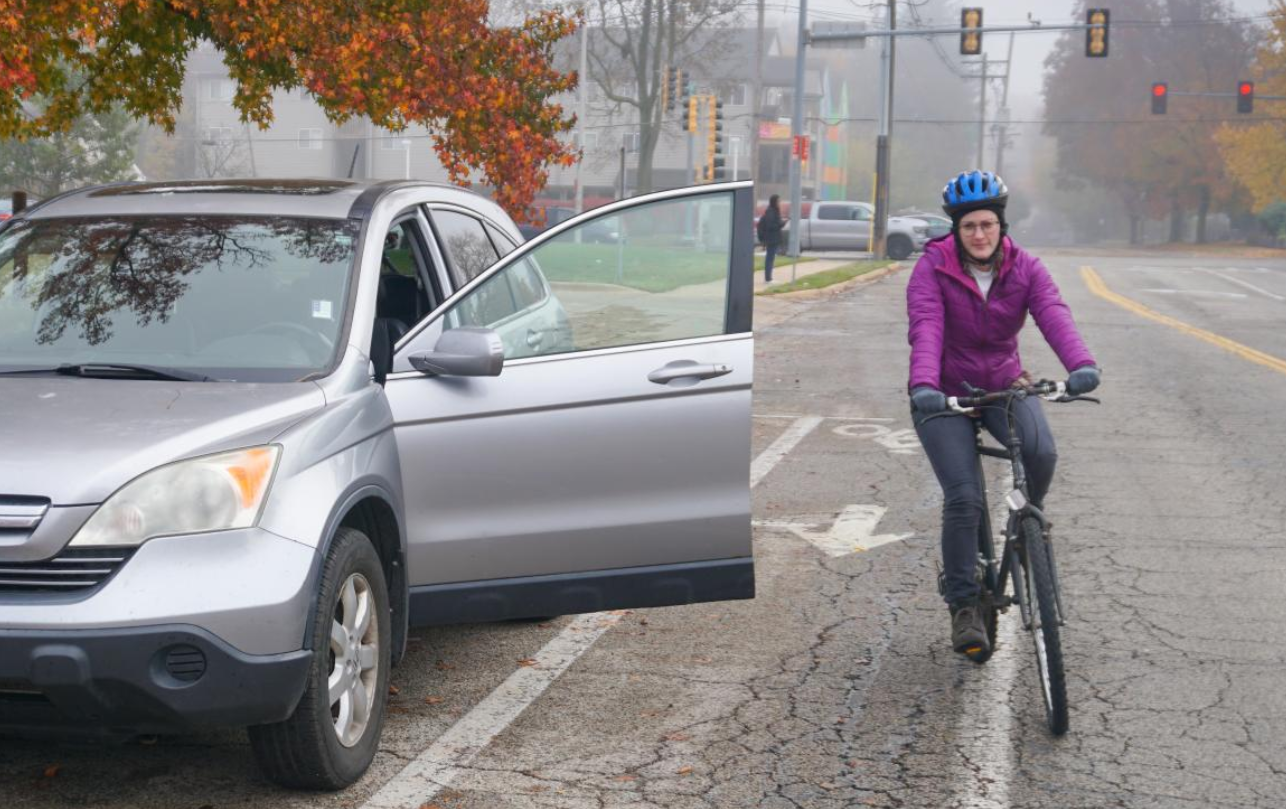
When the weather is even halfway decent, you can find me biking around campus. It’s quick, convenient, and provides a bit of exercise in the otherwise sedentary life of a grad student. However, biking on campus is not without its frustrations. Bike routes are not always obvious, and sometimes they’re blocked by pedestrians or poorly parked cars. Even though I’ve gained more confidence in using bike lanes, it’s always a little nerve-wracking when I need to merge into traffic to turn left, or when a bus drives by and I’m stuck between it and a row of parked cars, the doors of which could open at any moment.

biker avoiding an open car door
photo by Dominik Stallings

With these concerns in mind, I set out to learn more about the different kinds of bike routes on campus and the safety pros and cons of each. I read various research articles and made observations of potential features or issues while biking around campus. I took photos of campus bike routes, including common bike lane hazards, some of which were staged for the sake of photography, but still very real issues. I learned about resources related to getting around campus, and wanted to further share them.

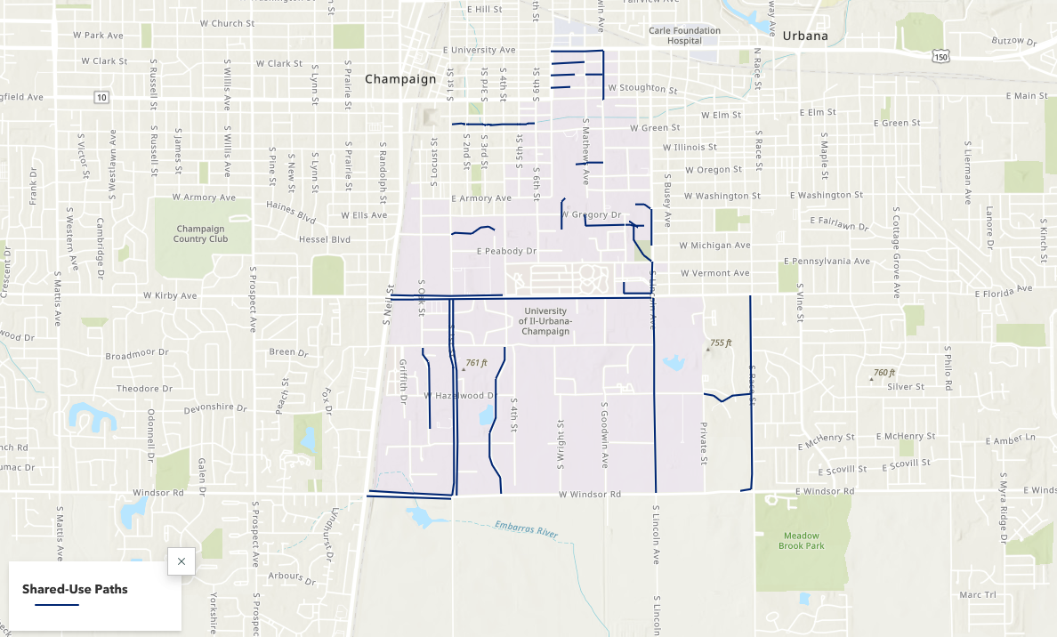
In order to present my research, which relied heavily on maps, I used ArcGIS StoryMaps. This software was well-suited to the needs of this project. I was able to get data on bike routes and parking areas from campus facilities, which I used to create web maps with ArcMap and ArcGIS Online so that viewers could see each type of bike route in isolation. Continuity of bike routes has been found to be an important factor in whether people choose to bike, and certain people may feel more or less comfortable using different types of routes, so I wanted to demonstrate how these comfort limitations affect route continuity, possibly leading to fewer people choosing to bike.

Screenshot of shared-use paths map

These maps, photos, and narrative elements came together to tell a story about biking on campus. To learn more about the campus bike network, the safety pros and cons of different bike route types, and campus navigation tips, you can explore the StoryMap here.

Explore the Possibilities with ArcGIS StoryMaps

ArcGIS StoryMaps is a handy tool for combining narrative, images, and maps to present information in an engaging way. Organizations have used StoryMaps for everything from celebrating their conservation achievements on their 25th anniversary to exploring urban diversity in Prague. The possibilities are vast, which can be both exciting and intimidating for people who are just getting started. I want to share some of my favorite StoryMap examples, which will demonstrate how certain StoryMap tools can be used and hopefully provide inspiration for your project.

A Homecoming for Gonarezhou’s Black Rhinos

Screenshot of a storymap with text about and an image of rhinos.

If GIS and map creation are a bit outside your wheel-house, no worries! A Homecoming for Gonarezhou’s Black Rhinos is a StoryMap created by the Rhino Recovery Fund that is a great example of how a StoryMap can be made without using any maps. It’s also a good example of the timeline feature as well as making great use of a custom theme by incorporating the nonprofit’s signature pink into the story’s design.

Sounds of the Wild West

Screenshot of a storymap with text about and an image of the Yellowstone River.

Sounds of the Wild West is a StoryMap created by Acoustic Atlas that takes you on an audio tour of four different Montana ecosystems. This StoryMap is a lovely example of how powerful images and audio can immerse people in a location, enhancing their understanding of the information presented. The authors also made great use of the StoryMap sidecar, layering text, images, and audio to create their tour.

California’s Superbloom

Header of the California's Superbloom StoryMap

Speaking of beautiful photos, this StoryMap about California’s Superbloom is full of them! It’s a great example of the StoryMap image gallery and “swipe” tools. The StoryMap swipe tool allows you to juxtapose different maps or images, revealing the difference between, for example, historical and modern photos, or satellite imagery during different times of year in the same region.

The Surprising State of Africa’s Giraffes

Screenshot of The Surprising State of Africa’s Giraffes StoryMap with a map highlighting the habitat of the Northern Giraffe

The Surprising State of Africa’s Giraffes is a StoryMap created by ESRI’s StoryMaps team that demonstrates another great use for the sidecar. As users scroll through the sidecar pictured above, different regions of the map are highlighted in an almost animated effect. This not only provides geographic context to the information, but does so in a dynamic way. This StoryMap also includes a great example of an express map, which is an easy way to make an interactive map without any GIS experience or complicated software.

Map Tour Examples

StoryMaps also features a tool that allows you to take users on a tour around the world – or just around your hometown. The map tour comes in two forms: a guided tour, like the one exemplified in Crowded Skies, Expanding Airports; and an explorer tour, such as The Things that Stay with Us.

StoryMaps Gallery

There are so many different forms a StoryMap can take! To see even more possibilities, check out the StoryMaps Gallery to explore nearly a hundred different examples. If you’re ready to get your feet wet but want a bit more support, keep an eye on the Savvy Researcher calendar for upcoming StoryMap workshops at the UIUC Main Library.

Of Maps and Memes: A Bit of Cartographic Fun

Co-Authored by Zhaneille Green

We use maps to communicate all the time. Historically, they have been used to navigate the world and to stand as visual, physical manifestations of defined spaces and places. What do you think of when we say “map”: a topographic map1 a transportation map2 or a city map3?

You can use maps to represent just about anything you want to say, far beyond these typical examples. We wrote this blog to invite you to have a little cartographic fun of your own.

If you’re on any kind of social media, you’ve probably seen maps like the one below, highlighting anything from each state’s favorite kind of candy to what the continental US would look like if all of the states’ borders were drawn along rivers and mountain ranges. People definitely seem to enjoy sharing these maps, curious to see what grocery store most people shop at in their home state, or laughing about California’s lack of popularity with the states in the surrounding area.

Map of most popular halloween candy in each US state. View the interactive version on candystore.com

Try your hand at creating your own silly map by using our programs in the Scholarly Commons. Start a war by creating a map that ranks the Southern states with the best barbecue using Adobe Photoshop or Illustrator, or explore a personal hobby like creating a map of all the creatures Sam & Dean Winchester met through the 15 seasons of Supernatural using ArcGIS.

If you’re feeling a bit more serious, don’t fret! Even if these meme-like maps aren’t portraying the most critical information, they do demonstrate how maps can be a great tool for data visualization. In many ways, location can make data feel more personal, because we all have personal connections to place. Admit it: the first thing you checked on the favorite candy map was your home state. Maps also tend to be more visually engaging than a simple table with, for example, states in one column and favorite animal in the other.

Using geotagging data, each dot represents where a photo was taken: blue for locals, red for tourists, and yellow for unknown. Locals and Tourists #1 (GTWA #2): London. Erica Fischer, CC BY-SA 2.0 via Flickr.

Regardless of what you want to map, the Scholarly Commons has the tools to help bring your vision to life. Learn about software access on our website, and check out these LinkedIn Learning resources for an introduction to ArcGIS Online or Photoshop, which are available with University of Illinois login credentials. If you need more assistance, feel free to ask us questions. Go forth and meme!

Making Infographics in Canva: a Guide and Review

Introduction

If you’ve ever had to design a poster for class, you’re probably familiar with Canva. This online and app-based graphic design tool, with free and subscription-based versions, features a large selection of templates and stock graphics that make it pretty easy to create decent-looking infographics. While it is far from perfect, the ease of use makes Canva worth trying out if you want to add a bit of color and fun to your data presentation.

Getting Started

Starting with a blank document can be intimidating, especially for someone without any graphic design experience. Luckily, Canva has a bunch of templates to help you get started.

Canva infographic templates

I recommend picking a template based on the color scheme and general aesthetic. It’s unlikely you’ll find a template that looks exactly how you want, so you can think of a template as a selection of colors, fonts, and graphics to use in your design, rather than something to just copy and paste things into. For example, see the image below – I recently used the template on the left to create the infographic on the right.

An infographic template compared to the resulting infographic

General Design Principles

Before you get started on your infographic, it’s important to remember some general design guidelines:

  1. Contrast. High levels of contrast between your background and foreground help keep everything legible.
  2. Simplicity. Too many different colors and fonts can be an eyesore. Stick to no more than two fonts at a time.
  3. Space. Leave whitespace to keep things from looking cluttered.
  4. Alignment and balance. People generally enjoy looking at things that are lined up neatly and don’t have too much visual weight on one side or another.
An exaggerated example of a design that ignores the above advice.

Adding Graphs and Graphics

Now that you have a template in hand and graphic design principles in mind, you can start actually creating your infographic. Under “Elements,” Canva includes several types of basic charts. Once you’ve added a chart to your graphic, you can edit the data associated with the chart directly in the provided spreadsheet, by uploading a csv file, or by linking to a google spreadsheet.

Canva interface for creating charts

The settings tab allows you to decide whether you want the chart to include a legend or labels. The options bar at the top allows for further customization of colors and bar or dot appearance. Finally, adding a few simple graphics from Canva’s library such as shapes and icons can make your infographic more interesting. 

Examples of charts available in Canva, with a variety of customizations.

Limitations and Frustrations

The main downsides to Canva are the number of features locked behind a paywall and the inability to see only the free options. Elements cannot be filtered by price and it seems that more and more graphics are being claimed by Canva Pro, so searching for graphics can be frustrating. Templates can be filtered, but it will still bring up results where the template itself is free, but there are paid elements within the template. So, you might choose a template based on a graphic that you really like, only to find out that you need a Canva Pro subscription to include that graphic.

The charts in Canva also have limitations. Pie charts do not allow for the selection of colors for each individual slice; you have to pick one color, and Canva will generate the rest. However, if you want to have more control over your charts, or wish to include more complicated data representations, you can upload charts to Canva, which even supports transparency.

Conclusion

As mentioned above, Canva has its downsides. However, Canva’s templates, graphics, and charts still make it a super useful tool for creating infographics that are visually appealing. Try it out the next time you need to present some data!

Meet Our Graduate Assistants: Apollo Uhlenbruck

This semester, the Scholarly Commons is onboarding five new GAs! In order to help you get to know all the new faces, we will be asking them to answer a few questions, and posting their responses throughout the fall. 

First up, we have Apollo Uhlenbruck. 

Apollo headshot

What is your educational and/or professional background? 

I got my undergraduate degree from Wellesley College in Massachusetts, where I studied media arts. Afterwards, I moved back to my hometown of Missoula, Montana and worked a wide variety of jobs: first, I was a production assistant on a Gold Rush spin-off, then I spent a little over a year as a bookseller at an independent bookstore as well as providing in-home care for people with developmental disabilities. Then, after a brief stint as an administrative assistant at the University of Montana, I finally worked in shelter animal care at the Humane Society of Western Montana before packing up my bags and moving to Illinois! 

What led you to your field? 

My hometown’s public library was a staple of my childhood. I was one of those kids that got in trouble for reading during class, and the library was more than happy to feed my voracious appetite. I also joined the library’s teen writers’ group, which helped me grow as a writer and a person. In my work after graduation, I’ve found that I really enjoy working with and helping people, so I aim to combine my love of books with my love of people by going into library and information science. 

What are your research interests? 

I would say that my interests are very broad. I’m primarily interested in how libraries can better serve marginalized groups, but I’m also curious about UX design, gamification, mythology, and diverse representation in youth literature. 

What is your specialty within the Scholarly Commons? 

I’m wearing multiple hats here at the Scholarly Commons, focusing on both GIS and Web and Media. Part of that involves helping to run this blog! 

Describe a favorite project you’ve worked on. 

Moon tarot card

For one of my undergraduate courses, I created a major arcana tarot deck comprised of photos featuring queer and gender-nonconforming individuals, emphasizing the magic that is present in everyday life. The photo series was an interpretation of the Major Arcana informed by the traditional symbolism and meanings and viewed through a queer feminist lens. The project involved research into the history of Tarot as well as the relationship between witchcraft and feminism. 

What Scholarly Commons resource are you most excited to learn about? 

The new studio space in 308! It’s still in the works, but as soon as it’s up and running I think it’ll be a great space in which to experiment with lighting and photo/video equipment, and I can’t wait to see what kinds of projects people create!  

What do you hope to do after graduation? 

After graduating from the MSLIS program here at Illinois, I hope to go into public librarianship and youth services.