Juan Salamanca Ph.D, Assistant Professor in the School of Art and Design at the University of Illinois Urbana-Champaign recently created a new data visualization tool called Simple NetInt. Though developed from a tool he created a few years ago, this tool brings entirely new opportunities to digital scholarship! This week we had the chance to talk to Juan about this new tool in data visualization. Here’s what he said…
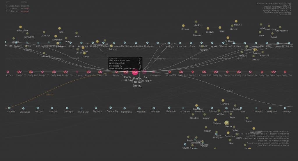
Simple NetInt is a JavaScript version of NetInt, a Java-based node-link visualization prototype designed to support the visual discovery of patterns across large dataset by displaying disjoint clusters of vertices that could be filtered, zoomed in or drilled down interactively. The visualization strategy used in Simple NetInt is to place clustered nodes in independent 3D spaces and draw links between nodes across multiple spaces. The result is a simple graphic user interface that enables visual depth as an intuitive dimension for data exploration.
 Check out the Simple NetInt tool here!
In collaboration with Professor Eric Benson, Salamanca tested a prototype of Simple NetInt with a dataset about academic publications, episodes, and story locations of the Sci-Fi TV series Firefly. The tool shows a network of research relationships between these three sets of entities similar to a citation map but on a timeline following the episodes chronology.
What inspired you to create this new tool?
This tool is an extension of a prototype I built five years ago for the visualization of financial transactions between bank clients. It is a software to visualize networks based on the representation of entities and their relationships and nodes and edges. This new version is used for the visualization of a totally different dataset: scholarly work published in papers, episodes of a TV Series, and the narrative of the series itself. So, the network representation portrays relationships between journal articles, episode scripts, and fictional characters. I am also using it to design a large mural for the Siebel Center for Design.
What are your hopes for the future use of this project?
The final goal of this project is to develop an augmented reality visualization of networks to be used in the field of digital humanities. This proof of concept shows that scholars in the humanities come across datasets with different dimensional systems that might not be compatible across them. For instance, a timeline of scholarly publications may encompass 10 or 15 years, but the content of what is been discussed in that body of work may encompass centuries of history. Therefore, these two different temporal dimensions need to be represented in such a way that helps scholars in their interpretations. I believe that an immersive visualization may drive new questions for researchers or convey new findings to the public.
What were the major challenges that came with creating this tool?
The major challenge was to find a way to represent three different systems of coordinates in the same space. The tool has a universal space that contains relative subspaces for each dataset loaded. So, the nodes instantiated from each dataset are positioned in their own coordinate system, which could be a timeline, a position relative to a map, or just clusters by proximities. But the edges that connect nodes jump from one coordinate system to the other. This creates the idea of a system of nested spaces that works well with few subspaces, but I am still figuring out what is the most intuitive way to navigate larger multidimensional spaces.
What are your own research interests and how does this project support those?
My research focuses on understanding how designed artifacts affect the viscosity of social action. What I do is to investigate how the design of artifacts facilitates or hinders the cooperation of collaboration between people. I use visual analytics methods to conduct my research so the analysis of networks is an essential tool. I have built several custom-made tools for the observation of the interaction between people and things, and this is one of them.
If you would like to learn more about Simple NetInt you can find contact information for Professor Juan Salamanca here and more information on his research!
If you’re interested in learning more about data visualizations for your own projects, check out our guide on visualizing your data, attend a Savvy Researcher Workshop, Live Chat with us on Ask a Librarian, or send us an email. We are always happy to help!

