Daylight Saving Time Gripe Assistant Tool
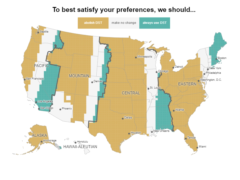
Clocks fell back this weekend, which means the internet returns once again to the debate of whether or not we still need Daylight Saving Time. Andy Woodruff, a cartographer for Axis Maps, created a handy tool for determining how much you can complain about the time change. You input your ideal sunset and sunrise times, select whether the sunset or sunrise time you chose is more important, and the tool generates a map that shows whether DST should be gotten rid of, used year-round, or if no changes need to be made based on where you live. The difference a half hour makes is surprising for some of the maps, making this a fun data viz to play around with and examine your own gripes with DST.

This shows an ideal sunrise of 7:00 am and an ideal sunset of 6:00 pm.
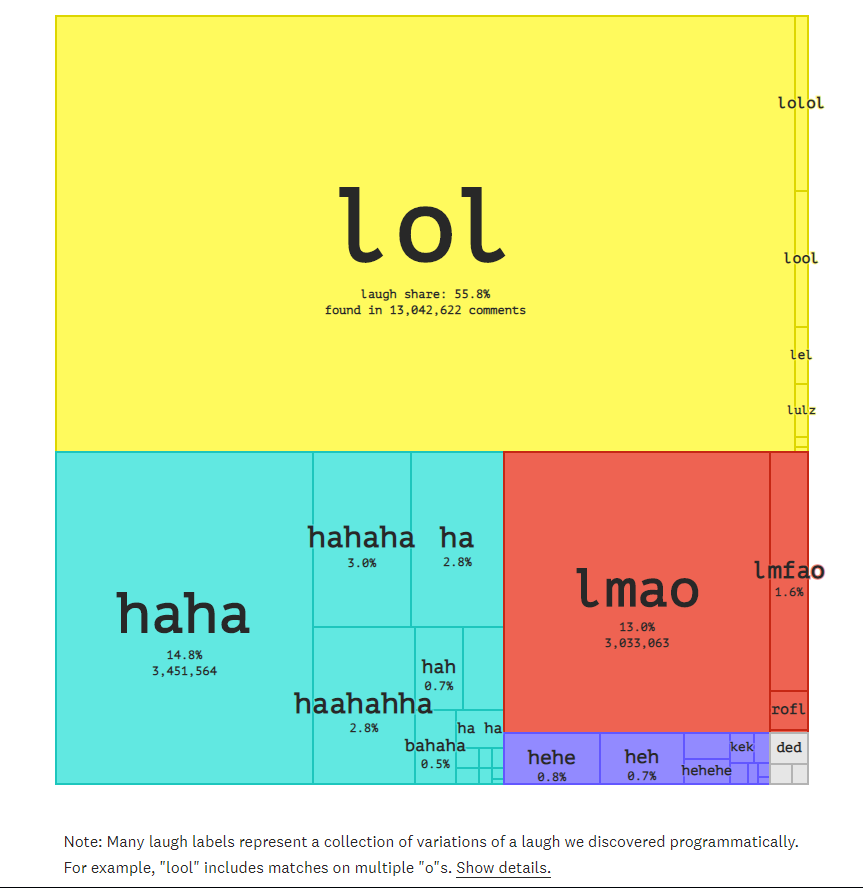
Conveying tone through text can be stressful—finding the right balance of friendly and assertive in a text is a delicate operation that involves word choice and punctuation equally. Often, we make our text more friendly through exclamations points! Or by adding a quick laugh, haha. The Pudding took note of how varied our use of text-based laughs can be and put together a visual essay on how often we use different laughs and whether all of them actually mean we are “laughing out loud.” The most common laugh on Reddit is “lol,” while “hehe,” “jaja,” and “i’m laughing” are much less popular expressions of mirth.

“ha” is the expression most likely to be used to indicate fake laughter or hostility
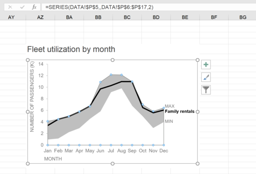
how to do it in Excel: a shaded range
Here’s a quick tip for making more complex graphs using Excel! Storytelling with Data’s Elizabeth Ricks put together a great how-to article on making Excel show a shaded range on a graph. This method involves some “brute force” to make Excel’s functions work in your favor, but results in a clean chart that shows a shaded range rather than a cluster of multiple lines.

Pixelation to represent endangered species counts
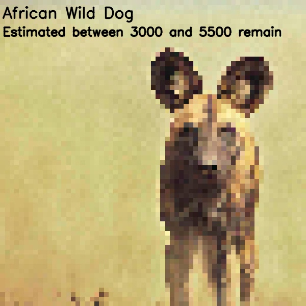
On Imgur, user JJSmooth44 created a photo series to demonstrate the current status of endangered species using pixilation. The number of squares represent the approximate number of that species that remains in the world. The more pixelated the image, the fewer there are left.

The African Wild Dog is one of the images in which the animal is still mostly recognizable.

